

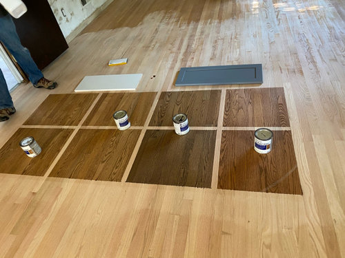
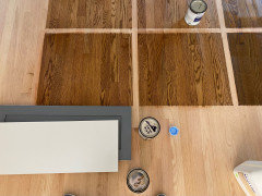
kitchen floor stain decision
3 years ago
Featured Answer
Sort by:Oldest
Comments (17)
- 3 years ago
- 3 years ago
Related Professionals
Atlantic City Flooring Contractors · College Station Tile and Stone Contractors · Hartford Tile and Stone Contractors · Dubuque Tile and Stone Contractors · Mount Vernon Kitchen Remodelers · Columbus Kitchen Remodelers · Manhattan Interior Designers & Decorators · Cumberland Architects & Building Designers · Lawton Kitchen & Bathroom Designers · Akron Kitchen & Bathroom Designers · Anderson Kitchen Remodelers · Dallas Kitchen Remodelers · Boise Kitchen Remodelers · Toms River Custom Countertops · Lynchburg Custom Countertops- 3 years ago
 3 years ago
 3 years ago
- 3 years ago
- 3 years agolast modified: 3 years ago
- 3 years ago
- 3 years ago
- 3 years ago
 3 years ago
 3 years ago
- 3 years ago
- 3 years ago
- 3 years ago
 3 years ago

Related Stories
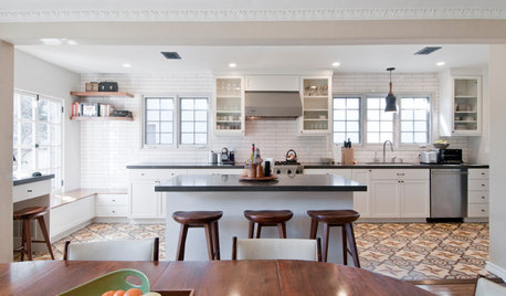
KITCHEN OF THE WEEKKitchen of the Week: Graphic Floor Tiles Accent a White Kitchen
Walls come down to open up the room and create better traffic flow
Full Story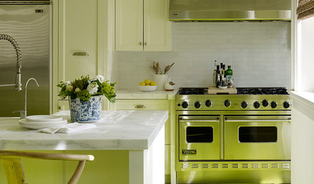
KITCHEN DESIGNEye-Catching Colors for Your Kitchen Floor
Revitalize a tired wooden floor with a paint or stain in an unexpected color
Full Story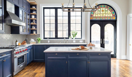
KITCHEN MAKEOVERSKitchen of the Week: Blue and White With a Stained Glass Window
A 19th-century Brooklyn townhome gets a colorful new kitchen with original crown molding and salvaged stained glass
Full Story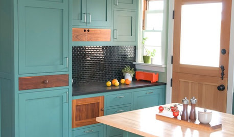
KITCHEN CABINETSKitchen Cabinet Color: Should You Paint or Stain?
Learn about durability, looks, cost and more for wooden cabinet finishes to make the right choice for your kitchen
Full Story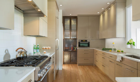
KITCHEN MAKEOVERSBefore and After: 3 Kitchens That Get Warmth From Wood Floors
See how wood floors add character and cohesion in these remodels
Full Story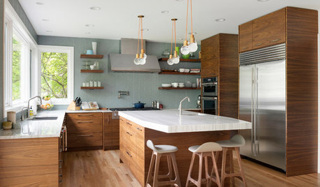
KITCHEN DESIGN10 Beautiful Kitchens With Wood Cabinets and Flooring
See how wood cabinets and other elements in a variety of designs add warmth and character to create welcoming spaces
Full Story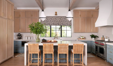
KITCHEN CABINETSPainted vs. Stained Kitchen Cabinets
Wondering whether to go for natural wood or a painted finish for your cabinets? These pros and cons can help
Full Story
BEFORE AND AFTERSKitchen of the Week: Bungalow Kitchen’s Historic Charm Preserved
A new design adds function and modern conveniences and fits right in with the home’s period style
Full Story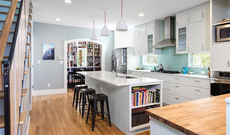
MOST POPULAR6 Kitchen Flooring Materials to Boost Your Cooking Comfort
Give your joints a break while you're standing at the stove, with these resilient and beautiful materials for kitchen floors
Full Story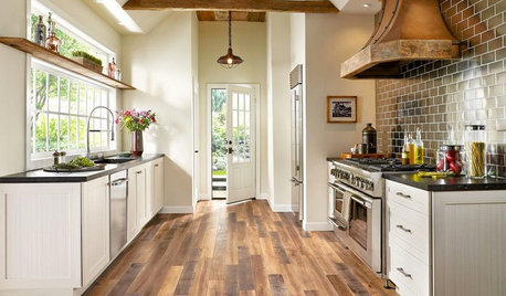
MOST POPULARPros and Cons of 5 Popular Kitchen Flooring Materials
Which kitchen flooring is right for you? An expert gives us the rundown
Full Story

SarahOriginal Author