

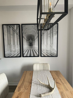
What to do with dining room wall?
3 years ago

Featured Answer
Sort by:Oldest
Comments (13)
 3 years agolast modified: 3 years ago
Related Professionals
Gainesville Interior Designers & Decorators · Pensacola Interior Designers & Decorators · Marietta Interior Designers & Decorators · Temecula Interior Designers & Decorators · Norfolk Kitchen & Bathroom Designers · Fargo Kitchen & Bathroom Designers · Scottsbluff Kitchen & Bathroom Designers · Manhattan Furniture & Accessories · Rolla Interior Designers & Decorators · Manhattan Architects & Building Designers · Sacramento Architects & Building Designers · Anchorage Cabinets & Cabinetry · Hays Kitchen Remodelers · Fort Wayne Kitchen Remodelers · La Crosse Kitchen & Bathroom Designers- 3 years ago
 3 years agolast modified: 3 years ago
 3 years ago
- 3 years ago
 3 years ago



Related Stories
DECORATING GUIDESHow to Create a Great Dining Room Wall
Shelves, candles, stonework, wallpaper and chalkboard paint make dramatic backdrops for feasts
Full Story
DINING ROOMSGraceful Decorations for Traditional Dining Room Walls
Let the elegant artistry of oil paintings, classic prints and wallpaper enhance your dining room — and your entire dining experience
Full Story
COLORColor Feast: When to Use Orange in the Dining Room
Dial up the zest at mealtimes with doses of snappy orange on dining room walls and furniture
Full Story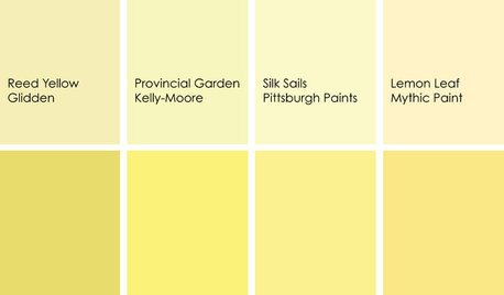
DECORATING GUIDESColor Feast: When to Use Yellow in the Dining Room
Make mealtimes a cheery affair with swaths of this sunshiny hue on your dining room walls, furniture or ceiling
Full Story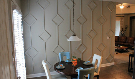
DECORATING GUIDESDIY: Bold 3D Dining Room Wall
Mid-century diamond pattern inspires dining room's new look
Full Story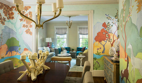
WALL TREATMENTSRoom of the Day: Original Mural Brings Joy to a Formal Dining Room
French inspiration gives traditional style a twist in this Victorian-era home
Full Story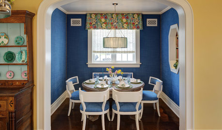
DINING ROOMSRoom of the Day: Dressing a Dining Alcove in Bright Blue
Vibrant upholstered walls and seats plus thoughtful architectural details give a nook in Chicago a happy vibe
Full Story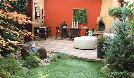
GARDENING AND LANDSCAPINGColor Makes a Garden Dining Room Sing in Santa Fe
Vibrant stucco walls, living art and chic furniture harmonize in an outdoor dining room in New Mexico
Full Story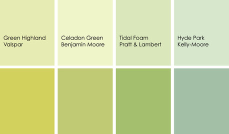
DINING ROOMSColor Feast: When to Use Green in the Dining Room
Squeeze a little lime into the space where you dine — green walls, chairs or accessories can be delicious if you do them right
Full Story
HOMES AROUND THE WORLDTraditional Kitchen Opens Up and Lightens Up
Removing a wall was key to creating a large kitchen and dining space for family life in this London house
Full Story


ffpalms