Software
Houzz Logo Print
hillary_bluhm

Dark entryway help

3 years ago
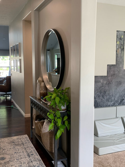
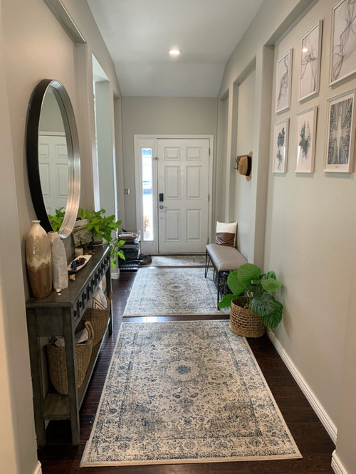
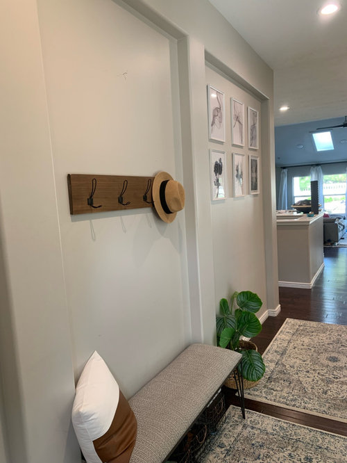
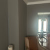
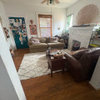
My entryway is need of some dimension and brightness. I’m leaning towards adding board and batten in white half way up the walls. But wanted to see if anyone thinks peel and stick wallpaper in the wall insets in a neutral mainly white pattern might work and look good to? Hoping that I’m missing an easy fix so I don’t have to learn how to install trim 🤣 to accomplish what I want.

Comments (17)

  • 3 years ago
    last modified: 3 years ago

    It doesn't seem very dark to me, but I can relate to wanting to lighten things up - I could see a pale tonal wallpaper working in the niches - I feel like adding a lot of trim could feel bulky and narrow the feeling of the hall even more -

    FWIW I would be tempted to get a custom runner for the hall so you don't have to have 3 rugs and you wouldn't see the dark floor breaking up the space as much

  • 3 years ago

    I’m definitely open to replacing the rugs. They’ve been giving me major pattern fatigue. Do you have any online recommendations for custom size rugs?

  • 3 years ago
    last modified: 3 years ago

    The hallway looks nice, but the rugs were the first things to jump at me too. The smaller rugs draw too much attention because they don’t fit.

    Next are the plants. They look fake.

  • 3 years ago

    For rugs, I would visit local oriental rug dealers. They will have runners in more unique sizes.

  • PRO
    3 years ago

    The space has so many vertical elements you thought it would be a good idea to now begin adding horizontal elements also??

    The foyer doesn't appear dark to me but it's 'choppy' with all the items you have added on the RH side. Also, I'm not sure why the art was mounted for someone who is 7ft tall.

    If you had to add white to the space.............and I'm not saying I would recommend doing that, it seems natural that the white be added inside the architectural niches created on your wall.

    I would take away the bench, pillow and plant just let the wall be.


  • 3 years ago
    last modified: 3 years ago

    I would paint theback wall of each of the insets.

    the slim table & mirror one a dark rich color so the furniture blends in, the same with the hook and bench area. the green of the plant and the natural fivers of the baskets will pop againt a rich background. is there room by the door for the mirror and slim table? Better there for a quick look before you exit the house. If the opening into another room is a living room I would put the slim table and round mirror there... so when in that room you look at a pretty view and not the bench & hanging hooks. they would be better right at the door.

    the one with the framed art needs another row, or lower all of them to eye level. I would paint that one white. the rugs don't have to match, just compliment.

    I would do something lighter on the wall with the white frames... the blue rug is great there, with something lighter across from it. a Deeper, richer rug for the foyer, with the dark coat hanging/bench and opposite with the dark table/round mirror. group green plants together. keep the aisle open.

  • 3 years ago
    last modified: 3 years ago

    Actually, less would be more in terms of lightness and brightness.

    The mirror needs to be where the hats are. If you don't want a full reflection for people entering and exiting the room opposite, positon the hats to mostly cover the mirror.

    Take away the top row of framed bird prints. Take away the floor plants. No pillow on the bench.

    Just get rid of the rugs unless you absolutely need them for noise.

    If you want to get fancy, see if you can replace your recessed lights with small double-headed LEDs that can be directed to wash your walls with light.

    You could try peel and stick wallpaper in the slightly recessed niche behind the console. But I think you might end up creating visual clutter. Before you try wallpaper, try puttting 1 or 2 of your bird prints where the mirror is (once was). Try some shiny objects on top of the console and on its lower shelf instead of what you've got.

  • 3 years ago

    So the art gallery use to fill the wall, but kids kept knocking down the frames which kind of has me rearranging everything.

  • 3 years ago

    I’m loving the layout suggestions! It’s been bugging me for awhile that there isn’t really a welcome or flow when you come in. The shoe rack is in the first 36 in nook, but it’s so ugly to see when you first come in and people don’t see that there’s a place to sit down right away.

  • PRO
    3 years ago
    last modified: 3 years ago

    Consider LED lighting...LED puck lighting and LED strip lighting. You already have the perfect niches for strip lights. I also agree that the bench and floor plant are choppy; they interrupt the flow. The possibilities are endless!

  • 3 years ago

    Yes to a full length runner. Place the mirror and table in the nook where the bench and hooks now live. The mirror will then reflect light coming in from the window next to the door and light from the adjacent room. If nobody is using the bench anyway, then I would remove it altogether and remove the plants too. What age are you kids? If in a year or two they can use the hall without running into the pictures, I would leave those up and add in a bottom row then.


    You do not need something on both sides of this hallway. It is fine to leave the left hand walls blank.

  • 3 years ago

    Does anyone have any pictures to share of the puck or LED strip lighting in the entryway. I haven’t heard of this.

  • 3 years ago

    Removed the rugs and I think it looks way busy/choppy which I think I was confusing for “dark.”

  • 3 years ago

    What beautiful floors! Stunning.

  • 3 years ago

    Thanks! I meant way *less busy/choppy. Excited to see how it evolves with the fresh ideas.

  • 3 years ago

    Place a tall, narrow buffet lamp on the table and remove some of the vases. Leave the light on all the time. That will help brighten the area.