

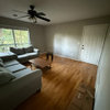
sectional fabric choice
3 years ago
Sort by:Oldest
Comments (15)
Related Stories
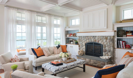
UPHOLSTERYFabric Focus: Make Your Interiors More Durable With Outdoor Fabric
Indoor-outdoor fabric is strong and beautiful, whether in the backyard or the living room
Full Story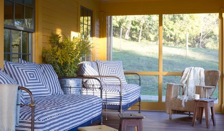
UPHOLSTERYFabric Focus: 6 Ways to Bring Ticking Stripe Fabric Home
From window treatments to upholstery and more, here are ways you can decorate with this decorative workhorse of a fabric
Full Story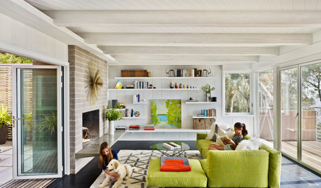
FURNITURE10 Reasons to Love Big, Comfy Sectionals
With their soft lines, visual heft and casual versatility, modular sofas are a great choice for many rooms
Full Story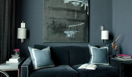
DECORATING GUIDESPin Down a Fabric for Your Couch
Material, color and pattern choices for couch fabric can be dizzying. These upholstery ideas can help you choose wisely
Full Story
PINKGuest Picks: Pretty in Pink Fabrics
Far from juvenile, these fabric choices show the many sophisticated sides of the sweet hue
Full Story
DECORATING GUIDES11 Ways to Remake a Room With Fabric
Give a space warmth and dimension with a choice textile for wall, furniture and accent
Full Story
UPHOLSTERYSofa Secrets: A Guide to Upholstery Fabric
Find out how to pick the right type of fabric for your furniture and keep it looking great
Full Story
GREEN DECORATINGEcofriendly Fabrics Make the Cut
Natural, vintage and even — yes — synthetic fabrics can enhance your home's green factor and radiate style
Full Story0

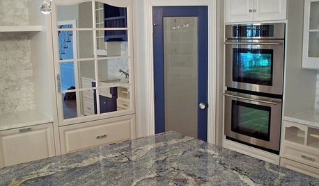
KITCHEN COUNTERTOPSKitchen Counters: Granite, Still a Go-to Surface Choice
Every slab of this natural stone is one of a kind — but there are things to watch for while you're admiring its unique beauty
Full Story
Patricia Colwell Consulting
auntthelma
Related Professionals
Des Moines Flooring Contractors · Sheridan Flooring Contractors · Beckley Furniture & Accessories · Lafayette Furniture & Accessories · Fayetteville Carpenters · Ottumwa Carpenters · Jacksonville Cabinets & Cabinetry · San Angelo Cabinets & Cabinetry · Riverton Cabinets & Cabinetry · Bronx Cabinets & Cabinetry · Dover Architects & Building Designers · Grand Rapids Architects & Building Designers · Minneapolis Architects & Building Designers · Vicksburg Kitchen & Bathroom Designers · Greenville Kitchen & Bathroom Designerskrystalmoon2009
susan gravesOriginal Author
mytwo cents
Creative Windows
susan gravesOriginal Author
Olychick
BeverlyFLADeziner
K Laurence
susan gravesOriginal Author
susan gravesOriginal Author
susan gravesOriginal Author
BeverlyFLADeziner
susan gravesOriginal Author