

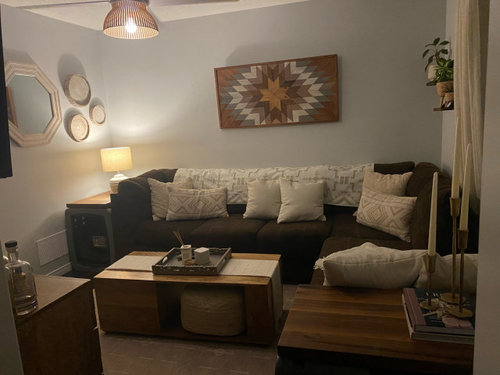
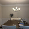
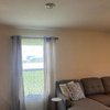
aligning art above sectional
3 years ago
Featured Answer
Sort by:Oldest
Comments (12)
 2 years ago
Related Professionals
Lafayette Architects & Building Designers · Hudson Architects & Building Designers · Montgomery Kitchen & Bathroom Designers · Baltimore Kitchen & Bathroom Designers · Wilmington Kitchen & Bathroom Designers · Salinas Kitchen & Bathroom Designers · New London Interior Designers & Decorators · El Paso Furniture & Accessories · Edison Interior Designers & Decorators · La Grande Interior Designers & Decorators · Huron Kitchen & Bathroom Designers · Belleville Furniture & Accessories · Austin Furniture & Accessories · Charlottesville Furniture & Accessories · Norfolk Furniture & Accessories 2 years ago
 2 years ago
 2 years agolast modified: 2 years ago
- 2 years agolast modified: 2 years ago
- 2 years ago
- 2 years ago
- 2 years agolast modified: 2 years ago
- 2 years ago
 PRO2 years ago
 PRO2 years ago


Related Stories
ROOTS OF STYLEArt Deco, Art Nouveau, Arts and Crafts: What’s the Difference?
If the zigzag and swirly designs of the past leave your head spinning, these descriptions will straighten you right out
Full Story
ARTLet's Put a Price on Art: Your Guide to Art Costs and Buying
We paint you a picture of what affects an artwork's price — plus a little-known way to take home what you love when it's beyond your budget
Full Story
ARCHITECTURERoots of Style: Art Deco and Art Moderne
Get to know the similarities and differences between these architectural styles of the 1920s and 1930s
Full Story
HOUZZ TOURSArt Deco Condo Infused With Color, Art and Whimsical Decor
A painted floor, a wallpapered ceiling and colorful chandeliers are among the eclectic touches in this Chicago home
Full Story
ARTAt Home With Art: Suspended Sculptures Heighten the Possibilities
Draw the eye in unexpected ways with 3D artwork hung from above
Full Story
DECORATING GUIDESOff-Center Art Hits the Mark for Energizing Design
Stifling a yawn over symmetry? Shift your art arrangements for design drama that's anything but middling
Full Story
WALL TREATMENTSThe Best Chalkboard Wall Art on Houzz
Who knew Houzzers could be so artistic with a little chalk? We did
Full Story
ARTNew Digital Art Frame Gets Put to the Test
Our writer sets up the EO1 at home, then invites artist friends over for a look — at images of their own work. See what they have to say
Full Story
REMODELING GUIDESRenovation Detail: Arts and Crafts Interior Trim
Utilitarian doesn't have to mean afterthought with window and door trim that highlights finely crafted interior openings
Full Story
KITCHEN DESIGNHome Above the Range: Smart Uses for Cooktop Space
With pot fillers, shelves, racks and more, you can get the most function out of the space above your kitchen range
Full Story


kandrewspa