Software
Houzz Logo Print
webuser_326063181

New countertops don’t match cabinets

2 years ago
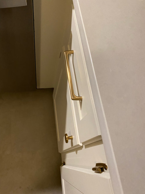
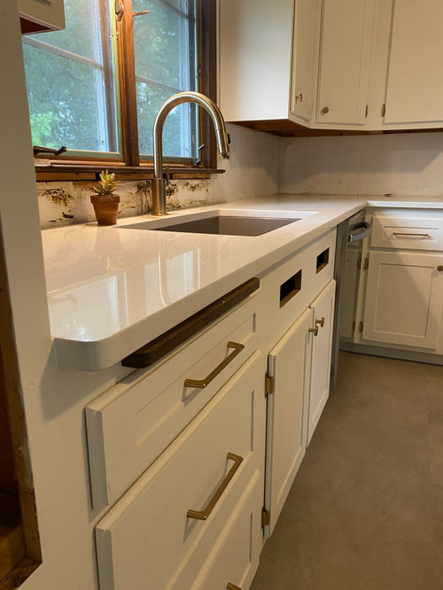
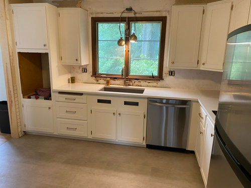
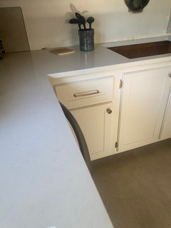
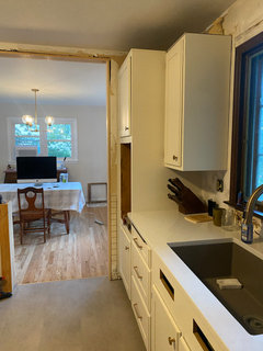
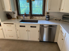
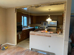
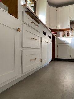
Looking for advice on how to make this work. I originally painted the cabinets Shoji White and paired with champagne bronze hardware. I picked countertops that I thought would be very subtle with little contrast. Now that they’re installed, they’re too cool for the shoji white cabinets in my opinion. In certain lighting they’re ok, but now that I’ve noticed, all I see is the blue/cool undertones and it drives me crazy. Do you think theres a paint color that will match better with these counters? Will I need to go with different hardware? Do I eat the cost and look for different countertop?

Comments (43)

  • 2 years ago
    I actually think it looks really pretty! When you have the backsplash and missing pieces, it'll feel better.

  • 2 years ago
    ^Agree - wait a bit and see, carefully select a BS with subtle varied white/cream tones as that can often bring cabs and counters together

  • 2 years ago
    It looks fine in the pictures but I totally understand being disappointed by something that didn't turn out as you expected.


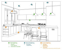
    You could experiment with warm undercabinet lighting to add some warmth to the counters. Or pick a lightly variegated backsplash that combines warm and cool so the undertone differences look intentional.


  • 2 years ago
    last modified: 2 years ago
    I agree. Dee posted a good example.

    Overhead lighting matters. Experiment with various degrees.

    While I like having under cabinet lighting I rarely use it. And I’m not a fan of keeping it on so that your counter doesn't clash.

  • 2 years ago
    not certain the hardware helps much....was that shade to go with your hinges? Its an older hinge but I think they can be found in various metals. I think a cool metal or black might be my choice....tile choice for the splash will impact things. I wouldnt repaint cabs or change the counters either.

  • 2 years ago
    How did you paint the cabinets? Considering painting mine.

  • 2 years ago
    last modified: 2 years ago
    Shoji White isn't really white! It is quite beige/yellow ... place a piece of white printer paper, or a paint chip of BM Chantilly Lace, on the cabinets and you will see it right away.

    Most "white" quartz colors definitely lean gray/blue/cool.

    We see this complaint quite often in these forums. Rarely do people repaint the cabinets or change the counters! The solution is to pick a backsplash that ties in the counter, cabinet and floor colors.

  • 2 years ago
    I’d try to find a whit-ish backsplash tile that combines the different tones…it will pull things together and make the difference much less obvious.

  • 2 years ago
    Internet photos are extremely poor when it comes to viewing colors.
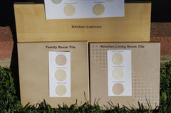
    If you have a sample of the countertop, the flooring and can take one of your drawer out and get a photo of the three items together outside, in natural daylight on a clear day around 2:00 in the afternoon we will be able to see the undertones that are fighting.


    with this type of photo you can easily see how pink the kitchen tile is compared to the family room tile, but inside the home it was really hard to see much difference, something just felt off.


    colors · More Info


    The three colors need to work together. It looks like the counter may be a better color with the flooring than the cabinets, but i need to either see them in person or see a photo that was taken in natural daylight to know exactly what is wrong.


  • 2 years ago
    last modified: 2 years ago

    White is a challenging color. You're finding out that you need to make the color choice in your space with your lighting. We can't tell from what we see on a monitor. If it bothers you, change whatever gets you the final feeling you'll be happy with. Paint gives you the broadest range of tone choices. I wouldn't invest in a backsplash hoping to solve this.

  • 2 years ago

    I went with Shoji White and champagne bronze hardware because I was originally going to do a hardwood/butcher block style counter. I figured the warmth from shoji would pair well with the white oak I originally wanted. I got impatient with wait times and opted to go with quartz instead. The quartz is calico white by MSI. I did have a sample of the counter which I reviewed with all the kitchen elements and I thought it was a great match. When looking at the sink side of the counter, I don’t really have an issue with the look. It’s the other side (seen in first picture) that the cool blue really shows (especially with natural light only). The kitchen lights help, but as mentioned above, I don’t want to use the lights just so the counter and cabinets don’t clash. I have no problem repainting the cabinets, but I would hate to replace all the hardware. I have champagne/gold hardware throughout the rest of the first floor.

  • 2 years ago

    what color trim do you have in the rest of the first floor?


    I would repaint the cabinets a brighter white that works better with the counter top.

    You should be fine with the hardware.


  • 2 years ago

    I went through a same issue. The slab was already ordered and delivered to the fabricator. My kitchen designer pointed out that there needed to be CONTRAST between the countertop, backsplash, cabinets and floor, or the space would look flat and dead. I trusted her, and she was right! Pros can explain it better, but CONTRAST is what brings life and movement to the space.

  • 2 years ago

    Another vote that it looks ok. I don't see blue in the counter, but just a hint of gray, which is somewhere between invisible and a nice contrast. I would keep it all and let the kitchen get filled up with life -- i don't think it will keep bothering you the way that it is right now, as the latest addition.


    (even if you repainted, I can't imagine a reason to change hardware color!!)

  • 2 years ago

    @teamaltese - that is SUCH wise advice! My tile person said the same thing but not as eloquently - that I didn't want the white of my tile to precisely match the counters (both marble) because you couldn't ever match it perfectly and if you tried it would look off.

  • 2 years ago

    Contrast is great, but when you have two whites that are close, but off, it is where you see a problem. One or the other makes one look dingy or yellow or blue or pink or green . . .


    These look like they are close enough that it feels more like a mistake than and intentional mix.


    Is it the undertone that is off or is one just a bit brighter than the other or both?


    We can't tell with the photos that have been provided.

  • 2 years ago

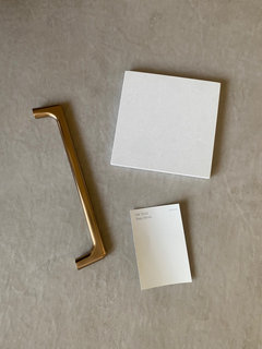
    I’m not sure. When I say blue I more or less mean that it’s too cool compared to the warmth of the cabinets. Here’s another picture with natural light only. I’ve also included a pic with all the samples together - naturally lit in the kitchen.

  • 2 years ago

    Based on the sample, I didn’t initially pick up on the cool temp of the counter. But now that it’s one big piece, it’s pretty clear. And now I can see it in the sample piece too

  • 2 years ago
    last modified: 2 years ago

    Youre getting a skewed reading.


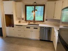
    Look at what's happening here,,,,you have this funky light shining directly down (what kind of bulbs are in it?) , No backsplash, so you're getting weird reflections, and an otherwise unfinished kitchen.

    Wait until your can lights are in, use a 3500-4000K bulb, nothing higher, and choose the correct tile for your backsplash. consider doing some wood cutting boards on the countertop to help warm it up


    I'd also do some type of runner just to warm it up a bit and add some interest


  • 2 years ago

    I think the wait and see approach is the best advice. Backsplash will pull it all together I’m sure. It’ll work, I think it’s lovely!

  • PRO
    2 years ago

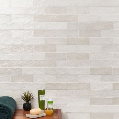
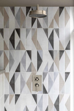
    When ever I have needed to make 2 colors work together I usaull add something that mixes the 2 colors and in this case a nice tile for the backsplash that has a cream and white and gray and it will lok like the whole thing was planned I love 4000K leds but 3500K can be okay just make sure every bulb in ther eis the same Maybe something like this to really catch your eye


  • 2 years ago

    We see this problem often, and it always works out in the end. Your lighting is the first thing to correct. The backsplash will also pull the two together.

    I’m sure you’re not happy right now, but take a few deep breaths and it will get “corrected” so your eyes see how they can look together. It’s a “cream/warm + white” problem. Some backsplash ideas are already posted.

    Don’t pull out the paintbrushes yet.

  • 2 years ago

    Good grief! This business of matching whites seems almost impossible! Might it be good advice to have only one white thing in a kitchen if just to avoid this very very common problem?

  • PRO
    2 years ago
    last modified: 2 years ago

    When something drives you nuts? Fix it. You are doing your own labor, so paint the cabinetry a clearer, cleaner white.

    Will they still appear slightly different at different times of the day, or in different light? Yes, but they will be the same "temperature".

    Try Ben Moore "Decorator White, or even Chantilly Lace.

    This Pic? Drives you crazy? The blue cast in the counter brings OUT the yellow in Shoji.

    WTH..... paint the cabinets soft black if you want, go for some sexy and the hardware will shine, with zero WORRY ON "WHITE" and paint the hinges when you do it.


  • 2 years ago

    Whites and neutrals can be difficult, especially if you don't know how to sample the colors.


    When we look at a 1" x 2" tiny paper sample 3 or 4 inches away from the 6" x 6" countertop sample with interior lighting we will never see the undertones and issues. People also forget that it has to work with their flooring. They pick colors without ever looking at the floor and then wonder why the neutral looks off when placed next to the flooring.


    It takes at least an 8 1/2 x 11 sample. For Whites, before making a final decision I often get a quart of the paint and paint a 1/2 sheet of drywall with a coat of primer and 2 coats of the white.


    White has such a little bit of color you have to have a large enough sample that you will actually see the color.

    Lightbulbs do not have the same ability to show color as natural daylight. If the two whites work together in natural daylight, they will work together in artificial light.


    I am not saying that you don't need to test indoors in the environment where the paint will live (if possible - new builds sometimes require you to trust the outdoor test, but you can test in your current indoor environment to see how artificial light will impact the colors.)


    I also often find that people are testing paint colors next to the colors that they are going to cover. Color is always about comparison, it is the way we see color, as an aggregate of all the colors in our visual frame, not one at a time. Our brains compare two colors that are next to each other to determine what we see. If you are looking at a color that is going away and won't be in your final visual field you are creating a false test.


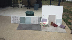
    Here is a color test I did for my home when selecting colors (Not my final). Yes the large white board is the white that was being used on my trim and doors.


    You can see that I was testing two neutrals. One was too pink, the other too gray next to my flooring. Needed to lean a bit more beige, although a true beige would look really yellow next to the taupe flooring. It took several attempts to get the perfect neutral wall color.


    The white works well with the white countertop, just a hair warmer, not nearly as warm as the background on my bedding. Bedding would be separated from the white trim and had enough pattern and color that it was going to be fine and it is one of many bedspreads that I will use throughout the year.


    If I chose a white that matched the bedding the countertop would have been way too white and would have made the white paint color look yellow.

  • 2 years ago

    Even in daylight whites can look different from wall to wall, depending on shade etc. Our cabs are a slightly warm white, and we chose Clé zellige in Weathered White as backsplash. We get lots of light in our kitchen, but in the area under the range hood the tile looks much cooler and grayer than on other walls, all due to shade from

    the hood. Luckily we went with Taj Mahal counters, and ours have lots of creamy areas, as well as some lighter gray, so it all works.

  • 2 years ago

    Jackie Cab love all your choices. Beautiful!

  • 2 years ago

    When different lighting is used it will change the way a color appears,


    Natural mid afternoon daylight is what we generally consider white light - it can be defined differently by different organizations, but generally 5000k, the color of a camera flash or daylight lightbulb is considered white light.


    If your lighting has a yellow cast (anything lower than 5000k) it will make a white or neutral appear more yellow, but if they work together under white light, you are adding the same amount of yellow to both colors, so they are both being altered the same way and will continue to work together.


    If they don't work in white light, adding yellow is going to impact both colors the same way. One is still going to be much more yellow than the other.


    Our brains are used to adjusting to different lighting and we still look at colors and compare one color to the color next to it. If one color is much warmer than the color next to it, adding the yellow cast doesn't change how the two colors compare. One is still much warmer then the one next to it.


  • 2 years ago
    last modified: 2 years ago

    People here keep pairing white floors, with white walls, with white countertops, with white appliances, with white paint, with white cabinets and are surprised that all the whites are not the same. We apparently need a design sticky note

  • 2 years ago

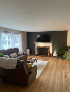
    I knew what to expect with shoji white since I used it on all the first floor walls. Since the first floor is small and the dining room opens into the kitchen, I figured I would continue with shoji on the cabinets to create a seamless transition. I went with shoji for the first floor because it paired well with the original hardwood that I refinished - I was also able to incorporate an accent wall in urbane bronze. Ideally, I would have hardwood into the kitchen, but the original kitchen flooring was linoleum.


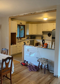
    Because the first floor is small and relatively open, I really wanted to keep everything warm/natural tone. I originally planned to do a white oak hardwood countertop. Since I opted for the quartz, I shifted my plan and intended to do my backsplash in white oak instead. I figured this would add contrast and help warm up the space. With the countertop now installed, I don't think a wood backsplash will look right. I was really trying to avoid an all white sterile look/the price of tile. I'm not sure how to move forward. My thought is to paint cabs and possibly change hardware. I'm just worried that the kitchen will not fit in withe the rest of the first floor.


    Pictures for reference:


  • 2 years ago
    last modified: 2 years ago

    Try testing tiles that will offset the difference (and become the focal point, drawing the eye).


  • 2 years ago
    last modified: 2 years ago

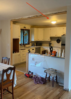
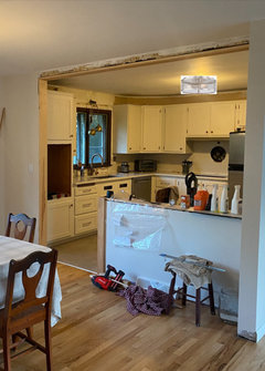
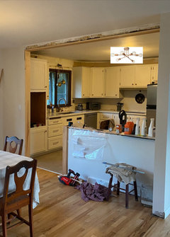
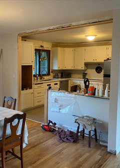
    This is the main source of your problem: (besides the room not being finished)

    A cheap boob light w/super yellow bulbs.

    This is not the correct tool to measure how your whites coordinate.


    Do you have plans on doing proper recessed lighting w/ the correct bulbs?


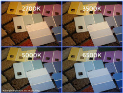
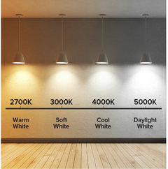
    Look at the diff in 'white' just shown in this pic w/proper lighting,


    At the very least, get a diff ceiling light w/3-4 LED bulbs in the 3500-4000K temp range.


    Change out the 'boob' for it and reevaluate to see if it helps.


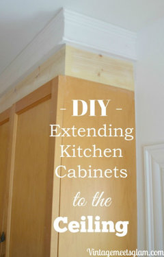
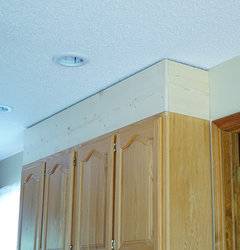
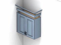
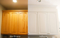
    BTW, you seem to be handy enough, take the cabs to the ceiling w/some simple molding. It will keep it from looking small and chopped, and give more of a finished look. paint to match.

    Diff ways to do it


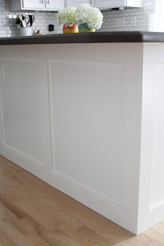
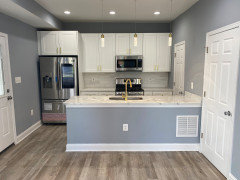
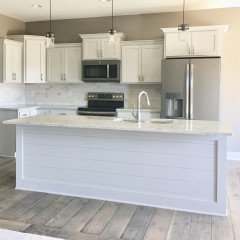
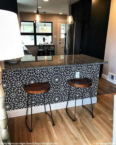
    What are you plans for finishing the back panel on the peninsula/bar?


    what about lighting over that portion? you could possibly do some pendant lighting. depends what the design is going to be.

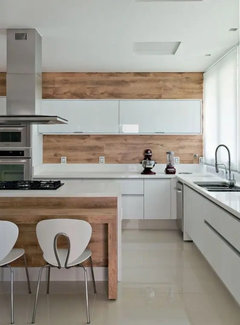
    here are diff finished back panels


  • 2 years ago

    Given all the information, I would not re-paint the cabinets. You want the same white in the kitchen as the rest of the first floor.


    Lighting is not going to fix that one white is cool and one is warm, but I agree with others who suggested a backsplash with both warm and cool whites and a bit of a design to draw your eye will be your best solution


  • 2 years ago

    I promise that the disappointment will evaporate one you move into the kitchen and start using it. These things stick out to you like a sore thumb because it is all you can see, you have waited for the final results, and you've plunked down a lot of money on what you hoped would be perfect. I don't mean to belittle your qualms, but I have been there, and know the disturbance does disappear. .

  • 2 years ago

    @jackiecab - Love the backsplash! Were your cabinets pre-finished or did you select the paint color?


    @Beth H. : - Recessed lighting is something I've thought about. But I decided to just update the one ceiling light for the time being. The light you're referring to has two bulbs - both 2700K and on a dimmer. I'm not sure what bulbs are in the light over the sink. Those are being replaced with a single pendant light centered over the sink. The picture makes the light look a lot worse than it actually is - although theres no doubt it casts yellow. TBH when the lights are on I notice the cab and counter difference the least. It's in natural light that it bothers me.


    Extending the cabs is also on the list! I'm also going to look into converting to concealed hinges.


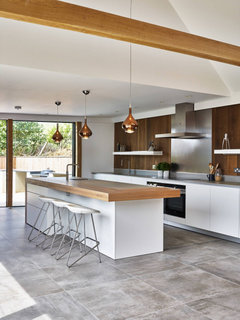
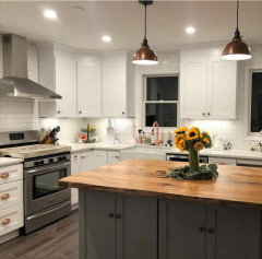
    As for the peninsula, I'm getting a white oak top milled for that. Will be similar to the below pic. I'm planning to cap off that ceiling spot and drop two small pendants over the counter. I hadn't given much thought to the back paneling, but I like your examples.


  • 2 years ago

    Hi Jim....in answer to your question, the cabinets were pre-finished. We bought our home about 18 months ago and we kept the cabinets but changed the countertops and backsplash, as well as the appliances.

  • 2 years ago

    The backsplash is Vian chevron white 2x10. The grout is permacolor # 2544 bright white. Hope this helps!! We'd all love to see what you decide!

  • 2 years ago
    last modified: 2 years ago

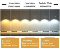
    Jim, go to the store and grab two LED bulbs at 4000K temp. no higher. I guarantee it's going to make it look better and give you more light in there to see.

    Personally, I'd get rid of that light altogether. it's got the diffused glass shade which isn't what you want for a working kitchen. (it further diffuses and dims your light. trust me, you want good lighting when you're cutting and preparing food!)

    Amazon has these, give them a try. (or if going to HD or lowes, grab a few there)


    https://www.amazon.com/Luxrite-Equivalent-Dimmable-Standard-Enclosed/dp/B07BHV9PY7

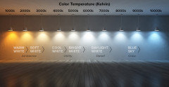
    You see the diff on this scale?


    Since that is your only light source, I'd do a 3 or 4 light in glass. It's going to make a huge diff in overall lighting.

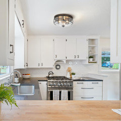
    how about something like this?


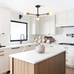
    these cabs/kitchen almost identical to yours. Ditch your 2700K bulbs (those are way too diim for a kitchen) and get the 4000K

    Try Wayfair or Lowes online.

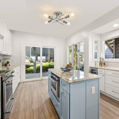
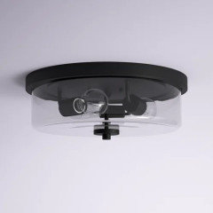
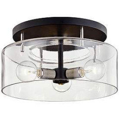
    I like this one too. Zullo flush mount from Wayfair $140. 4 lights, diff directons.


    or, Amazon,,

    u see how the bulbs go in diff directions? this is good for the kitchen.


    Jacobson semi flush mount, wayfair, $65.00


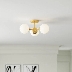
    This one is nice in the gold. $121.

    https://www.wayfair.com/lighting/pdp/mercer41-panagoula-3-light-18-semi-flush-mount-w003429267.html


    Even Houzz carries some.

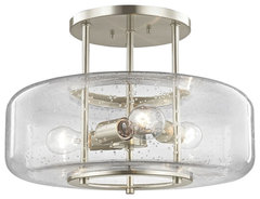
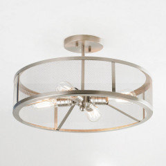
    This one w/the seeded glass is nice. it's semi flush mount

    Seeded Glass Semi-Flush Ceiling Light Satin Nickel 3 Lt · More Info


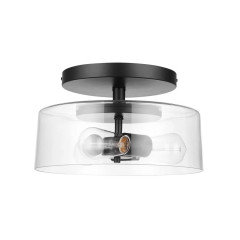
    this one is pretty cheap. Azevedo

    wayfair has a ton of them.


    https://www.wayfair.com/filters/lighting/sb5/ceiling-lights-c1873711-a150881~495067-a150881~495068-a151212~495241-a151212~495242-a151215~495361.html


  • 2 years ago

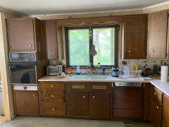
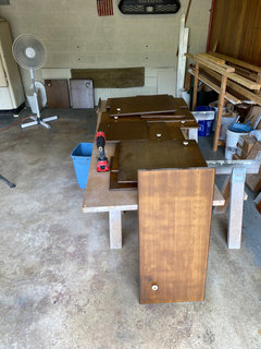
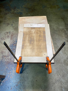
    @dlbmsu - Cabinets are original to the house - they were 50's flat panel with a rounded edge and I converted to shaker style.


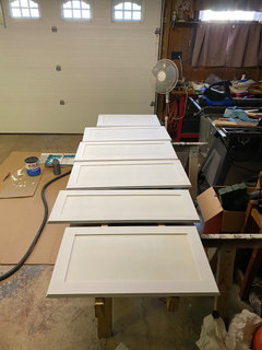
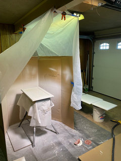
    I started by ripping strips of birch plywood to create the shaker look. I glued and brad nailed the trim pieces to the doors. I then sanded them - I started with 120 and finished with 220. I used a wagner sprayer (Flexio 3000) to get an initial primer coat. I used Kilz All-Purpose 2 and did two coats total (lightly sanding with 220 between coats). I finished by rolling two coats of Sherwin Williams SuperPaint with a foam roller (sanding with 220 before final coat).


  • 2 years ago

    nice job jim.

    Did you read my last comment about the new ceiling light and bulbs?

  • 2 years ago

    Extending the cabs is also on the list! I'm also going to look into converting to concealed hinges.


    Yes!