Software
Houzz Logo Print
jahnin

What am I missing...

2 years ago
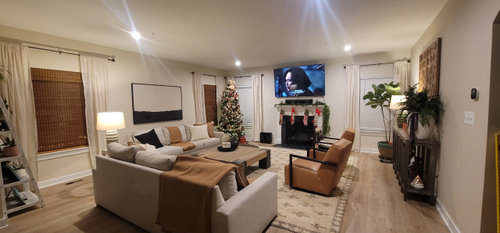
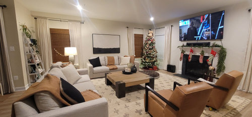
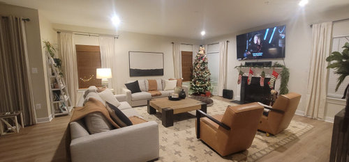
Just finished my living..I think I'm missing something or is it fine.

Comments (20)

  • 2 years ago

    Looks great!


    This is a mount that lowers and angles the tv. So when you are not using the fireplace, you have the option of having the tv more at eye level, if you’d like to. Amazon also carries this company’s products. https://www.mantelmount.com/

  • 2 years ago

    In my opinion you are missing reading lamps (and books). You need layers of light for a pleasant room.


    Is the coffee table reachable from the chairs? Or do you need a table (with lamp) between them?

  • 2 years ago

    One thing i see that throws me off is the use of two different types of window blinds. i would only use one through the room and i prefer the color and texture of the bamboo blinds. i would hang them higher above the window close to the rod.

  • 2 years ago

    TV is too large and high over FP. I would move it to the wall with the art. Art over FP. Sofa facing TV and 1 facing FP. Chair on each side of FP. End tables (with lamps) as no one can reach the coffee table to put their drink or book. Add some items in an accent color and all blinds matching.

  • 2 years ago

    The tv is way too big for the space, and it feels like you are spacing things too deliberately. Look at the stockings - evenly spaced on the mantle. Group 2 to the left and 2 to the right. Look at the camel colored things - spaced evenly around the room, rather than casually placed. But I’m being picky - it’s a beautiful room!!!

  • 2 years ago
    last modified: 2 years ago

    I'd change the curtains ... bring in some color. The room lacks color, and the darker blinds look wrong with the pale curtains. I think this one thing would make a world of difference.


    Do you have brown shades on some windows and white on others? I like the brown (ties into the furniture), but they do need to match.

  • 2 years ago
    last modified: 2 years ago

    I'm going to give you the positives of your beautiful space. I really love your limited palette. You stayed consistent, but up close, it doesn't look bland or boring. I love that all your seating looks comfy, and I really love that giant coffee table AND that the rug is awesomely large and brightens up the room in a warm/neutral way. I think others have made some good points, but I really think you should be pretty satisfied with having executed a nice, comfy, pleasing family space that looks well-thought out.

  • 2 years ago

    The room is lovely. I think @Mrs.Pete made a good point about the drapes being a bit boring. But overall, the room is well executed and also looks comfortable!

  • 2 years ago
    last modified: 2 years ago

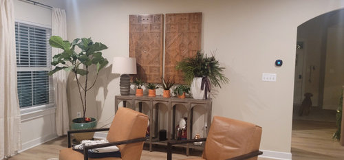
    Your room is lovely and this is just a tweak. Have you tried switching out the art over the sofa with the panels above the console? The console area looks just a little too busy and the art above the sofa looks just a little bare.

  • 2 years ago

    And curtains are too short.

  • 2 years ago

    Great comments, I am no decorator I mixed multiple living room decor ideas into mine. I am going to look at lowering the TV with the fancy mount suggested.

  • 2 years ago

    I think what the room could gain is coziness. I love more lamp lighting, more texture in the form of patterned pillows for the leather chairs or to trade out on the sofas. Right now it looks perfect, too perfect, like a showroom I wouldn't want to mess up by sitting anywhere.

  • 2 years ago

    @Jenny, interesting suggestion, but i wonder if the wood panels will mimic too closely the woven shades on the windows?

    I really like art with a horizon line such as this, and i think it looks great with the couch and the throw on the couch, but i also wish the top of the shades lined up with the drapery rods. I kinda see 2 more ’horizons’ on this wall.

    Overall, the roomy is snappy and well put-together. Studying the images we look for weak points that visitors are unlikely to notice.


  • 2 years ago

    I agree with the comments about things feeling a bit too “even”, too “perfect”. Try disrupting that perfection a bit! I would suggest some different pillows, in patterns and colours that don’t perfectly match everything else going on. Also more artwork (something you LOVE, not something that MATCHES)

  • 2 years ago

    Actually just looked again, and maybe there’s not room for more artwork. But do you love the panels that are over the console table? If you do then great. But if they’re only chosen cuz they match so well with the rest of the decor, then I would suggest considering something more interesting.

  • 2 years ago

    Love the subtle colors, which is hard to master but you did it - black and white art against the sofa, subtle cream colored curtains on cream wall, wall color and rug color are a fantastic combination. Beautiful. Lots of seating but not too crowded and the right scale for the room. You are better at this than you think.


    TV placement is a killer for me. Get a second of the same console, push them together to make one long console, center the TV above it. Put it on an arm if you ever want to reach it out or angle. You get to keep your amazing black and white art arrangement, the TV won't look like it is dominating the room and squashing your fireplace. You'll still be able to easily watch it, but it won't be the focus of the room. You can do something else beautiful above the fireplace to high light it. You'll need to consider where else to put the wood panels.


  • 2 years ago

    Pretty room! What seems missing to me is a bit of pattern - try to add pillows with different textures/patterns. I'd also raise the top of the blinds, and make all the blinds the same.

  • 2 years ago

    The room is lovely but not very intimate or cozy. There is too much “white space” try pulling the pieces in closer to the cocktail table and maybe angling one of the chairs next to the fireplace. If you want to stay with the nice natural vibes you have going on, you can change out the drapes to add more of a textural element and with a little warmer beige/taupe color. I also agree with replacing the blinds that are white to match the bamboo. You need to focus the eyes away from the television by providing a little more contrast.

  • 2 years ago

    It’s a great start to a beautiful room! Love the color choices.
    I do agree that all the blinds should match. I would add another panel of drapes to each side of the window bringing out the rod a bit on each side. It’s just brings a lux feeling to the room. Too many throws, one is enough. Roll up the other one and place in a basket on the floor near the sofa. The ladder shelf unit need not be in the room. Looks like it takes up too much space and too many Knick Knacks. I would add two pieces of art to that wall one over the other.

  • 2 years ago

    I agree with everyone that it's a lovely room. I think the draperies are nice, but too close in color to the wall color to stand out at all. Black draperies would look great in your room, since it's a large room and it would help ground and balance the space. Hang them a couple of inches from the ceiling. And like other comments it would be best for all of the blinds to be the same. You can stay neutral in your colors on the couch pillows but add some with heavy texture. Top it off by adding some bright white decor (vases, planters, etc) on the coffee table. You'll see a big difference.