Software
Houzz Logo Print
webuser_679061012

new build regret

2 years ago
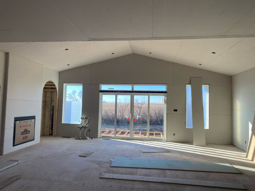
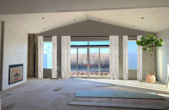
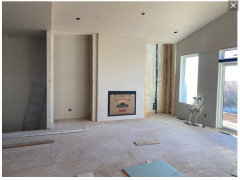
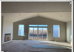
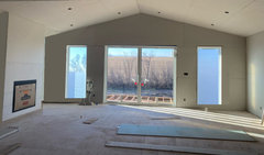
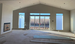
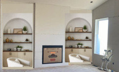
I have posted about these windows and built ins previously but they continue to cause me so much regret. Windows were moved in and when it was at the framing stage I thought I was happy, but now that drywall, I’m really not, especially with the non symmetry. I’m worried this is something that will bug me forever.
Suggestions/thoughts?
Will it be okay with furniture etc
Remove built ins?
Change windows?
Go back to drawing board with room/ window plans (obviously $$)

Comments (62)

  • PRO
    2 years ago
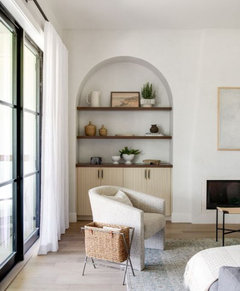
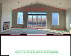
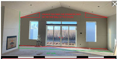
    Looking at your previous post and this one… It looks like if you removed the built ins flanking the fireplace (relatively cheap at this stage) everything would be centered. Buy two nice chests to flanked the fireplace Instead.

  • 2 years ago
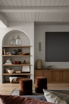
    I agree with removing the built ins. I personally do not care for the windows on either side of the glass doors but they are less bothersome than the built ins.

  • 2 years ago
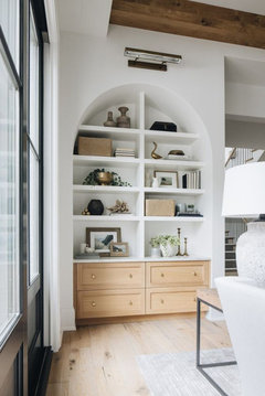
    Agree to get rid of the build-ins. You can deal with the symmetry issue with furniture placement.

  • 2 years ago
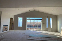
    I like the built-ins. They'll be useful and a lot better than adding furniture. If the built-ins aren't equal in size, get that fixed.


    Your problem with assymetry is that your roof/ceiling is not symmetrical. That's ok, but you want to focus on balance. For example, you could put a tall plant in the righthand corner of the window wall and no one will notice that the distance between the window and the wall is longer on the right as opposed to the left.


    My observation is that odd interior angles come from "adding interest" to the roof. This is why when people see elevations and want to change something, they often end up with another problem elsewhere.


  • 2 years ago
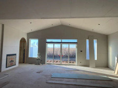
    I will assume that it's too late to move the fireplace wall to the wall on the right side.

    What is planned for that extra space in that corner on the right side.

    That wall would have been great for the fireplace and low built-ins. Is there a TV in the room?

    The built-ins need to go. If you need/want them make them low and have them match the wall colour. I don't think you'll be able to put furniture on either side because of how close the window is to the corner.


  • 2 years ago
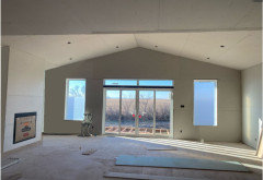
    last modified: 2 years ago
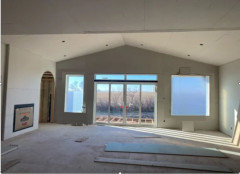
    What if you put built-ins on the opposite wall of the current built-ins? that would fiil in the wall space and help with the the symmetry

  • 2 years ago
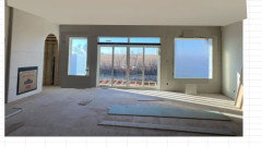
    At this point removing the built-ins is nothing more than some framing similar to a doorway. It will take a couple hours to reverse this.

    Don't let the tail wag the dog and do ten steps decorating the house to compensate for it, and living with it for however ever long you stay there, when it is simply addressed right now.

  • PRO
    2 years ago
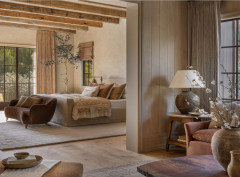
    The only issue with the built-ins is the arches. They have to go. They do not complement the architecture of this room.

    There is nothing wrong with your windows that a professional cannot deal with. You simply don't have the experience to know how to address these speed bumps in new construction.


    Where were you planning to place the TV?


  • 2 years ago
    Following....

  • 2 years ago
    Take a breather and draw the floorplan and whatever ideas you had, or haven’t, about how you envision using the room and how you will arrange furniture. That’s where designer may help you. Because you might find other issues. But the built- ins, in isolation from a specific plan for display and furniture placement, will be limiting.

    Otherwise you will soon be asking, how on earth do I arrange furniture, and what pieces?
  • 2 years ago

    Your problem with assymetry is that your roof/ceiling is not symmetrical. That's ok, but you want to focus on balance. For example, you could put a tall plant in the righthand corner of the window wall and no one will notice that the distance between the window and the wall is longer on the right as opposed to the left.

    Actually the roof is symmetrical but the built ins ruined the symmetry.

    The solution is to get rid of the built ins.

    If it were me, I'd also get rid of the fireplace and have the seating situated so the view out the back is the focal point.

  • PRO
    2 years ago

    Tear it down and start over.


    (just thought I would offer up the absurd to make you feel better on whatever you decide to do)

  • 2 years ago

    I think you can still have built ins, just not full height. If you build in a cabinet and have open shelving on top, the eye will see the space to the left of the window as equal to the right of the other window. Anything you put in those spaces will still block the bottom part, unless you just hang art in the recesses. Personally I would build in the cabinets rather than free standing because the space is narrow and recessed so you would only see the fronts anyway. There was no way this design would have worked, even if you had pushed the FP wall back two feet to retain the symmetry because of the stairwell wall. You would not have seen the FP/built ins until you were in front of them. Built ins on bottom, shelves on top, and enjoy your new home! The view is gorgeous, does the field turn green in the winter? Or maybe snow? Is that a grain silo in the distance? I have open space envy!

  • 2 years ago
    last modified: 2 years ago

    The ceiling on the right side is longer than on the left side - is that not asymmetry? So the windows on either side are different distances from the side walls.

    Regardless - it can be brought into balance visually but it will take a little bit of work.

  • PRO
    2 years ago

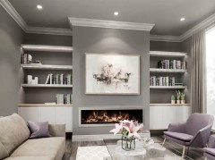
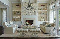
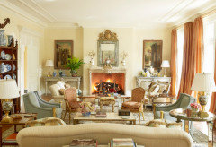
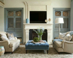
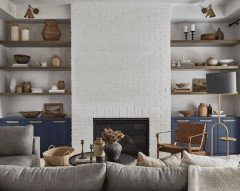
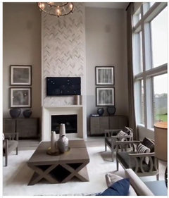
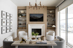
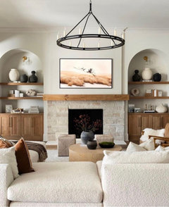
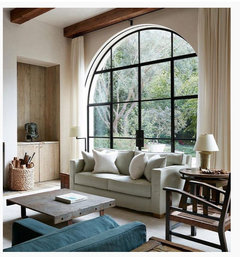
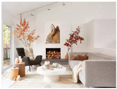
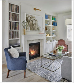
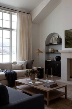
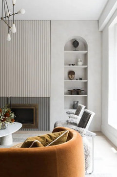
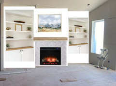
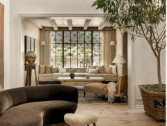
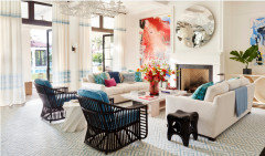
    Here are photos that illustrate various ways the space on either side of the fireplace can be configured. Maybe one of these photos will inspire you.


  • PRO
    2 years ago

    Palimpsest nailed it, and gave a great visual of how it would look if the built-ins were removed.

    Just do it.


  • 2 years ago

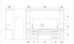
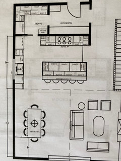
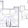
    Thanks for all the feedback. This our some initial drawings from our designer.. not locating the final ones on my phone. we are aware the space is tight.
    The built ins are symmetrical- just a poor angle of the picture. The back wall is also symmetrical (just the built ins make it not)
    The area is open to the kitchen which has an arch going into the pantry area. I do like the look of the 3 arches together, but I think it’s just not working with the back wall.

  • 2 years ago

    This room will not have a tv

  • 2 years ago

    I agree with everyone else that the arches need to be gone. If this was my project, I would blow out all of the built ins and the space hogging fireplace. Recover that space and the room is symmetrical. Not that it needs to be symmetrical but the lack of symmetry is bothering the OP. The fireplace can be replaced with a linear electric FP which require minimum wall depth. Or a gas FP is you want to give up a bit more wall depth.

  • 2 years ago


  • 2 years ago

    With the chair in the corner of that to the right of the door you're sliding door you could have a chair or a plant there that's tall it won't look that bad or floor lamp it will look okay over there I'm not sure what the built-ins are going to be but if it's at the fireplace you don't need them

  • 2 years ago

    With the chair in the corner of that to the right of the door you're sliding door you could have a chair or a plant there that's tall it won't look that bad or floor lamp it will look okay over there I'm not sure what the built-ins are going to be but if it's at the fireplace you don't need them

  • 2 years ago

    The ceiling on the right side is longer than on the left side - is that not asymmetry? So the windows on either side are different distances from the side walls.

    It's asymmetrical because she put the built ins on either side of the fireplace going up to the ceiling. Without the built ins, it's not asymmetrical.

    One other thought is I'd have less lower cabinets and make the cabinets wider.

  • PRO
    2 years ago


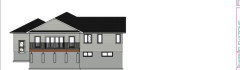
    Can you show the exterior elevations for the house? Please?

    I just don't see the "wonderfulness" in those windows, that would suggest the mix. Maybe I am missing something.

    It isn't that you can not mix an arch, soften things, make the juxtaposition wall, window, or vice versa...... I'm not feeling it here.

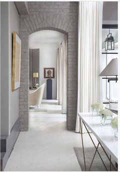
    It feels...........forced? Versus below, where it feels quite intentional. Or intentionally repeated.


  • 2 years ago

    These windows have/ this room has been a few errors / main source of stress this build.

    Built ins will hold books, a few pictures. Style is more cozy (Nancy myer movie) maxilism (not afraid of bit of clutter or color)

    Even though we are building on a farm we were limited in house shape/ size to existing infrastructure, septic field, cistern etc.

    Yes, while the room / built ins were planned out early with a designer it is feeling forced

  • 2 years ago

    Get rid of the right side built in so that the window wall remains symmetrical. It is the dominant wall in the room. If you feel the need to have a built in, keep the one on the left. Get rid of the arch . And then just embrace the asymmetry of the fireplace wall. Perhaps someone can mock this up? The other alternative is to remove both built in areas and place small matching chests there, as Hallet, above, suggests.

  • 2 years ago

    At the risk of being beaten over the head by other posters…symmetry is most associated with traditional and classical design styles. Your space leans toward modern/contemporary which would not necessitate symmetry so much as balance.

    Took me a while to see the built-ins…Beverly’s post makes it all work….

  • PRO
    2 years ago
    last modified: 2 years ago

    This marriage makes sense.........: )


    And if "maxi Nancy, books, photo cozy clutter" is the issue?

    Then you need to abandon the idea that perfection in symmetry is necessary for a lovely space.

    Either way? Please kiss the arches good bye.

    Anything less? Is jamming a square peg in a round hole.: )


  • 2 years ago

    Bookshelves only need to be 10" deep unless you have a lot of art books and they don't need a 4-1/2" thick wall in front of them.

    If you need bookshelves build bookshelves, not something two feet deep. 10" will not throw the symmetry off much, or you could stop them short of the ceiling so you can still see the ceiling line all the way to the corner.

  • PRO
    2 years ago

    OP what advice are you looking for? Your options are to live with it and decorate around it or remove the shelves and have symmetry. Binary choice that you have to make and the sooner you decide the better. Unfortunately I suspect with the inertia of construction the drywall is probably complete and you will just keep them because they are there.

  • 2 years ago

    Go with palimpset's photo suggestion without the built-ins!!! The window wall looks so much better & balanced without them. Removing the built-ins is a must! The fireplace is fine as a bump-out without the built-ins. If you need display space, consider furniture, maybe a pretty chest, on the left of the fireplace with open shelving on the wall above it. Or a tall open armoire on the left. There are lots of possibilites for good overall decor/design without the built-ins throwing off the balance of the window wall.

  • 2 years ago
    last modified: 2 years ago

    The windows don't bother me. What bothers me is the truncated ceiling on the left. Simple fix is to remove the built-ins. That restores both the ceiling and window symmetry. If you need to replace the storage lost by removing the built-ins, then use furniture. Antique/ vintage armoires, primitive pantries, wardrobes.... Or gussied up Ikea.

  • 2 years ago

    I get what some people are saying about balance vs symmetry, but when 90% of the design is symmetrical and one corner is cut off short it looks and feels like a mistake instead of an intentional design choice.

  • 2 years ago

    What if any, window treatments do you have planned for the windows? If draperies are one of your options then you need someplace to pull them into on the left side and right now you won't have that space with the built ins. Something like low built-ins with floating shelves might be easier to visually balance the space.

    I should have realized that the built-ins came out into the room but thought they were recessed. We are building new and have a very similar window/fireplace placement but recognized the issue in the planning stages of the drawings and planned for it.

  • PRO
    2 years ago

    As has been pointed out, these are not really built-ins, but bump-outs.

    Has your designer done a perspective drawing of the room? What architectural details are being planned? Because right now it's a bit blah.

  • 2 years ago

    Can you take more photos of the arches? Do you have arches elsewhere in the house?


    I think part of the problem is the arched recess goes to the floor and the window is elevated. There is also competing shapes….peaked roof, rectangle windows, long sliders, arch. I wonder if it would have helped if the entire wall was glass, the same height as the sliding doors.

  • 2 years ago

    I think if I were planning something like this, a door flanked by two windows I would have done something more like this, in order of preference with first at the top.


  • 2 years ago

    Palimpsest- first picture is what I thought I was getting, but it’s not and I don’t know if it’s my error, contractors, window company etc but unfortunately I felt I was talked into my current situation

  • 2 years ago

    Yes, there are arches in two other spots in the house- going into the pantry and the entry into the back hall. Both are visible from different spots in the room.

  • 2 years ago

    I just saw your other photos. I’m not an interior designer but since you have other arches, I might just run with it. The only thing I would consider changing is making the two side windows longer like Pal showed. I guess a long wall of glass wouldnt work if you need the switches and it would be cost prohibitive.


    I honestly think you can make this work. I would add some textures and paint colors to the arches and fireplace. Do you plan to have wood beams in the room?


    Just looking at photos online, I see lots of arches with varying sized windows, fireplaces, etc.


    Also, the asymmetry does not bother me at all. I frankly did not even see it until I studied the image. Once you get furniture in, that will go away.


    Maybe the straight lines of a cabinet will help relate the arches to the windows.


  • 2 years ago

    Your exterior elevation shows that first version with the bigger windows, so you either had different version of elevations and floor plans floating around and some of the subs probably had different/older versions, which can happen if preliminary plans were sent out for bids.

  • 2 years ago

    I feel your pain, but you can't go backwards in time or afford to start over at this point.


    You wanted this


    You Got this


    You can either keep what you have or remove the built ins


    or make the lack of symmetry feel more intentional - but it will alter the outside as well.

    (I care less about the looks from the outside than the functionality of the inside.)


    move one window - enlarge the other window, have the spaces between walls windows and the sliding glass door all the same.


    Or do that and flatten the ceiling so there is even less evidence that you wanted it symmetrical.


    Your architect and designer may have other tricks up their sleeves.


  • 2 years ago

    Right now the paint emphasizes the difference. Add a vertical light colored column , floor light, plant, art, on the right, or change the floor carpet pattern as seen in a delightful book called Home By Design by Sarah Susanka, and the eye can be fooled. Step the arch or bookshelf back a bit will also help.

  • 2 years ago

    Ok, this is kind of an off the wall idea. How about putting a free standing corner cabinet or shallow cabinet in that right corner. One that has an arch on top. It should be the height of the window or a bit higher. Your eye will be stopped at the cabinet and probably won't go up to the wall above it. It would add another arch, but won't be seen on the same plane as the bookcases. The cabinet should be a size that will leave the same sliver of wall as the left side. then shades on the windows and drapes on the doors. Otherwise, I would go with my previous post, basically the same as Pals mockup. Look forward to seeing what you do.

  • PRO
    2 years ago
    last modified: 2 years ago

    Over time you come to realize that perfection is a bit over rated. That the very thing to which you devote a week of hand wringing? Turns out to be the non issue. It's a fact in any new build, it is fact in any reno as well.

    Nobody who enters your home is grabbing a tape measure. Not even you will do that when it is furnished.

    Designers who get published are often those who abandon the more mechanical symmetry for the artistic and less expected, as their clients don't want the ordinary or the expected, not because there is anything wrong with that ( it's safe, comforting )- they simply do not want anyone else's home.

    Embrace the "imperfect" you see now. Close one, close both, narrow one....get rid of them both. It's a decorating issue; not a structural nightmare unless you make it that. Whatever your style, be it organically tactile in touch me sink in rooms......ala Amber Lewis


    Or Wildly colorful Melanie Turner?


    Truth is......the most memorable rooms , most memorable people you meet, and the most memorable experiences in a lifetime? Are anything BUT perfect and often break quite a few rules: )

  • 2 years ago

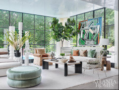
    That last photo ... can you imaging if someone posted and asked if they should hang their big painting in front of the big window! It looks great and is an unexpected installation. I would guess they don't have a great view on that side and there are advantages to partially blocking it, but I can "hear" all the negative arguments people here would throw at the idea!

  • 2 years ago

    There would be lots of objections to that last room: from the apparent disregard for scale, symmetry or balance, to furniture "blocking" the windows, to the completely inward orientation of all the furniture, to the presence of drapery at all. In addition to the painting hanging on the window. But all of those things are what make it an interesting room.

    My concerns would be what the back of the painting looks like from the outside, and of course, if it has any value, what's happening to it because of the sun.

  • 2 years ago

    The symmetry of the windows do not bother me at all! If the window on the right side is where your dining table is going, then it will all work out visually. Arched built-ins on either side of the the fireplace look a little awkward next to the rectangular shaped window. I can't tell if the built-in dimentions are the same on each side of the fire place or one is wider than the other, but that wouldn't matter either. Here is a visual of built-ins that are not arched next to your window and ones that are arched just to get an idea of what it might look like.


  • 2 years ago

    After seeing that your dining table is going to be in that corner and possibly a chandelier and that the room will be visually split in two, I think your plan might look ok. I hesitate to say this because you may already have your kitchen window in, but I think having your dishwasher to the right of the sink would be better for putting away dishes etc. Yes, there are a few cons to this but I think the pros outweight them. The other thing I notice is for balance and symmetry (because you seem to care) putting another wall cabinet to the left of the sink to balance that side. And it would give a bit of a separation from the kitchen to the living area. Some might think its better more open and not like the look of the side of the cabinet, just something to consider. I didn't see a microwave in the plan. Your range wall is very symmetrical.