Software
Houzz Logo Print
hermesmg11

Exterior Design Help Requested

2 years ago
last modified: 2 years ago
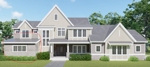
We have our initial designs and I am stuck on the front of left of our exterior. (See image). The color scheme and stone is not exact, but you get the idea of general design.

The bump out and roofline circled in red feel off to me but I am not sure how I would fix it. Please send your thoughts and ideas!


Comments (16)

  • 2 years ago

    I'm a layman hopefully the experts jump in and help you. But what I see looks like an added she. Why is all stone? WHat room is it?

  • 2 years ago

    This is actually our master closet. Main reason it is stone is because we need a certain % of stone on the front of the home. It could go elsewhere but tried to mirror the right hand side.

  • PRO
    2 years ago

    Sorry that looks like a terrible ill conceived addition. The stone shouldn’t end at windowsill height, choose one mass of the house to stone completely not a skirt that could never be structural.

  • 2 years ago
    last modified: 2 years ago

    I know it doesn't look good but I am not an expert so can't wrap my head around how to change it to make it work. Which area would you do all stone and what material would you put there instead? Would you keep the shape of the roof/bump out or revise?

    I'm also not sure what you mean about the stone ending at windowsill height... it goes above the windowsill on left. Do you mean the stone height all the way across shouldn't end windowsill height? Remove all skirting?

  • PRO
    2 years ago

    That one story addition to the left of the front door with the low slope roof is terrible. The entry door should be the most prominent feature. The way to fix it is to work with your design professional to change the plan. The stone, while poorly conceived, is a non issue compared to the bump out.

  • 2 years ago

    Wow, your comments are so unhelpful. First off, the colors and stone are not the final selections as stated in my ask. I've stated I know it does not look good and clearly asking for actual ideas of how to adjust, not just reaffirming that it looks terrible. So unless you have actual ideas of how you'd improve it, you can keep your opinions.

  • PRO
    2 years ago

    The idea is to remove it. You know it’s bad. You asked for opinions. It’s bad. Don’t build it. It’s just an idea now so go back to the drawing board and adjust the plan. What other advice do you want? Hide it with landscaping? If you had already built it we could try to disguise it, but why build it? I’ve even tried to explain why it’s bad so you can explain it to your designer (you may intrinsically know it’s bad but can’t figure out why).

  • PRO
    2 years ago

    We have our initial designs and I am stuck on the front of left of our exterior.


    You are not giving us much to work with.

    Initial design for what? New build, remodel, addition?

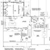
    What does the plan look like? The plan dictates at least the shape of the exterior.

  • 2 years ago

    Removing it isn't entirely out of the question, however, 1.) we are past the architectural design phase and 2.) we lose significant square footage by removing it altogether that we need.

    The design on the 2d black and white blueprint didn't look out of place but then got our 3D rendering. While part of it is very poor stone and color combo, which is far from what our final selections will be, I recognize it does not fit the rest of the front exterior. It's not entirely impossible to go back to our architect, but looking for other design ideas first.

  • 2 years ago

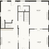
    @PPF. This is a new build design. I added photos of a few of the exterior shots, as well as the 1st and 2nd floor layout. Initially, this area was on the side of the house but we were too close to the lot line so had to move it.


  • 2 years ago

    I see you have stone around your entry door already, so you might consider eliminating the white striped accents (not really a fan of those tbh) and putting stone there, making the stone area higher on the wall across the entire front in order to achieve the required amount, and then do the Adobe above it in that area, similar to the garage side. Another option might be to stone the other wall that's under the porch with the window or run stone up that entire wall to the left of the door, in which case I would eliminate the rest of the white stripes.

  • PRO
    2 years ago

    It's not entirely impossible to go back to our architect


    It's their job to fix this as they are the ones who designed it.


    I'll suggest the entire front elevation needs a rethink. Focus on continuity, and the use of fewer materials.

    The garage is as wide as the core of the house. Work to make it part of the house rather than looking like a giant addition.

    The left side is similar in that it looks like another addition that tried to copy the design of the garage.

    The large gable is too large. It should be no higher than the ridge it intersects.


    Here is a really poor, and very incomplete change to your rendering.


  • 2 years ago

    Thank you!

  • 2 years ago

    If you made the left hand bump-out stick out less than the porch, it wouldn't look quite as bad. As is, it does look like an amateur addition to an otherwise well-designed house.

  • 2 years ago

    Thanks for all the advice so far. Revised the colors a bit. Still not totally accurate but look a lot closer to what we’re envisioning. Open to feedback and ideas!

  • 2 years ago

    I like the change PPF made. I think the “addition”-looking closet would stand out less if you only put stone around the bottom, then used the other material (like the rest) above that. If you need to add more stone I think I’d try it on the 2 areas around the small garage windows. Good luck!