Software
Houzz Logo Print
gtdj519

Can anyone help mock these art prints?

2 years ago
last modified: 2 years ago
Hi

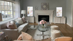
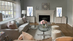
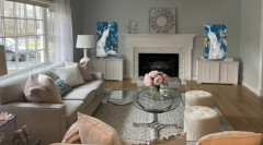
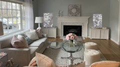
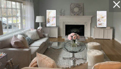
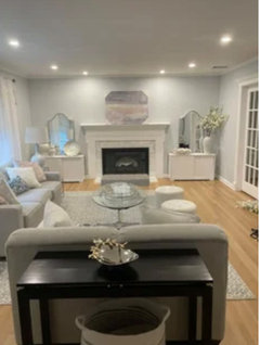
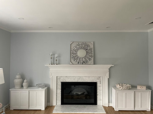
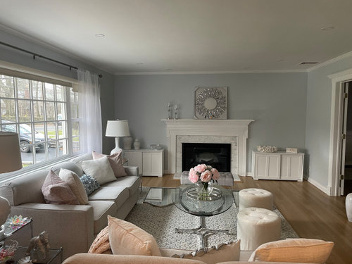
i posted previously about what to do over these cabinets flanking the fireplace. I like these art prints, and was wondering of anyone can mock up one on each side so i I can get an idea of what they will look like in the room. I dont know how to do it myself.

a round mirror will be placed over the fireplace, NOT that mirror. I just put that there

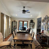
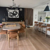
to get a rough idea of how a round would somewhat look in the space. i put a few pics of the room, as I am not sure what angle is best to do a mock up thank you!!


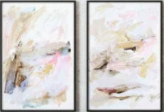
Choixe 1


choice 2


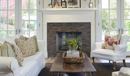
Choice 3


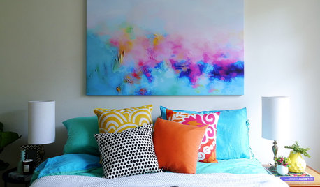
Choice 4


Comments (36)

  • 2 years ago
    last modified: 2 years ago
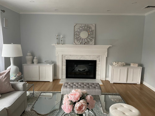
    Hi, gtdj, I’m hoping someone with better skills than mine will see this and do mock-ups. If they don’t, I’ll give it my best shot. :D

    The flowers on your coffee table look so beautiful!

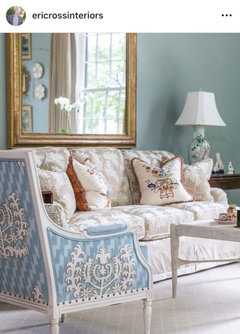
    ETA: One of my favorite designers just posted this on IG and it reminded me of your room. So graceful and serene.


    gtdj519 thanked Jilly
  • 2 years ago
    last modified: 2 years ago
    Patricia cowell consulting - your level of rudeness and inappropriate comments is really off the charts. if you dont want to bother with a post , don't read it and don’t comment- simply move on. No one is twisting your arm or moving your fingers to reply.

    I am trying to work on a space, and find it easier to post when it is the next step, so that the question stays on topic.

    For a ”Pro” , you sure do have a lot of time on your hands to continuously respond with snarky remarks to countless members who simply come here for support and guidance.

    I am thankful to those members who are kind and respectful. .

  • 2 years ago

    What a beautful post Jilly! thank you for sharing. I will check that designer out! it sure is beautiful! my room is no where close to that! a girl can dream LOL

  • 2 years ago


  • 2 years ago


  • 2 years ago


  • 2 years ago


  • 2 years ago

    I really like this one, the first mock-up.


  • 2 years ago

    Love the peacocks!

  • 2 years ago

    I agree that the photo Jilly posted is beautiful, and, while the style seems much different than yours, take a look at a few of the elements: the gold framed mirror, the lamps, and the wall color. I just read through your previous post and all of the comments, and this one too, so I am 'caught up' on your issues. I am a lover of blues, and have a similar BM icy blue in 2 rooms of my home, but I do think your room, while lovely, seems very cold and pale, with so much white, both in furnishings, trim paint, ginger jars, etc. The room that Jilly posted is much warmer and so welcoming; the gold frame adds warmth and contrast, and the richer, bolder paint color also adds a warm contrast to the furnishings that makes them stand out. I understand that you like neutrals, but the room is a bit sterile-looking, less welcoming, and "glam." I think it would benefit from some richer color (pillows or wall color), and either wood frames or gold frames (gold frames look amazing with the icy blue) for whatever artwork you choose. As an artist myself, I dislike "hotel room" art, but I realize that I am most likely in a minority...it just looks mass produced to me. Good luck, and you are getting a lot of good advice from many Houzz helpers. Keep listening, then take it all in and use what works for you and your family.


    gtdj519 thanked decorpatti
  • 2 years ago

    You can click the small flag on the bottom right-hand corner of Patricia's comment and report it for being "inappropriate or abusive".

    gtdj519 thanked deegw
  • 2 years ago

    Thank you so much for doing these!! truly appreciate it and it helps give a bit of an idea.

    inappreciate all the helpful advice and comments. i will consider all of it!! all great suggestions.

  • 2 years ago

    Deegw…. the bully has left the building.

    thank you though for the info to report.

  • 2 years ago

    I like #1 and #2. Are they the same size? The peonies on the coffee table are a nice touch of color.

    gtdj519 thanked kcooz07
  • 2 years ago

    I like #1 the best, like it was made just for your space!! While the others are pretty too, I would feel the need to change other accents in the room to make them fit in better. Boy, I think you're getting close on this one!!

    gtdj519 thanked bearbev
  • 2 years ago

    I also like #1. Nice work, ilikefriday!👍🏻

  • 2 years ago

    @gtdj519, appreciate if you will share where you located the art options, especially #3 with blue background. Thank you!!


  • 2 years ago
    last modified: 2 years ago
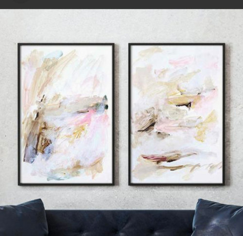
    Ilikefriday pulled through for me!! many thanks!! so helpful.

    thank you kcooz07! arent the peonies gorgeous? i have 2 pink peony bushes in my garden, and I have to say these really give them competition! they look SO real. I always cut my peonies and fill a vase, but they die so quickly. I love them, so when I saw this arrangement I gigured Id give it a try. and yes, art 2 would both be the same size. My pics are just off in size

    sure happy to share jackowskib!

    choice one is by a California artist who’s work I love named Hope Bainbridge. The name of these are ” sunset scribbles”. I would love to have her commision a piece for me, but it is not in my budget. She has many beautiful prints though available for purchase which are more affordable; this set is one of them.

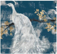
    The peacock (3) and abstract (2) are by another arrist I love named Jennifer Goldberger. the peacock is called “white peacock on indigo” and 2. is called ” azure vortex” i love both of those pieces, and my only reluctance with the peacock is that it is only offered in square sizes. A square could work, but I do feel rectangle art hung longways would look nicer (?)

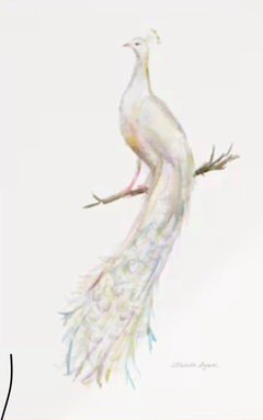
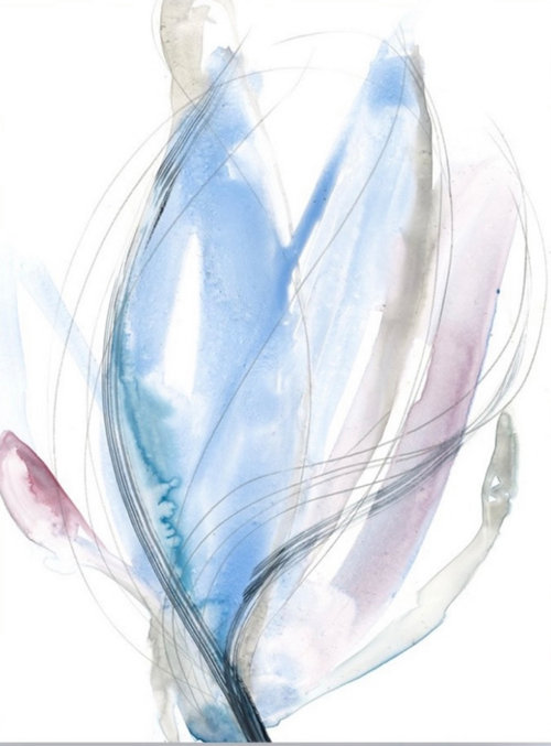
    Also, I did find another beautiful peacock print from another artist that I was considering using in my entryway, but onstead will use the leaf mirror in the entry. However, I still love the peacock and will perhaps use it on another wall in the living room, as the colors would look beautiful with either choice 1 or choice 2.

    all of these are available through McGraw Graphics. They are based in Vermont. TONS of artists and prints. They have options of paper print, canvas or Giclee. whatever I choose, I will do Giclee, as it is the nicest option of the options but still affordable.

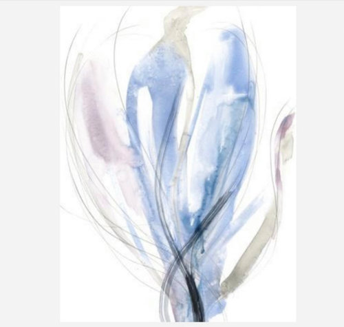
    this is the other peacock art print I want to use perhaps on another wall in a small size somewhere in the LR. sort of like an accent art.


  • 2 years ago

    I really like that last peacock too! So nice that you can have real peonies on the coffee table when they bloom. Sorry my question wasn't clear-are the #1 and #2 art choices the same size? I think with either of those and the peacock in the room, it would be very pretty. Look how just the peonies brightened things up.

  • 2 years ago

    I'm not sure about difficulty fitting the mockups above the chests, but I would like pictures that are a little bit wider relative to the chests. Is there any "rule" about size of picture, like there is a suggested relativity of a tv above a credenza? Just a thought....

  • 2 years ago

    Good questioin dianabythelocks. from what i have read, art should be 2/3 the width of whatever furniture it is hung over .

    my cabinets are 42 wide, so the art should be around 28 wide .

    also, it should be hung about 8-10 inches above the furniture .

    if i am wrong, someone please clarify .

  • 2 years ago
    last modified: 2 years ago
    I am not certain what the rule is but that sounds about right. However, the best, most interesting rooms always break a few rules.

    gtdj519 thanked ilikefriday
  • 2 years ago

    I can’t do mock-ups but I would like to suggest that you use different pictures above the chests. Perhaps you can find a similar but different painting by the same artist. I am afraid that using two of the same would suggest you bought two at TJ Maxx or similar place and that would not reflect the great taste you have in the rest of the room. Just my two cents. I certainly don’t want to offend you.

  • 2 years ago
    last modified: 2 years ago
    I agree two of the same pictures are too matchy matchy. What about one picture of a similar size to your mock-ups, then two smaller ones, one above the other, with a total similar size, and with similar colors to the larger one.

    gtdj519 thanked doods
  • 2 years ago
    last modified: 2 years ago
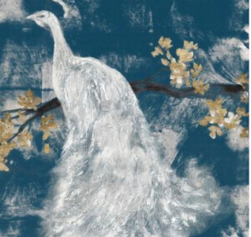
    Thank you Pat Reddick…. no offense taken at all. I appreciate the suggestion.

    I see your point as many commercial art is sold in sets of 2. I did discover though that many commissioned artists very often make a series of their work; with anywhere from 2-6 variations of the piece. The pieces I picked are each slightly different; they arent exact. but at a quick glance, you’re correct, they can look the same. I will look and see if there are any by those artists that are a bit different and see if anything catches my eye.

    I know many may associate 2 similar art pieces with being a tjmaxx type purchase, but truthfully there are so many beautiful art series done this way by artist that I wish I could afford 😂

    the one artist I like that did the first choice Hope Bainbrige does commision work. I could get her to do 2 custom pieces, which would probably end up being similar to what I posted for a whole lot more money , but it is way out of my budget. These would be the next best thing for me 🤷‍♀️

  • 2 years ago

    ”so many small shiny trinkets”

    can you clarify where?

  • 2 years ago

    If OP prefers to use similar/complimentary art that's her choice. Many prominent artists do work in sets of 2-6 depending on the type. Pretty sure you won't find the likes of these at TJ Maxx, etc.....


  • 2 years ago

    I like the first mock up that ilikefriday made with the soft abstract tones. You really have a special and unique color thing going on in the seating area and these particular prints carry that over to the fireplace. The branches and bird break the mood for me. The other abstract isn't nearly as spot on as the first one you selected.

  • 2 years ago
    last modified: 2 years ago
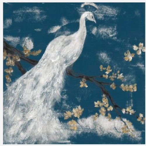
    Is the peach sofa in the mock-up still in the room? I think the sofa in that same spot is grey in one of your other posts. I think I like the 1st art mockup the best because it compliments the peach sofa. I also like the black frame.


  • 2 years ago

    Thank you jackowskib! that is exactly what I was trying to explain below. So many artists do series and I personally love them. My point was that 2 of the artists I posted prints of can be privately commissioned for thousands, but they also offer more affordable giclee prints of their work done in series. For me, that is what I can afford to do. I agree with you, you will not find even their more affordable art prints at a TJ maxx.

    Sure, TJmaxx sells 2 set art prints, but does that mean that ALL 2 set art prints are considered ” cheap motel art”?

    I think not.


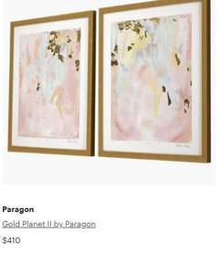
    That paragon art series is beautiful ! I love that one too!! The colors are gorgeous. I will look into that as well.


  • 2 years ago

    Peach sofa???? LOL… no, my sofas are light gray .


    I looked at the pic and its the lighting- it does look peach there 🤣

    no peach colors in my room.


    walls are BM silver cloud - which is a very soft blue color

    sofas light gray

    pillows are white, blush pink and soft blue textured accent pillow

    rug is light blue and ivory

    ottomans ivory

    bench seat light gray

  • 2 years ago

    Lol. Wow. They look like two completely different colors to me. It is crazy how lighting affects a photo.

  • 2 years ago
    last modified: 2 years ago
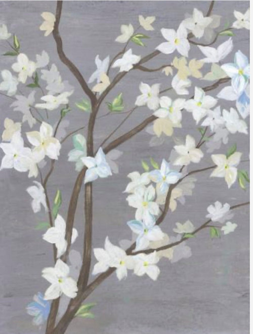
    Youre right! absolutely looks peach.

    pics show colors horribly. that is why when many comment “you need color,” i dont fret much about it, as I do have color in here, it is just that in photos, everything looks gray!

    except my sofa…. that looks peach 😂

  • 2 years ago

    I must apologize. i thought the paintings were identical. i do realize artists do series. thank you for being so gracious.

    gtdj519 thanked Pat Reddrick
  • 2 years ago
    last modified: 2 years ago
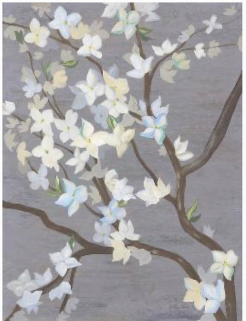
    Dont be silly Pat Reddrick!! no apology necessary at all!!

    I too would think it odd to have 2 of the same paintings and at a quick glance, it could easily be mistaken as being the same. i could see why you may have thought that. And also, these pics sometimes arent the greatest at showing colors and details at all!!