

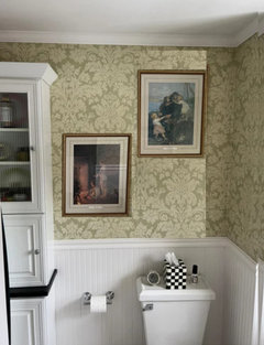
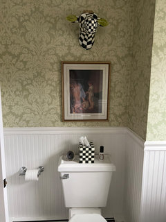
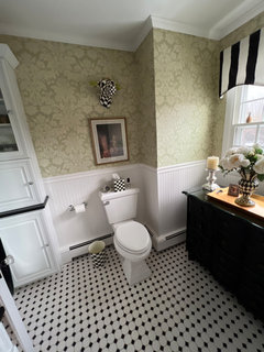
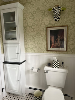
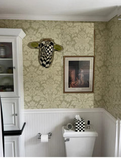
Wall decor, added print, moved piece
2 years ago
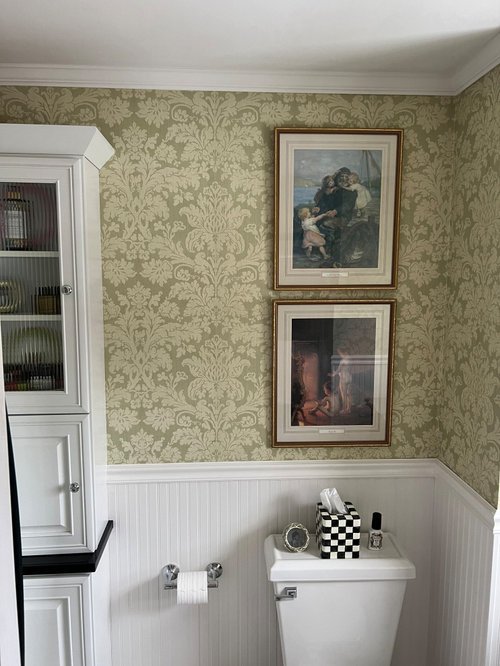
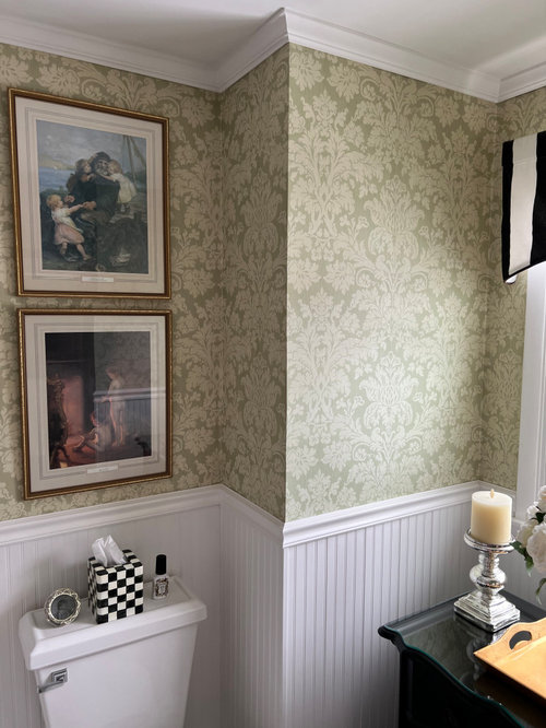
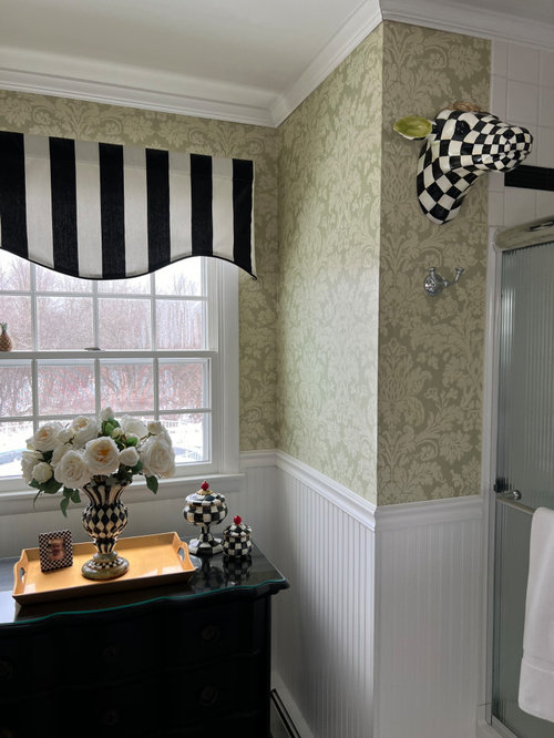
Featured Answer
Sort by:Oldest
Comments (15)
 2 years ago
- 2 years ago
Related Professionals
Augusta Interior Designers & Decorators · San Francisco Interior Designers & Decorators · San Angelo Interior Designers & Decorators · Zanesville Kitchen & Bathroom Designers · Muskogee Kitchen & Bathroom Designers · Duluth Kitchen & Bathroom Designers · Hilo Kitchen & Bathroom Designers · Fairbanks Kitchen & Bathroom Designers · Nashville Furniture & Accessories · Edison Furniture & Accessories · Sheboygan Furniture & Accessories · Valdosta Interior Designers & Decorators · Riverton Interior Designers & Decorators · Miami Architects & Building Designers · Danville Architects & Building Designers- 2 years ago
- 2 years agolast modified: 2 years ago
 2 years ago
- 2 years agolast modified: 2 years ago
- 2 years ago
- 2 years ago
 2 years agolast modified: 2 years ago
- 2 years ago
- 2 years ago
- 2 years agolast modified: 2 years ago
- 2 years ago


Related Stories

Guest Picks: Culinary Art Prints to Decorate a Kitchen
Treat your kitchen walls to artwork celebrating food, cooking and the beauty of nature's bounty
Full Story
DECORATING GUIDES13 Ways to Upsize a Small Living Room Without Moving a Wall
A design pro shows how to use light, colour, layers and focal points to make a compact room look and feel more expansive
Full Story
GREAT HOME PROJECTSWhat to Know About Adding a Reclaimed-Wood Wall
Here’s advice on where to put it, how to find and select wood, what it might cost and how to get it done
Full Story
DINING ROOMSGraceful Decorations for Traditional Dining Room Walls
Let the elegant artistry of oil paintings, classic prints and wallpaper enhance your dining room — and your entire dining experience
Full Story
DECORATING GUIDESGreat Print: Decorating with Damask
Big and bold or soft and light, damask prints transform a wall
Full Story
BUDGET DECORATINGBudget Decorator: A Most Affordable Gallery Wall
Need to fill a wall on the cheap? See how to make use of something pretty cool you may already have
Full Story
ECLECTIC HOMESHouzz Tour: Comic Book Prints and Vintage Decor Punch Up a Dublin Home
Flowing space and an ever-changing mix of vintage finds are key to this home’s cool, creative look
Full Story
BUDGET DECORATING8 Budget Ideas for Decorating Your Blank Walls
Postcards, tile and sentimental clothing can bring beauty to your walls, often for less than the cost of original art
Full Story
WALL TREATMENTS7 Ways to Decorate Your Walls When Painting Is Not an Option
These wall decor ideas let you be creative when you rent, despite any design restrictions you may face
Full Story
DECORATING GUIDES10 Enduring Pieces of Decorating Advice
Follow these tried-and-true rules and you’ll be ready for any decor situation
Full Story
Patricia Colwell Consulting