

Aesthetic white with Simply White
2 years ago
Sort by:Oldest
Comments (6)
Related Stories
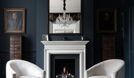
COLORDiscover White’s Surprising Power to Energize Every Room
Using white in different ways gives you limitless options for light, color and creativity
Full Story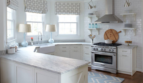
KITCHEN DESIGNHow to Keep Your White Kitchen White
Sure, white kitchens are beautiful — when they’re sparkling clean. Here’s how to keep them that way
Full Story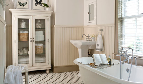
MOST POPULARMust-Try Color Combo: White With Warm Off-White
Avoid going too traditional and too clean by introducing an off-white palette that brings a touch of warmth and elegance
Full Story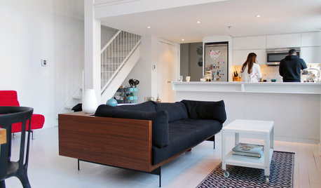
HOUZZ TOURSMy Houzz: Color Hits the Spot in a White-on-White Scheme
Bright red furniture strikes a dramatic pose against snowy walls and floors in a Montreal loft
Full Story
HOMES AROUND THE WORLDHouzz Tour: A White-on-White Home Radiates Scandinavian Charm
Pale woods, black accents and an abundance of white shine in this Australian-Swedish family’s renovated row house
Full Story
KITCHEN DESIGNWhat to Do if Your Kitchen Is Simply Too White for You
Does your all-white kitchen have you craving a little color? Here are some ways to introduce it
Full Story
KITCHEN MAKEOVERSKitchen of the Week: Chic and Functional in Black and White
Two designers blend aesthetic features like a sophisticated bar with practical solutions like a handy dog food cabinet
Full Story
BATHROOM DESIGN13 All-White Bathrooms With Clean and Classic Style
Show immaculate taste in your bathroom with simply beautiful white walls, floors and finishes
Full Story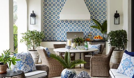
VACATION HOMESHouzz Tour: A Breezy Vacation Home in Blue and White
A couple host extended family in their elegant but comfortable Naples, Florida, home
Full Story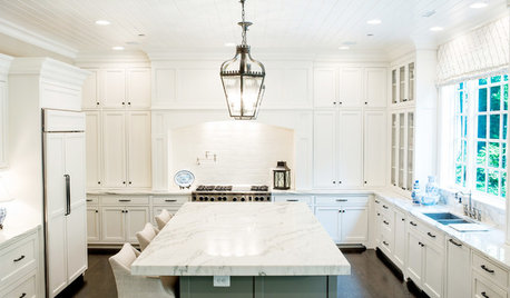
KITCHEN CABINETSHold Everything — Your White Kitchen Cabinets Just Got Better
These design moves will add even more to white kitchen cabinets’ appeal
Full Story

Patricia Colwell Consulting
BPMBA
Related Professionals
Jackson Interior Designers & Decorators · Beaumont Interior Designers & Decorators · Frisco Interior Designers & Decorators · Bend Interior Designers & Decorators · Kahului Interior Designers & Decorators · Danbury Architects & Building Designers · Trenton Architects & Building Designers · Kennewick Architects & Building Designers · Fayetteville Kitchen & Bathroom Designers · Bemidji Interior Designers & Decorators · Kirksville Interior Designers & Decorators · Norfolk Interior Designers & Decorators · Bowling Green Bathroom Remodelers · Valdosta Kitchen & Bathroom Designers · Bloomington Kitchen & Bathroom DesignersBeth H. :
chloebud
Lori A. Sawaya
Patricia Colwell Consulting