Software
Houzz Logo Print
wellsartsandcrafts

Backsplash Mistake??

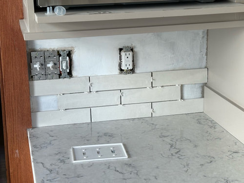
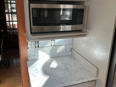
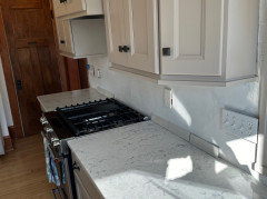
I'm thinking that we might have made a mistake with our backsplash tile. Our countertops are a white quartz with grey veining, and we went with an off-white tile that in certain lights (and against our greige cabinets) comes off almost cream. I'm thinking that the warmth of our tile may clash against our cooler countertops. Am I overthinking it, or should we switch tile before finishing the kitchen?

Comments (23)

  • 2 years ago
    last modified: 2 years ago
    if the wall cabinets are the painted putty shade shown then there are issues. the side wall is not a great view to assess for the viewers...if you can pull back and show the cabinets/counter and prop up some of the tiles on the longer splash area then feedback will be more valuable.

    a true white tile might be the better solution for the play between your paint color and counter.


    Full Home Remodel: Fifty Shades of Gray · More Info


  • PRO
    2 years ago

    Too yellow green of a choice. The counters are a cold blue white, with a cold gray. A colder white tile would work better.

  • 2 years ago

    As Herb said, show more pics….

  • 2 years ago

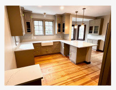
    We need to see a larger view of the kitchen - with the cabinets, flooring, wall paint... On my screen the backsplash tiles goes well with the cabinet above, but neither work well with the countertop. A larger view of the space, with all surfaces shown, will help.

  • 2 years ago

    More pics please. Do you have undercabinet lights? Take pics in daylight and night with lights on and off.

  • 2 years ago

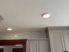
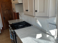
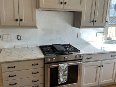
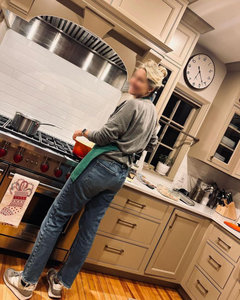
    Hi everyone - here are some additional photos, although afternoon sun is really shining in. Cabinets are SW Perfect Greige. Cabinet hardware hasn't been upgraded yet.

  • 2 years ago

    I was hoping some pros would respond for you. Have you made any decisions about your backsplash?

  • PRO
    2 years ago

    You are questioning your result and it's not going to change. The backsplash will always touch the counters, and they are cool toned. What are you comfortable doing?

  • 2 years ago

    A good learning lesson for me is that if you are not 100% on a tile choice, buy more than one or two sample tiles. It's hard to pick up on potential issues from just one tile, but once you see a full row it becomes a lot more obvious

  • 2 years ago

    I’m not sure I would have chosen those countertops with the greige cabs….I think that’s where your issues started. At this point you might look at tile with slight color variations to combine the cooler and warmer tones…..we did a similar thing (we have soft white cabs with Taj Mahal counters, which contain both warm and cool tones). Good luck!

  • 2 years ago

    Countertops are existing and not in the budget for us to change

  • 2 years ago

    @wellsartsandcrafts, when a tile isn't that expensive, I have even bought a whole box to test in the space. I stick them up on the wall with Alcolin quake putty so I can see what it looks like up on the wall. If I don't like them, I then return the box, if possible, or donate to Habitat ReStore.

    For more expensive tiles, I order at least 4 pieces of the tile. Better yet if the tile store has a large grouted sample board I can borrow for 2 days. I never borrow for longer, because it isn't fair to the shop or other customers.

  • PRO
    2 years ago
    last modified: 2 years ago

    Hard to tell what color the cabinets are...but if they are a warm taupey color, then a white/white top is fine.....go with a white/white tile that blends with the countertop. Here's a job I did that's similar.


    Here it is with the white backsplash installed.


  • PRO
    2 years ago

    Don't feel bad, I do this daily. Clients tend to focus on one thing at a time. It's telling to me when they want to pull a color from counter top, and it's actually not the one you'd actually notice first. I always ask if they can see that color from 3 feet back!

  • PRO
    2 years ago

    You might want to consider a darker tile with more contrast. It's easier than trying to match all light neutrals. What about green or blue?

  • PRO
    2 years ago

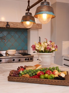
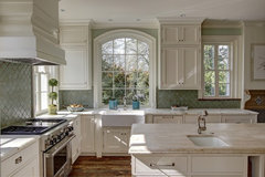
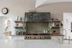
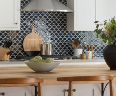
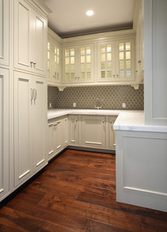
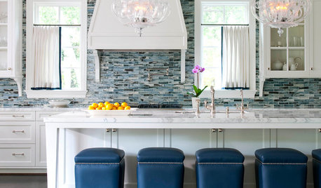
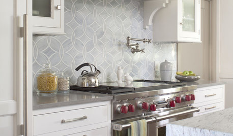
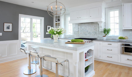
    Here are some kitchens with white cabinets and counter tops that have been jazzed up with colored backsplash tiles:

    turquoise

    Mediterranean Kitchen · More Info

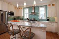
    greenish gray:

    Interior Portfolio · More Info

    muted green:

    Zinc Extractor in Villa Kitchen · More Info

    dark navy:

    Concord Avenue · More Info

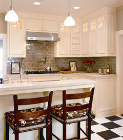
    gray:

    Atherton, California Luxury Home by Markay Johnson Construction · More Info

    more gray:

    Traditional Kitchen · More Info

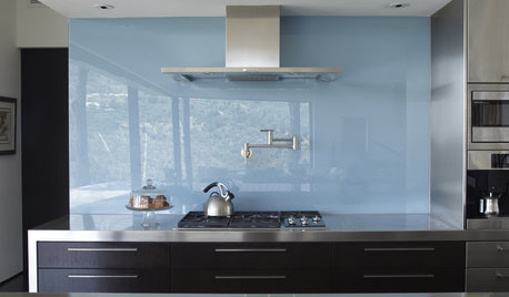
    blue glass:

    Cabinets, Kitchens and Bathrooms · More Info

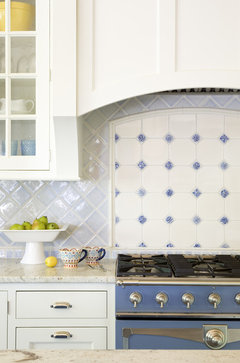
    blue and white:

    Misty Blue · More Info


  • 2 years ago

    What color tile do you think would look good with warm Greige cabinets and cool white countertops?

  • PRO
    2 years ago

    Any of those I posted above. Get samples from a good tile retailer (not a big box) and view them vertically in your kitchen.

  • 2 years ago

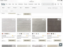
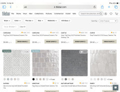
    Go to Tilebar.com and type in “grey tiles”. Click on “backsplash” under Usage. Here is just some of what came up. One of these types of grays will pull together the cool/warm issue you’re facing. Tilebar gives you 5 samples for $5. Buy more of anything you’re considering!

    Hang in. You’ll find it. Now you know where your first error came from and you won’t repeat it.

  • 2 years ago
    last modified: 2 years ago

    I love the warm woods you have in your kitchen.


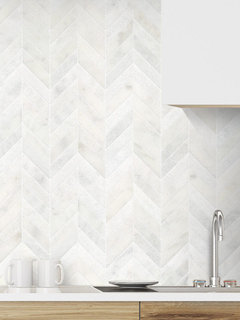
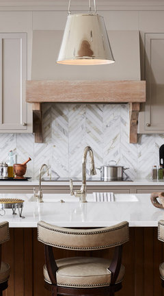
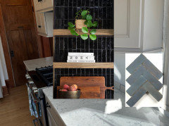
    This carrara marble (in 3 diff textures) in the chevron layout might bridge the gap


    backsplash.com BA631613

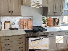
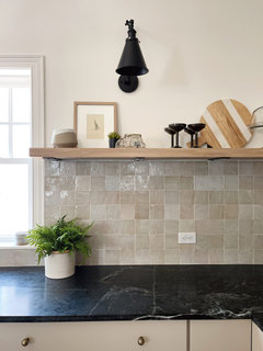
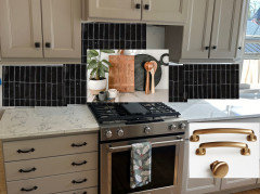
    have you considered replacing the heavy, dark iron hardware and trying a softer gold ? then, to further try and warm up that countertop, bring in some accessories like this. (BTW, this tile splash on the left is a white zellige tile. they come in diff tones of white. maybe try one of those?)


    I really like how the wood cutting boards, the neutral crock, plants, the black and the gold play well w/the cab color and your wood floors/door.

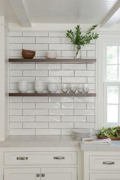
    if you had a darker countertop, or a warmer gray tone, i'd have said to choose something like this


    This calacatta gold tile is the perfect compliment to your cabinet color. however, the cooler quartz, not so much


    since this countertop is really driving the tile bus, I'd just match it to a tile like this white, not an off-white.

    what I would do w/the tile is a diff layout rather than a standard subway-50/50. too generic.

    However, I think more of a contrast would look better.


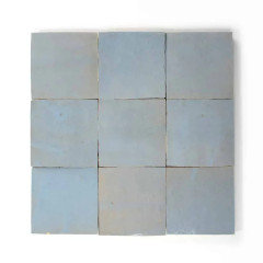
    this zellige, in Skylight, has the slight griege around the edging, cool tone for the counter, and compliments the cab and wood tones


    Graphite Gray is another,

    or what if you went w/the black??

    would work w/the counter, the griege, and look beautiful w/the woods


    https://www.ziatile.com/products/carbon-black-2x6-zellige-tile

    lay it out in the herringbone design


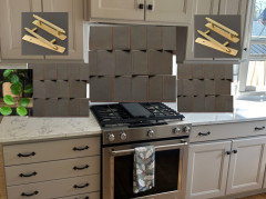
    or this stacked layout (you could do a horizontal.


    they also make a ceramic 2x8 in diff colors. black and the ethereal blue are pretty


    Although, I'm kind of liking this Cacao color!!! with the gold?

    wow


    https://www.ziatile.com/products/cacao-4x4


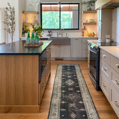
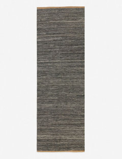
    bring in a similar rug,,runner,,


  • 2 years ago

    Thumbs up for the cacao tile above!

  • 2 years ago

    @Beth Wow, you are a rockstar. Thank you so much. I am completely sold on going with more color now. The cabinet hardware is a holdover from previous owners and we are planning to replace with something warmer (brass/gold). We have a lot of neutrals in our home and adding some color with our backsplash is really growing on me.