Software
Houzz Logo Print
webuser_283081375

Looking for kitchen backsplash guidance

2 years ago
last modified: 2 years ago
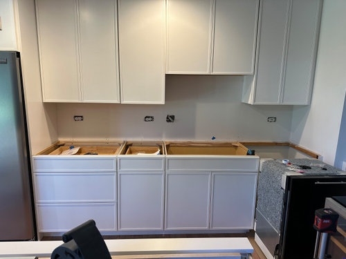
We redid our kitchen with an open island concept. There is one area that needs a backsplash.


- Our kitchen cabinets are skinny shakers in white- countertop: MSI Miraggio Gold (https://www.msisurfaces.com/quartz-countertops/calacatta-miraggio-gold-quartz/) - the idea was not to have a bright white countertop and match the natural oak floor

- floor: beveled red oak, natural Bona satin finish

- hardware: champagne gold/bronze

- sink: black single bowl


My thoughts are not to match the countertop/cabinets exactly, using a more natural look without going rustic.


I really use some pointers and appreciate any feedback


The backsplash area:


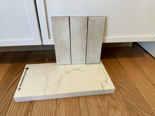
Idea 1:
Not bad, not glossy. Looked a bit dark


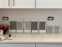
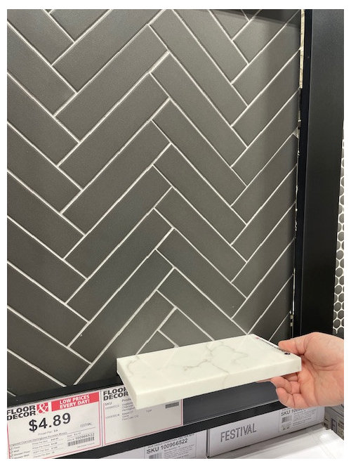
Idea 2: Going grey - slate - maybe with a grey grout


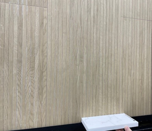
Option 3: It is actually in reality a bit darker - would be kind of matching the wood floor with a modern touch. there is also a lighter (maple) version


Comes in different orientations. This color rendering seemed more accurate:

https://www.tilebar.com/kenridge-ribbon-maple-24x48-matte-porcelain-tile.html

Variants with wood


Comments (25)

  • 2 years ago

    Hi there - why are you looking for a backsplash tile to match your flooring? Do you have an image that inspired you?

  • PRO
    2 years ago

    IMO wood look tile is not my fave but for sure should never be used where you would not use real wood. IMO the big issue is the black sink and not IMO you need to have something that connects to in the space so maybe look at tile with some black and I need to see the space and if the tile makes your space too dark get better lighting . I think backsplash is like a piece of jewelry it needs to work with the whole outfit (or kitchen ) . I need to see the space and honestly backpslash and wall color are two of the last choices you make.

  • 2 years ago
    last modified: 2 years ago
    Your counter material does not have grey in it. In the MSI description it is a ”crisp white background and elegant golden brown veining.” I would not be looking at grey tiles. If you want something other than white, consider a golden to brown tile. This is a glaze called Oat in HeathCeramics field tile (click here). Their web site is difficult to navigate at best, just keep at it.


  • 2 years ago
    last modified: 2 years ago
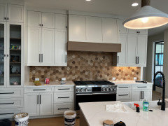
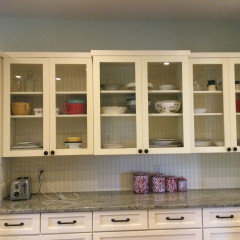
    open island concept usually means there is focus at that island with stools/ pendants and traffic TO the island and AROUND the island..../ a "destination" . can you show or describe in that sense???? I wouldnt labour too much for this wall's backsplash. You have quite a few doors AND some drawers. I think the hardware choice perhaps is next ...then the backsplash and a simple default to white subway/ maybe herringbone maybe a textured white tile would all be fine and quite easy altho whites take a bit of effort sometimes. Knobs? Handles? polished nickel/ ? stainless/ ? pewter? / black?

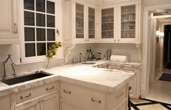
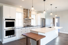
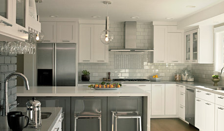
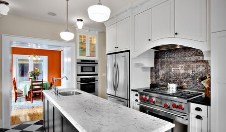
    1st pic...a more detailed handle on the skinny shaker.....detail which works nicely .... their backsplash choice stayed quite simple.. 2nd pic...the tile in variegated brick look may be what you are thinking.....choice of the black hardware as a punctuation / but simple size and shape . I would put effort into hardware pick right now in your kitchen


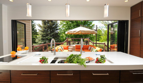
    KitchenLab · More Info


    Guenther Rd · More Info


  • 2 years ago

    If you prefer to not take the counter up the wall, then I would wait until the counter is installed before considering backsplashes so you can see the samples in your space with your full lighting. From your photo, it kind of looks like a dark shadow under the cabinets so you may want to look at getting under cabinet lighting.

  • 2 years ago
    last modified: 2 years ago
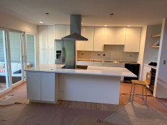
    As requested another picture. Meanwhile 60% of the countertop is installed. there was an issue with sink size. So, that part will be installed in a couple of days. Most of the floor is still covered, but some of the oak is visible just where the island starts.


    The hardware is champagne gold


  • 2 years ago

    There are tiles that have a bit of rustic edges around them which will pull in the floor color and the hardware and veining.

  • 2 years ago

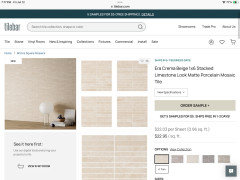
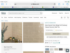
    You need to get a lot of samples. A soft beige/caramel colored tile might look good with the light veining. Maybe even a glass tile will complement the two main elements. These are all on TileBar.com where you can get 5 samples for 5. They have A LOT of tiles. These are just first stabs at what might work for you.

  • 2 years ago

    @ RedRyder : I like the direction of the Era Crema. It keeps it contemporary while bringing the natural look. I do not like shiny :-)


    We went to a tileshop and found Coco Canvas matte

    https://www.tileshop.com/products/coco-canvas-matte-porcelain-wall-and-floor-tile-2-x-6-in-484213

    For some reason I thought it was a tad to rustic


  • 2 years ago

    You’ll also want to make sure whatever tile you choose looks ok with the shades of white in your countertops and cabs. I can’t tell if it leans warm or cool.

  • 2 years ago

    I would get a sample of it. That shade of beige/caramel looks a little dark to me, but photos aren’t accurate.

    Get two of the ones you like the best because one tile is hard to judge. I think a soft caramel-beige will beautifully highlight the veining in your stunning countertop.

  • 2 years ago

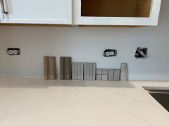
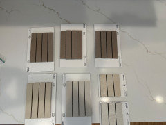
    ok, I got a couple of samples, and counter is installed.

    It is interesting how the era crema appears almost a bit grey when placed there. In plain daylight it is beige.

    The wood ribbons are different from what I expected and seen at other places.


  • 2 years ago

    The gray is due to the shadow.

  • 2 years ago

    I think the gray is gray compared to the warm creamy tones in the countertop Colors are seen in comparison to one another. A white shirt may look white until you get it next to a brighter/cooler white shirt.


    The wood tone on the far left looks better with the counter than any of the others.

  • PRO
    2 years ago

    My advice is the backsplash should provide a background for cabinetry and other elements in a kitchen. Trying to make it the star of the show often backfires and detracts from other elements.

  • 2 years ago

    @ Norwood Architects. I agree. That is what I am after. Kind of Zen, as that side of the kitchen is visible form my living room/lounge area.


    @Jennifer Hogan: I saw another similar wood tone, more ribbed at Floor & Decor. https://www.flooranddecor.com/dimensional-tile/ribbon-oak-ceramic-tile-101022655.html

    I have only seen one picture so far using such a tile as a backsplash (somewhere in Korea). I know, many designers don't like "fake" wood tiles....

  • 2 years ago
    last modified: 2 years ago
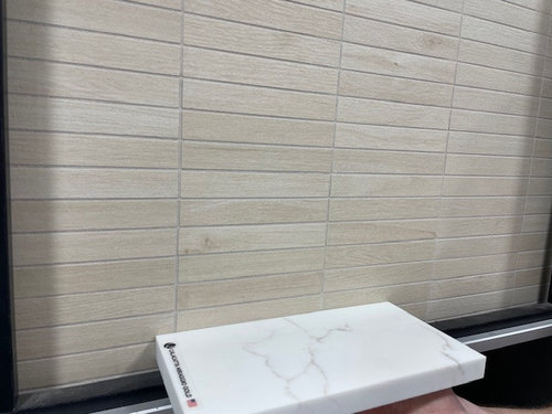
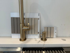
    Ok. I got a new set of samples. All the same style, different colors. The middle two on the third pictures seem to be the best fit so far. With no undercabinet lighting installed yet, color rendering can be a bit tricky. Still, undercabinet lights will not always be on...

    Also, toyed with the idea to go more grey-brown to make it a bigger contrast.

    Any opinion, guidance is welcome!


  • PRO
    2 years ago


  • 2 years ago

    I would make a final decision with the under cabinet lights installed so you can see the tiles with and without them.

    The big decision is how much contrast you think you want. The two you mentioned look kind of pink-ish on my monitor, so only you can tell which tiles look best. But a medium grey-brown sounds pretty if you find the exact right shade.

  • 2 years ago
    last modified: 2 years ago

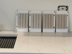
    I narrowed down my choices to those three. I am intrigued by the taupe (left) looking one. It looks a bit dark, but a lighter grout might lighten it up. Does it work with my other materials otherwise?


  • 2 years ago

    I would not go gray
    Personally I would not use something with small grooves because that makes cleaning more difficult
    I love your counters—and would just run a slab up the wall—the veining brings the floor color up and frankly looks seemless and very sophisticated—especially for such a small focal point
    Using a separate tile (especially a dramatic one) will be out of balance with the mood you want to create after all is done I think—
    Consider that having a different pattern at that ONE side of the kitchen will throw it off balance in competition with the classic Shaker cabinets…
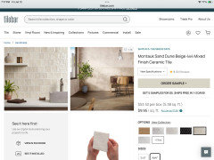
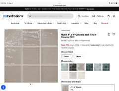
    IF you wanted tile vs the quartz, I would go with a vertical subway in the Montauk Sand Dune but maybe in the white vs the tan/cream—just to balance more with the white cabinets…

    Step back and visualize BALANCE—
    Too heavy a tile/backsplash will make that end of the kitchen weighted—
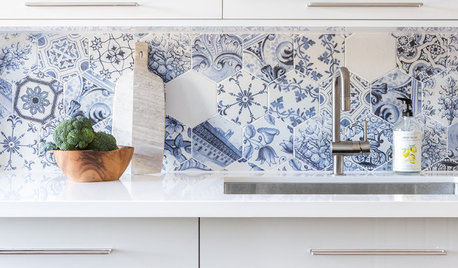
    The hex tile in the photo is much too heavy for YOUR kitchen because your backsplash doesn’t flow across a long counter…

  • 2 years ago

    I found this taupe tile. I agree the grooves will be a cleaning problem if they’re near the cooking area. Just another thought for you.

  • 2 years ago

    My backsplash does not have a cooking area.


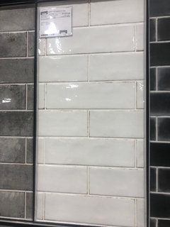
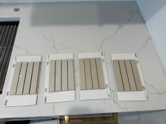
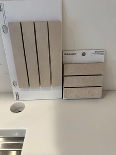
    I am going to pick a tile from the following choice. Other than size the difference is texture and color "variation". The one on the left is more uniform. The one on the right has some more colors in it. Both seem to work with countertop and white cabinets.


    I thought that I would install the one on the left vertically to make the kitchen look taller. Are smaller tiles like the one on the right ever installed vertically?


  • 2 years ago

    Neither does mine and I just did painted beadboard for my backsplash and carried it up the back wall in the cabinets with glass doors. This allows you to pick the perfect color.