Software
Houzz Logo Print
lisa_crawford115

Nightmare Living Room Painting Project

2 years ago
last modified: 2 years ago

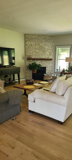
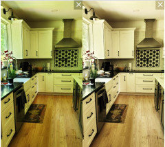
**pictures in comments**Good afternoon all! I am trying to find an impossible unicorn paint color for the nightmare of all great rooms. It is open to the kitchen, so everything needs to coordinate. Our style is modern farmhouse. The usual popular faves like agreeable gray, revere pewter, etc, just look like sad mud in the morning or when the sun starts to go down.
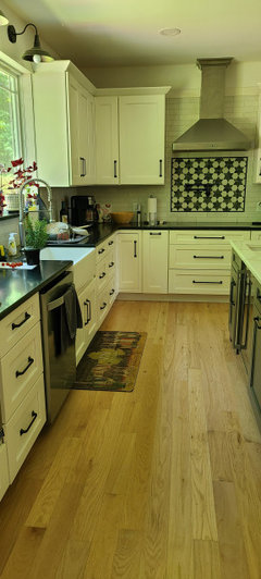
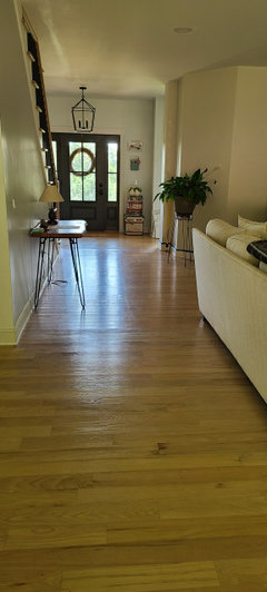
The dilemma: this room is North facing with a wall of windows but also gets warmish afternoon light on one large wall thanks to a slight western light that peeks in. Also, it is open to the front of the house, so certain walls get that southern light just a tad as well. The windows open to a ton of trees, so there is a constant green cast coming in as well. My floors are natural bona whitewashed red oak, so up to date but still contributing some pink orange tones, especially on the one wall that gets slight west sun in the afternoon.
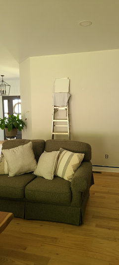
I thought I had chosen the perfect color after I sampled, Benjamin Moore Classic Gray. It looks pink on one wall, green on another, and cold gray on a third. I can't unsee it.
My favorite paint color in the world is Benjamin Moore Shoreline, a warm gray with slight violet undertones, but the purple comes out too hard in this room. I want the space to be bright and welcoming, so I'm avoiding a darker hue because the room tends to be dark except for a few hours in the middle of the day.
I'm pulling my hair out over here! About to ho back to pure white. It looked the best, but my hubby complained that it made the walls look primed and unfinished. White Dove is pink, Alabaster falls flat, and I have to be careful with yellow based whites on the one wall. Help!

Comments (18)

  • 2 years ago

    Did you mean to include a picture?

    Lisa Crawford thanked millworkman
  • 2 years ago


  • 2 years ago

    I would test out very soft sage greens that lean toward cool tone .

    Lisa Crawford thanked S J
  • 2 years ago

    Sherwin Williams Silver Dust is a very light, barely gray. In our north facing kitchen, it was the only true gray that didn’t turn lavender. It kept its color. No brown tone to it, like some of the BM grieges you listed.

    Lisa Crawford thanked chloe00s
  • 2 years ago

    Whoops - May be Valspar Silver Dust… Looks like Sherwin Williams has a Silver Strand, and Valspar has the Silver Dust?

  • PRO
    2 years ago

    You have a north-facing room, which lets in very indirect/cool light, and you're looking at all manner of gray colors for the walls. Gray will not give you any warmth at all, it will render your rooms dreary and cold.

    I hesitate to use this word, because most Houzzers will gasp with horror, but try a yellowish white. Linen White, Mayonnaise, Ivory White, Windham Cream, Weston Flax, Beacon Hill Damask. You might be surprised at how yellow can brighten up a room.

  • 2 years ago

    No gasping here Diana. I'm in love with Farrow and Ball White Tie. It is almost exactly the same as BM Linen White. I have painted our east facing guest suite, our south facing living room, and our west facing kitchen with it, and had our cabinets finished in it too. Wish I had painted my office with it as well. I'm in love with the color and every thing it does to my mood. It is warm without being sunny. Friends drool over it and find it so relaxing they often nap on my sofa.

  • 2 years ago

    The back of my house faces north. I used Soft Chamois in the upstairs bedrooms and Edgecomb Gray and Timid White downstairs. If you have a cased opening separating rooms you can change colors. You don't necessarily have to use the same color everywhere. Light, warm colors are going to be challenging against your white kitchen cabinets, so look at Edgecomb Gray for that part of the house. It is warmer than the grays you have already tried. I was having trouble with some of the other colors I tested looking green and EG didn't end up looking green at all. I have it in a room that has two north facing windows and one west.


    Soft Chamois is a warm off white, but doesn't look yellow in other exposures. I also have it in my foyer and upstairs hall where the light is coming from directions other than north. Timid White can look yellow if not facing north. When facing north the yellow keeps it from becoming muddy. Mayonnaise and the others Diana suggested are also good options. I did test Mayonnaise in the room which ended up Timid White. It didn't look right with the upholstery on my chairs, but if it weren't for those chairs it would have worked in that room.

  • 2 years ago

    You are never really going to find one color that does not look different on different walls depending upon how light hits it, what exposure it primarily faces, what time of day it is, and natural light vs. artificial light.

    I read somewhere once that the designer Mariette Himes Gomez, who frequently used white walls, would sometime use slightly different shades of white on different walls in the same room to achieve a really consistent white appearance--and that a ceiling in the same white as the walls will never look exactly the same as the walls, and that to achieve a really consistent look took sampling and experimentation.

    Lisa Crawford thanked palimpsest
  • PRO
    2 years ago
    last modified: 2 years ago

    Fight fire with fire. Meet wildly shifting daylight with full spectrum paint colors that are built to shift too.

    Full spectrum brands are Ellen Kennon, C2 Paint, and Ben Moore has the CSP colors.

    This issue is installing paint colors that are built to be as constant as possible in a quality of light that is anything but constant.

    For example CSP-365 Grandma's China requires 6 different colorants, no black in the formula compared to Classic Gray's recipe of 4 colorants and one of them is a healthy shot of black.

    Typically the goal is to use as few colorants as possible because that helps to lessen shift, make the color more constant. Black helps too.

    More colorants results in more shift. Which is the short answer to the question "what are full spectrum paint colors?".

    And spaces like yours is the answer to the question "what are full spectrum paint colors good for?".

    So, yeah, regular paint colors shift too but because of how they're built - fewer colorants - the WAY they shift can be clumsy. e.g. the many different ways Classic Gray is showing up for you.

    Full spectrum colors shift different using more colorants and most importantly no black.

    Lisa Crawford thanked Lori A. Sawaya
  • 2 years ago
    last modified: 2 years ago

    1- Trim the trees. They are casting the green reflections, as you noted.

    2- If you also have modern green-tinted glass, you will have to live with a green cast on everything unless you turn on lights in daytime.

    3- Enjoy the color changes over the course of the day. It is not possible to see the same color on each wall in a room that has windows in several walls. It's the nature of the earth's atmosphere, causing scattering and absorption at various times of day.

    4- You can cut the Gordian knot by picking a color that is not white. Blue, green, tan, pink- there are lots of options.

    5- Many people perceive colors differently in their right and left eyes. One may perceive a white wall is slightly pinkish, the other eye may see blue.

  • 2 years ago
    last modified: 2 years ago

    I actually like full spectrum paints that provide certain color shifts because I think they are more alive. I think shades that have black in them instead of actual --hues I guess-- combined to make whatever black is needed, can end up a little dead?

    That said, it can be tricky. The very slightly warm or not cool pale blue of my old north facing living room was much closer to the greens in the paint deck and on the wall in the paint store. Actual blues looked periwinkle or lavender almost.

  • 2 years ago

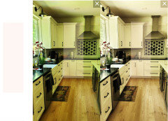
    Light is different colors when it comes from different directions at different times of the day, but generally our eyes adjust to this and we accept that corners are grayer and areas directly across from a window are lighter and brighter. Your green issue is because of the greenery outside the windows. I assume the current color is the white you were talking about. It doesn't look white, it looks green. Your cabinets look green, your counter looks green. I assume this is not the case in the winter, so if you purchase a color that corrects the green in the summer, it may be too pink / orange in the winter. Finding the right balance is tough.


    Cut away some of the greenery, put up shades and use indoor lighting or try work at finding the right balance in the paint color to correct the green and leave you with something you can live with.


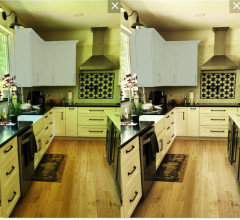
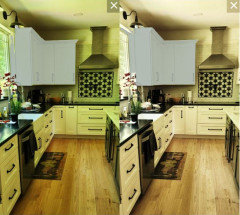
    Your kitchen Color Corrected


    Add peach to the white fixes the green in the summer, but may be a bit orange in the winter


    Some BM Paint colors to test Compared to the White Dove and Classic Gray you have tried. Too gray. You need more orange to combat the green.


    Navajo or Indian White may be enough to combat the green and not go too orange, but you will need to test.


    Blues and greens will absorb the green and you won't notice the color change so much.


    You don't have to go really dark, but you will do better with an LRV in the 60s than with higher LRVs.

    Lisa Crawford thanked Jennifer Hogan
  • 2 years ago

    Go darker. Some sort of actual color (meaning not white or off-white). Darker colors don't shift as much, if at all.

  • 2 years ago

    Jennifer Hogan thank you so much. One question... beiges I've tried that have a peach undertone only look more pink or peach because of the floor tones. What are your thoughts on that??

  • PRO
    2 years ago

    Most houses do not have Vermeer like light coming in all the time.


    So true and so well stated. Love this.❤️

  • 2 years ago
    last modified: 2 years ago

    This is why I suggested starting with Navajo White and Indian White. They have much less obvious orange tones, but honestly, without being in the room and looking at some colors it is hard to guess if they will be enough to combat the green. It is a balancing act.


    If the colors go pink or violet they have too much gray and need to be a bit more colorful.