Software
Houzz Logo Print
fall50

Exterior Color final decision after color consult

last year
last modified: last year
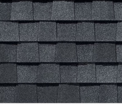
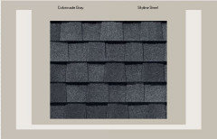
I have been reading on several different forums. My partner and I have narrowed down the exterior color to Colonnade Gray or SkyLine Steel. One leans a bit more gray in Colonnade whereas as Skyline Steel is a bit browner. My partner thinks Skyline Steel has pink undertones and I am not convinced. I have been trying to make sense of some previous posts, however we are really torn. Trim is Snowbound, house faces north with CertainTeed Landmark Moire Black shingles

@Flo Mangan any assistance would be so greatly appreciated or any of the other reside color consultants


Comments (35)

  • PRO
    last year
    last modified: last year

    My partner thinks Skyline Steel has pink undertones and I am not convinced.

    Possible.

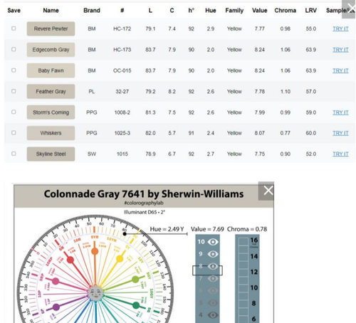
    Skyline and Colonnade basically have the same hue and value.

    Both colors are over near the yellow-red (orange) hue family.

    The difference is chroma. Skyline has a smidge more chroma, it is slightly more colorful.

    That's what your partner is sensing - the peachy/pink overtones from the neighboring hue family.

    And it also explains your discernment of "browner".

    IMO Colonnade is the prettier, more neutral option.

  • PRO
    last year
    last modified: last year

    IMO we need to see them to comment Lori is a color consultant and has good advice I persoanlly do not get bogged down in the chroma stuff but that is me. If you want help here most of us do not go to links and best to just post the sample here IMO. I think if you see a hue it is there so if that bugs you don't use it. IMO both are called stone gray which IMO says some brown . I would like to see your house to really understand the reason for either of those colors with that roof . I would be looking for a much more gray color

  • last year

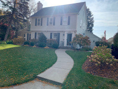
    Thanks Patricia. We have a friend who did his house in Hardie board in the hardie cobblestone color, with a similar shingle color and it looks stunning. Skyline Steel is a very close match to the Hardie cobblestone color, although with a smidge more black in it. Here is our house, however this is not a great picture. due to the sunlight. The shutters and front door are Wrought Iron and the main body trim is Snowbbound

  • last year
    last modified: last year

    The fist picture gives reference to shingle color and was take during construction of the new siding. Second is not a great picture and the color of the house is misleading due to a siding defect when they factory finished with repose gray. The repose turned mint green and looks like a house color in south florida, hence we are getting the house repainted and need to choose color!


  • last year

    Did you look at photos of houses with CertainTeed Landmark Moire Black shingles? I like this one more than those with yellower, grayer, or whiter paint though it has stone which presumably affected the color selection.


  • last year

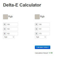
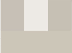
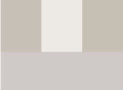
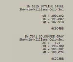
    The difference (Delta E) between these two colors is 1.19


    Delta E values are used to measure the difference in color and lightness between two colors, and are often used to evaluate color accuracy. Here are some Delta E values and what they mean:

    • Delta E ≤ 1.0: The difference is not perceptible to the human eye
    • Delta E 1–2: The difference is perceptible through close observation
    • Delta E 2–10: The difference is perceptible at a glance
    • Delta E 11–49: The colors are more similar than opposite

    This means that if you paint two rooms in your home - one with Colonnade Gray and the other with Skyline Steel no one is going to know they are two different colors.

    If you paint two walls in the same room or 1/2 a wall they will be able to see a difference.


    Both work well with the white that you picked (Snowbound)

    And all of them are in a hue family that can move slightly toward a pink or violet undertone as they become more gray.


    They are not overly pink/violet and will appear quite neutral unless you place them next to a yellow or green undertoned neutral.


    See how the three colors Colonnade / Snowbound / Skyline look next to a green undertone like Revere Pewter, which also looks quite neutral unless right next to a warmer undertone.


    See how the same three colors appear very neutral next to a color like grayish that has strong pink/violet undertones.


    When testing colors for the exterior it is a good idea to make large samples (I often use a 1/2 sheet of drywall) and look at the colors on all 4 sides of the house at different times of the day.


    I painted my garage without following my own advice - thought I would be fine. Looked great when I painted it in the morning and looked great when I left to run some errands in the afternoon. I returned around sunset and it was really purple. I had to repaint with a slightly different color so that it didn't scream purple at sunset.


    My bet is that if you did the test without knowing the names and looked at the colors on different sides of the house and not next to each other you would not be able to pick a favorite, but look at them next to each other and see if you have a preference. If not - toss a coin.


    fall50 thanked Jennifer Hogan
  • last year

    @Jennifer Hogan this is super helpful. Thank you so much! They are so close in RGB, with just the subtlest variance. Thanks for laying that out.


    We will probably just go with Colonnade as that what my wife wants. As mentioned earlier, we had Repose Gray, and liked it, however it just read a bit more gray then what I liked. It feels like Colanndade gives more warmth vs repose and Skyline just ever so slightly more of a brownish/tan undertone.


  • PRO
    last year

    They are so close in RGB, with just the subtlest variance. Thanks for laying that out.


    Do not use RGB Values. These values do not include dimensions of value (lightness/darkness) or chroma (clean/dirty).


    In other words, they make no effort to model human visual perception nor can you use those values to quantify how colors differ in appearance.


    Useful color notations/data values that do model human color vision in order to define and describe color appearance are LCh and Munsell hue/value/chroma.

  • last year
    last modified: last year

    Have you tried ColorSnap? Here is the SW rendering. It would not let me paint the garage doors or front door but the trim is Snowbound.


    Here is a good blog with someone painting sample swatches of Colonnade and Repose exterior.

    https://www.addicted2decorating.com/six-inspiring-house-exteriors-and-my-potentially-shocking-final-house-color-choice.html

  • last year

    It seems Colonade Gray could be a good choice in your case. It was a contender for us, but we went with Repose Gray since it leaned a bit more gray…just as you mentioned.

  • last year
    last modified: last year

    You can convert RGB to LCH and you can convert LCH to RGB. It is just math.

    Caculating the delta variance was easier using an online calculator and the one I found was using RGB as the input

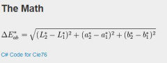
    That color was converted CIE LAB color specs and per the CIE 76 formula the calculator did the math to detemine the Delta E value or eucledian distance between the two colors.


    The result would have been the same if I had started by entering the LCH values and the calculator converted that information from LCH to CIE LAB color specs and did the math.

  • last year

    Saying not to use RGB and that LCH is the right answer is like saying that the whole world should stop using the imperial system and only use metric. As long as you can convert 1 cup to 237 ml your recipe will turn out the same regardless of which measuring system you use.

  • PRO
    last year

    @Jennifer Hogan


    You're wrong.


  • last year

    Beautiful…love the hydrangeas as well. Any idea where n what your roof color is?

  • PRO
    last year
    last modified: last year

    Hi Fall50….the roof is black/dark charcoal and after this photo was taken we added all black gutters…we have hydrangeas everywhere!🤗

  • PRO
  • PRO
    last year
    last modified: last year

    We used Pure White for trim but Snowbound is very close and rated one of the top exterior whites.


  • last year

    @Lori Sawaya -

    " You're wrong. "


    My objective was to help the OP solve their dilemma. The OP thanked me and said the information I provided was helpful. How is that wrong?


    Is using RGB values to describe a color wrong? Sherwin Williams is a pretty successful company and they use RGB values to describe their paint colors on their website. It may not the information you want to see, but it is apparaently deemed acceptable by others.


    I don't like Chocolate Ice Cream but I accept that many people love Chocolate Ice Cream and that is okay.

  • last year

    @Lori Sawaya

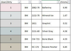
    "chroma (clean/dirty)"


    Really? Are you sure?


    I wouldn't ever expect Mineral Ice or Ballerina to go muddy in a dark hallway, but Revere Pewter can. How exactly does chroma describe clean/dirty?


    Ordered by Chroma


    Ballerina and Revere Pewter have very similar chromas, but no one would ever say that Ballerina may look drab on any wall, not even in a dark hallway, but Revere Pewter can and will look drab next to flooring with violet gray undertones and can be drab in a dark hallway


    Mineral Ice has a much lower chroma than Revere Pewter but will appear much cleaner, crisper than Revere Pewter.


  • PRO
    last year

    @Jennifer Hogan Is using RGB values to describe a color wrong?


    Yes, the reasons why RGB/sRGB/Adobe RGB values alone don’t define or describe color appearance are discussed in nearly every color science book. Authors I recommend on this topic include Günther Wyszecki, W.S. Stiles, Roy S. Berns, Mark Fairchild, and Fred W. Billmeyer.


    In addition to missing dimensions of value (lightness/darkness) and chroma (clean/dirty) "RGB" on its own refers broadly to the concept of the Red-Green-Blue color model but does not specify any particular color space.


    RGB is a foundational color model used in digital imaging and displays, where colors are created by mixing red, green, and blue light in varying intensities. However, without specifying a particular RGB color space (like sRGB or Adobe RGB), "RGB" is vague and doesn’t indicate precise color characteristics.


    Last but not least, none of the RGB color spaces specify an illuminant (light source).


    And, yes, I am 100% sure about Chroma. It effectively describes colorfulness. Peter aka color.nerd on Tik Tok is also an excellent resource.

  • last year
    last modified: last year

    @Lori Sawaya


    LCH describes a color in terms of light vs dark, colorful vs gray and hue.

    We agree on that point.

    It may be easy to understand, but you do realize that almost no one outside of color nerds have ever heard of LCH and the numbers mean nothing to them.

    On the other hand RGB is something they are used to seeing and using. Most people can change the color a cell in excel to an RGB value and see the color. They are comfortable with it.

    Same goes for metric vs imperial measuring systems. People understand when I say my kitchen is 10 feet x10 feet, but I am not sure how many of our OPs or designers could just as easily picture the size of my kitchen if I described it as 3 meters x 3 meters.

    If I want to describe Sherwin Williams Powder Blue I can use it's name or I can describe it using the LCH or HEX or LAB or LCHuv or Hunter LAB or RGB or Adobe RGB. It is the same color no matter how I describe or define the color.


    By the way the 's' in sRGB stands for standard. The RGB colorspace used for computer systems was standardized about 2 decades ago. I don't know of a single coding language that requires the use of the s in front of the RGB to denote that you want to use the standard RGB notation. It is assumed when you say RGB that you mean sRGB.

  • last year

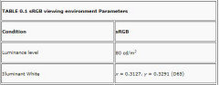
    @Lori Sawaya - the standard for sRGB does specify the illuminant.


  • last year

    @Lori Sawaya

    I am glad that you and I agree!
    And, yes, I am 100% sure about Chroma. It effectively describes colorfulness.


    We just disagree that a clean color vs a dirty color is the same as chroma.


    You can have a very low chroma color that appears clean and crisp. White, Black, neutral gray, a light blue gray can all be very clean and crisp colors. A muted, low chroma yellow is never clean and crisp, it will look dirty next to a true white. Think new vs old, yellowed t shirts. The new white looks clean and crisp and has a chroma close to zero. The yellowed shirt has a higher chroma, and looks dirty, but a bright, clean, florecent yellow is again clean.


  • last year

    For what it’s worth. Colonnade Gray is looking pretty tan/brown. Can’t say we love it. House was finished last week

  • last year

    I am sorry that your not in love with the color.

    I would like to know if you looked at large samples before making a final decision.


    I recommended doing samples the size of a 1/2 sheet of drywall because we really do need a decent size sample to really see what the color will look like on the side of a home.


    I think most of us assumed you wanted a warm, brownish gray and not really gray because the two colors you had narrowed your choice to were very similar warmer grays.

  • last year
    last modified: last year

    Use decor in browns like copper light fixtures, rich walnut furniture and planters and redwood and big terra cotta clay pots to make the house color look grayer, less pink by comparison.

  • PRO
    last year

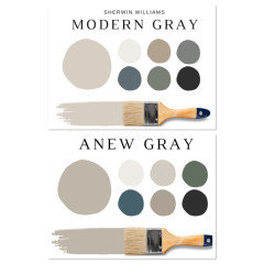
    Fall50 bummer…I really had hoped you picked Modern Gray it is a lighter more neutral gray. Was so hoping I took the guess work out for you seeing it on my home..I had many designers collaborate we me on the colors we used. Please post a photo we would love to see the final results and advise you on ways to compliment the new color.

  • last year

    Thanks everyone. I will take some pictures today. It’s better than what we had, as the factory finish failed and turned lime green. We rushed through the process as we didn’t want to have a lime green house all winter

  • PRO
    last year

    @Jennifer Hogan


    Unfortunately, I don't have the chunk of time necessary to unravel all the things that need unraveled here.


    The Color Literacy Project on YouTube is another reliable resource I recommend accurate color information on how color works. https://www.youtube.com/@colourliteracyproject/videos

  • last year

    @Lori Sawaya, I understand how color works. I am just not so arrogant to belive that what works best for me in one given situation is the only answer for everyone in every situation.


    The world according to Lori is not my world. My world is rich in diversity and innovation and creativity.


    I don't ask that you think like me. I don't think you can. I simply ask that you stop telling me and others that I am wrong simply because I am not doing things the same way you would do them.

    As my mother would say "Who died and left you boss?"


  • PRO
    last year
    last modified: last year

    Been doing design and picking paint colors for clients for a very long time..it has worked well for me😉 we all have our own way…I dont always follow the rules! such a rebel!

  • PRO
    last year

    @Jennifer Hogan


    Despite the fact that I know you will eventually attack me personally, I will continue to speak up when I know what you're telling people is incorrect.


    Because it's not okay to let them spend time and money they might not have trying to make something work that a I know for sure will not.

  • last year

    @ Lori Sawaya -


    All I have asked of you is that you stop attacking me or telling others that because I am not doing things according to your rules that what I am telling them is wrong.


    Your advice: "IMO Colonnade is the prettier, more neutral option."


    I provided information on the delta variance between the two colors (1.19) and explained what that meant

    • Delta E ≤ 1.0: The difference is not perceptible to the human eye
    • Delta E 1–2: The difference is perceptible through close observation


    I then provided this additional advice:

    When testing colors for the exterior it is a good idea to make large samples (I often use a 1/2 sheet of drywall) and look at the colors on all 4 sides of the house at different times of the day.


    My bet is that if you did the test without knowing the names and looked at the colors on different sides of the house and not next to each other you would not be able to pick a favorite, but look at them next to each other and see if you have a preference. If not - toss a coin."


    You attacked: "Do not use RGB Values "

    "@Jennifer Hogan You're wrong."


    The advice that I gave the OP was absolutely correct.


    The two colors are very similar, close enough that it really didn't matter which of the two they picked.


    RGB values are very similar,

    The display of those RGB values are very similar and

    the LCH values are very similar


    Easy RGB comes up with basically the same information:


    So why did you feel the need to attack me and the advice I provided?

    Just because the calculator I used for determining the delta variance uses RGB values as the baseline for the math? It is still math and still provided the right answer.

    Or is it just because it came from me?


    I don't respond to your advice to OPs. I don't tell people not to listen to you or not to use the information you provide, or tell them that you are wrong. I ignore you and provide the best advice I can to each OP I respond to.


    We only get into these diatribes when you attack the advice that I am providing.


    We can agree to disagree, but I can't just give you a pass when you attack the advice I provide simply because you want me to conform to your way of thinking.


  • PRO
    last year

    Lori and Jennifer please stop....it does not matter..have fun..head to a different post and help someone else instead of this petty bickering.