Software
Houzz Logo Print
shellygold53

Help with console decor

last year
last modified: last year
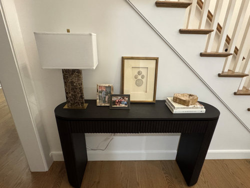
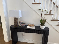
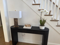
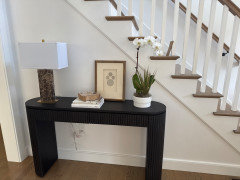
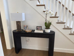
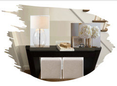
Put out decir on this console and need help. have marble lamp, stone frame and petrified wood bowl on books. too much? maybe a simpler lamp or one without stone?

Something just feels off

Comments (20)

  • last year

    Agree about removing the small photos. They create visual clutter, and personal items like that are better in a more private space. Also agree about nudging the lamp to the right a bit. Try placing books/tray next to it and moving the print to right side.

    shellygold53 thanked Caroline O
  • PRO
    last year

    The entirety of your home is your private space, so if you enjoy family photos then keep them out. While I like the items you’ve placed, I might have picked things that aren’t as blocky/chunky as the table they are on.

    shellygold53 thanked User
  • PRO
    last year

    "Put out decir" not sure what that means.

    I'd keep the lamp, the books and the photos. The larger framed print could go elsewhere. Family photos are just fine in one's home--it's happy and comforting to see them as you walk by. They just aren't great for staged photos, so if and when you decide to put your home on the market, or unless a professional photographer is coming to photograph your home for a magazine shoot, you should remove them. But for everyday living I think that silly "rule" on not having family photos is just that, silly.

    shellygold53 thanked Diana Bier Interiors, LLC
  • last year

    Is this console near the front door? Do you need a landing place for things like keys, to put your purse down while you take off boots etc? I would hang your pictures on the wall above the console and just leave the lamp and bowl on it. I would also tape up the lamp cord.

    shellygold53 thanked Expobaby
  • last year

    I feel it os very bare with just lamp and books with bowl. adding a ohoto with an orchid. maybe more balanced?


    Seems way to bare to me, no?


  • last year

    Filling the table just looks cluttered. Remove the orchid. Not sure the table is right for the space. It doesn't seem to match the style of the house

    shellygold53 thanked jck910
  • last year
    last modified: last year

    "Bare" is actually good on an entry table! A place for keys, bags, etc as Expobaby said. I agree with their suggestion to put the photos on the wall above the table, for more bare table space. Or put the larger print on the wall, photos on the table below. Bowl directly on the table, no books. The books are adding visual noise.

    No orchid. It's too tall. I would like to see the items follow the staircase in height. Having a tall item on the right popping up above the stair trim is jarring. Contrast with your first picture, where the items "stairstep" down in height. Try moving the small photos to the right side of the pring, and setting the bowl directly on the table, and see what you think.

    shellygold53 thanked mcarroll16
  • last year

    The table style looks a little heavy to me. Aside from that, I agree with Yvonne’s comments.

    Regarding the lamp cord showing, I use small Command hooks on the back or under the tables to secure the cord as much out of sight as possible.

    shellygold53 thanked chloebud
  • PRO
    last year

    The style of the console table itself looks out of place against your traditional stair.

    shellygold53 thanked Norwood Architects
  • last year

    Not sure what ”not matching style pf

    house” means. what would suit it better?

  • PRO
    last year
    last modified: last year

    A poorly designed table not proportioned right IMO the lamp way to clunky for the top just not a great look at all. Is this a must keep table or can it be returned ?I never like family photos on display where stangers can see them so a big no for that placement. Waht is the decor and style of the living room ? IMO the entry should depict a style that is the same .

  • last year

    I dont have strangers in my home only people that are excited to see photos. that being said, i think the photos feel like clutter there. a poorly designed table? what does that mean? the table is beautiful in my opinion or i wouldnt have gotten it. im asking for help with the decor ON the table.

  • PRO
    last year


    shellygold53 thanked lisedv
  • last year

    Three people so far, and I’ll make it 4, have suggested that the style of table isn‘t right for where you have it. They’re not saying it’s not an attractive table - just not there.

    shellygold53 thanked jinwpg
  • last year

    I like the table. I would try and find a new lamp

    shellygold53 thanked C Stone
  • last year

    ”the table is beautiful in my opinion…”

    That’s all that matters. Try moving the lamp to the right a bit and remove the two small frames.

    shellygold53 thanked chloebud
  • last year

    Try moving both the lamp and art to the right. Then overlap the books/bowl a bit with the art and see how that looks. Remove the photos and orchid. It is not too bare.

    shellygold53 thanked kcooz07
  • last year

    Lamp just seems too dark and clunky with the “heaviness” of the table, though. Use a simpler, lower profile tray if you need a tray for keys, etc. and get rid of the books.

    shellygold53 thanked chloe00s
  • last year

    Getting rid if the lamp for starters.