Software
Houzz Logo Print
webuser_428558135

kitchen touches

11 months ago
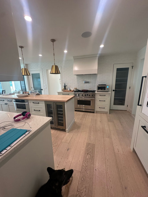
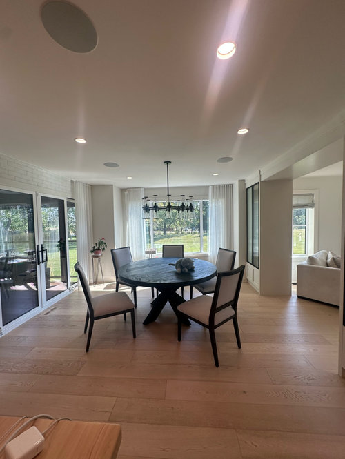
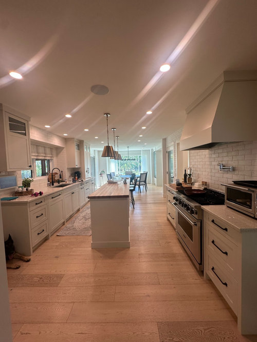
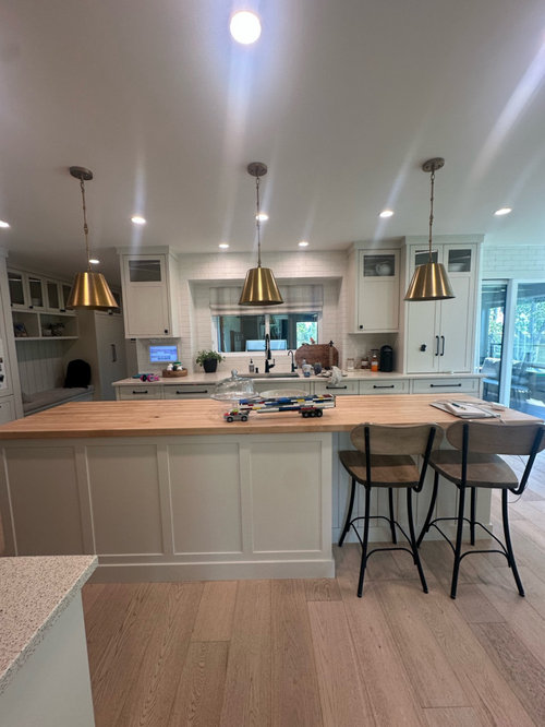
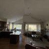
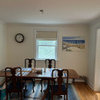
Our kitchen is beautiful and has some great features, like the white brick, but it feels stark overall. I also can’t figure out how to improve the lighting. The pot lights were here when we moved in We’re adding sconces on the side of the cooking range. Our ceilings are low at 8ft and I find the pot lights so stark. I’m thinking of adding new pendants that can brighten the space. I also hate our counter stools. Love our dining table but it needs some softness. Thoughts?

Comments (12)

  • 11 months ago
    last modified: 11 months ago

    You're lights aren't too bright, the color of the light is probably too cool-toned for you, based on you saying "stark".


    A lot of people confuse color temperature and brightness/amount of light. Kelvin is the measurement of the color temperature (how cool or warm the light appears), not the amount of light coming from the fixture -- that would be the lumens. You can light up a runway with 3000K lighting if the lumens are high enough, and conversely 4000K or higher bulbs can be dim because the lumens aren't high enough.


    Looks like you've got at least 4000K, but might be higher. I find 4000K much too blue for my liking, it's too harsh for me.


    This is an easy fix. I can't tell from the photos whether they're recessed housings + screw-in bulbs or integrated (bulbs integrated into the unit). If bulbs, simply replace with a lower K bulb. If integrated fixtures, pop out the fixture and see if you can change the K setting -- most newer units have this feature. If not, you might simply be able to replace with new integrated units, they not terribly expensive.


    FWIW, I have 3000K throughout my house, it's plenty bright when I need it to be and neigther overtly warm nor cool. Many also like 3500 K, which is a nice compromise between 4000K and 3000K.


    Also, put the overheads on dimmers, if they not already.

  • 11 months ago

    Thanks so much. I know I can change the kelvin if I pull them down. The electrician told me he put them at 2700 but they seem brighter. Then I second guessed the paint. There are a lot of dark spots. Am also looking for suggestions on decor, or paint or anything that can give it some life

  • 11 months ago

    I would be shocked if those are set at 2700K.... If they were your walls just under the fixtures above the sink would appear much yellower.

  • 11 months ago

    Agreed. I am going to pull them down and check.

  • 11 months ago
    last modified: 11 months ago

    You have a beautiful home!

    I like the shape of the pendants, Maybe you could spray paint them a matte black on the outside but leave the interior gold and leave the gold chain? Then do matte black sconces with gold interiors?

    Since it seems that the island splotches would need to painted again anyways, why not paint the island a warm color? Maybe paint the two doors the same as the island? Maybe add a wood strip to the bottom of the range hood? Then for sure add colorful rugs and other items.

    I did a mockup with a green island and the two glass doors, but you could do what ever color your like.


  • 11 months ago
    last modified: 11 months ago

    The correct green island will work well w the brass pendants. anything from an olive khaki to medium warm sage or greenish teal. bring home some paint cards . then a large rug w pattern and colors under table.. dimmers are all over my house…your kitchen needs that upgrade and not much else

  • 11 months ago
    last modified: 11 months ago

    Lighting is certainly a culprit here. Wafer can lights of this type produce quite a bit of glare, and with so many I'd dim them down a LOT. (Grr to whoever installed lines of runway lights in your ceiling.) They also point light straight down which brings a harsh feeling. Interrogation room, anyone?

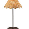
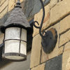
    I'm a huge advocate for light fixtures with white glass shades that either hang down a bit (semi-flush; pendants) or are wall sconces - the soft glow they spread around has a massively different quality than top-down directional lighting. Anywhere you can squeeze in a lamp (again with a white shade) is going to bring good vibes too.

    Your brass pendants are gorgeous, I love them, but they aren't helping the lighting issue as all the light is pointed straight down, none glowing out from the sides. When you add range sconces, choose ones that are white-glass-shaded, and consider swapping your island pendants for similar.

    Cabinet knobs in brass or nickel will be softer than the harsh black you currently have. I wouldn't add more black, that's for sure.

    After that, textiles and natural materials & items add softness, especially ones with texture. Quick wins would be gathered fabric panels on little sash rods ($6 at walmart) inside both glass pantry doors, a few more colorful rugs, pattern on your dining curtains - it can be tonal/subtle if you're afraid of color and pattern - and art & plants. You have blank walls for art, and you have windows for plants (up on stands is good when you need height). Both add a lot of life and homeyness.


  • 11 months ago

    I would add an area rug under your dining table to add some softness.

  • 11 months ago

    This is all extremely helpful. It was an interior designer that put in all those lights! It blows my mind. It does feel like an interogation room.

  • 11 months ago

    I’d love to replace the hardware from black. Could I do Nickle hardware with brass in the lighting through?

  • 11 months ago

    Could these pendants work above the island?

  • 11 months ago
    last modified: 11 months ago

    Absolutely you can do 2 metals in the room, and nickel and brass look very good together since nickel has a faint warm tone compared to other silver metals. Don't get those pendants unless they also come in white (sometimes called opal glass). The lightbulb will stab you in the eye when it's on - check this forum for lots of people complaining about this problem with clear-ish glass pendants. You really need a solid white shade. But I love the shape, the curves and ribbing add softness and are just pretty.