Software
Houzz Logo Print
sal369

kitchen renovation gone awry

11 months ago
We’re on the tail end of a major remodel and I’ve hit a wall. For context, we added square footage to our kitchen and started from scratch with everything: new cabinets, counters, paint, the works. I worked with a designer throughout the process and felt confident in my selections, until the cabinets arrived.

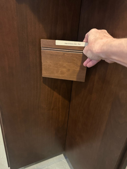
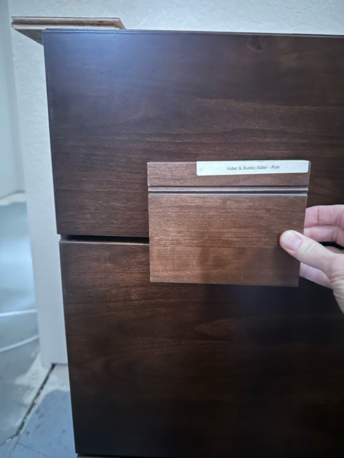
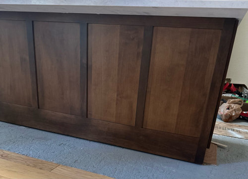
I ordered Starmark alder cabinets in the Rye stain, but when they showed up they looked darker than the sample I had chosen from. I’ve attached a photo where you can see the sample against the installed cabinets, plus the back of the island where there are clearly two different tones. The lighter shade is what I expected; the darker is what I actually got.

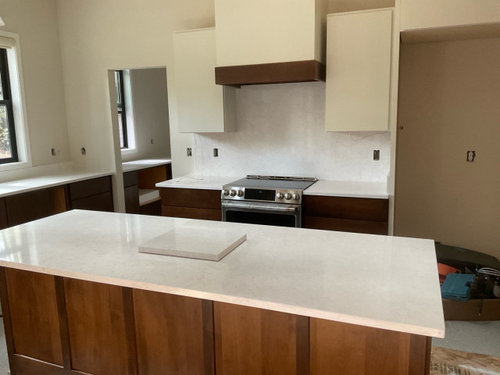
I contacted the seller, who sent the photos to Starmark. Their quality specialists reviewed them and said the cabinets are “within specifications.” By then, my counters (Cambria Seacourt, used on both counters + backsplash) were already ordered, so I moved forward.

The counters just went in last week and honestly, I’m struggling. The cabinet/counter combo feels off to me, and the uppers don’t seem to work with the backsplash either. If the lowers had come in closer to the lighter tone I expected, I think it would feel totally different. Also, the floors will be natural hickory and are not in yet.

I’ll be talking with my designer this week, but right now I’m lacking confidence and just need some outside perspective. Is there hope to salvage this, and if so, what would you do to pull it together? Thanks for any and all help!

Comments (9)

  • 11 months ago
    last modified: 11 months ago

    You could even out the difference between the island back and perimeter w a finishing person locally i think. thats the thing that jumped out. So scuff it up..use gel stain but let someone do it who can judge the tone ......align the island backside with the perimeter . that would suffice for me. They came in darker yes but you have a lot of light surfaces to balance everything out. the darker might actually be better w natural hickory once that comes in.


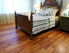
    hickory flooring w darker wood furnishing.


    Antique Hickory Hardwood Flooring · More Info


    Shelly Larson thanked herbflavor
  • PRO
    11 months ago
    last modified: 11 months ago

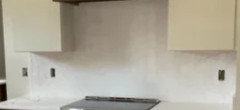
    Just looking at your images -- and it's really difficult to capture how things look in person, it seems like the uppers and wall color do not work with the countertop.

    From here, the lowers look fine.

    And you really need some more room between the hood and flanking uppers.

    Shelly Larson thanked PPF.
  • 11 months ago

    That's a good point about the hood and the uppers. Originally there wasn't supposed to be any space in between, but the wood band around the hood made that impossible.

  • 11 months ago
    last modified: 11 months ago

    “Within specifications” . That is BS for we gave you the wrong stain but aren't going to admit it. This is on the sellers to make it right for you. I would not have accepted this order. I would have made them take it back and reorder. BUT, since you have already accepted them, installed, and added countertops, you might not have any recourse.

    However, I don't think the lighter lowers would have made a difference with the discord between your upper color and backsplash. They just are not a good combo and I'm a bit shocked that a designer put those together. Just look at them without the lowers:


    Once hardware is installed and all of your counter items in place, your lowers and counters will look fine. But I'd for sure take down the splash and start a new with it. Others here will have better suggestions than I have.

    While the two tone panels on the back of the island are obvious in your close up, they are not as bad in your other pic. And I think counter stools will hide them.


    Sorry you are going through this. It is a lot of heartache to spend this much money and time planning and be left in this situation.

    Shelly Larson thanked Kendrah
  • PRO
    11 months ago

    Hi, Shelly,

    If the sample is labelled correctly, your base cabinets are alder. Alder is notorious for problems staining uniformly. You can see the color variation in the panels on the island and even on the bottom rail from your photos. Your designer and dealer should both know this, and should have warned you. I suspect there's some fine print in the cabinet manufacturer's contract regarding acceptable color variation from the sample provided and/or approved. That said, they should work in combination with hickory floors for a "rustic" look.

    Shelly Larson thanked Charles Ross Homes
  • PRO
    11 months ago

    Wood comes from different trees. Each piece of tree even on the same tree will have different characteristics and absorption rate for stain. That's what alder does. You're very very lucky that it's not blotchy as all get out. It looks pretty decent for alder, and they did use a toner coat to even it out, or it would have been a much starker difference. Also, the flat veneers stain differently than the solid stiles and rails. The center veneer panels are the closest to the sample piece.


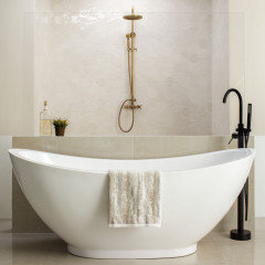
    The issue with the ktichen isn't the cabinets. At all. Lighter toned cabinets would not "fix" what is wrong here. It's a mix of cool and warm whites that aren't playing nice together. You can bridge that by choosing a multi toned tile that has both cool and warm variances in it. Try something like Daltile Mesmerist in the Spirit color. It has color variation within each tile, and from tile to tile both. The base is a warm white, with a bit of a cool white subtle swirl in it. There are multiple shapes, including 2 sizes of subway and an arabesque, as well as the hex shown. See how it works with the cool white tub, and the warmer white floor here?


    Shelly Larson thanked Minardi
  • 11 months ago

    Everything looks great, and once you have your lighting in (or on) your uppers will look better. It is not uncommon for people to feel let down at this stage of the process. Things may not look exactly as you had imagined but keep in mind:

    Wood changes constantly. Alder gets darker with exposure to UV light, so your lighter tones in the island will mellow in to the shade of the perimeter cabinets eventually. It will all look more cohesive over time.

    You’re not done yet! You will fill that space with a lot of other items, each with a finish of some sort that can meld your choices into a thoughtfully curated space. That’s why you have a designer.

    Just hang in there. Look at your inspiration images and remember why you chose what you did. It’ll be lovely when you are truly done.

    Shelly Larson thanked eam44
  • 11 months ago

    Thank you all so much, this is exactly what I needed to hear! I realize now I was so focused on the one thing I knew wasn’t right that I wasn’t seeing the bigger picture. The rest of the uppers haven’t been installed yet, so I really appreciate the ideas for making everything feel more cohesive. I’m going to give it a little more time and also see what our designer suggests. If I do decide to paint the uppers a different color, do you have any favorite go-to options?

Sponsored
Custom Home Works
Average rating: 4.6 out of 5 stars10 Reviews
Franklin County's Award-Winning Design, Build and Remodeling Expert