Software
Houzz Logo Print
plumbr1

1970s Living Room Design Help

9 months ago
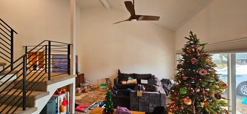
Hello! Thank you in advance for ideas and advice!


We moved into our home four years ago. It's and early 1970s builder grade home and before we moved in, we did a massive renovation of the entire house, mostly replacing the dated/broken materials. When we moved in, we were very into minimalist design, and in a rush to make the space livable, so we chose a white paint for the entire interior and trim. The exterior is also all white, though our windows are original with black trim, and our front door is orange in my small attempt at a nod to the mid-century style - we'd like our interior to not clash with the exterior.


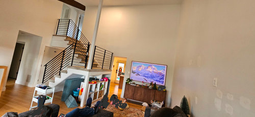
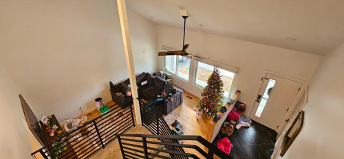
We're having a very hard time designing the living room. It has a half vaulted ceiling, and multiple doorways/entrances including a front door that is raised and separated by a half wall. We're hoping for help with ideas about how to our living room. We'd like a nod to the 1970s without it feeling like a time capsule, and are hoping to make the space feel less cavernous. We're open to many ideas, including paneling, wallpaper, paint, etc - but are trying to create a space that doesn't cater too much to current trends and can be flexible in terms of eventually having different furniture and rugs to grow/change with our family.


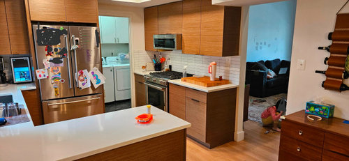
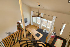
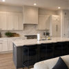
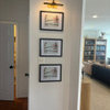
I've attached pictures of the living room from multiple angles. as well as our kitchen to avoid clashing with that space. Please excuse the mess, we're in the middle of decorating for the season and just can't be bothered to tidy for this photo opp.


Comments (21)

  • 9 months ago
    last modified: 9 months ago

    it definitely a caverness living room. You have good natural light, so going dark would work.

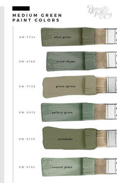
    I would choose a shade of green to compliment the flooring. these would be on my to sample list.


    I would mount the TV on the pony wall below the front door landing and position the sectional opposite along the long wall. It depends on your own color interests, but the orange front door sounds fun, and a nice color to include inside, and compliment a green wall color.

    I do like the black railings for a modern twist. Some oversize canvas art www.greatbigcanvas.com would help fill the space, rather than a lot of small pieces that will be overwhelmed.

    I can't make out the rug colors, but positioning the rug under the sectional to anchor and define the seating area.

    the kitchen looks great. I would screw thin sheets of steel (you can find at any home improvement store) on the inside of a couple of cabinets and use magnets to post kid art and memos rather than on the frig. Too much visual stimulation clutters any space. minimize what you can.

    https://www.greatbigcanvas.com/view/arpeggio-ii,2393836/?ref=also-in-set-image

  • 9 months ago
    last modified: 9 months ago

    We actually just moved it away from the layout you have @BeverlyFLADeziner - we had a large console/shelving unit surrounding our TV. The kithen is eat-in, so we used that dining area as a play area for our kids! It makes sense on paper, but in person the space was very cramped (the room is cavernous but doesn't have a large footprint). We're really happy with the current layout, our goal is just to use design elements to make the space more cozy and less empty feeling.

    @Lyn Nielson those are along the lines of the paint colors we have in our dining area, so that could tie the spaces together well

    Thank you both for your advice and time!

  • PRO
    9 months ago
    last modified: 9 months ago

    Sorry but the 70s had few design elements thatt need respect IMO I do love MCM but I would love to see the LR minus all the clutter . I guess cavernous in the volume of the space but certainly not in floor space . IMO no kids toys on display in a LR if you must then nice low wide storage to house all that kid clutter and give you a good spot to hang the TV above and eliminate all the toys from under thastairs Not sure how old the kids are but just no reason to have every toy out all the time . The sectional is too big for the space the tree needs to have a space for this short time Just so much wasted space for no reason . Try putting the TV and storage on that long wall then a sofa at one end TV direstly across forn thesofa and then 2 chairs facing the window The tree behind those chairs in that space where you have the TV now . The kitchen is a bit poorly layed out too but one step at a time . For me I wouldbe seriously thinking of changing that staircase but I have no fto scale floor plan so not sure about space . I just hate seeing huge wasted spaces .Is this also the oly space for TV in the whole house ???/

  • 9 months ago

    Measurements would be very helpful.

    Do you need a dining table near the kitchen?

    How many people watching TV at the same time?

    Do you need a floor play area for children? Approximate ages?

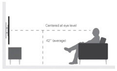
    For cosiness, keep the focus on the lower part of the room with wall art. Don't decorate above eye level. Larger pieces, not groups of small things. No mirrors.

    Add softness and reduce noise with substantial ceiling height fabric drapes that extend much wider than the windows themselves. Larger rugs.

    My decorator recommended art first, then rugs and upholstered furniture, then drapes. Paint last.

  • 9 months ago

    Painting those tall walls will be a major expense. I would try to avoid it and add colour with other items. What colours do you like? Green is a great accent with wood to es and very MCM.

    Perfecting the 60-30-10 Rule in Your Living Space https://share.google/NVHAwwfQgd4FMauIy

  • PRO
    9 months ago

    Sorry the current arrangement doesn't complement the architecture It doesn't showcase the remodeled room to its best advantage.

  • 9 months ago
  • 9 months ago
    last modified: 9 months ago

    Please show the 4th wall by the front door where you have a mirror.


    There's nothing MCM or minimalist about your home or the choice you made to have a massive sofa "island." Just accept the space and furnishings you do have. You don't need to paint. Save your budget for some storage systems. You could add some drapes the same color as the current walls to add softness to the space.


    Entryway:


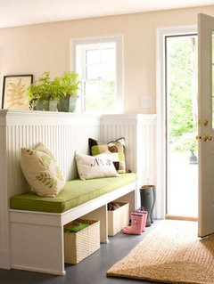
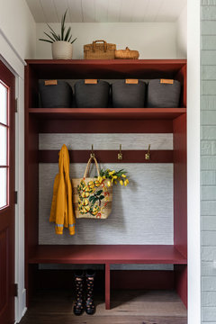
    --While pony/half walls aren't ideal, take advantage of the one you have to corral the kids'backpacks, shoes, coats, etc. Then train your family to keep their stuff organized right at the door. These setups are easy to build and you already have the wall.


    Is there a closet nearby? Then train everyone to hang their coats on hooks in there instead of rods This was once a closet.

    Phoenix Rising in Chicago · More Info


    --Add a colorful indoor-outdoor runner at the entryway to define the space. Cozy and clutter are opposites.


    Living room:

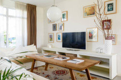
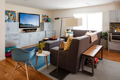
    --Turn your massive sofa "island" around and place the TV on a long, low built-in. Place the back of the sofa island against or a few feet in front of the other side of the pony wall. This will minimize the full view of the dark, massive sofa.

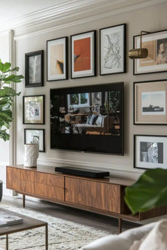
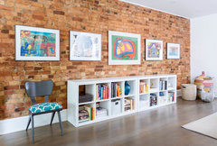
    Next year, put the Christmas tree in the corner by the window. If you need color and interest in the room, get a few large, framed art works for the new TV wall. Notice below, though, all the smaller pieces are framed the same way so the gallery wall doesn't look cluttered.


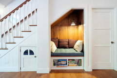
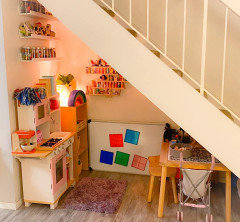
    --We don't know how old your kids are. At some point, create a reading nook under the stairs as they get older.

    Парижский шик · More Info


    Canyon Oak · More Info


  • 9 months ago

    Only you know how a reorientation to the far wall feels on the ground since you did it. So be it. This is what your current layout looks like to us: a giant black playpen-like sofa--in the middle of the space, a Christmas tree no one can look at while sitting on the sofa, a huge blank wall. How can that orientation possibly become cozy? Adding doodads like panelling or repainting are not going to fix the fact that walking into the space from stairs and entryway (which you haven't shown) means facing a huge black square and chopped up play space that all blend together when what you need are two zones.


    If you went back to putting the TV on an art wall with sofa backed up to pony wall, two armchairs facing sofa with nice rug and coffee table, you'd only see half the sofa and you'd have a cozy conversational grouping. Where you now have TV could be a low bookcase with baskets for the kids,. You could put a kid's table, a couple of beanbag chairs, an easel, under the stairs The play space would be to the left of the "adult" conversational grouping--two zones.


    Industrial Chic Basement · More Info


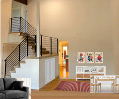
    Kids' wall where you now have TV and console. (Can console go in entryway?)

    Hillcrest Residence · More Info


    Under the stairs mini-playroom:


  • PRO
    9 months ago
    last modified: 9 months ago

    I don't have dimensions of the room nor sectional but have you ever tried this layout?


    I suggest to close-off the area under the stairs with double doors at the front for kids to access.


  • 9 months ago
    last modified: 9 months ago

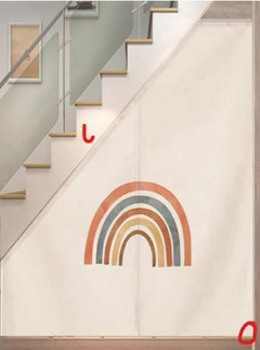
    I would cover the under-stair space on both sides with fabric curtains. Put the storage inside. It would be more fun to play in (because it's tent-like) and look better from the outside when closed.

    Here's an example for the angled section. I'd add a ring on the corner and a hook on the staircase, so it can be tied back.

    On the other side's rectangular opening, I'd just use white ring clips on a white curtain rod, so the fabric can be pulled to the side.


    Lots more ideas in this link .

  • 9 months ago

    lisedv: Your suggested layout is exactly what I pictured--adult, conversational, TV watching zone with sofa against pony wall and therefore not such a huge eyesore and the left side for a well organized play area. OP, though, said she tried it but not with all the suggestions others have made--drapes, low TV shelf, armchairs, rug anchoring "grown-up" side, etc. Beverly suggested similarly. OP doesn't seem very open to our suggestions.

  • 9 months ago

    as others have said - I’d leave the walls alone and focus on furniture layout and storage

  • 9 months ago

    @partim Thank you for your suggestions and links, I've been going through them and have some really good ideas of how to move forward. We're planning to add in a simple closet under the stairs for our storage, but our kids will love those fabric coverings in the meantime. We're excited to put some of those ideas to use!

  • 9 months ago

    Glad you're finding some useful advice. If I was a child, I'd find that under-stair area the best part of the house for imaginative play.

    I forgot to mention previously that I see the space is actually 2 spaces separated by a wall. If you could connect the 2 spaces, that would be even better. The kitchen-side space looks smaller and quite dark now. Obviously you can't remove the structural uprights of the wall between the spaces or the staircase would fail (!), but I suggest you remove just the drywall between the 2 spaces. Leave the structural uprights and simply paint them the wall colour.

    Then the kitchen-side space would be brighter, and the children could reach it from inside. Depending on the location of the uprights it might be easy to move between the spaces. Or you could put deep boxes or shelves in there for toy storage, easily reachable from inside.

  • 9 months ago

    Are those staircases kid-safe? Those railings look tempting for a child to climb and fall over. Vertical bars would be safer.

  • 9 months ago

    @lisedv We just moved away from the layout you suggested (maybe you can see the holes in the wall that are patching the former console/shelving unit)! It worked really well for the first four years we were in the house, and we like the current set up better for our family now - lots more open space for bigger kids to run around in the common area, and we just moved their cube storage up to their playroom area for some privacy. I do really like the curtain set up you have and the closet/storage under the stairs for our future plans. I'm going to try to update as we make changes, but we're a DIY family and won't be moving super fast during this season of life


    @partim removing that wall was on my wish list when we did our big renovation before move in, but it wasn't (and still isn't) in our budget because of plumbing and HVAC in the wall - so sad for me. I wish I could cut a sky light through the second floor so our kitchen isn't as dark! At least it faces east so we get really beautiful morning sunlight

  • 9 months ago

    If you could please get all that kid clutter off the photos, that would be great!

  • 9 months ago

    If you could clean up that kid clutter next time. that would be great.

  • 9 months ago

    I guess I'm looking at with a grandmother's eyes because I smiled when I saw the children playing with their toys while the house is being decorated for the holidays.

    As always on the internet, YMMV.

    However, on other posts, I do wish that people put down the toilet seat before taking pictures of their bathroom, and pull up the bedspread to cover the sheets when showing their bedroom.

    plumbr1 thanked partim