Software
Houzz Logo Print
vic_hig

WOW to this wallpaper!!!

11 months ago

Ohhhhh BOY! I’ve been waiting for 2 months for this paper to go up! I am gulping and jumping with fear and excitement! Am I making a mistake?!?

Comments (43)

  • 11 months ago

    It will be fabulous - please share pics! i have that pattern in the pink colorway on some throw pillows and love it


    I am having a big install of Schumacher’s Queen of Spain next month so i totally understand the nerves 😅

  • 11 months ago

    It's gorgeous paper, will this be your dining room?

  • PRO
    11 months ago

    The wallpaper is quite something! Hopefully, it won't overpower the room. Would appreciate if you posted photos after it is up.

  • 11 months ago
    last modified: 11 months ago

    The design is very specific style wise and if you know it will suit/enhance your decor and you love it, then it wouldn’t be a mistake. It’s normal to be nervous. Looks like you are only applying on that wall and wonder if it would be appreciated on wall that is not broken up/if there is enough. Thought this article might be helpful as well.


    https://rabbitandmustard.com/chinoiserie-wallpaper/

  • PRO
    11 months ago
    last modified: 11 months ago

    PLease post it when the room is done. It is quite a statement but I am curious to see the space. Quite aleap of faith in a still under construction space , I find wallpaper is really love or not thing and only you will know if you love it I do wish it had been palnned for a wall with no doors or windows but only you know this choice .

  • 11 months ago
    last modified: 11 months ago

    I have that pattern in the aquamarine colorway in my guest bedroom. I used it for drapes and pillows. I somewhat regret using it for the drapes because you lose the pattern and the drapes appear much darker compared to when the fabric is laid flat.

    I also have some pillows in the mocha colorway in my media/TV room!

  • 11 months ago
    last modified: 11 months ago

    I like this sort of thing when it is used with other things that stand up to it, rather than it being the only intense thing in a neutral room.

    I hope you use some boldly colored upholstery with it.

    I like all-overs, too, but they are done in more "contained" rooms, usually.


    Arbre de Matisse


    Les touches


    This use of Queen of Spain-- to me, falls a little flat because the chairs are beige. They are too neutral for the paper. Neither white enough, nor bold enough in some other way, to stand up to the paper.


    Here is Queen of Spain with a table I have in storage, from 1975. This is the sort of thing where both things hold their own, in my opinion.


    This is not Diana Vreeland's "Garden in Hell" by Billy Baldwin, but it is a very direct homage to it. And it might be better because there is no white as in the original. This is too much for me, but I appreciate the concept.


  • 11 months ago
    last modified: 11 months ago

    Hopefully the red room is in a cold climate! I test drove an SUV with red leather upholstery in 95F sunny & hot weather. When we got into the SUV I think I got an idea of what hell would feel like!

  • 11 months ago

    The original room was in Manhattan, I don't know about the copy, but the overall vibe seems very Northeast, MidAtlantic to me

  • 11 months ago

    “Am I making a mistake?” Only you can answer that. I agree with Patricia in that I think wallpaper is a love it not thing. I’m more of a grasscloth person when it comes to wallpaper, if at all, so I’m no help :)

  • 11 months ago

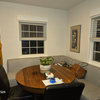
    This is very messily and roughly what you will have: a little over 6 drops. (this is 7 drops because of the photo) with two doorways, and a little triangle missing at the upper right:

    It won't look so "sectioned" in real life.


  • 11 months ago
    last modified: 11 months ago

    Sorry to say…not a fan on that wall as its impact might be diminished. If you can get the same batch number, consider getting more (if needed) and add to the focal wall where it can be the star.


  • 11 months ago

    It will be splendid.

  • 11 months ago

    I tend to agree with Pal, that with a bold/colorful wallpaper you usually want to repeat that boldness in the rest of the room. With this room they went all out, but not everyone could handle this much color and/or pattern.

    Bellaire 2- Mahjong Room · More Info


  • 11 months ago

    Going through my ideabooks and found this.

    Chiang Mai Dragon in aquamarine colorway wallpaper ...

    Living rooms · More Info


    I am glad you posted and I looked up this photo, because the solution to my not loving the Chiang Mai Dragon drapes, might be to add the same wallpaper on that window wall, so you can actually see the pattern. That idea had not occurred to me before, so I'll definitely look into it! My walls are going to be painted a similar blue/aqua to the drapes in this photo, so having the one wall be all pattern (drapes and wallpaper) might work out.

  • 11 months ago

    @la_la Girl - Please make a post when you put up your Queen of Spain in the sky colorway. I think that it is such a pretty wallpaper!

  • 11 months ago

    Chang Mai Dragon drapery. The sofa matches the background, but I would prefer to see it in a color (and I'd rather the black paint be something else, since there is no actual true black in the fabric.


  • PRO
    11 months ago

    Oh I think it will look great! I had a customer do a bold wallpaper in part of her kitchen. I was skeptical but it turned out so good!


  • 11 months ago
    last modified: 11 months ago

    I think the only mistake would be if you use it as a strong accent moment in an otherwise tame room. You have to really up the ante with the rest of the wall colors and textiles in the room, otherwise it looks like you were too timid to commit and it comes off as just an isolated, tepid accent.

    May I ask why you are not choosing to do the entire room? Is it a cost issue or did you think it would look like too much?

    What color are you painting the triangle above, the other walls, and the ceiling?


    I'd much rather see this paper covering an entire, smaller room than used on one wall in a larger room.


    Here are other pics of intense Schumacher papers where you can see that using it in the whole room is truly the appropriate choice.


  • 11 months ago

    Pal, the last one you posted, with the drapes, is in the Mocha colorway. I have throw pillows in that one! Good for an accent piece, but that mocha background color is too drab for drapes or wallpaper!

    These pillows used to be on a red/coral colored sectional in my previous house. I got this reclining sofa and the rug for the media room and then realized that my "old" pillows would work in there. The pillows were expensive, so I was glad I was able to reuse them.


  • 11 months ago

    Hi all! Appreciate everyone’s input. Truly.

    The room is a very odd trapezoid in shape from left to right the room is wider to smaller. There is a slider at the narrowest wall to the right

    I plan on putting in wallpaper on the one wall and see how the colors look in the room and decide about colors. That weird alcove above is on both sides of the awkward room. And once we bring in furniture and clean things out we’ll decide about next steps

    This installation is a bit of an homage to my last house’s dining room and its paper (attached photo - the other walls in that room you’ll see had wainscoting and a perfect steel blue on the ceiling and an ochre gold color on the walls. And I loved the “dragon” like scales on the pedant lighting in the middle The room was intimate and great feeling

    So. I’ll do the one wall with the paper, have two sconces that are linear vertically, a large mirror in between that is sentimental (the mirror in the pic of rhe old dining room)

    I

  • 11 months ago

    I love your style. You know what you’re doing.

  • 11 months ago

    I really like the black ceiling in your former home. It could be a smart color for the alcoves in this room. It would make them seem endless and curious.

  • 11 months ago
    last modified: 11 months ago

    @Vic Hig,

    Maybe look at some of the complementary fabrics from Schumacher/Celery Kemble, like the Betwix pattern that has many of the Chaing Mai Dragon colors.

    Could work on your dining chair seats. Comes in 10 colorways,

    https://schumacher.com/catalog/products/65687?source=PDP&pdp_origin=VARIATION&tab_id=99e9ee96-fe3-4e3-9e3-6edc

    I have the Spark/Ivory colorway with my aquamarine Chiang mai dragon fabric.

    Lumbar pillows on the loveseat in my guest bedroom.


  • 11 months ago
    last modified: 11 months ago

    I hope you are placing your sentimental mirror in the vertical/portrait orientation in the new room ...

    Easy enough to re-wire and I've done it myself with a kit from the hardware store.

  • 11 months ago
    last modified: 10 months ago

    Love anything Schumacher. It is one of the classiest wallpaper/fabric houses.

    You have to incorporate that paper into the rest of the room...no, you have to incorporate the rest of the room to work with the paper.

    I see (and I have one) an antique Chinese Wedding Cabinet, and it will compliment the paper.


    My daughter was stationed in Japan for several years and she shipped home gorgeous pieces she purchased at Shrine sales, or on her trips to China, Vietnam, Thailand, Korea.

    All looks great with sisal rugs and casual linen covered furniture.

    You have to share the wall papered room (on this post).

  • 11 months ago

    Could you just close off those alcoves? That would be a huge help. I convinced a client to close off some similar alcove/dead spaces in her house and it made a world of difference.

  • 11 months ago
    last modified: 11 months ago

    Looks like they added some beams, so they might not be willing to close it off now ...

    Agree that it would have made sense to simplify the lines and close it off.

    I think people are always afraid to close off or lose space.


  • 11 months ago

    Hi all! Appreciate everyone’s input. Truly.

    The room is a very odd trapezoid in shape from left to right the room is wider to smaller. There is a slider at the narrowest wall to the right

    I plan on putting in wallpaper on the one wall and see how the colors look in the room and decide about colors. That weird alcove above is on both sides of rhe awkward room

    This installation is a bit of an homage to my last house’s dining room paper (attached photo - the other walls in that room you’ll see had wainscoting and a perfect steel blue on the ceiling and an ochre gold color on the walls. The room was intimate and great feeling

    So. I’ll do the one wall, have two sconces that are linear vertically, a large mirror in between that is sentimental (the mirror in the pic of rhe old dining room)

    Iclosing it off was not an option without making the trapezoid room vereeerrey odd

  • 11 months ago
    last modified: 11 months ago

    I tried closing the upper bit as best as possible, and putting the ground color of the paper on all the walls. I am not sure how bringing the wall straight up to the ceiling could make the space more odd?

    In any case if it's in the budget I would do the whole room, recesses included if they can't be closed off, and I might even do matching drapes on the slider for eating in the room at night.


  • PRO
    11 months ago

    I think it is an interesting space I could see some fab Japanese pottery up there lit up or some great brass jugs and pots .

  • PRO
    11 months ago

    No mistake--it's a fabulous pattern and if you love it then do it! I agree that Schumacher is my most favorite source for wallpaper and fabric. And their customer service is top notch.

    I just had curtains made in a very highly patterned and colored Schumacher fabric (Bermuda Blossoms in cocoa) that I had been eyeing for a long time. So glad I didn't wimp out--go bold or go home!

  • 11 months ago

    It will be gorgeous. Can hardly wait to see it!

  • 11 months ago

    My mother made some curtains out of Schumacher fabric. Probably in the 70s, but possibly in the 60s or 80s. I now have them in my house. The fabric doesn't fade in the sun.

  • 11 months ago

    I have several panels of Schumacher, Lee Joffa and Mulberry drapes that I had made for my previous house, but they do not work in the new house as my ceilings are much taller. I have room to store them till I find someone that can appreciate them and use them! My kids are still young-ish in rental apartments, so it might be a few more years!

  • 11 months ago

    You could look at these wallpaper options: https://inspiredrealms.com/1960s-wallpaper-making-a-comeback/

  • 11 months ago

    Since you love it , absolutely do it. That has always worked for me. A few of my friends dislike my house, art & furniture. Ceilings too low, too modern, sofas not comfortable , too much glass (especially the front doors, ”what if someone comes to your front door & you’re sitting around in your underwear?!? ” ). well, for starters I don’t make it a habit of sitting around dressed like that, but I like my MCM even if it’s not everyone’s cup of tea.

  • PRO
    11 months ago

    I feel the same way as you do, K Laurence. My home is Colonial Americana/English Country, which is not on trend at present. Ask me if I care!

  • PRO
    11 months ago

    I like someone not afraid to do something they love so no do not close up that wall and have ablast using that wallpwer to give you permission to do amazing out of the box things

  • 11 months ago
    last modified: 11 months ago

    I'm curious why you have fear in this instance when you have used a bold paper in your former dining room. Is there something else about this set up that makes you a bit nervous to use this paper? Or something about your last use of bold paper that felt like a fail?

  • PRO
    11 months ago

    I think that because the OP has been waiting so long for this paper she/he is anxious. But that's normal--it's always a leap of faith to do something bold. It's easier to be blah and neutral because you're afraid. But then you regret it. So as I said previously, GO FOR IT!!!!

  • 11 months ago
    last modified: 11 months ago

    ^ agree Shumacher paper is an investment so nerves are totally normal - i can’t wait to see it installed 😍

    your home sounds fabulous @klawrence (i have a knocked back lavender for my dining room walls that I still love 15 years later)

Sponsored
Mary Shipley Interiors
Average rating: 4.8 out of 5 stars34 Reviews
Columbus OH Premier Interior Designer 10x Best of Houzz