Software
Houzz Logo Print
kendrahhendra

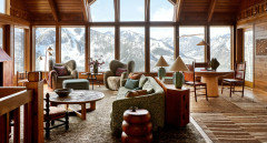
Do you like this Aspen cabin redesign?

9 months ago
last modified: 9 months ago
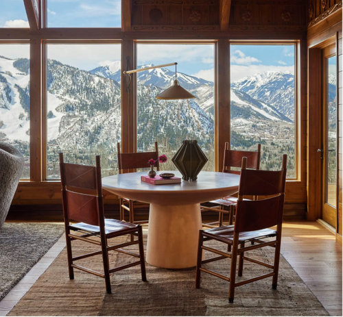
Just looking at the feature house tour on AD. I'm sure it was quite expensive design work, but man it leave me feeling so flat. What do you think of it?

https://www.architecturaldigest.com/story/frances-merrill-reath-design-aspen-ski-house


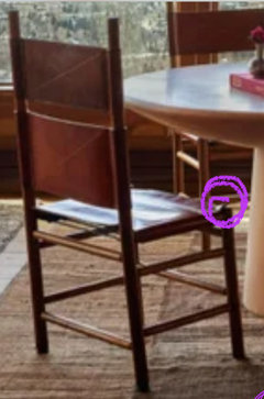
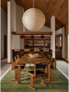
The chairs look so uncomfortable and like they are awaiting the next death penalty victim.


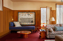
The floor looks like old indoor outdoor carpeting and the blue chaise looks like an after thought made of pallets.


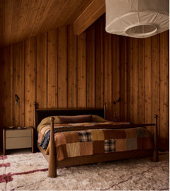
The bedroom is a near success. Feels like the looked at a lot of Heidi Callier, tried to immitate but didn't quite end up nailing it.


Comments (28)

  • 9 months ago

    I L O V E Aspen Colorado! Look at that view! The furniture has a LOT of personality. It feels warm, the wood is warm. The fluffy fabric on the designer chairs is warm. If I was SUPER rich I'd live in Aspen "AND" get a season pass to the slopes. It's a BEAUTIFUL town. I've visited and stayed awhile many times. I was just there in late September to camera-shoot the aspen trees and go 4-wheeling. Paradise!

  • 9 months ago

    left you flat is very generous.


    I'm sneering, on so many levels with so many choices, aesthetically and functionally

    Kendrah thanked mtnrdredux_gw
  • 9 months ago

    Agree, do not really care for most of the furniture/design choices here. Stunning view.

    Kendrah thanked jill302
  • 9 months ago

    I went throigh all the photos on the AD site and can say that nothing about or in that hoise appeals to me. Nothing— and that’s unusual. It looks like a committee of people designed it who didn’t know what each other was doing.. one person in charge of hard finishes of flooring, tile, counters, etc., and one over soft furnishings, one selecting wall colors and cladding, another case goods, another art and someone randomly selecting accessories. And the common theme is “ennui drab.” I’m not even sure how you can make yourself screw up a house like that?

    Kendrah thanked Kswl
  • 9 months ago

    Yes, that one get me to Jilly. It looks like leftovers from relatives. Functionally and aesthetically a big NO.


  • 9 months ago
    last modified: 9 months ago
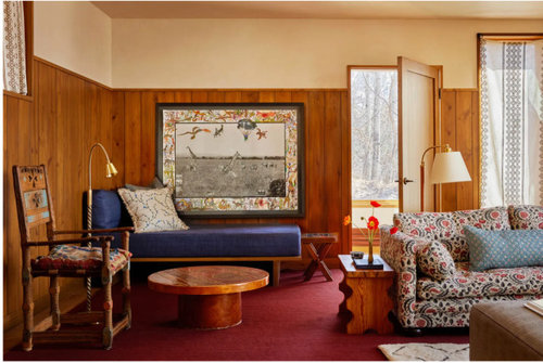
    Speaking of big, what's with the way, way over-sized chair/throne in the crock-pot room? Or is all the other furniture diminutive in comparison?


  • 9 months ago

    As for the chairs, is there a name for this, where the legs are not covered by the seat, but can protrude into one's flesh when you sit down? I always assume this style was easier to make and cheap?


  • 9 months ago

    I love the moniker crock pot room!

  • 9 months ago

    The view from that table looks like a trail map

  • 9 months ago

    Jilly, the church/crockpot comments are spot on!


    I looked at her website (LINK), clicked on four jobs. I wasn't impressed with any of them. She tries to be edgy but falls short? Let's just hope the homeowners liked the finished looks.

  • 9 months ago

    It looks like leftovers from relatives

    I think that is kind of the point. Most people I knew who had summer "camps" as they were called where I grew up didn't particularly "decorate" them in anyway, they got furnished with random sorts of things, even the large log house with a pool owned by a family whose house in town was full of antiques and persian rugs layered on top of each other. (I think the log house had one persian and one braided rug in the same room(?))


    And I think it's kind of a subversion of the "Low" room aspiring to look like the "High" room. I think it could have been executed a little better, and I am not sure that I would have given floor space over to that statement throne chair, when I think you would want to maximize comfortable seating. (But I get the idea, I have two tiny gilt aesthetic movement "bamboo" ballroom chairs that would collapse if anyone over 50 lbs. sat in one--but I have plenty of real places to sit.)


    But I am a little bored by the "I spend a few weeks in this house every year but I still have $1M of decorating inside that is so perfectly shore/mountain/beach expensively trite that there is no confusing which house I am actually in this weekend"


    So I don't love some of the particulars, but honestly if it was one of those 20 foot ceilinged chalets with the deer antlered chandelier and the leather chairs patinaed "just so" and the "rustic" cabinets in the kitchen....I wouldn't even look at it, let alone admire it.

  • 9 months ago

    So I don't love some of the particulars, but honestly if it was one of those 20 foot ceilinged chalets with the deer antlered chandelier and the leather chairs patinaed "just so" and the "rustic" cabinets in the kitchen....I wouldn't even look at it, let alone admire it.


    I don't ski or like cold weather, but your comment, @palimpsest encouraged me to seek inspiration for $1M+ ski chalets that are neither antler nor crockpot. I don't know that I would ever select these for myself. But they show that there is a skill to crafting a collected or eclectic look.


    That's what bothers me about the crockpot design. I love an eclectic, historied look. But, for $1M you have to make it feel deliberate rather than looking like "this stuff was free so we shoved it in the church basement". Or at least make it look as though you throughtfully sifted through 1stDibs instead of making all of your purchases from there in an hour.


  • 9 months ago

    Y'all are a tough crowd. Maybe it's the appearance in AD that makes it so offensive, because it doesn't appear to be AD worthy, and there are certainly some missteps, but I would be perfectly comfortable in this space. Though I do agree the dining chairs look uncomfortable. Some of the rooms are uninspired, but the only one I really had a strong reaction to was the bathroom with draperies behind the tub. Why? If I found this on airbnb, in this setting, I would think it was great.


  • 9 months ago

    If I found this on AirBnB I'd be thrilled, probably just avoid the crockpot room, and maybe bring odd chairs from around the house to push up to the dining room table, or just eat at the coffee table. But, if I paid $1M for design, I'd be pissed.

  • 9 months ago
    last modified: 9 months ago
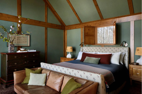
    I mostly like it, if that was buried in my critique.

    Is there something really uncomfortable about this, with another chair on the left?


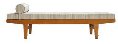
    I know you don't really like modernism, but the daybed is probably Danish and made by someone like Mobler or France and Son: they are basically mimimal, sturdy, teak pieces:


    The chairs at the dining table are awful, not only because of the post style of the front legs, but because they are not very stable. Get up quickly and the chair falls over backwards.

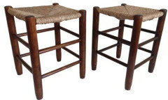
    A restaurant near me had these (with rush seats) and they did not last very long before they were replaced.

    My problem with the bathroom is not the curtains but the bathtub itself and the pendant fixture over it. Lose your balance getting out of a high rimmed tub with castrating or concussion potential and what are you going to grab onto? The only thing within reach is the light fixture.

  • 9 months ago

    I agree, I like the chaise tho it seems an odd pairing with the sofa and end table, which look country to me. I love the chaise with the coffee table. And I should have said the bath didn't work for me, more than just the curtains...I don't like the light fixture either and always read warnings about not having them hang low for fear of grabbing them during a slip, but honestly, I can't imagine reaching up if I were falling; I'd be grabbing for the faucet or edge of the tub ;something to brace me down low.

  • 9 months ago
    last modified: 9 months ago

    Just to point out one thing (among many) that bugs me: the door frame is absurdly skimpy and the paneling and trim look cheap. I could go on about how the color of the carpet looks like a 70’s artifact and visually competes with the stained wood in the awfulest way and how the sofa fabric is apropos of nothing else remotely tied to the room.

    This is not the ugliest room I’ve ever seen but probably the worst I’ve ever seen from an interior designer. (And I do think it’s pretty ugly.)

  • 9 months ago

    seems an odd pairing

    maybe so, but nothing is really designed in a complete vacuum, different sorts of things are coexisting in the same time period, and the same sorts of things are popping up in different time periods.

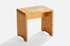
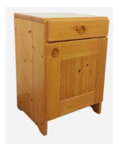
    Charlotte Perriand, who was a French modernist who worked with Le Corbusier, designed this:


    But she also designed these: and all are considered forms of French modernism


    Even though the wood furniture references earlier or vernacular pieces, and the chrome chair references nothing that came before it.

    In any case, I might look at things differently because I have pieces of furniture from 150 years apart sitting next to each other. And I might feel a little better if there were a piece of obvious chrome or Formica in this mix rather than all stained wood.

  • 9 months ago

    “ I have pieces of furniture from 150 years apart sitting next to each other.” So does my mom and it looks good, as I assume yours does. It’s not the age or mixing of periods, it’s the lack of discernment with respect to selection of said furniture. Some people have training but no eye. I would say the designer of this Aspen home is one of them.

  • 9 months ago
    last modified: 9 months ago

    the door frame is absurdly skimpy

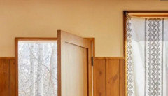
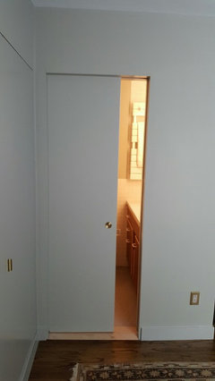
    Not that will--or am trying to--convert anybody, but telescopic frames that consist of only a jamb, with no casing is a very difficult and expensive detail to achieve.

    Why? Because there is nothing to cover up an irregular joint. Anybody can snap off an edge in drywall that leaves a half-to-one inch gap between itself and the window jamb proper and then cover it with a wide piece of decorative casing. That's why you see decorative casing around every door and window no matter how cheap the house is. You can bang out basic mitered casings around a door or window to cover the rough edge of drywall in a matter of minutes per window or door.

    Compared to this: there is no concealing any imperfection here. There is a perfect joint of wall material, either drywall or plaster to the jambs of the doors and windows The joint is exposed for all to see and it has to be without flaw. This is the most expensive way to finish something like this.


    Actually I am a bit biased about this because it's the detail around the windows in my house. Its painted to match the wall so you can't see it


    here you can see it a little bit


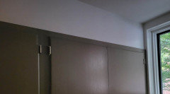
    These doors have wood jambs too.


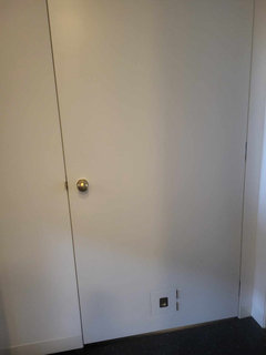
    And the hinged doors have a flush jamb


    So you may not like a detail like this (someone said it looked like "I ran out of money for trim", but please at least understand what it is you are looking at. It's a detail that probably cost 5x the conventional trim per door and window than in your house. (not saying that as a brag, just a reflection of how long it takes to do something that looks like "nothing" compared to traditional casings).

  • 9 months ago

    Bridging 150 years well is a real skill and one that I really enjoy seeing.


    This designer's name came up for me two weeks ago when I google designers who are like Heidi Callier.

  • 9 months ago

    I would not want this as a primary residence, but having grown up in a place where most people's 2nd houses were what I consider homely or pleasantly ugly, I have an affinity for this sort of thing.

  • 9 months ago
    last modified: 9 months ago

    There are some individual furniture pieces I might like in different settings, but overall it doesn’t do anything for me. But then, I’m not in the target market for mountain chalets, or cabins, or whatever it’s meant to be. I’m afraid of heights and that view of the mountains makes me feel claustrophobic. So I don’t think the designers should lose any sleep over my opinion!


    Edited to add: At last I've been able to read the whole article and see all the pictures. I spotted a few more individual pieces that speak to me,, but nothing to change my overall opinion. It's just not for me.

  • 9 months ago

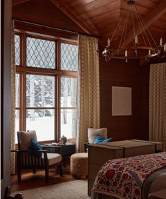
    I don’t see the same molding or joins in the Aspen house that you point out in yours Pal. In one of the AD photos you can see a slight curvature of the door framing that looks exactly like inexpensive picture frame molding. I see the same thing in the trim along the top of the pine panelling— which would have been lovely in a different room. Panelling at that height typically has a more substantial cap molding— the lack of which only emphasizes that the panelling stops six or so inches below the top of the door and there is no good reason (like a deeper, wider cap) to make any sense of it. The paneling and wood molding was all added by the designer per the article.


    And don’t get me started on a window with a single long flat panel of fabric that doesn’t even hang straight. There’s so much wrong in that one room that it almost looks like a caricature. If she was going for the look of a fishing or hunting camp that has been in a family for a few generations she’s failed miserably. I grew up going to those, ours and friends’, and there is a beaten up charm and je ne sais quois to those that is nothing like this 🤷‍♀️

  • 9 months ago

    It does remind me of some vintage MN lake cabins - the ones whose decor just kind of "happened" not the newer ones that were professionally decorated. I personally prefer the vintage look which seems more like a charming and interesting collection of a family's stuff. The professionally decorated remind me more of a designer showroom. All that said, it's mindboggling to think someone paid $$$$$$$$$ for this Aspen cabin design work. I guess they wanted the vintage cabin look and had the money to make it happen immediately rather than waiting 60-70 years.

  • 9 months ago

    I went to the AD article linked. (Thank you for the link. 😊 )


    That "great room" is spectacular. That view!!!! My only minor quibble is I don't like an eating area in a spectacular room like that. I don't even know why. Not the end of the world, but not something I would do.


    The furniture specifically doesn't generally appeal to me. I would need a bit more softness in the room to counteract the beautiful but frigid view outside. But I love the house in general, with some different furnishings. If none of you want it, I will take it. 😄

  • 9 months ago

    I agree ally - except I would say that’s a great table to set out a puzzle or play games. And I like the bath and kitchen. Personal decor and furniture aside - it’s pretty spectacular.