Software
Houzz Logo Print
henry_woodruff

Kitchen remodeling feedback

6 months ago
last modified: 6 months ago
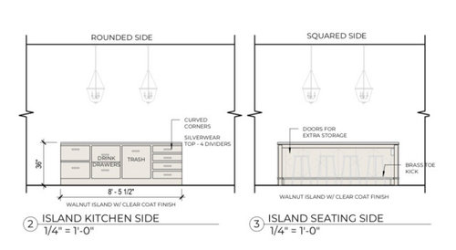
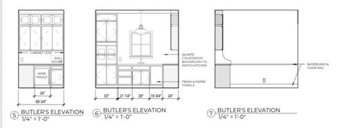
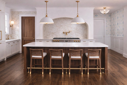
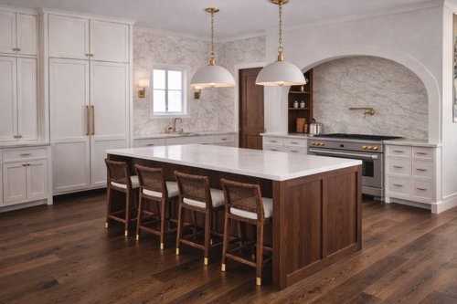
Need some true designer feedback on these kitchen design renderings. We’re planning a remodel in Dallas, TX. Leaning to walnut and marble finishes, and brass. There is a butlers pantry behind the left walnut pocket door. Floors are already a darker stain and no plan to redo all flooring. Any input or thoughts much appreciated!


Comments (37)

  • PRO
    6 months ago

    Waht exactly do you want? Waht is the material with the bluepattern? Why do you show stools and lighting now those are choices made much later . I need info and pics of the kitchen as it is not AI ideas .

  • 6 months ago

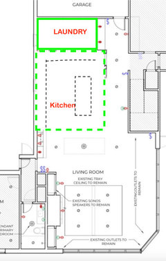
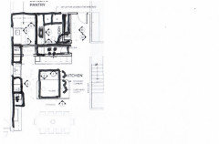
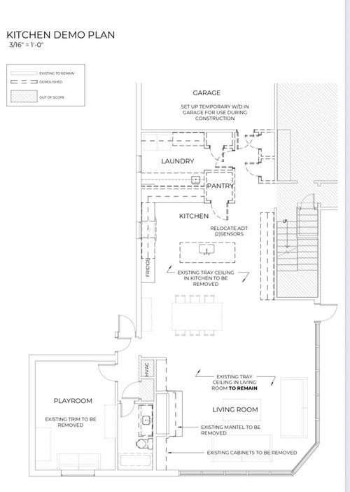
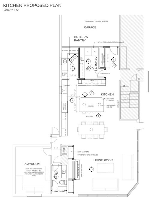
    Floor plans uploaded. Generally happy with the proposed layout, open to constructive feedback. Its a large space.

  • 6 months ago

    Agree to let the waterfall counter go -

  • 6 months ago

    At a glance - You don’t appear to have enough room for back to back seating between the island and dining table. It needs about 7 feet from edge to edge, or you’ll be pushing in chairs and asking folks to scoot in anytime someone want to walk between them.

  • 6 months ago

    Space is your weak link here. Better design would give you same length of island to range wall. Distance from the range dials to island 45”. 3’ passage door width into Butler pantry. 42-48” between the island and the sink. No more than a 4’ wide island regardless of your curved edges or suquared ones.

  • 6 months ago
    last modified: 6 months ago
    Flagging @Diana Bier Interiors, LLC and @JAN MOYER on this. Curious about their feedback.

    1. OK, so butler's pantry is a misnomer and causes confusion. I see that your pantry is not a place for storing dishes and setting out food on the way to the dining room. I see it has a speed oven and sink. Where will dirty dishes and dishwasher go? In the pantry or in the sink area below the window? Is the sink area below the window a prep area and not a dirty dishes area?


    2. Are you trying to keep the island in the current position so as not to have to redo flooring?


    3. How many inches from the edge of the island countertop to the edge of your table?

  • 6 months ago

    1. there would be a dishwasher to right of sink, and we might put a second in the butlers pantry.

    2. keeping in the current place as its the most logical positioning, we’ll be redoing the flooring in this area but not changing from current stain / type to avoid full redo throughout house.

    3. enough space between island and table, its a large open space.


    Shared a few more images above

  • 6 months ago

    You have a nice sized kitchen, but the renderings make it look crowded and compartmentalized. The arch closes up the range wall and the sink area seems pretty tight.

  • 6 months ago

    ^^^^Kendrah - good advice provided in both comments. I am also interested to hear from Diana and Jan.


    Question - will this kitchen be used to cook food OR is it for show?

  • 6 months ago

    Cook food and look nice!

  • 6 months ago

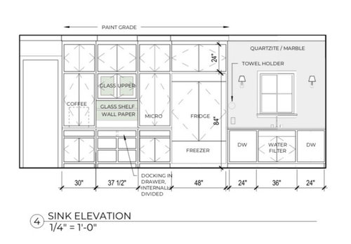
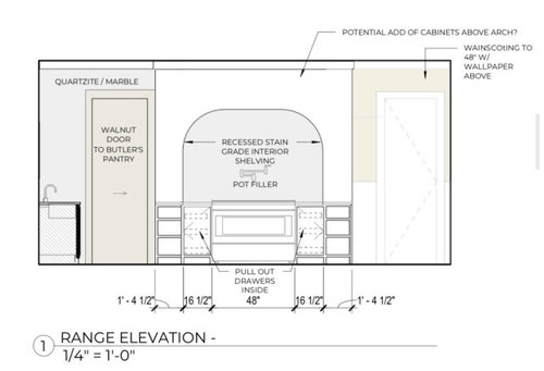
    You only have 16 inches of counterspace on either side of the range. That would not be enough for me. It appears there is not enough space between seating at island and seating at the table in your proposed plan. Where do you plan to put pots and pans and everyday dishes?

  • 6 months ago
    last modified: 6 months ago
    Some people do design kitchens to be beautiful and then eat out/have food delivered for meals.

    I'm happy that you want both an attractive kitchen + one that functions well (that definitely helps in the event you sell the property at some point).

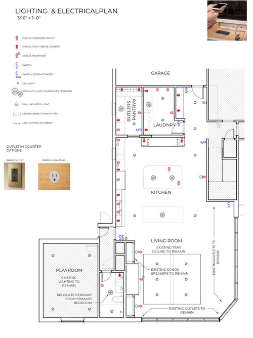
    I assume that you have overhead layouts in addition to the elevated views? We need you to post those also. While elevations are helpful for the homeowner to understand how the space will look - kitchen designers need the corresponding overhead layouts in order to improve the kitchen design.

    Diana and Jan + hopefully a few others will join this post. They need to know the dimensions of every wall/window/doorway/etc. of your space in order to design the space to be both beautiful + FUNCTIONAL.

    I have seen many kitchens (where the layout was already designed) posted on here where the OP ends up with a HUGELY improved kitchen after some pros + expert non pros join in the discussion. I'll see if I can find a link to one of them in order for you to see how much better the layout was after the talented people on Houzz revised the original one. JAN - I assume that you have the link to the one that I'm specifically thinking about . . .

    You are spending a lot of money on this reno - you owe it to yourself for it to be the best it can be!

    @rebunky - wondering if you are around also?


    If you are willing to allow Jan/Diana/rebunky to help, I'm excited for you!

  • 6 months ago

    Sounds great, I think all drawings are loaded. Hopefully someone likes something we have so far 😂

  • 6 months ago

    The AI renderings of your kitchen look nice - we just need the experts to provide their input re: design!!

  • 6 months ago
    last modified: 6 months ago
    Okay - I've found a good one for you to review. It's a long thread - the OP had two design options and asked which one to use. The answer was neither one!

    The new layout turned out so much better! The finished kitchen looks beautiful + is super functional.

    https://www.houzz.com/discussions/6359906/option-1-or-option-2-for-kitchen-layout

    It's a long thread - it's unbelievable how much free pro design help the OP received - the free advice was SO MUCH BETTER than the advice/layouts from the paid designer!

  • PRO
    6 months ago
    last modified: 6 months ago
    It’s alarmingly claustrophobic for such a large space. The range cave, stone island burqua, and different zip code sink scullery, all seem to exist in a stone fabricator’s showroom. One whose brother sells big, bigger, and biggest, appliances. And for people who don’t wash their hands or implements during food prep.


    A 250K kitchen needs a 250K kitchen designer. And a consult with a HVAC engineer about the 2000 CFM+- venting and heated/cooled makeup air that will be required.

  • 6 months ago

    I cook every day. I have renovated 4 kitchens. I can tell you that there is not enough counter space at either the sink or the stove area in this large kitchen. I would hate to do the dishes with so little counter space next to the sink. The arched area where the stove is also looks crowded.

    I wouldn’t have so many floor to ceiling cabinets in place of extended, useful countertop space. This plan needs to be redone.

  • 6 months ago

    Thanks for posting all of the drawings.


    I agree with others that it feels so tight given the size of the kitchen. Where will you store all of your pots and pans? Why so many base cabinet doos.


    I'm not a fan of separate scullery rooms, but I thought the purpose was to get dirty dishes out of the way. In your case, it seems you still intend to do dishes at the sink next to the fridge. What do you intend to wash in the scullery/pantry sink?


    Do you don't have enough space on either side of the range. If you are seeking an arch in your space, I'd consider a large rounded arch between the dining room and kitchen and eliminating the arch over the range.


    Why wouldn't you have your wine fridge closer to the table or an area where you are entertaining? If you don't like the look of it, get a panel ready one to blend in with your cabinets.


    Not sure how many versions of floor plans your designer did. I'd rather a much more functional layout without a separate scullery room. I'd could see a lot more function in a very large L shaped kitchen with the island turned perpendicular to the dining table - along the lines of this:


    PS - I adore the milton light over your pantry sink!

  • 6 months ago

    I would rethink the position of the drink drawers in the island. That is the working side of the kitchen. Why would you want people coming in looking for drinks to be entering the area where you are cooking? It seems like it would make more sense for the drink drawers and wine fridge to be on the fridge wall.


    Why is the trash in the middle of the island? Prepping produces the most trash and prepping takes place next to the sink plus you would want the trash near where the dishwasher is to scrape plates off.


    Think of emptying your dishwasher. What cabinet are the dishes being put away in?


    Do you have small appliances you need to store…blender, mixer, slow cooker, instant pot etc. Where will they be stored?


    For such a large kitchen there is really not much drawer storage. Have you actually gone . through all the items you want to store in the kitchen to see where they will be housed?I think about what I have stored in my kitchen and would have no clue how I would even store half of it in your kitchen.


    Where do you plan on storing actual food? In the area labeled butlers pantry? You have sink cabinet, wine fridge, trash, speed ovens and you said you may add another dishwasher. Where does all the food get stored that is accessible and not in upper cabinets?


    Honestly I dont think this is a well planned out kitchen. Its got all the pretties and thats about it.

  • 6 months ago

    Can you tell us more about who designed this? Are they specifically a kitchen designer, architect, interior designer?

  • 6 months ago

    This is a kitchen of someone who values cooks higher than looks??????


    No, it isnt. There no room to work, and no understanding of work zone requirements. The island needs a prep sink, the cooking zone needs to lose the homage to a medieval pig roasting spit, and the cleanup sink—and ALL cleanup functions, needs room to exist IN the kitchen.Unless there is a scullery maid? If there were, there would be a cook servant and spit turner waif too.

  • 6 months ago

    I guess I was wrong to assume this community may help provide productive feedback on initial plans vs. just unhelpful criticism. Such is life.

    If you have anything helpful to contribute though, I’m open as we DESIGN and REFINE a plan….

  • 6 months ago

    Someone ping @JAN MOYER. For some reason it isn’t hyperlinking when I type her name. Her feedback will be spicy but at least it will be useful.

  • 6 months ago

    @Addison Woodcraft How are some of the comments not productive feedback? You now make it seem like all you are looking for is praise for your plan and not actual feedback. Everything I mentioned in my comment are things you should think about when planning out a kitchen. Others gave you helpful feedback as well.

  • 6 months ago

    Not you, Clyde.

  • 6 months ago
    last modified: 6 months ago
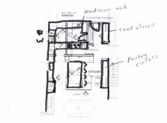
    Sorry, this drawing is crude, but I would rather add a couple feet to the kitchen (taken from the laundry and pantry)

    This opens up the space between your dining table and people seated at the island. Plus, reorienting your island allow people at the island to maybe converse with people at the table. Also, you have more room around your sink,

    Also make the island not as long and put the dining room about 6 inches farther from the living room.


  • 6 months ago
    last modified: 6 months ago
    I like Kendra"s idea too and building on that idea, you could do a panty behind the island seating and add a coat closet near the entry if you move the entry door. I think your laundry would be clsoe to the original size.


    Sorry, that is closer to your original plan. :)

  • 6 months ago

    Thanks Karen!

  • 6 months ago

    I’ll just note this isn’t the formal dining room, which is separate and not included in these plans, but a more everyday dining table in the open plan kitchen / living space where we spend most of our time and meals

  • 6 months ago
    last modified: 6 months ago
    Useful info. @Addison Woodcraft . Where is the formal dining room located? Good to know for footpath with food.

  • 6 months ago

    @Kendrah - I've sent Jan a message re: this post. I can't tag her either.

  • 6 months ago

    Addison, what is driving this remodel? What do you not like/doesn't work in your existing plan? It helps people to help you if we know these answers. Also, it's been asked but not answered, how many live in the house, ages, lifestyle, etc. We need to know who we are figuring things our for!

  • PRO
    6 months ago
    last modified: 6 months ago
    That would be thoroughly unpleasant kitchen to work in because of the dysfunctional design. Space planning a kitchen involves zones of use. Your zones do not have the basic needs in them, including adequate space where needed, direct water access, and are spread out too far apart to function well.

    You probably should go back to Kitchen Design 101 and relearn the classic rules. Then look at it again in light of how many it breaks. There are other things too, but the basic space plan has to be done well before you can move on to the decorative. The Thirty-One Kitchen Design Rules, Illustrated

  • PRO
    6 months ago

    What is the existing layout? I have to think it's more functional than this.

  • 6 months ago

    Minardi, the existing layout is the first plan labeled Kitchen demo plan.

  • 6 months ago

    Looking at the broad concept, 3 things stand out to me:

    • Breakfast Area: The table does appear quite tight, with clear space not proportional to the other areas. Showing Family Room furniture would help understand layout, and how important flow through the pinch point from the Playroom/outside is. I assume this is a Family Room, and there is another formal Living Room elsewhere.
    • The route to Dining Room elsewhere: It is essentially the same in steps/pathway as original, however, now the route looks directly into a Laundry and open Mudroom. This keys in on a "backhouse" area of a Kitchen. If you have a formal Dining and Living Rooms funneling into this hallway, this route arriving at a visual "backhouse" now may not be optimal (before it was walls and hidden closets).
    • "Heavy" appearing cabinetry as opposed to the "lightness" of an entire window wall in the Family Room and the clear space around the Family Room furniture, two areas specifically: The range arch feels like an over-proportioned massing, because it is wholly extended out from the adjacents Scullery and skinny open hallway. Also, the cabinetry block of refrigerator/beverage is more dominating than typical placements, because of the height/depth, when combined with the arched range and large island, make the short sink window wall area get lost visually (the renderings illustrate this). And the forced symmetry of the beverage portion is calling for the table to be centered on it, but the table is not.


    These comments are probably nitpicky, but the value perception of the proposed design calls for a deeper thought train than a simple modest kitchen. There are other things too, like lighting seems to fall a bit short.

    But if the 3 comments I made were agreed with, Karenseb's version of moving the Kitchen wall back towards the Garage seems to head in a better direction to make the sink wall more visually accessible and functional, opportunity to resolve the visual path from the Dining Room, and create more room for the Breakfast table.