Software
Houzz Logo Print
mxk3

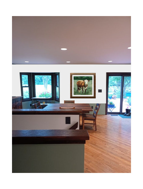
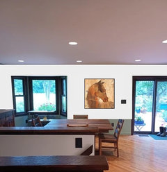
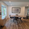
Is this the right or wrong shape picture for this wall?

6 months ago
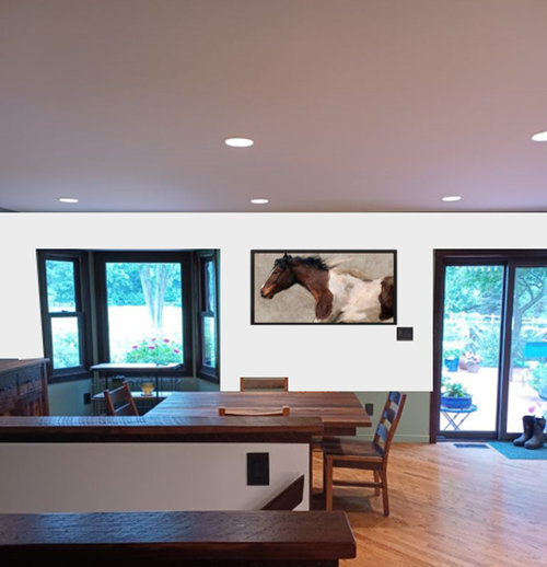
Not sure if this picture shape looks "right" on this wall. What do you think? (there will be no furniture underneath it -- just the kitchen table and chairs in front of it)


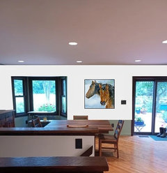
Or I could do a square:


Comments (32)

  • 6 months ago
    last modified: 6 months ago

    The square looks fine. You're showing the rectangle too high, IMO; lower it and it will also be fine. I recommend painting the light switch (if that's what that little black object is) the same color as the wall. Right now it's a distraction.

    porkchop_z5b_MI thanked amystoller
  • 6 months ago

    "I recommend painting the light switch..."


    It's slate. All the switches and electrical outlets are the same throughout most of the house -- I like the look.

  • 6 months ago

    I understand. I certainly wouldn't want to paint the slate! In that case, I think the square fits better in the available space. Lowering the rectangle would have the right side of the frame uncomfortably close to the light switch.

    porkchop_z5b_MI thanked amystoller
  • 6 months ago

    I'd look for art you absolutely love and go with whatever shape it is. Yes, square works better with light switch. But if you find art you love that is the rectangular size and shape, that can work too.

    porkchop_z5b_MI thanked Kendrah
  • 6 months ago

    I also think square is better.

    porkchop_z5b_MI thanked WestCoast Hopeful
  • 6 months ago

    "I also think square is better."


    You know -- I do, too. But DH wants a horse. Problem is, I haven't found any horse prints I like except that one, let alone in square. (there's something about horse pictures that I just don't particularly like, but I can't put my finger on exactly what puts me off them).


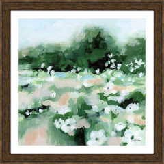
    I am really drawn to this flower print. I could do the cow and this print, both square, one on each wall (buffet wall is out of frame of the pics above -- but that's the cow print I'm going to get).


  • PRO
    6 months ago

    IMO the horizontal would be my choice but hung lower so a tad off center if the switch stays there . I too love horses so probably a bit biased but IMO the horizontal shape is better

    porkchop_z5b_MI thanked Patricia Colwell Consulting
  • 6 months ago
    last modified: 6 months ago

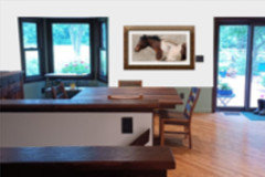
    Like this? (I changed the frame)


  • 6 months ago

    Square looks the best IMO.

    porkchop_z5b_MI thanked chloebud
  • 6 months ago

    Are you interested in other horse images, or have you settled on the one you show as the only horse you'll consider?


    Is the image available in a smaller size?

    porkchop_z5b_MI thanked amystoller
  • 6 months ago

    "Are you interested in other horse images, or have you settled on the one you show as the only horse you'll consider?"


    The latter. I can't seem to find any other horse pics I like (see post above).


    "Is the image available in a smaller size? "


    It's available in multiple sizes.

  • 6 months ago

    I did see that it was the only horse you liked; I wondered whether I could help by finding more horse pix. But I get it; that's the one and you're done looking at horses!


    Since the horse pic is available in a smaller size, do you think it would be worth it to get the next size down? That way you could fit the horse picture more comfortably into the space you have.


    BTW, I like the flower print you showed. And the cow is very cute.

    porkchop_z5b_MI thanked amystoller
  • 6 months ago

    "do you think it would be worth it to get the next size down? That way you could fit the horse picture more comfortably into the space you have."


    Maybe. I can play around with more mock-ups. There's something about it that just isn't right, though. I can't put my finger on whether it's the shape, the picture itself, or both. It might be the movement -- kind of like it wants to run away from me LOL!

  • 6 months ago
    last modified: 6 months ago

    The horse is amazing. I would get it in a smaller size. I'm an artist, for whatever that is worth. I think that the white mats in the cow and modified horse adds too many extra lines that plays off of the white wall. I find it noisy. I like the no mat version of the horse in just a frame. I would mock up the horse image 25% smaller with a frame that more closely matches the beautiful red-tone woods in the room no mat. A med-dark reddish wood will distinguish it from the black window frames. The horse in that large size is a bit much for the room. Also, as you say, it is maybe too much movement for the calm feel of the room. OR, maybe it draws out the natural beauty of the wood in your home and integrates it with the wild world outside the windows. It's beautiful and the white in the horse integrates with the white walls.. Ask yourself and your husband if that image of raw power and freedom will enhance your mood everyday, or not.

    I would put the cow image (no mat) in a med-dark wood with reddish tones. That is, if I am seeing the wood of your table and counter correctly. The current frame around the cow is too yellowish-brown. I would explore the cow print smaller. I think that the green adds a nice tone to the room.

    porkchop_z5b_MI thanked Jeanette Mieko
  • PRO
    6 months ago
    last modified: 6 months ago


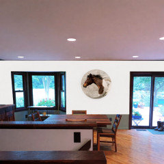
    I would say that a round artwork will add more energy to the wall. Since everything around it has sharp, straight lines, the circular shape creates a nice contrast and makes the piece stand out more.

    porkchop_z5b_MI thanked WM Architects
  • PRO
    6 months ago

    No matting

    porkchop_z5b_MI thanked Patricia Colwell Consulting
  • 6 months ago
    last modified: 6 months ago

    Looking at WM architect's idea. I love the horse image with no frame. I also like the circle, and I agree there are already lots of sharp lines. However, the circle in that particular place cuts off the horse too much for my taste. But, actually, looking at it again, I would skip the horizontal altogether. It looks to squished in with the windows and the light switch. I like the idea of a square format with no frame, if you can get the print of your choice as a canvas.

    porkchop_z5b_MI thanked Jeanette Mieko
  • 6 months ago

    "I like the idea of a square format with no frame, if you can get the print of your choice as a canvas."


    Yes, I can get the other two (cow and flowers) in a square format canvas print.

  • 6 months ago

    Just thinking..if the frame matches the floor color…that may relate well …and relieve the need to “match” other elements …

    porkchop_z5b_MI thanked btydrvn
  • 6 months ago

    Options?


    porkchop_z5b_MI thanked simplynatural
  • 6 months ago

    The horse matching the floor..even better

    porkchop_z5b_MI thanked btydrvn
  • 6 months ago

    Agree. I like the horse (or other image) matching the floor. Nice.

    porkchop_z5b_MI thanked Jeanette Mieko
  • 6 months ago

    What Jeanette said…(also artist here). That’s a lot of energy in the moving horse images. You might want something a bit more tranquil for a dining area. Up to you. I think it’s important that you love what is hanging on your walls, however.

    porkchop_z5b_MI thanked liasch
  • 6 months ago
    last modified: 6 months ago

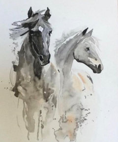
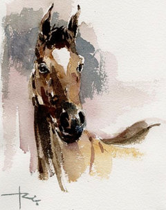
    Suggest a rectangle hung vertically. I’d keep looking until you both love one as the location is quite prominent. I like watercolors for their soft, creative impact and I bet it would be a conversation piece. If you search Pinterest there are lots of artist sites.


    porkchop_z5b_MI thanked Maureen
  • 6 months ago

    The thing that’s nice about the recent horse images is there more calm than the running horse, and your eyes stays focussed as opposed to wanting to move in the direction of the horse. The watercolours are nice because they combine an abstract component, which is more relaxing.

    porkchop_z5b_MI thanked liasch
  • 6 months ago
    last modified: 6 months ago

    If there's something about horse pics you don't particularly like then you and DH should find a compromise on subject matter.. I would not want leopard art even if my DH wanted one.

  • 6 months ago

    The horse art, while beautiful, is better suited to a different wall. I would choose a landscape or modern art for a dining room.

  • 6 months ago
    last modified: 6 months ago

    Well, since everyone else is suggesting horse art, I'll add my additional two cents.

    A search for Chincoteague Pony/ies Art (or Poster), and/or for Assateague Wild Horses Art (or Poster) will turn up some lovely images in "portrait" rather than "landscape" mode. You can also find original paintings using those search terms.

    Or you can think a bit further outside the box …


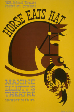
    The image is of a poster for the WPA. You can find reproductions online easily.


    And here's a Picasso print: https://sugarandcanvas.com/products/the-horse-line-drawing-by-pablo-picasso-print?srsltid=AfmBOopH2TM0p5qDWShC8njOR6aFEce3eYIXaTtMBBl-DZCD8tkQgXnW

  • 6 months ago

    Update: Thank you for all the opinions and alternative choices. I ended up ordering the cow and the flowers, both square. DH actually liked both of them so he's not too disappointed there won't be a horse in the mix.

  • 6 months ago

    Order the horse smaller and surprise him with it for his birthday. hang it in his den or a bathroom or the TV room.

    porkchop_z5b_MI thanked auntthelma
  • 6 months ago

    ^^ HAHA I could do that but I think he'd rather have a bottle of booze :0p