

Kitchen cabinet colors?
I'm in the process of picking out cabinet colors for my kitchen remodel in my 1920s tudor.
It's a smaller space (~110 sq ft), so I'm going for a lighter tone to make the kitchen feel bigger.
The floor is red oak. I will have a lot more bottom cabinets than top cabinets (i have 3 windows in that room taking up a lot of wall space).
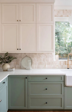
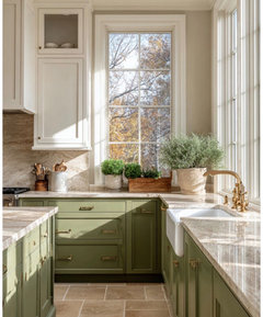
My designer thinks a two tone would look nice with a warm white for the top cabinets and muted moss for the bottom.
What do you guys think about two tone? Is it too much of a modern trend? Is muted moss too bold? My designer seems to think muted moss is timeless, but idk. The word "timeless" seems subjective...
Comments (54)
 6 months ago
Pictures would be nice …. guess the color of your countertops, walls & everything else might affect the decision. The muted moss &/warm white sound nice in the right environment.
David Dang
Original Author6 months agoHi all. I will get rendered drawings tomorrow with color. I just realized the drawings my designer sent me yesterday aren't colored unfortunately.
Here are 2 black and white outline pics:
In the second pic, this would be a view from the dining room with the wall removed (I'm not removing the wall. it's removed in the pic for illustration purposes. It's got a door entryway in between the kitchen and dining.
here's a top view: https://imgur.com/DoNFRMr(the kitchen/dining wall is present here, but the entry way was enlarged on the left side. i was going to enlarge the entry way, but I think i'll keep it the same, so that left wall will extend quite a bit to the right)
Related Professionals
Auburn Home Remodeling · Grand Forks Home Remodeling · San Diego Home Remodeling · Vernal Home Remodeling · Kankakee Kitchen Remodelers · San Diego Kitchen Remodelers · Waycross Interior Designers & Decorators · Muskogee Interior Designers & Decorators · Orangeburg Interior Designers & Decorators · Altoona Architects & Building Designers · Richmond Kitchen & Bathroom Designers · Brattleboro Kitchen & Bathroom Designers · Las Vegas Kitchen & Bathroom Designers · Saint George Kitchen & Bathroom Designers · Rutland Kitchen Remodelers- 6 months agolast modified: 6 months ago
how Tudor of a kitchen do you desire for your Tudor home? might be fun to seek inspiration images..they can help at this stage of mulling things over. its a style that can really play up details..even if a few. Have you considered some detail for your hood, given the location of the cooking [ in the middle ] of your main wall ?
Tudor is DETAIL.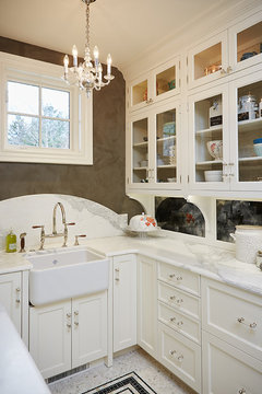 Rookwood - Traditional Estate · More Info
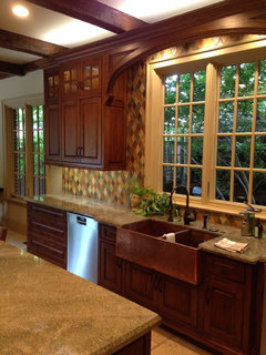 English Tudor · More Info
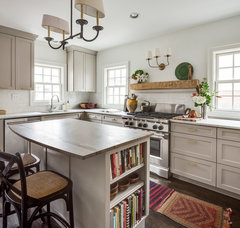 Brookside Tudor · More Info
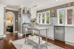 Laurelhurst Tudor · More Info
 - 6 months ago
Subjective? You bet!
Nothing is literally timeless. So "timelessness" is in how you look at it. Once upon a time, kitchens had dirt floors with a fire in the middle, and thatched roofs with holes in them to let the smoke out. Is timelessness in later materials: Wood, stone, iron, brick, ceramic tile? Some of the design pros seem to consider stainless steel appliances timeless. I, contrary-wise, think they're very much of their time. (My idea of a "timeless" kitchen color is white.)
Is your designer an interior designer? A kitchen designer? A consultant at a cabinet vendor?
I ask because "Muted Moss" is a color that Kraftmaid currently offers their stock in. That means that at some point, they will stop offering "Muted Moss" and start pushing some other color. So I would not call that "timeless"—I would call it "trendy." And if your "designer" is really a consultant at a cabinet store, they are pushing that color for their reasons—possibly commission-based—and not for yours.
https://www.kraftmaid.com/products/colors-finishes/colors/muted-moss
Nevertheless, a medium-dark green with a lot of grey in it, whether it's branded as sage, muted moss, or some other name, is a perfectly good color. If you like it now and think you're likely to like it in your kitchen for many years to come, that's a good reason to consider it seriously.
But if you didn't tell your designer that you were interested in a greeny-grey color; if you didn't tell them you wanted a two-tone kitchen, ask yourself why you're letting the tail wag the dog. What do you like? What do you want?
Also, you mentioned that your home is 1 1920s Tudor. Why? Because you want a kitchen with a 1920s-influenced design? Or a Tudor-influenced design? Neither of those is timeless, but either, if done well, has the potential to feel "just right." Could "just right" be your "timeless"?  6 months ago
In all fairness, though, there were not any green cabinets in the subsequent group of images (that were generated from that same, simple word prompt).
Here they are: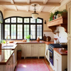
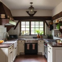
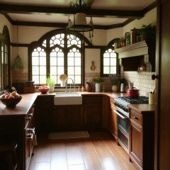
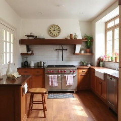
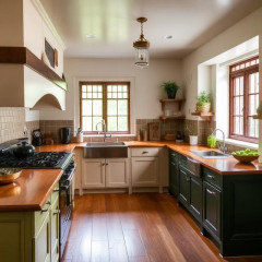
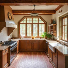
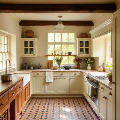
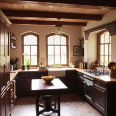
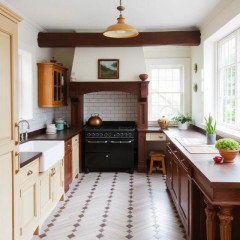
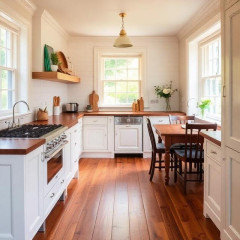
On the image shown directly above, I had just added ”red oak floor” to the ”1920 Tudor kitchen” word prompt.- 6 months ago
For my take on it: Green has sort of become the ’new grey’. It has been a popular trend. It is very taste specific, though... and for that reason, I would not put it in the “timeless” category.
Personally, there is no way that I would want a place with green cabinets. I would rather have grey, and I am very far from a grey aficionado; but at least grey is a neutral. I cannot wrap my head around green cabinets. That said- are there people who like green cabinets? Of course. Can you sell a house with green cabinets? Of course. A green cabinet lover will buy it- or if they don’t want green, they’ll put in something else.
If you are not a green lover - I would say opt out of the moss green. - 6 months ago
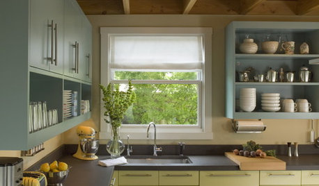
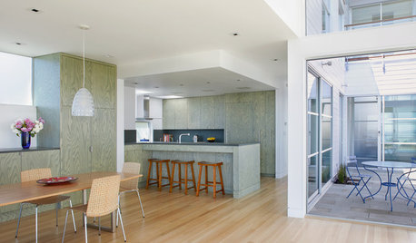
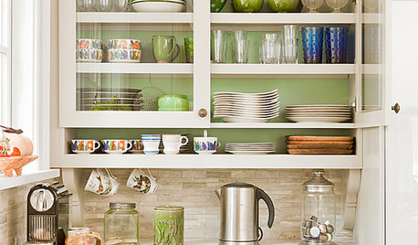
In a smaller space, you don't want too much visually choppiness. Unifying colors can help a kitchen feel larger. However, it is overly simplistic to just isolate the cabinet color and think that matching uppers and lowers will achieve the color unity. Bands of countertop color and backslpash color can interrupt the same color uppers and lowers and still make a space feel choppy and smaller. So you have to look at all of the color: floors, lowers, counter, splash, uppers, wall color, plus ceiling height and natural light to figure out how to make a space feel larger.
If you adore moss green then go for it on the lowers and use counters, backsplash, uppers, and ceiling all the same color so the space feels more open. If you don't love green then surely don't use it. And even if you go with all white, pay attention to how the other colors you add make it feel more open or closed in the room.
All white kitchen feels very open - no contrasting splash or counter.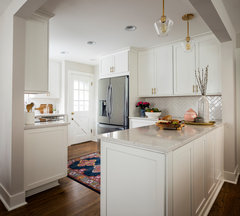 Wedgwood Kitchen Remodel · More Info
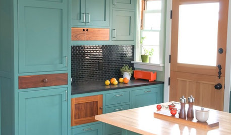
This small all white kitchen feel choppy not just because of the size but because of of the black counters and blue tile creating stripes along the walls.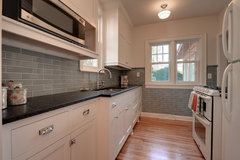 Minneapolis Vintage Modern Kitchen · More Info
Very light colored wood in matching uppers and lowers still make this kitchen feel choppy to me because of the band of contrasting white splash and the block of vertical white wall space. If the uppers were the same white as the splash, counters, and wall color it would feel much more open and less claustrophobic.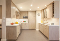 Ellington Condo Kitchen and Office Remodel · More Info
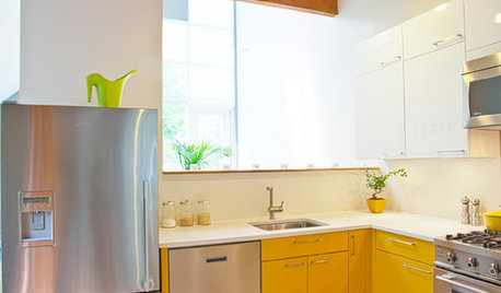
This kitchen has great light, high ceilings, and it still feels a bit visually top heavy and oppressive to me. I think it would feel less so were the upper cabinets white.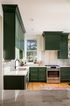 Cherokee Triangle Kitchen · More Info
This is a nice open feel even with heavy dark green bases.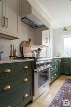
 6 months ago
Do you have painted trim in your home or no? not a pro but when we redid our kitchen in our 1920’s home - the trim was already painted white and white cabs in the same color helped connect the updated kitchen to the rest of the home - I forced myself to limit the number of materials used in the space - & only added some oomf with hardware and pendants, which are easy to update as desired
 PRO6 months ago
Since your kitchen is small will suggest that you keep the lower and upper cabinets the same color. Just as with keeping the walls lighter in color the single color of cabinetry should help your kitchen look larger. Will suggest a lighter color for your cabinetry too.
 6 months agolast modified: 6 months ago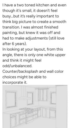
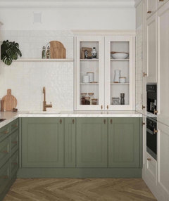
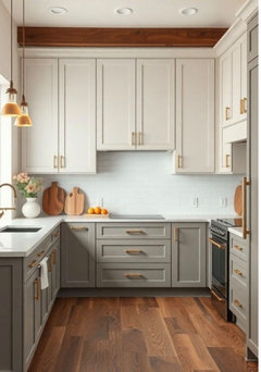
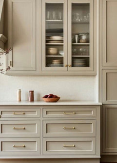
In this area you have more prominent uppers..so the tall cupboard/upper cabinet color will need to be decided on to ensure the best transition.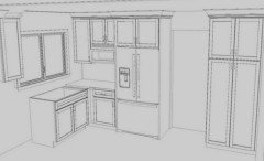
- 6 months ago
I wouldnt recommend two toned cabinets, especially for a smaller room. I wouldnt necessarily say white either, unless you really love white. Personally, I could not live with white anything. Think about it for a few days, and what color you really love, and the color you pick will always make you happy. Just one color, not two toned.
 6 months ago
I think part of your decision should be based on the stain color of your floors and how the green relates to the other colors you're using in your home. If you don't have green anywhere else in the house, it doesn't make sense to use it in your kitchen. If you have lots of plants or other green accents, it could tie in nicely. The colored renderings should help you decide as well.
- PRO6 months ago
I think we need to see the space for sure . I also need to know how Tudor is the interior of your home ? That will decide many things in the kitchen . IMO any color of cabinet could be done but context is everything . A color just plopped into a space will always be a bit off. I will wait for the renderings in color and more info about the rest of the house,
 6 months ago
I’m team two toned for your situation. I actually think it looks more ‘collected over time’ and works well for a Tudor. Freedom posted good examples of this. But to know what exact two tones to use it would be helpful to know how the kitchen flows with the home? Is it next to a dining room with stained wood paneling? Wallpaper? Painted and if so what color(s). The kitchen is not designed ed in a vacuum but plays off the whole experience of the home.
David Dang
Original Author6 months agoThanks for all the comments. I was tied up the past 24 hours. I'll upload some pics of my house later today. I also have some samples that I'll put against my flooring to illustrate the color contrasts
David Dang
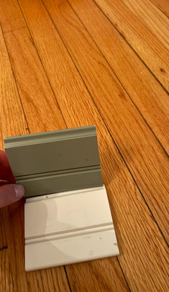
Original Author6 months agoApologies for the delay. Having a hectic week. Here's a pic of the warm white and muted moss samples against my red oak floor. i'm going to upload some other pics of my house shortly. it's a 1927 4-floor (3 above ground) brick (no stucco surprisingly) tudor with lots of greens in the yard, but no greens in the house (except for the existing kitchen countertop)
David Dang
Original Author6 months agoI stole these pics from my prior listing photos:
current kitchen (that door will become a window)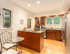
dining: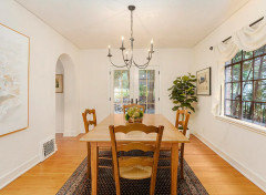
sunroom: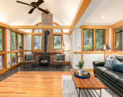
living room: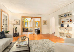
another angle of living room: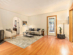
the "green" backyard (the designer was fixated on the greenness of my yard, idk why)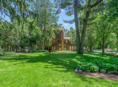
- 6 months agolast modified: 6 months ago
I remember you posting this kitchen a while back. Glad you found a designer to work with.
If you adore green cabinets then I think green lowers and warm white uppers can work in this space. However, it feels like your designer is more attracted to the green than you are. If this is the case, I'd hesitate and think more about what *you* want. It should be their job to tease from you a look that you will love.
Do I remember correctly that you live here with your son and will be in the house for about five more years? If so and you are not in love with the green and white combo, then don't do it. It will look very dated by the time you sell. If you adore the green and white then don't worry about resale. If I'm completely mixing you up with another family, completely disregard! :)
- 6 months ago
Your designer is wrong. Your smallish closed in kitchen will not carry two colors well. Two tone in this manner is 100% the fad of the day. It works best in very large kitchens where one can't take in the entire space from say a door. I think Maureens pictures show how unfinished and confusing it makes a room. Smaller, closed in kitchens look like they are in transition. Which color will the homeowner choose white or the other??!!! Colored cabinetry in general is not long lasting for most. It's done best by those who can afford the switch to white when the color of the day goes the way of gray . If you want to do this once white or wood tone are your choices. Everyother color will not stand the test of time. No doubt people will ooo and awww over your new kitchen but to themselves they will be saying "I couldn't live with that', they love seeing it, love that you did it, but it's not for them.
David Dang
Original Author6 months ago(Typing on my phone and idk why this is showing up in bold)
Kendrah, you remember correctly indeed. I think the muted moss is fine but it’s not my favorite color. I honestly couldn’t tell you what colors I’d prefer either.
I can tell you that I definitely wouldn’t want anything dark for that small space, and I’m not a big fan of blue, red, black, and non-muted shades of green.
My main goal with the remodel is to maximize functionality of the space because right now it’s too cramped and dysfunctional. The secondary goal is to pick a cabinet style (door style, moldings etc) and color (these 2 things don’t affect functionality for me) that could potentially help with resale. I anticipate being in this house for a little over 7 years so resale is on my mind.
Now I understand trends change, the definition of timeless is subjective, and there’s no way I’ll know what the buyer pool will want in 7 years. But theres certainly a set of extreme colors that probably will never work in that space
In this case I’m really just hoping some designer could help me choose. i’ve worked with a few already and i constantly question their color choices, and since I’m not good at this kind of stuff I’m always looking for second opinions lol.I feel like the safest bet may just be to go with some shade of white?
This demo is supposed to start in mid June (we’ll be gone for 2-3 months in the summer so the timing is perfect) and at this rate I’m not confident of that timeline starting on timeDavid Dang
Original Author6 months agoArcy, makes sense. i do like wood tones but i think a lighter color like some shade of white or tan would make the space feel larger than any wood tone?
- 6 months agolast modified: 6 months ago
It’s really personal but I love a simple white kitchen in an older home - we did one with glass uppers 15 years ago in our 100 yr old home and it still looks appropriate & current - my advice would be to go as simple as you can and use as few different materials as you can (discipline is your friend :)
fwiw i love blue and green cabs and wanted it for a new vacation build but it was a strong no from DH as it seems ”country” to him - so we did white again - 6 months ago
"Love seeing it, love that you did it, but it's not for me" seems like a reasonable expression of live and let live.
David Dang
Original Author6 months agoSomewhat related question, but in a lot of original tudor bathrooms, the colors can get pretty wide. I've seen pink, yellow, green bathrooms. Those don't feel "timeless" but are indeed consistent with the style of the house. Idk if the same extrapolates to kitchens.
- 6 months agolast modified: 6 months ago
Pink, yellow, and green bathrooms were fashionable in the US from about 1920 (maybe a bit earlier) till around 1960-something. That range is within the period when Tudor Revival architecture was popular in the US. So it would make sense if the baths you mention were in Tudor-style houses built in, say, 1920–1940—or a little bit earlier or later in the 20th century.
A lot can change in seven years, including your plan to sell. But as you're currently concerned about selling, what makes the most sense to me is to be conservative with any more-or-less permanent fixtures and finishes (architectural detail, flooring, tile, any large appliances that you would expect to sell with the home), and feel freer to express yourself in color with paint and soft furnishings. Now that I've taken a look at your kitchen photo, I have to agree with arcy_gw that your kitchen does not seem to be a good candidate for two tones of cabinetry.
Look out! Rumination and philosophizing ahead …
Decorative trends, including colors, are not timeless. Whatever else they may be, whatever style they may reflect or be labeled with, they are either of their time, or hark back to an older time (probably with a right-now twist), or are an-up-to-the minute "futurism" that will be just as dated when we reach that future time as anything else that came before then. - 6 months agolast modified: 6 months ago
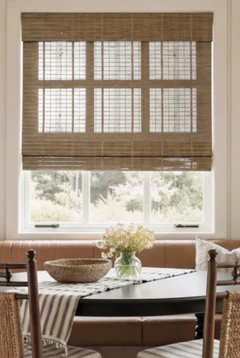
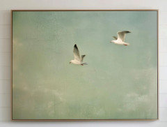
Given the size and layout of the kitchen, I’d suggest only using a color that works well with your counter.
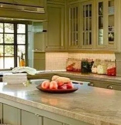
To add more personality, take advantage of this area and also add large art to balance that wall.
- 6 months ago
You don't seem thrilled with the green. I think it's pretty, but it's not my kitchen. I'd go with a warm white. Bright white will feel too sterile IMO. You're going to have to be careful choosing the color though. All the lovely green outside your windows is going to affect whatever color you choose. SW Moderate White has slight pink undertones that can cancel out the green.
 PRO6 months ago
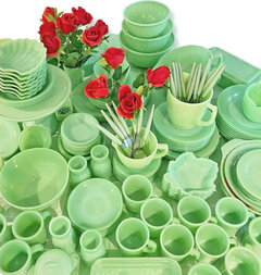
I'd suggest something more time appropriate to the era instead of a faddish 20's green. The minty green blue of the 1920's or the color of jadeite pottery would be perfect. White counters, and everything else.

David Dang
Original Author6 months agoi think i'm just going to go with some shade of white and call it a day. tired of thinking about this :)
the layout is somewhat decided already. there was one somewhat open question which was if i want a cabinet trash can or freestanding trash can. we can't fit a trash can under the sink and the designer said one option is to convert the cabinet space by the fridge into a pull trash cabinet space, but I already have limited cabinet space given the size of the kitchen and all the windows, and opted for a free standing one, but it'll be on the dining/kitchen wall, on the opposite side of the sink, which is kind of annoying, but workable 6 months agolast modified: 6 months ago
White - there are hundreds of shades. Consider a warm white like Sherwin Williams Greek Villa. It looks beautiful in older homes. And repeating myself here, whatever you choose for the wall color, consider making the uppers the same color. For the lower cabinets perhaps Easy Green with fairly neutral undertones (not too yellow, not too blue, not too grey). Best of luck!



David Dang
Original Author6 months ago@eam44 - I meant I will just go with the same color for top and bottom. I think I would be more open to two-tone if the ratio of lower to upper cabinets was closer to 1:1. In this case it's almost 2:1. I do feel like there'll be too much going on in that space. Also, from either of the 2 door entry ways, half of the upper cabinets (the ones on the same wall as the fridge) won't either be visible (and also lower cabinets as well), will will make 2:1 feel more like 2.5:1.
Given this would you still suggest having the wall be the same class as the uppers (as well as the lowers)?- 6 months ago
Ooooh. Got it. Not necessary to match the cabinets to the wall color then. What helps is if you choose a palette of colors that go well together, have similar undertones. Paint companies make suggestions and those can be really helpful.
- 6 months agolast modified: 6 months ago
How fortunate to have a 20s Tudor! FWIW: sage greens are very common in English country kitchens and cottages. It's a botannical color. Is nature timeless? :) See F&B paints. https://www.farrow-ball.com/the-chromologist/the-soothing-power-of-sage-greens
Also, I get your hesitation with the "tuxedo" look. Since your room has so many windows and natural light, I don't see why you can't just pick the green you love the most for upper and lower cabinets. Use glass if you feel you must break it up. - 6 months ago
Beautiful house and grounds.
FWIW, I think your choice of a white for the cabinets is a good one. I could also envision a wood and white cabinet mix- if you were to keep some of the existing cabinetry; two-tone can work well in some situations- and imo, it works best when the elements are truly “collected” over time.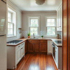
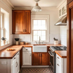
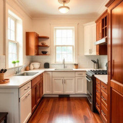
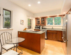
I think the mix could give you a nice look.
But if you don’t want to keep any of the wood cabinetry- then of course all white would work well, too.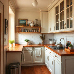
David Dang
Original Author6 months agoHi guys. I decided to go with warm white :). I still have a layout issue that I overlooked previously -- the size of the window to replace that exterior door with. Originally I was thinking of going with a 36" to match the existing window and to get perfect symmetry since the hood and stove will be centered in between the current and the new window.
But the door opening is probably around 33", so there'd be a bit more work to get a 36" window to fit in there (probably need a new header in there). So I'm thinking of just going with a 32" window....
Tudors seem to be known for asymmetry, and I think 36" on left side of the hood and range, and 32" on the right side should be fine? Any thoughts on this?
Also idk if the 4" difference is something I would really notice unless I stared hard at it.- 6 months ago
Glad you avoided the trend of the day-two tone. As for your spacing challenge, in the end it is you who will see it everyday, no one else. Will it bother you? Some it would drive insane. It's tough to say w/o a picture to compare both....
David Dang
Original Author5 months agoI'm going with the 36" window.
Also since I'm going with an all warm white cabinet set up, i'm thinking of changing my countertop color.
Previously, I wanted to go with something like this: https://www.lowes.com/pd/Silestone-Ethereal-Glow-Polished-Quartz-White-Kitchen-Countertop-SAMPLE-4-in-x-6-in/5014427769
I might still go with it, but there would be no contrast between cabinets and countertop.
Another thing is the door style. The default choice is tudor, but I've seen some people say shakers aren't appropriate for tudors. ironically all the above pics of tudor kitchens have shaker doors...- 5 months ago
Take a look at Isla Porter for some door profile options. They have some really pretty options.https://islaporter.com/collections/doors-1?direction=next&cursor=eyJsYXN0X2lkIjo5NDExNDMzMDM4MTM2LCJsYXN0X3ZhbHVlIjoiMHR6enp6NiIsIm9mZnNldCI6MzF9
David Dang
Original Author5 months agoThanks just took a look!
Do you guys have any suggestions for counter top and backsplash colors, given the all warm white cabinets + red oak flooring?
my designer suggests deciding on the countertop color before the backsplash and they think it'd be beneficial to have a countertop that contrasts with the cabinets, though I question whether that makes sense in a smaller kitchen like mine (~110 sq ft). I could see continuity in colors being better in a smaller space, but I've shown time after time that I don't know what I'm talking/thinking about lol- 5 months agolast modified: 5 months ago
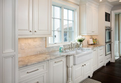
do you have a TYPE of material chosen? for a small cohesive kitchen you can certainly find several corian light shaded options.....otherwise a trip to a stoneyard ..taj mahal or white granites might work .since you know the paint shade take a swatch on a card and walk around ....it will be a good start.. No you dont need contrast but light shades can have some subtle pattern or blend of a few colors if youd like something a little more complex because of red oak floor...some copper or brownish veins ....really just depends on the selection and how your eyes see it. if you find 3 or so , you can ask for votes here ..people will chime in.
here is super white granite [ resembles marble-very classic] . I like the white granites.
 Powell Ohio Kitchen · More Info
here is a leathered or honed stone top....polished is always nice but this looks great in the small classic kitchen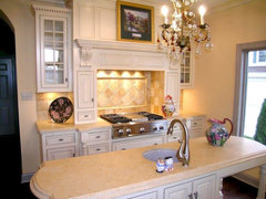 Backsplash · More Info
 David Dang
Original Author5 months agoyeah, I want to go with quartz. granite's OK as well.
i think corian is considered inferior to quartz?
i like the granite one you linked a lot. the name "super white" seems misleading since it's gray :) ?
below is the one I ordered previously but can cancel for a full refund. i still like it but want to consider other options as well
i think i'll choose the countertop first before i decide what to do for backsplash. i was thinking of just going with the classic 3x6" subway tile pattern though- 5 months agolast modified: 5 months ago
Corian would likely be considered "out of style" by the influencers - but many experienced cooks and designers on here understand that it's a fantastic surface
I wanted it for a recent lake build but couldn't get it in the rural area and had to settle for white quartz
fwiw for a small kitchen, I'd do a slab backsplash and continue the counter material as the backsplash - behind the range I'd do a stainless steel panel (saw a brass one on etsy that was pretty fantastic) - 5 months ago
You have a classic tudor house. So from my perspective, granite and/or butcher block would be classic choices.
I love granite- and basically any kind of granite, including the white granites. River White is a favorite of mine. - 5 months ago
Corian (solid surface) is not inferior to quartz; it's different from quartz. It has different care and maintenance requirements. A lot of pros here speak disparagingly of quartz-the-counter-material, as it is not stone, but an amalgam of quartz-the-mineral fragments (mostly) and resins (a little, to bind the fragments together), and some pigments. There's a designer here who consistently dismisses it as "plastic," even though it's 90–95% quartz-the-mineral. You could dismiss laminate (resin-infused paper) the same way, but I find that short-sighted. Different people want different features, and different projects have different budgets.
If you want stone, then you probably want granite or quartzite. There are other stones as well, but I have learned on these forums that many stones are mislabeled by the people selling them. Also, care and maintenance differs for each kind. So it pays to learn about the actual substance you are discussing, and to be able to recognize whether you are getting what you pay for.
As for your backsplash, subway tile is considered a classic. It is never a bad choice, no matter how many design mavens are bored by it. They see a lot of kitchens. You will be living in only one: yours. But there's no need to make that particular decision just now. David Dang
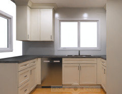
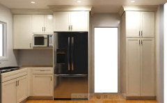
Original Author4 months agoHere are a few rendered drawings of what I have so far.
The current dark gray/black countertop in the photos is just a placeholder. I’m still leaning toward a lighter countertop (white or light gray) with less contrast against the cabinets to create more continuity in this relatively small kitchen (~110 sq ft). In terms of material, I'm pretty much open to many things.
For the backsplash I've decided to do 3x6" subway tiles. I haven't decided on the color yet (it'll likely be some shade of white again). I'm really struggling with figuring out the layout of the subway tile, especially on the range wall with the two windows. My designer gave me a few ideas:
1) Extend the subway tile all the way to the ceiling. The designer cautioned against this and said "that's A LOT of tile; could be distracting from the focal point of that wall which are the symmetrical windows".
2) Have the subway tile end right below the countertop on all 3 walls. This isn't great either because then it'd end below the hood, and there would be a gap between the backsplash and the bottom of the hood
3) Same as (2) except extend the tile above the range all the way to the ceiling, which creates an upside down capital T shape. The designer rendered that particular drawing (unfortunately I don't have a copy of it and it's late friday night and I don't want to reach out to ask for it) for me and I don't like the look of it...the upside down T looks weird and too pronounced.
4) Same as (2) except extend the tile above the range only to the bottom of the hood. I also don't have a pic of this from my designer unfortunately, but I played around with a software I found online and drew up this: https://imgur.com/4DcMO5A (ignore the colors and just focus on the backsplash layout).
So this is still an upside down T, just a much shorter version of it compared to (3). It's OK but I don't love it.
5) Same as (2) except instead of having everything end below the countertop, extend everything upwards to the height of the bottom of the hood.
This is OK. Similar concern as (1), i.e., a lot of tile, but not as much.
I don't really love any of these options, and idk if there are other options we haven't considered yet? I'm really stuck on this one and could use some 2nd, 3rd, 4th opinions
Note that for option (1), I think my general contractor said that they would need to install the tiles before the upper cabinets -- something about having to put the tile behind the crown molding. This is a non-issue with the other options.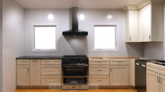
- 4 months ago
I’m a ”use as few materials as possible ’ girl in the kitchen as I think often design elements keep getting added until it’s a bit of a mish mash - and I am normally not a tile lover bc it dates fast to my eye (just a me thing) but all that said, I’d want a clean backdrop for the walls and not a lot of different competing lines so I’d pick a super simple tile and run it to the ceiling. If the tile is low contrast and low key with matching grout, I think it will recede in a good way (i’d mock it up with color copies first to be sure)




freedomplace1