

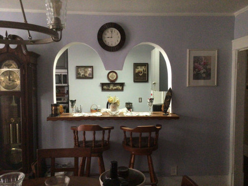
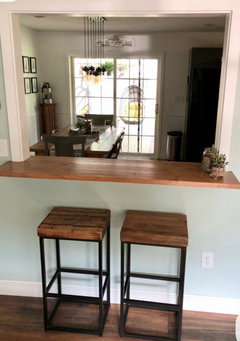
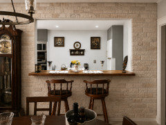
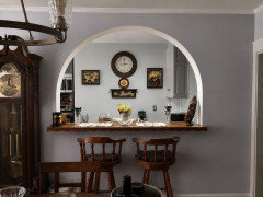
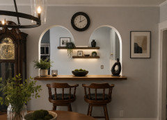
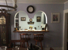
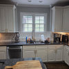
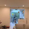
Help to remove cut out on wall
2 months ago
Featured Answer
Sort by:Oldest
Comments (19)
 PRO2 months agolast modified: 2 months ago
- PRO2 months agolast modified: 2 months ago
Related Professionals
Brooklyn Kitchen & Bathroom Designers · Birmingham Furniture & Accessories · El Dorado General Contractors · Santa Fe General Contractors · Wichita Falls Bathroom Remodelers · Natchez Interior Designers & Decorators · Williamsburg Interior Designers & Decorators · Shreveport Architects & Building Designers · Saint Cloud Architects & Building Designers · Olean Architects & Building Designers · Lawton Kitchen & Bathroom Designers · Charleston Kitchen & Bathroom Designers · Tucson Kitchen & Bathroom Designers · Wenatchee Kitchen & Bathroom Designers · York Kitchen & Bathroom Designers- PRO2 months agolast modified: 2 months ago
 2 months ago
 2 months ago
- PRO2 months agolast modified: 2 months ago
 2 months ago
- PRO2 months ago
- 2 months ago
- 2 months ago
 2 months ago
- 2 months agolast modified: 2 months ago
- PRO2 months ago
- 2 months ago
 2 months ago
- 2 months ago
 PROlast month
- last month


Related Stories

LANDSCAPE DESIGNIs Your Garden Cut Out for Matisse Inspiration?
Look to the artist’s paper collages for a creative and easy approach to garden design
Full Story
FEEL-GOOD HOME50 Out-of-the-Box Ideas for Bedroom Accent Walls
Neon signs, gallery walls, wood and dramatic paint add personality and budget-friendly flair to these bedrooms
Full Story
GARDENING AND LANDSCAPING7 Out-of-the-Box Retaining Wall Ideas
Go Beyond Railroad Ties With Stylish Rock, Metal, Blocks, and Poured Concrete
Full Story
REMODELING GUIDES11 Reasons to Love Wall-to-Wall Carpeting Again
Is it time to kick the hard stuff? Your feet, wallet and downstairs neighbors may be nodding
Full Story
LANDSCAPE DESIGNGarden Walls: Dry-Stacked Stone Walls Keep Their Place in the Garden
See an ancient building technique that’s held stone walls together without mortar for centuries
Full Story
HOME OFFICESQuiet, Please! How to Cut Noise Pollution at Home
Leaf blowers, trucks or noisy neighbors driving you berserk? These sound-reduction strategies can help you hush things up
Full Story
BEFORE AND AFTERSGreen Walls Wake Up a Tired Living Room
With a $6,000 budget, this couple rip out carpet and wallpaper to create a colorful, eclectic space to hang out in
Full Story
KITCHEN DESIGNHow to Map Out Your Kitchen Remodel’s Scope of Work
Help prevent budget overruns by determining the extent of your project, and find pros to help you get the job done
Full Story
PAINTINGHouzz TV: How to Paint a Wall Faster
Should you roll your paint first or ‘cut in’ the edges with a brush first? This expert’s preference can save a lot of time
Full Story
COLORPaint-Picking Help and Secrets From a Color Expert
Advice for wall and trim colors, what to always do before committing and the one paint feature you should completely ignore
Full Story


katinparadise