

Craft room paint colors?
2 months ago
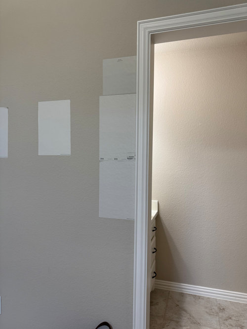
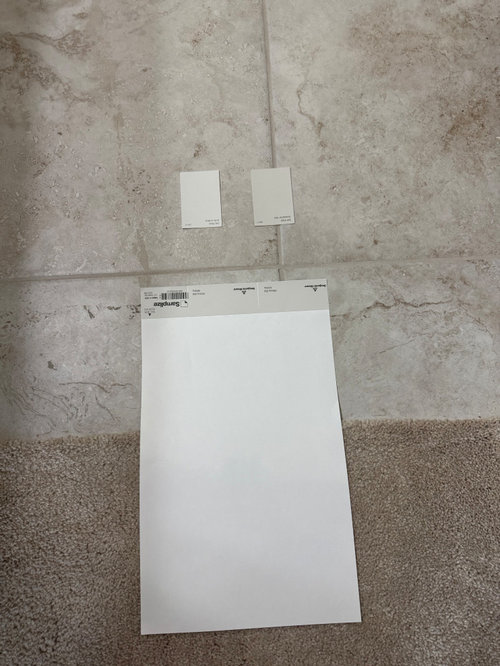
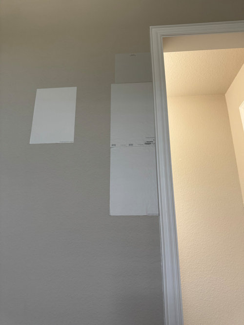
Gossamer Veil
Drift of Mist
Pale Oak/Athena
Keep the original wall color
Use a different color
Featured Answer
Sort by:Oldest
Comments (9)
Related Professionals
Orange County Interior Designers & Decorators · Newport News Bathroom Remodelers · Manhattan Bathroom Remodelers · Newport News Interior Designers & Decorators · Grand Forks Interior Designers & Decorators · Bloomington Kitchen & Bathroom Designers · Atlanta Furniture & Accessories · Waycross Furniture & Accessories · San Antonio Furniture & Accessories · Elgin Furniture & Accessories · Ontario Design-Build Firms · Philadelphia General Contractors · Mason City General Contractors · Provo General Contractors · Minneapolis Flooring Contractors 2 months ago
- 2 months ago
 PRO2 months ago
- 2 months ago


Related Stories

COLORColor Palette Extravaganza: Room-by-Room Help for Your Paint Picks
Take the guesswork out of choosing paint colors with these conveniently collected links to well-considered interior palettes
Full Story
BATHROOM DESIGN8 Bold Paint Colors for Your Powder Room
Turn your powder room into a exclamation point with a bold shot of red, raspberry, hyacinth, rich brown or stormy blue
Full Story
BATHROOM DESIGN7 Striking Paint Colors for Your Powder Room
Whether you opt for a little or a lot, see why the petite bathroom is the perfect place for a fun hue
Full Story
INSIDE HOUZZSearching for the Perfect Paint Color? Try Our Color Finder Tool
Houzz’s Color Finder tool will help you find a shade that’s just right. Here’s how it works
Full Story
COLORColor Feast: 6 Deliciously Uncommon Dining Room Color Combos
Give your mealtime space a generous helping of hues paired in a most refreshing way
Full Story
LIVING ROOMSRoom of the Day: Color Wakes Up a Living Room
A modern blue, gray and orange rug is at the center of a redesign that embraces the homeowners’ art collection
Full Story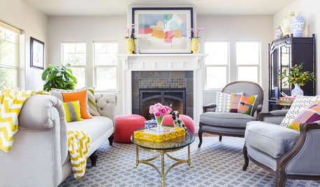
DECORATING GUIDESRoom of the Day: Color Cheers Up a California Living Room
A couple’s eclectic city style brightens a suburban bungalow
Full Story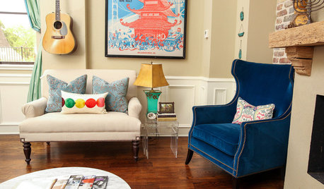
LIVING ROOMSRoom of the Day: Colorful Living Room Hums With New Energy
A Broadway poster inspires the makeover of a much-redecorated space, this time with vibrant new upholstery and a faux fireplace
Full Story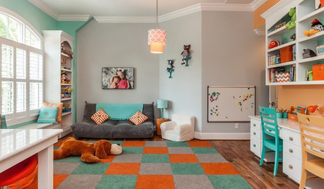
KIDS’ SPACESRoom of the Day: Colorful and Organized Kids’ Playroom
Everything has its place in this North Carolina crafts, study and play area for 3 children
Full Story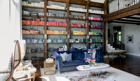
ROOM OF THE DAYRoom of the Day: Color-Coded Bookcase Spiffs Up a Nashville Library
Starting from nothing, designer Hannah Crowell crafted an eclectic decor scheme that turns traditional style on its head
Full Story


Benjamin Dennis