Software
Houzz Logo Print
buckeyemamato2

Decorating Fireplace Mantel

12 years ago
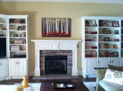
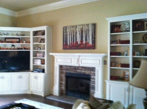
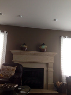
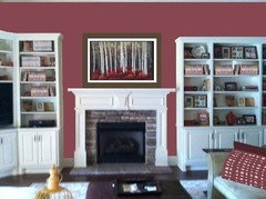
I have finally found the right picture to hang above our fireplace and I love it but feel that I need to "finish" the mantel with something - just not sure what? I would love to hear your ideas. I have thought about lanterns. I am also attaching a picture of some amber mercury glass candle holders that I thought might look nice - a set of 3 on one side and something else on the other? or purchase 2 sets- 3 for each side? With the high ceilings and the built ins I know that scale of whatever I put on the mantel will be important - again looking forward to some great ideas!

Comments (66)

  • 12 years ago
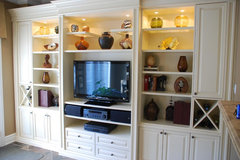
    I really appreciate all the great suggestions. In looking at my own photos and reading the suggestions it has become obvious that I need focus more on my built ins then on my mantel. This is a new home and we had the built ins added just 2 months ago to hold our TV( to the left of the fireplace) as I did not want the TV above fireplace. Once installed I struggled with what to put into the bookcases - besides the obvious, books. Decoenthusiaste, I really appreciate the styling suggestion and links. You asked if there are 3 identical boxes....I'm thinking that you are referring to the first column of bookshelves where I have actually staggered on four shelves - 101 antique books from the "Little Leather Library, circa 1924-25. These little red books are approx. 3 1/2 x 4 inches in size...from a distance they look like identical red boxes). I debated how to display these little books and ended up dividing and staggering between shelves...would you have any suggestions for these? Also, in answer to your question, the shelves are adjustable.
  • 12 years ago
    I love the way your painting pulls the fireplace surround up beyond the mantle. With everything being so symmetrical, I wonder if the painting might add even more interest if it were placed off-center. Then perhaps you could add a very tall clear glass vase on the opposite outer edge of the mantle with an arrangement of flat, dark red reeds that are higher than your bookcases, perhaps mere inches from the ceiling. For added height and dimension you could carefully prop the vase on a box or pedestal sturdy enough to support it. You could even paint an item (or reed) the color you need if necessary, and distress it. It might be fun if you painted it with red first n then your charcoal. If you use a little candle wax on the red, the areas you want to distress will rub off more easily revealing the red beneath with a fine grit sandpaper (320). Or, if your vase is tall enough, you could play the same color trick with any interesting object you have lying around or pick one up at an off-price store. I like empty frames and oddly-shaped wicker boxes bc they seem to draw the eye. Using the high-low-medium theme and working in odd numbers might work in your mantle-scape. The possibilities are endless in decorating. Every eye sees beauty differently. I love your red. My powder room ceiling was Ralph Lauren's Hunting Coat Red until recently. I have my grandmother's ruby-glass platter on my mantle. I'm always changing things. I think I have "decorating ADD." Hope this helped. M
    buckeyemamato2 thanked makennac
  • 12 years ago
    Although the painting is lovely, I think that space needs a larger painting hung vertically to break up the exact horizontal line of wall units and current painting. There is not much interest if everything is so regimented. Also try removing some of the shelves to add variation in the cabinetry.
    buckeyemamato2 thanked mountie
  • 12 years ago
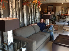
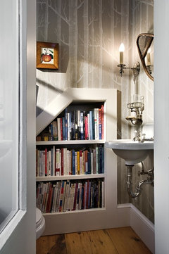
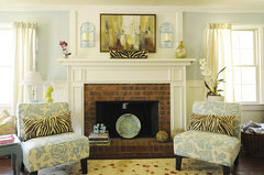
    I'm familiar with the "Little Leather Library" as my friend has had some in her antique shop. 101 is a lot of books, so distributing them throughout the shelves can work - in 3's, 5's and 7's. Pulling some to the mantel and a couple to the tray on the hassock will help sprinkle the color for you. If you didn't have so many shelves I might suggest backing them with some birch tree wallpaper, but that would be too much. Do you have a niche or small wall where that might fit in to pull your art theme around just a bit? Maybe just a bit of birch decor would be fine. This guy has gone a bit over the top. Might pick it up in a powder room or breakfast area.
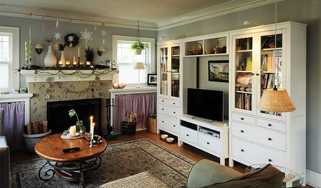
    Our Union Street window · More Info

    Atherton Holiday House Tour · More Info

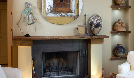
    Traditional Living Room · More Info

    Snug yet elegant powder room · More Info
    buckeyemamato2 thanked decoenthusiaste
  • 12 years ago
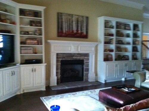
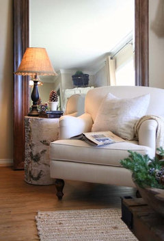
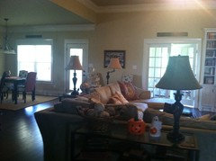
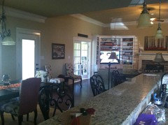
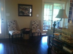
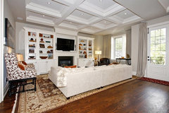
    Decoenthusiaste- I am attaching additional pictures that give a view of how open our floor plan is...thru the french doors is a sun room and the other door leads to a screened porch. My kitchen and breakfast nook is very open to our great room. I have been looking for new table and floor lamps...and I love the table lamp in the "Union Street" pic above. Also currently using a make shift table from a large old crock between the two chairs that I have set on the wall/doors leading to sun room and screen porch. Perhaps the side table above would work in that spot. I do love the idea of bringing a bit more birch into the decor so maybe thru the lamps or a small table. Now back to the built ins....I think i will take your advise and break up my "little leather library".....have a feeling I will be playing with rearranging shelves and decor most of next week. Thanks again to everyone for the wonderful suggestions.
  • 12 years ago
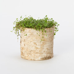
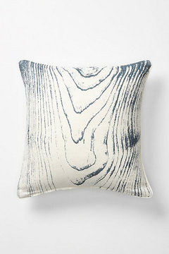
    Thought of you...
    Birch Cylinder Pots · More Info

    Faux Bois Pillow, Birch · More Info
    buckeyemamato2 thanked decoenthusiaste
  • 12 years ago
    Here's a very pleasing shelf arrangement. http://houzz.com/photos/765556

    Hope this works, I never tried it before.
    buckeyemamato2 thanked cindyguent
  • 12 years ago
    Have a great time arranging...you have a beautiful home!
    buckeyemamato2 thanked cindyguent
  • 12 years ago
    last modified: 12 years ago
    You have already had some great suggestions, but I would like to add my thoughts as I have a different take on the situation. Keep in mind we are talking about "hierarchy" here, something needs to be boss & in decorating for something to be visually pleasing there has to be some hierarchy. You have a beautiful room, but to my "decorators eye" the bookshelves are upstaging/fighting for attention with the mantel and fireplace, especially as your background wall colour provides quite a contrast to all the white. If you want the fireplace to be the feature out of the trio (usually it is), then I think you have to coax the bookshelves into the background a little. An easy way to achieve this would be to paint some cardboard pieces (as a trial) the same colour as your yellow walls, cut to fit in the spaces at the back of the bookcase. If you don't like this idea after decorating around it, no harm done. Or try some wallpaper in a pale yellow & white.
    buckeyemamato2 thanked lindav
  • 12 years ago
    last modified: 12 years ago
    Kitchen eating area built-in · More Info


    city · More Info
    buckeyemamato2 thanked inkwitch
  • 12 years ago
    Inkwitchs pics are a good example of a balanced arrangement. The black of the tv and fireplace draw your eye as they are central to the units and there is unity and harmony created with the fireplace, shelving units and walls painted all the same colour. The molding above the tv also gives unity to the arrangement, but also gives the fireplace area centre-stage. Hope this helps.
    buckeyemamato2 thanked lindav
  • PRO
    12 years ago
    There are so many fabulous ideas here! And the picture is really perfect for the space and style. My 2 cents would be to put a frame on the picture, possibly rustic white, not wider than the trees in the picture. It will contrast beautifully with the pretty color on the wall. Then add a tall vase on one side and a group of 3 tall candles on the other to finish it off. Let us all see your final finished product!
    buckeyemamato2 thanked VivaDesign
  • PRO
    12 years ago
    You have plenty of great ideas here to pull from, love decoenthusiaste's ideas/lesson, what I want to stress is that this isn't something that comes together on the first try.

    When I've worked in client's homes this much shelving can take HOURS to get right. And usually we come back and do some more the next day after we get the right accessories to fill the holes we've created with what we had to start with.

    To start take everything off the shelves and relocate them to get a nice arrangement - it may change as you start to fit books,etc on them. You definitely need to get rid of some of the shelves. They are too close together for the scale of the overall space. You're not just decorating a set of shelves.....you're creating a visual from the other areas, so you need to have some larger scale items that will be seen from across the space, then smaller items become clearer as you get closer. Maybe get rid of both above TV and do extra large pieces there....again see deco's second photo. Personally I don't have to have my shelves line up all the way across, but that's just my taste. Look at how they balance with the fireplace space. Find an inspiration picture if that helps guide you.

    Don't be afraid to play with it over and over. Go thru your house and pull things from other spaces....something like the triple candlesticks could look nice on a shelf...with lots of "negative" space around them.....balanced by a small stack of books with maybe a small knickknack on top of them, don't center the candlesticks....and even this I guarantee I might have to try twice to get right! Some people have the gift..some have to work at it. Have fun....can't wait to see the results.
    buckeyemamato2 thanked Catherine Belan
  • PRO
    12 years ago
    Definitely needs a green plant trailing down on one side for softness. Perhaps your grouping on the other side or maybe better a topiary to continue the nature theme. No matching sides - this room has too many square angles going on so something softer is needed - quickly! :)
    buckeyemamato2 thanked J&K Property Investors
  • 12 years ago
    I love your beautiful built-ins. I do agree with others though that the shelves are too lined up. It would give more visual interest and flow if they were staggered so different sized items could be placed on them. They look a bit forced as-is. I love the picture you chose, but as it is, the spot which should be the focal point of the wall looks a little left out. I agree with lindav--there needs to be some hierarchy. I think the area above the fireplace needs to be visually taller than the bookcases. You might consider having some sort of overmantle. Maybe a panel which repeats the design of the doors on the bookcases, or some picture-frame panel painted the color of the built-ins. I might even paint the wall around the fireplace the same color to make everything look more cohesive. After that, I think some nice garland across the mantle with a few small votives would allow your art to take center-stage.
    buckeyemamato2 thanked decorgirl01
  • 12 years ago
    I wouldn't add anything to the mantel; reduce the amount of things on the shelves by 2/3rds. Start by taking everything off .. 3 piles .. "must have" "maybe" "can go".

    Will be a whole lot easier to dust too!
    buckeyemamato2 thanked indianpatti
  • 12 years ago
    Don't add anything to the mantel but DO add a frame to the painting. This is why the area looks "unfinished".
    buckeyemamato2 thanked Michelle Moscow
  • 12 years ago
    First of all, LOVE it! ;o)

    I wouldn't do too much. Maybe some white pillar candles clustered in the corners? Save big decorating for the holidays! That mantle is going to look smashing in the wintertime!
    buckeyemamato2 thanked Julie Elder
  • 12 years ago
    I love it! The only thing I would add is to paint the mantle and moldings surrounding the fireplace a black. It would give it the contrast you are looking for! You could even paint the inside of the bookshelves.
    buckeyemamato2 thanked jlnicholls22
  • 12 years ago
    Had the same dilemma and found these at Home Goods :)
    buckeyemamato2 thanked ymiadcsc
  • 12 years ago
    I love the picture of the birch trees, it's perfect! Have you seen the candle holders covered in birch bark? You can use them with tea lights or candles, and them come in a variety of heights. They look really nice when surrounded by a few every green branches. I would arrange them on one side of the mantel only, in staggered heights. :)
    buckeyemamato2 thanked halfpint2
  • 12 years ago
    you could anchor it on either side with candlesticks on one side and an old oil lantern on the other. nothing taller than half the height of the picture.
    buckeyemamato2 thanked Patrick Besong
  • 12 years ago
    I like Vivadesign's idea of a rustic white frame around your painting and nothing else. Also fill your fireplace with a large stack of birch logs. You can get some good-sized well-cut ones from Wilson's evergreens: http://www.wilsonevergreens.com/fireplace-birch-logs.html. That will also connect your white built-ins, fireplace, and painting. Your place is already gorgeous and comfy!
    buckeyemamato2 thanked housegal200
  • 12 years ago
    Would some type of wall lighting work in the narrow area on each side of picture?
    buckeyemamato2 thanked beesknees2260
  • PRO
    12 years ago
    The break between the fireplace and bookshelves is adding a very strong vertical element that is distracting. I would add a piece of chair rail on either side of the fireplace at the height of the trim at the top of the fireplace brick surround (the piece of white trim that protrudes slightly on either side). Paint this trim and the wall below it the same color as the shelving and mantel and you will get a more built-in, harmonious look. This will shift the focus from the wall to the accessories. I agree that the a few shelves should be removed to vary the height of the shelving. It is too symmetrical right now. Your eye is drawn to the horizontal lines of the shelves rather than the interesting accessories displayed on the shelves.
    buckeyemamato2 thanked DESIGN SOLUTIONS
  • 12 years ago
    How about a soft flood accent light to illuminate the painting? I've seen this painting in a local decor store and love it! The textures of the red are beautiful in person, and perhaps a little bit of lighting on it might bring that out. I also agree that you should space your shelves if they're adjustable.
    buckeyemamato2 thanked skfreyca
  • 12 years ago
    I would definitely add an ivy plant trailing down on one side of the mantle--I think every area of a room needs a plant to break up the solid areas.
    buckeyemamato2 thanked nhmorris43
  • 12 years ago
    The fireplace and art work are both dwarfed by the book shelves. You need to make the center more powerful. Several suggestions: painting twice that size; group of prints including your painting; stone or tile backdrop to the sides and above the fireplace; wallpaper around and above the fireplace; paint the wall just around and above the fireplace.
    buckeyemamato2 thanked oddshots
  • 12 years ago
    I believe this suggestion was made by someone above, but I can't find the post. Try putting a white frame around the picture, see if you like that better.
    buckeyemamato2 thanked halfpint2
  • 12 years ago
    Too many items the same scale on the shelves. Vary the textures and sized of the items and leave some open spaces on the shelves. Sometimes less is more.
    buckeyemamato2 thanked misael11
  • 12 years ago
    a long row of votive candles in clear glass holders
    buckeyemamato2 thanked Leslie Liddell
  • 12 years ago
    Choose a color from the painting for the wall and accessories and have the painting framed and mounted to make more of a statement keeping it level with the bookcases.Add more substantial pieces to the bookcases and more books to stop the display looking too bitty. Perhaps a trailing plant to one side of the mantel.
    buckeyemamato2 thanked Coco Nuts
  • 12 years ago
    The shelves are too busy and distract from the fireplace and painting. A couple of plants on the shelves would look nice as well.
    buckeyemamato2 thanked shelaw
  • PRO
    12 years ago
    I would edit what's on your bookshelves .. too much.. simplify ....Have a couple of small pieces in red maybe short an round .. then take another pic and send here to help with mantle.. You want your pic to be the focal point and right now you don't know where to look... Less is more
    buckeyemamato2 thanked AliciaTappDesigns Images on Tiles
  • 12 years ago
    I too vote that you need to simplify and add more negative space to the shelves. Paint the backs of the shelf units to match the soft yellow wall color and remove a few shelves. I would also suggest that the painting be proped ontop of the mantle instead of wall hung as I find that the eye needs to get a different horizontal line - right now it sorta lines up with the top of the wall units and this is distracting. You could also add some wicker baskets to the top of the bookshelves to add height and leave the painting as it is, but then it would need a bolder frame to "beef it up a bit" to the correct scale. I would add a mid sized trailing plant ( the room needs something organic) down one side of the mantle and the 3 amber hurricanes on the other. I think you will really like how this decluttering of the built-ins allows your eye to focus in on the fireplace and art first.
    buckeyemamato2 thanked Leta Thiessen
  • 12 years ago
    last modified: 12 years ago
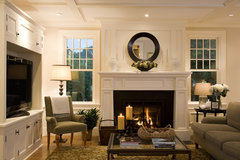
    First you have a very nice home. I know that painting and love it too. I agree with the comment above from Design Solutions. There is a problem with the wall behind the fireplace. There's a disconnect there. I'd run some trim across the top wall to connect the 2 shelving units somehow. Or even better remove the small pieces of crown molding on each side of the top edge of each unit then extend the top board nearly the same width and depth as the top of your shelving units and add a few recessed lighting fixtures in this to accent your picture. Then you add bead board on the wall of this entire area. Paint it white and everything would be unified. Another thought would be paint the back wall of the shelving yellow like the rest of the walls but leave the shelves white. I agree that the shelves are too symmetrical and some need to be adjusted to different heights. I'd try propping the painting up against the wall (off center) and add your three glass candle holders.
  • PRO
    12 years ago
    Hi buckeye! I know I'm getting into this discussion late in the game, but I think the reason you feel that there needs to be something else added to your mantel is because the painting and the wall color are competing.

    What I would do is to frame out the area above the fireplace with trim to add some architectural detail and paint that area white. Below are some examples of what I'm talking about. I think it would be gorgeous!
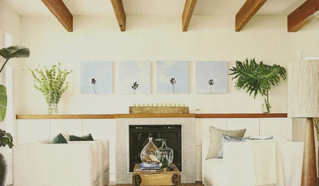
    Contemporary Beach Living Room · More Info

    Mignon Road · More Info

    Living Room · More Info
    buckeyemamato2 thanked ACR Interiors
  • 12 years ago
    my first thought was a trailing ivy plant on one side to add some softness to all the straight lines...I agree with the nhmorris 43... plants bring life to rooms!
    buckeyemamato2 thanked Carol
  • PRO
    12 years ago
    You can also frame the canvas and you will not feel the need to put a lot more in the space. I like something sole and low with tea lights others suggested or maybe just the red vas if it is not too small. You do not need something on both sides!! I also love the deck uttered bookcase ideas from decoenthusiast!
    buckeyemamato2 thanked Gillilan Designs Inc.
  • 12 years ago
    Your room looks lovely. Decorating shelves can be hard as many have said. Definitely remove some of the shelves so the spaces are not so uniform. That way you can place a large, tall object in a space or lean a painting in one. Use fewer items. I am not a fan of a lot on the fireplace mantel. At the most, I would try your red vase to one side just to see how it looks. Nothing on the other side. I see a basket or leather box on the hearth holding cozy red throws.
    buckeyemamato2 thanked Debp
  • 12 years ago
    Your home is beautiful and you have acomplished a lot in a short time. An eye trick is in bright light (day time) look at your wall units and fireplace and stare then close your eyes-- what remains in your vision with your eyes closed? I think you will almost see and H . Bookcases framing fireplace. You need more varied heights both in the bookcases and above. One way may be to widely trim out around the picture similar to the trim on the sides of the fireplace make sure you go above the 2 side bookcases in height and not beyond the fireplace width(not mantle width) maybe even add the same pediment as in the center of the fireplace but that may also take away from the painting its trial and error. Paint the trim and interior white and put the painting back in the center. Put some large items above the bookshelves ie an old birdcage-a small wagon-??? a large plant spilling down one side by the fireplace?? you just don't want long straight lines. Above is as hard as decorating the inside of the bookcases.Its all about balance-pleasing the eye and the natural desire for the eye to want to travel around its surroundings and not get stuck with too much clutter or lines that just lead away from the focal point. Basicially you are making a giant painting like the one you like--your eye travels around looking at the trees you go up one down the next go to the red on the bottom go back up a tree come back down to the red but alway going back to the center because the red is a little higher and thicker there but since it spreads out in 2 directions your eye wants to see everything so you go back and forth staying within the painting.Basic composition. You know it in taking a picture just expand it to your room. You already have the basics. If your not sure ask a professional they are used to working with different proportions and can save a great deal of time though I think the stage you are at now is the most fun. Really the majority is just moving things around stepping back and living with it for a few days then trying again. You'll
    know it when you finially get it right for you. Good luck and enjoy.
    buckeyemamato2 thanked lomogo
  • 12 years ago
    last modified: 12 years ago
    lomogo could you please explain further the eye trick & the theory behind it - sounds like a really useful tool. Your other tips are great too, are you an artist? They sound like art theory which of course works equally as well with decorating/design - in the end it's all art. Love that we can learn from each other.
    buckeyemamato2 thanked lindav
  • 12 years ago
    lindav
    the eye trick was taught by a high school teacher (way before computers) to learn light/dark relationships--we were given a color painting and we had to render it in india ink which allows only black and grey variations up to the white paper.So if you have a person in a purple robe wearing black boots sitting on a red velvet chair with his hands resting on the walnut arms at first it seems impossible to transfer all those dark rich colors to black and white but by looking intensely than closing your eyes you retain a particial image on your retina for a monent which gives you the most dramatic lights and darks so that purple is a light grey while the red is a little darker grey, the hands are almost white against a very dark grey arm etc. Its easy now with photo shop --just take a color photo scan it and then play with different modes-bk/wt, sepia etc. and you'll see what stand out as the focal point and how physicially something is balanced. That being said color also adds it own weight and balance ie almost everyone picked out the red vase and red books/boxes to add weight and balance to the "heavier" red in the painting .Basicially the eye is not stagnant it is moving all the time without us even realizing it--you don't read letter by letter or even word by word your eye is moving to see as much as possible (transferring it instantly to the brain to analyze) so you read in lines, sentences even paragraphs and interestingly you automaticly correct for a misspelling or missin word or letter (impressionist painting!) You read a room the same way.
    You don't have a pinhole view you automaticially scan all and then rest for a moment on a focal point and scan again and again (all unconsciously) the eye loves to undulate around different level of height and color---that's how supermarket shelves are set up -they know where your eye goes first and where it will linger the longest--a sale is made! Wow this is long winded but I hope it helps. That being said there are also symetrical people and asymetrical people--on a mantle we had if I dusted the 2 candle sticks were on one side the glass dome clock on the other (2 + 1 asymetrical) if my husband dusted it would be candle stick on each end clock in middle( 1+1+1 symetrical)Neither one is right or wrong just a preference and I'm just really happy he dusts! So design/art is not cost or amount of things its what makes you feel balanced and there are "tricks" to achieve it. 2 tall thin things balance 1 low fat thing,different color receed or expand or change perception of each when place next to one another . Its just fun to experiment and when you achieve that balance it feels really good and comfortable-your eye can finality rest!
    buckeyemamato2 thanked lomogo
  • 12 years ago
    Lava lamps.
  • 12 years ago
    Gary..lol
  • 12 years ago
    Hi, there. I've been following this discussion and I keep looking at the fireplace wall and trying to figure out what is bothering me. I think I came up with it. The shape/size of the painting doesn't work. I love the painting, but I would recommend something that has a vertical shape--about the same width as the painting you have, but taller so that it extends noticiably above the height of the bookcases. Have it high enough that you can flank it with a few tasteful items on the mantel. Unclutter the bookcases. I think that they are overwhelming the fireplace and it should be the star.

    I love the painting and the color, but it's just not right there (in my opinion, at least).
    buckeyemamato2 thanked jen046
  • 12 years ago
    You are all just fantastic ! I appreciate all the comments. I plan to take a day later this week to just sit down with a cup of coffee and my computer as I review and reflect on all the suggestions before I make any major changes. I have already begun to tackle the shelves...it is a huge undertaking but I am finding it fun. As a side note- My dining room is open and adjacent to this room and I am also still working on putting the finishing touches in there.....trying to decide on the right piece of art....I hope you guys will be up to making suggestions for that room too. I'll be taking some pics of that area soon - so you can look for another decorating dilemma from Buckeyemamato2. Thanks again!
  • 12 years ago
    Lomoto...love your explanation above. I might not be able to pass a test on that theory, but I can relate. I am a musician. To me, it is all about rhythm. This applies more specifically in decorating shelves than other areas, but when things follow a certain rhythm, it will be right.
  • 12 years ago
    Rather than hanging the pic, you might try just leaning onto your mantel and adding some intertwined birch branches around its base with varying lengths of twigs emerging upward and a red berry glued here and there.
  • 12 years ago
    What did this room look like before you put in bookshelves?
    It seems to me that you did not leave enough free space on each side of the fireplace. When you try to put more of anything here it only gets worse.

    But the major problem for me is the excruciating contrast the white presents. I see you have this strong white in all the crowns in this space. The long counter in the kitchen has some grey in it. The current wall color doesn't work here. If the walls were some nice grey and the the cabinets painted in reduced tone (and reduced sheen) then the contrast between the two would be less brutal.

    I would not frame the painting. I would consider taking the red tone in the painting and using this color in the keystone.

    The cabinets did not need to be this high. 42-48 inches would have left more space.

    But you still have a lot going for you here!