Software
Houzz Logo Print
hayrud

Living Room Colors

12 years ago
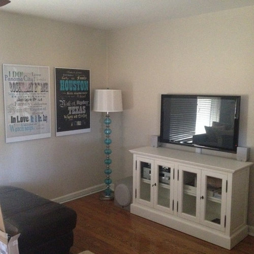
Hello! I just bought a house and im trying to figure out a color scheme for the living room. I have a media center from Restoration Hardware in the distressed white oak, and a turquoise floor lamp and beige couch and need to start decorating and i have no idea what goes together. I would love to have a fun fabric pattern in the room but i am lost on where to being to find things. everything is pretty much beige, walls off white. what looks good with those colors and turquoise? I thought yellows and purple but when I put it together it looked way too young for my taste! My sweet made me those picture on the wall but they printed out really cheap looking from the company i ordered it from and the whole room so far isnt going together. Thank you so much!!!

Comments (37)

  • PRO
    12 years ago
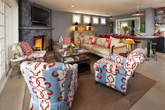
    I love the turquoise, and the touch of it in the artwork is the right idea to try to start to tie different elements of your room together. You can add a lot of interest and color with pillows (Z Gallery or West Elm have large selections with lots of colors) - and when picking out pillows, think in terms of not just color, but size/shape and texture - the "mix and match" approach.

    Also, a rug could tie the whole room together. Getting the right rug could help you figure out what you want for the rest of the room.

    Picking your wall colors will depend a lot on how you want to "feel" in the room -- try to think in terms of emotions like "calm", "energetic" and so on. Once you have the rug, you can build off that for your pillows and other accents - and then pick the paint color that will tie it altogether. Walls can definitely be a focal point in a room, especially where there is an architectural feature that you want to highlight. But short of that, your walls are your "blank canvas" that highlight the other objects in the room.

    It can feel really overwhelming, but Houzz is great site for seeing what other folks do, and start to firm up what you like and don't like. If you want to really pump up the turquoise, just do a search for "turquoise living room", and see if there's anything there you like? Or you could search for "calm neutral living room" if that's more your speed. Start an Ideabook, and start to compile looks that really speak to you, and then start to apply it to your living room. And most importantly, trust your gut - it'll never steer you wrong.

    Good luck - and have fun!
  • 12 years ago
    last modified: 12 years ago
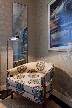
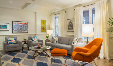
    Wallpaper (infinite variety and peels right off now) really adds zip! Wallpaper could just be a back drop to add interest. You could look around (consignment stores) for a fun chair to recover in a great fabric. That could be your jumping off point.
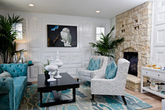
    Drew McGukin Interiors - Chelsea Apartment · More Info
  • 12 years ago
    With turquoise, think of it as a spectrum that ranges from the very light tones (spa blue) to the deeper teals . .. just train your eye to see the difference between blue and blue-green. Since you have the charcoal ottoman, gray and cream and some aqua is a good place to start because then you can add all shades of gray to black and work with your off-white down to oatmeal and linen tones. You can add one print that brings in other colors, but generally, while you are starting out it is better to focus. Look online for print fabrics that combine creamy off-whites, some shade of aqua - when you find one you adore, get enough to make a pillow cover or carry around a large 1/2 yard swatch - build from there. . . take your time, make an idea book here with images for inspiration - don't over think it - just search and click, then go back through and determine what it is that they have in common / what drew your praise . . . then slowly, learn more about how to get there.

    Painting your walls will do a lot for you, and if you select a neutral greige you could go forward with that now . . .if you want to send the charcoal to another room, you could do a pale cocoa wall - your turquoise and white would pop then and the room would feel very cozy. Like bm winterwood http://www.benjaminmoore.com/en-us/paint-color/winterwood

    But even if you keep the charcoal and layer, if you go one shade up / to a paler taupe the room will take on instant sophistication - test here's brushed aluminum http://www.benjaminmoore.com/en-us/paint-color/brushedaluminum
    a good neutral to test -
  • 12 years ago
    Hello there! You have gotten off to a great start with your decorating. Do not doubt yourself! You just need to go the distance and start building on that co,or scheme you have established (maybe even expand on it), and start adding in new layers of interest through texture and variations of the turquoise/Ivory color scheme.

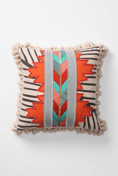
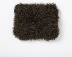
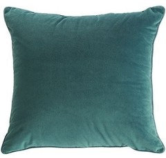
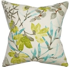
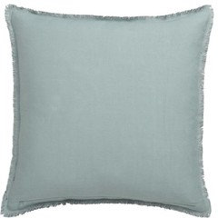
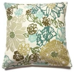
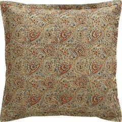
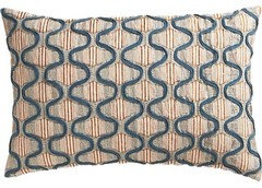
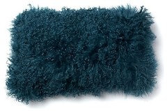
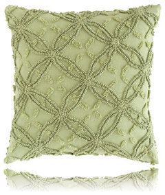
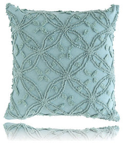
    All of the above comments are pointing you in that direction! To illustrate libradesigneye's idea of varying the turquoise, I'm going to post a bunch of sofa pillows that all use variations of turquoise. You could start with a few of these pillows, then work on a rug with great texture (maybe a wool/jute combo?), then curtain panels that either add more turquoise, or maybe just being in texture.
  • 12 years ago
    More ideas:
  • 12 years ago
    Some more:
  • 12 years ago
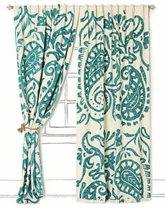
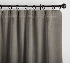
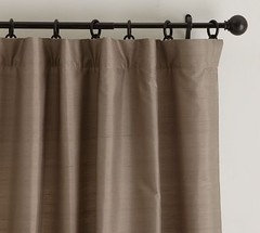
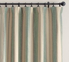
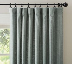
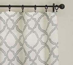
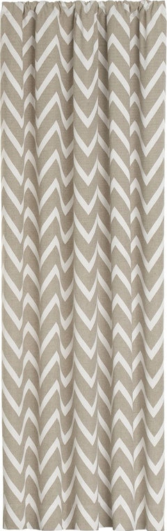
    Curtain ideas.
  • 12 years ago
    I did our last living room in a hazelnut brown with bright white woodwork. It looked very nice, but I did have lots of light from windows. But I do think that might look good with the turquoise if you picked up your turquoise in the rug and in throws and pilloows. We just moved and I am doing the accent wall in the brown and the rest of the walls in beige with blue and brown accents.
  • 12 years ago
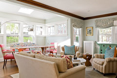
    One for you!
    HGTV Showhouse Showdown · More Info
  • PRO
    12 years ago
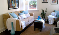
    I would move the charcoal print over the buffet. I like the other print and the lamp! And move the mirror somewhere else in the room. Nice start. Clean lines.
  • PRO
    12 years ago
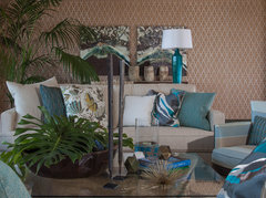
    Great ideas from colorific!
  • 12 years ago
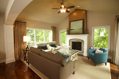
    Poster, could we get more photos of the room from different spots, plus your furniture also!
  • PRO
    12 years ago
    Painting the walls a subtle gray would create a contrast with the entertainment center and baseboards and give your room depth. Check out Light French Gray 720E-2 by Behr. You could build the room around shades of gray, turquoise, white and accent colors (greens, lavenders, browns) Karemore55 posted a lovely color spectrum. We need more photos, as pcmom1 suggested. For now, how about a glass accent piece on the entertainment center? I've also added photos of accent pillows for color inspiration.
  • 12 years ago
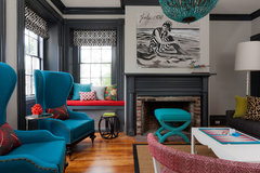
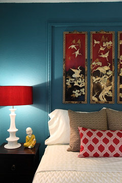
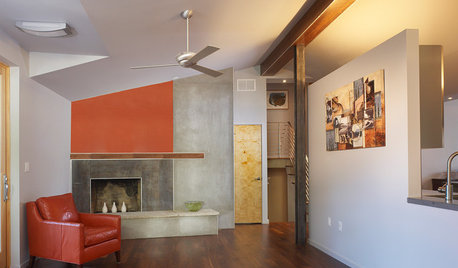
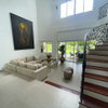
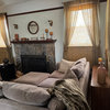
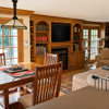
    I love the colors you have so far. What about incorporating pops of red? I think red, grey, white, and turquoise look fresh and modern together. Here are some examples of what I was thinking:

    1.)
    Contemporary Bedroom · More Info


    2.)
    Chapman House · More Info


    3.)
    the Bauhaus living space · More Info


    4.)
    The Upward Bound House by Elizabeth Bomberger · More Info


    5.)
    Living Room · More Info
  • 12 years ago
    From your original post, you don't seem to be afraid of colour. If the yellow and purple seemed too young, perhaps you just had the wrong shade or the wrong depth. Benjamin Moore Fire and Ice would be quite lovely on the walls with your gray (don't see your beige couch) and would help pop those pix. They don't seem so bad in your post. If the copy is cheap looking, I would get them to redo. If they are just a bit faded in places, think of them as antiqued. You already have a distressed piece (which is lovely), so go with that eclectic antiqued look.
  • 12 years ago
    Aquas & teals have been my favorite colors forever. Our home either has accents in rooms of that color or walls. My favorite colors to add to the turquoise is a soft lime green; corals; orange; soft, bright yellow; even some fuchsias. The main thing is getting the right shade like someone already mentioned. All look so well with grey & white. As for the pictures, you may consider putting them on canvas which is a great alternative, totally "upgrade" their look. Also using non glare glass makes a big difference in how they look. I did a poster too & the outcome was very similar to yours. I love the picture by one of my favorite artists & is perfect for our guest bedroom. But it didn't "work" for my taste & going to have it put on canvas though has been on hold due to the holidays. I should take before & after pics. Good luck.
  • 12 years ago
    I might add how much I love your media center. It is a great piece of furniture. The lamp & pictures are perfect for this room & a good way to begin building on. They would fit so well in my home! My couch is taupe, walls are a light beige. I really want to change the walls to a grey shade & will check out the recommendations you received. My new curtains are in a geometric pattern in turquoise & white-very similar to the curtains suggested to you. Looking at your room & furniture I think I need to make some newer changes here. So will be interested in how your room comes out.
  • PRO
    12 years ago
    last modified: 12 years ago
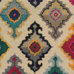
    -- In cases like yours, when you are a drift re: colors to work with or paint the walls, it is always so much easier to narrow things down if you have an area rug with a touch of turquoise in it. This would also give you other colors you could logically add. A piece of artwork also works - as does many other items - but, since you have a start on the artwork, go with finding a rug.

    Now, of course you can use a rug with no turq in it but you then have to be careful with how you add turq. around the room so it doesn't look like you tried too hard or didn't understand how to do it.

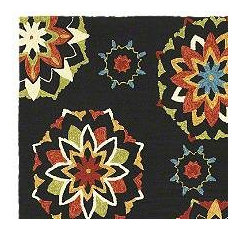
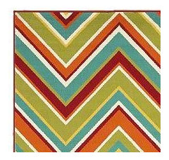
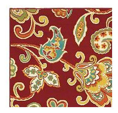
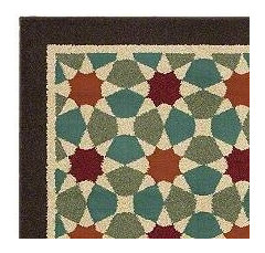
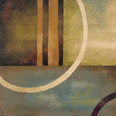
    The rugs that have the most turquoise in the design are contemporary or transitional . There are some traditional/Persian designs with turq. but the colors are too muted compared to your clear turq. Notice that all of these examples contain a shade of brick and a shade of olive green. If a rug has a cream/taupe/white shade as the lightest, make sure that it comes close to the white in the cabinet. You do not want the whites to be too different because one could make the other look grimy.

    All of these examples are from Shaw Floors.
  • 12 years ago
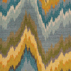
    Looks like you have a good start with the aqua touches in artwork and lamp. I was thinking an orange chevron would be good, then saw the Shaw rug above with orange and turquoise.
  • 12 years ago
    Blue with white damask pattern wallpapers on the accent wall and light blue paint on the rest of the walls
  • PRO
    12 years ago
    When painting the wall with the television, I would keep in mind how the color you use will interact with how you watch television. You might not want something that could be distracting from what you're watching.

    It's like going full screen when watching something on a computer, for instance, and the black bars show up. It makes for a more immersive viewing experience.

    You could do wallpaper patterns on your wall, if you would like to save money. The wall with the tv could be a darker gray, or even a nice brown. Something neutral.
  • PRO
    12 years ago
    last modified: 12 years ago
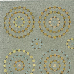
    I agree Sandy G. Area rugs are a great focal point for creating a color scheme in a room, so thought I'd add more options. I chose examples that tie in with what appears to be a black or dark brown ottoman, as well as the existing teal, white and grey. From the photo, it appears your style is contemporary, but cozy, so my favorites are the two with circular patterns. One is soft and subtle, while the other is more bold, but both have additional colors (yellows, greens, browns, creams) to drawn from when designing your room.
    Christi for ThosBaker
  • 12 years ago
    I have had very good luck with overstock rugs . . . for the $ you can get a great value rug there. Home Goods is another place with good quality seconds. I do think a rug is a great next step and that one with some blue-green in it is idea. However, your room will be more sophisticated if you do layer in different light and dark shades / values of the same turquoise hue . . . just make sure you like the rug like you would pick out artwork.
  • 12 years ago
    More food for thought...

    Belmont · More Info

    Harris · More Info

    Four Seasons Vacation Home · More Info

    Traditional Family Room · More Info

    East Bay Bungalow · More Info

    Lounge Lake Living Room · More Info
  • PRO
    12 years ago
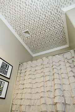
    Wallpaper on the ceiling could give this room style without making it feel closed in...
  • 12 years ago
    last modified: 12 years ago
    My family room ceiling is wallpapered. I agree, it can really be a great addition!
    Bathroom. · More Info
  • 12 years ago
    Karenmore55, where did you find those gorgeous paisley turquoise and white curtains?? Love them!
  • 12 years ago
    Black and white would look great. The turquoise will pop.
  • 12 years ago
    i think a light blue would look good but i would look at small details in the room and pick that color so that you can pull the color out or go with the mood and furniture of room
  • 12 years ago
    I see something like pumpkin on the walls.
  • 12 years ago
    Love the lamp and media cabinet. A rug will make it feel pulled together and I would consider some tone on tone designs- you can add the turquoise with pillows and fabric- Target has some nice weight curtains with a turquoise and white pattern that would add some pop without a big investment. Bleeker Beige by Benjamin Moore is a terrific paint color- is sophisticated and looks good with everything. Have fun with your project
  • PRO
    12 years ago
    to give you any worthwhile advice I would need the answers to the following: 1. Where do you live (North,East,South,West)? 2. The windows: where are they, what type, where do they face (North,East,South,West)? 3. What type of view do you have from your windows? 4. What furniture are you working with other than the wood piece in the photo? 5. what is the major FOCUS - the view, the paintings, a fireplace, a piece of furniture? This is where you need to start. 6. what are the dimensions of the room? Is it large or small? If you have other photos - especially those indicating where doorways are located, it would be helpful. thanks
  • 12 years ago
    I love neutral tones with pops of color, the turquoise lamp is great! I would use "shiny" jewel tone colors for accessories, pillows, draped. Fuschia, deep purple, emerald green and at least one other thing in turquoise.
    I always like my backround to be neutral so I can change the other colors at will and inexpensively.
  • 12 years ago
    I have a question for karemore55 - in your first comment, where is the pillow is the upper left from? (the one with the orange, and arrows, and stripes). I love it!!
  • 12 years ago
    Don't rush into decorating or painting. If you can afford it, go to art festivals and buy art that you like--paintings, glass, ceramics. Pieces are more affordable than you think. You will start to realize what colors you are attracted to and you can go from there. You are starting out with neutrals and that is great since you aren't limited to any one color. Don't feel wedded to the turquoise lamp. If it works great but if not, get another lamp. Have fun, that is the most important thing.
  • 12 years ago
    You can't go wrong with turquoise and lime! My living/kitchen/dining accent colors are turquoise/lime/orange. For a more neutral palette, I think turquoise and chocolate is warm and sophisticated.
Sponsored
Wannemacher Interiors
Average rating: 5 out of 5 stars26 Reviews
Customized Award-Winning Interior Design Solutions in Franklin Cnty OH