Software
Houzz Logo Print
marcnlisy

Left Paint swatch or Right??

12 years ago
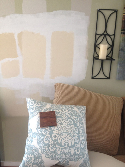
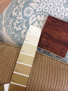
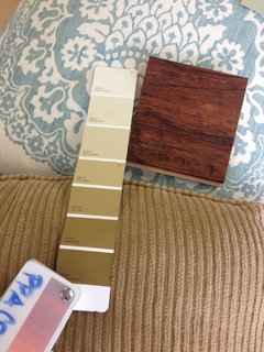
I have narrowed my paint selection down to 2 paints by Benjamin Moore. Here is a pic of the two swatches (long swatches…don't mind others) Here is my sofa and the pillow represents the colors in my home as well as a piece of my wood flooring. I also have a mix of rod iron and dark wood. So, the color on the left? or right? I am partial to the one on the Left because i feel like it brings out the warm tones in my sofa. I also love the right but is there something a little "fleshy" to it? i DO NOT want any pink.

Comments (33)

  • PRO
    12 years ago
    I prefer the one on the right, but either color will work beautifully.
    Lisy thanked User
  • 12 years ago
    last modified: 12 years ago
    I like the one on the left, too, as it is a nice tone for what you are showing, adds some color to the wall and makes it all work together. It seems to offer more contrast with the couch.
    Lisy thanked abbyjean
  • 12 years ago
    I think deco's suggestion is a good one as these colors depending on the light can sometimes look pink (I am not a fan of that either). I am also leaning to the one on the left but you really need to move it around the room at different times of day. I have made the mistake on testing it in one place and it looked fine, then when I painted it had a kind of fleshy undertone in the room as a whole.
    Lisy thanked saratogaswizzlestick
  • 12 years ago
    I have painted it a few places and they are both so pretty which is why I am having a hard time. Neither is in the pink family or really has any pink undertones but for some reason it did look fleshy to me (a tiny bit) compared to the one on the left. ITs such a hard decision. They are so close…but as we all know…a tiny change in color makes a big difference. I also want to brighten up this room. The windows mostly are North and South so it can be more shady in the middle. Hmmmmm…i don't know. lol. HELP
  • 12 years ago
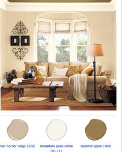
    This is my inspiration pic… I just love how the room flows from wall color to sofa
  • 12 years ago
    last modified: 12 years ago
    Love the inspiration pic.....so smart to work with one of those. I was hoping the color on the left would allow that to happen with the wall and sofa.
    Lisy thanked abbyjean
  • 12 years ago
    I am partial to the left so far. Even with the morning artificial light it looked so pretty.
  • 12 years ago
    saratogaswizzlestick. Thats what i am afraid of. If i even mentally noticed something fleshy in the right….what will happen when its everywhere!
  • 12 years ago
    Oh, good glad you tested. Pick the one on the left then. If the other looks the slightest bit fleshy now it will look more so when the room is painted. I like what you have chosen so far.
  • 12 years ago
    I couldn't stand it when it happened to me. The shade I repainted was not all that different but that fleshy tone was gone thank goodness.
  • 12 years ago
    Maybe it's my computer, but the one on the left looks quite pink to me. Is it the bar harbor beige from your inspiration pic??? If not, have you tried that color?
  • 12 years ago
    I prefer the color on the right. The color on the left seems to have a pink undertone to it although it may just be my monitor. But, either shade will look beautiful. Remember when a swatch is painted on the wall the surrounding wall color will influence the test color. It's not until the room is fully painted and the color bounces off it's self will you get a true read on the color.
  • 12 years ago
    No pink at all. It has yellow and green undertones. I tried bar harbor beige and it came out so dark w pink undertones on my wall. I think there big window and lighting lighten it up
  • 12 years ago
    Here are the swatches . It's the number 2 color from the top on each.
  • PRO
    12 years ago
    The one on the left seems fleshy to me...but it could be the computer. Today my bedroom was painted Sherwin williams Stucco, a khaki color to be coordinated with my gray bedding. Like you, my biggest concern was not wanting pink/peach fleshy colors. My husband swore it looked pink with the swatch, but it was the existing pale green on the wall. When in doubt, paint one whole wall. Either way, both colors work...and once you bite the bullet and paint, you'll never look back! Good luck!
  • 12 years ago
    I completely agree that the strip on the right has yellow and green undertones, but I think there are very pink undertones in the strip on the left, showing up the most in the shades 2nd and 5th from the top on that left strip.
  • 12 years ago
    Try revere pewter
  • 12 years ago
    Btw I used the bar harbour beige and it reads very pink at my house
  • 12 years ago
    Marcnlisy, there is a Houzzer friend of mine who is just great with paint colors. She seems to know them all by memory. Let me see if I can find her and if she's available to visit this discussion.
  • 12 years ago
    Hi, what exactly are the colors? I'm leaning to the one on the right (pic with paint swatches in the pillow, just above)
  • 12 years ago
    Going by your inspiration room, choose paint sample on the left.
  • 12 years ago
    Thanks for visiting Michele!
  • 12 years ago
    Try Sherwin Williams Latte. No pink. data:image/gif;base64,R0lGODlhAQABAPAAALqlh7qlhywAAAAAAQABAEAIBAABBAQAOw==
  • 12 years ago
    Sorry. That was supposed to be a picture. :-(
  • 12 years ago
    I lean towards the bottom left color
  • 12 years ago
    I like your inspiration pic but the one on the left looks pinkish. I know bm Delaware putty is a beige with yellow undertones
    Lisy thanked Jessica Decker Kinzler
  • 12 years ago
    Powell buff - more yellow no green
    Lisy thanked Jessica Decker Kinzler
  • 12 years ago
    What are the color names? You might like BM Manchester Tan.
    Lisy thanked Opal
  • 12 years ago
    Its actually Dunn Edwards Thatched Roof and Dunn Edwards Marble Dust
  • 12 years ago
    last modified: 12 years ago
    Looking at the two colors, side by side, with the my perfect color swatches, I prefer the marble dust. The one on the right is marble dust, the left is thatched roof. I don't see pink in either of them, but prefer the brighter look of the marble dust :)
    Lisy thanked mefor
  • 12 years ago
    Mforr, marble dust is the one I prefer too:)
  • 12 years ago
    last modified: 12 years ago
    I think that your combination of colors is just lovely. Very cheerful, warm and welcoming. Don't forget to show us some after painting photos :)