Software
Houzz Logo Print
kao7

Dover White

12 years ago
Has anyone else used SW Dover White for trim? It's looking very yellow and they already have the final coat on all 2nd floor including doors and I'm panicking a bit. I was told it's the most popular trim color in the SW line but am really regretting using it.

Comments (17)

  • 12 years ago
    We used Dover white at our house. It looks great. I don't think it would look good with gray tones. What is your wall color?
  • 12 years ago
    The type of lighting you have will also make the color look different.
  • PRO
    12 years ago
    Whites are tricky - I generally stick to pure white (not blue white), Designers White by BM, or Mistaya by General paint. Having a subtle undertone of yellow, green or gray can get tricky depending upon the natural sun light coming in to your home, and the flooring colour. You can tweak this by compensating to an alternate wall colour - or pulling back any further use of yellow in your space to cut back on the yellowing affect.

    To understand undertone you need to know that colors have both mass tone and undertone. Mass tone is the color you immediately see. Undertone is the characteristic of the color that is often concealed when a color is viewed in isolation. Undertones become more apparent when they are used in combination with other colors. In some colors, the mass tone and undertone are very similar; other colors have undertones that are quite different from their mass tone.

    Creating harmonies

    It’s important to identify the undertone of a paint color because selecting colors with harmonious undertones is the secret to creating a successful color scheme. Interior designers and paint color consultants know this and use undertones to create flow from room to room. If you think like a designer, your wall color will always coordinate perfectly with your carpet and furnishings.

    Designers also use undertone to skillfully emphasize or downplay elements within a home. For example soft olive green will intensify the warm red tones in a wooden cabinet; terra cotta will make the red tones in that same cabinet seem less obvious. It just depends on what effect you are trying to achieve.

    My best advice to you now is to have a professional colour consultant come in and have a look as to change the trim colour now would be very costly, but you may be able to save it by adjusting your wall-paint colour. I know, its not optimal but its the best advice I can give at this juncture - sorry for the bad news, I am hoping a professional didn't help you choose this colour to begin with. Good Luck,
  • 12 years ago
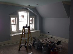
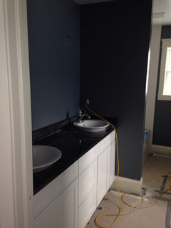
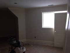
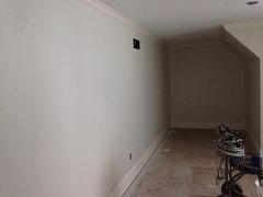
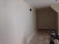
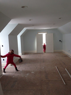
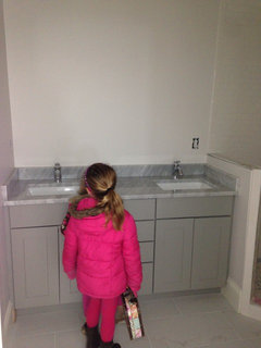
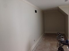
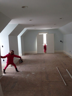
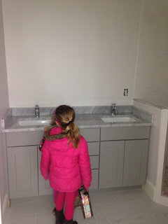
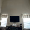
    Thanks to everyone for the input, especially you, Marie. The designers approved (and still do) the color and unfortunately it's up against a lot of cool/grays/blues. Attached are some pix. These are my kids rooms, playroom and baths upstairs. The main level is more warm grays. I am debating reducing the yellow in the trim for the main floor? Or going with a different entirely. There are no areas where you really can see trim near each other between floors so hoping it wouldn't be an issue??
  • 12 years ago
    Additional pix.
  • 12 years ago
    Additional pix.
  • 12 years ago
    I love Dover White. Its very rich, and warm.
  • 12 years ago
    Thanks solonicia, I hope it's just me over analyzing it.
  • 10 years ago

    The same thing happened to me - dover white was recommended and we used it on our kitchen cabinets, all doors and trims. I'm getting used to it and actually like it in the kitchen, but it still drives me nuts when I see it next to anything true white....

  • 10 years ago

    How do you like it now that you've lived with it for awhile?

  • 10 years ago

    Still wish I had chosen a different color. For the main floor I halved the yellow and i absolutely love that color. The Dover is still very yellow.

  • 10 years ago

    If I learned anything, it's to go with your gut even if the pros tell you otherwise. I would be looking at a bright white kitchen right now :) Your house looked beautiful by the way!

    kao7 thanked User
  • 10 years ago

    I'm glad I'm not the only one who thinks it's yellow nledvina. 1/2 the dye is a really pretty but still warm tone so if you ever choose to redo it...

  • 10 years ago
    Well, I came on here looking to see if anyone thought Dover White looked yellow....so at least I know I am not seeing things. It's too late for us to change it, but I do not like it. Anything white in my house (Like my master bath floors and tub and sinks and shower tile or my white subway tile backsplash..and more...) next to the Dover White just makes it look even worse. Even not next to anything white, it's soooooo creamy. Oh well, we are selling, so I hope it won't come across to most others as it does to me. I probably will never use it again. I choose it from all the great reviews on it and a particular photo that had it paired with Revere Pewter walls, which I also have. I will always get samples from now on!
  • 10 years ago
    Edit: Chose* it not choose :)
  • PRO
    10 years ago

    Sherwin William's Dover White is a good basic white - it DOES have a slightly yellow cast to it though. Color of your walls AND your lighting will make a huge difference. MY favorite color for white trim is Snowbound, it is a good TRUE white that isn't too bright or too creamy. If you place is mostly painted and you don't feel like paying for re-painting, I'm sure Dover White will be fine. If your more particular and have the extra money - double check Snowbound. BUT test, test, test on site first - and make sure it's two coats that have dried completely! That is the only way to know for sure.