Software
Houzz Logo Print
hzdeleted_6341242

Wrong colour backsplash!

12 years ago
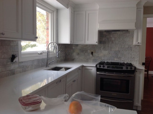
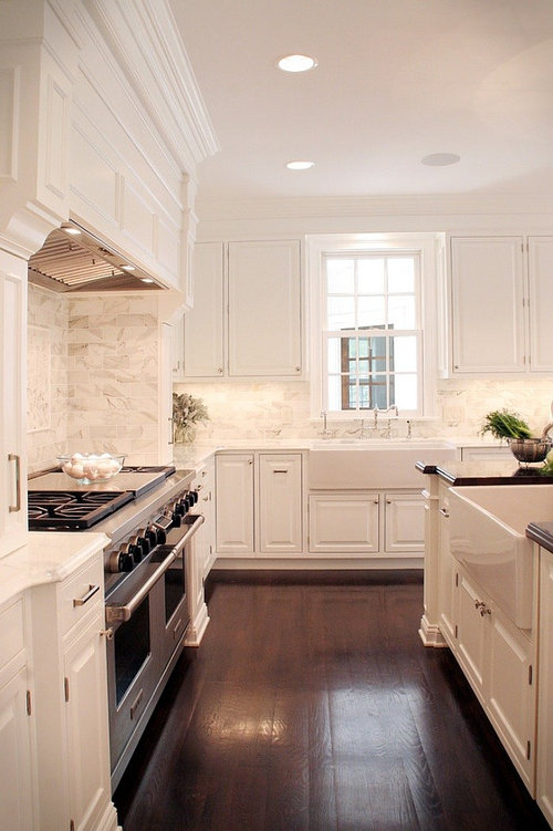
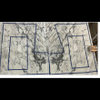
Just recently installed my new backsplash but not pleased with the grey and tones...too grey. I was hoping to have less grey and more white, cream and taupe...I haven't grouted it yet.... My inspiration photo is enclosed.... Thoughts? I am ready to tear it out.

Comments (43)

  • 12 years ago
    It is more gray than the photo, but I think it is beautiful. If you have the money and it is really not for you then tear it out, but I really like it. Perhaps it just isn't what you expected.
    User thanked Jolene
  • 12 years ago
    It looks very good and similar to you inspiration pic, but if it isn't what you wanted and will bug you.....remove :- )
  • 12 years ago
    I think it ties the black range and white cabinets together; with some good undercabinet and task lighting I think you'll like it.
  • 12 years ago
    Looks great! But I agree...if it's not the look you wanted, fix it now.
    User thanked Emma Ann
  • 12 years ago
    Gray is so "in" right now! Paint the walls a beautiful gray, use white grout for the tiles and embrace the color! I think it looks great!
    User thanked Mary Grable
  • 12 years ago
    Your cabinets are white.... I don't think more cream and taupe would look as good. these colors look wonderful in your kitchen. Why not live with it a few days?
    User thanked kadodi
  • 12 years ago
    i think it looks fantastic! be sure to choose a nice grout color and you will love it!
    User thanked cmarquardt1
  • 12 years ago
    Go for a bright white grout. You will be surprised by how it gets lighter looking.
    User thanked Nancy Walton
  • PRO
    12 years ago
    What a happy accident. It adds a depth and richness that the other lacks. I hope you come to prefer it over your original plan.
    User thanked Barnhart Gallery
  • 12 years ago
    last modified: 12 years ago
    Oh gosh it's gorgeous! Such amazing texture. Though the majority is grey it is a gorgeous gray a very warm one at that. You are feeling upset and it's okay to feel that way because it's not what you wanted and you're feeling frustrated. Before you add grout or anything to it maybe grab some white Christmas lights (most are 90% off by now)and hang them under the cabinets like the under mount light would be. Try to bare with it for a couple days and see how you feel once you're calm. You might come to enjoy it, or you may continue to dislike it. It's okay whatever you choose because it is your happiness that counts! If you don't like it try again, but if you begin to like it keep it. Personally, I think this is an impressive color combo. Just go have a break relax, drink your favorite beverage and take some pro's and con's. See which list is bigger and this may also help you process your feelings. Good luck!
    User thanked Mandie Click
  • PRO
    12 years ago
    I agree with Nancy. A bright white grout will lighten it up and I think it will blend well then.
    User thanked overstockArt
  • 12 years ago
    last modified: 12 years ago
    I love your back splash. Very elegant!
    User thanked houssaon
  • 12 years ago
    I'd keep it if I were you; your kitchen is gorgeous! Plus you have to consider the lighting in the inspiration photo which is adding to the brightness.
    User thanked Clay Aragon
  • 12 years ago
    I agree the grout will brighten the whole kitchen and you will love it, the bright white grout will bring it together and blend with the cabinets. Will there be a stainless steel hood over the stove? I believe you are just seeing too much tile right now. A hood could make a huge difference. I always freak right before the grout happens.
    User thanked Valerie Hiss
  • PRO
    12 years ago
    I have to agree with everyone else, I love it. However, if it is going to bother you for years to come, tear it out. Now is the time to do it.
    User thanked By Design
  • PRO
    12 years ago
    Oh I love that inspiration photo! But the gray may always bother you. If you have the budget and time, rip it out and get what you want.
    However, if your ready to live with it make sure your under cabinet lighting is in cool tones and not warm. The yellow from a warm tone will make the gray look muddy. And, as everyone suggested, white grout.
    Are you up for ripping out the backsplash?
    User thanked Fini Design
  • 12 years ago
    LOVE IT! Come do ours!
    User thanked Steve Benton
  • 12 years ago
    I want to thank you all.... I think I am going to assemble a sample board grout it and see if it will brighten up the marble. Lesson learned, when it comes to natural materials you have to be diligent in viewing every piece to get the look you want.
  • PRO
    12 years ago
    I would choose a taupe color from the backsplash and use that for grout and it would bring out the taupe instead of the gray
    User thanked Patricia Colwell Consulting
  • 12 years ago
    I really like it ... even better than the inspiration photo.
    User thanked indianpatti
  • 12 years ago
    The marble I purchased is Bianco carrera marble, I wonder what type was used in the inspiration photo? They both are beautiful .... Just curious.
  • 12 years ago
    Please permit me to live in your beautiful home!!!! Tee hee. I suggest using a whiter grout, KEEPING the elegant backsplash....and use some white bibelots/decor to whiten the look if it pleases you....So gorgeous!
    User thanked Saundra Kortesma
  • 12 years ago
    It looks lovely a similar look to my own kitchen. White grout will lighten it.
    User thanked clareree
  • 12 years ago
    last modified: 12 years ago
    Epoxy grout is more expensive and harder to work with, but it is bright white and resists stains. I agree, live with it for awhile. We all think it looks great.
    User thanked victorianbungalowranch
  • 12 years ago
    I agree with most of the reviews. The kitchen is very nice. But if you are looking for colour I would suggest a red Roman Blind at the kitchen window similar to the red wall in photo. I would also change at least 2 of the solid cabinet doors to a frosted door with a hue of colour or regular frosted would also work. This would add a visual contrast to the whites and greys. Sleep on it for at least a week before rushing to make a change. If you still don't like it then go with your gut. Enjoy!
    User thanked oasis5b
  • 12 years ago
    I love your tile! Your inspiration photo has an abundance of lighting in the kitchen. Please could you add pictures of the other sides of your kitchen? My recommendations: #1 is to make certain you too have an abundance of under the cabinet lighting, and a large pendant light for the entire room. I really think having the right lighting fixtures will make this room pop! I, like you, prefer an elegant white kitchen. I would keep your tile and use white grout. I also might add a really transitional roman shade.

    https://www.theshadestore.com/window-treatments/product/flat-roman-shade

    The roman shade patterns which might be fun are: "gate in charcoal or bridle", "Boteh in bridle", "Mazework in dove", "Soft Scolls in charcoal or bridlel", "Dotscape in charcoal", "Medallion Band in mineral", "Vreeland in bridle or aquatint",

    I would also use paint that is on the lighter, not darker side. I might look into "calm" "silver gray" or "winter white" all by Benjamin Moore.

    It would be really fun to add a fun indoor/outdoor rug in front of your sink. I like:
    http://www.rugsusa.com/rugsusa/rugs/rugs-usa-outdoor-trellis/grey/200HJAIR15C-508.html
    http://www.rugsusa.com/rugsusa/rugs/rugs-usa-indoor-outdoor-chevron/charcoal/200HJSAN6A-2608.html
    http://www.rugsusa.com/rugsusa/rugs/rugs-usa-no1-indoor-outdoor/grey/200HJNO1A-508.html
    http://www.rugsusa.com/rugsusa/rugs/rugs-usa-askew-chevron-outdoor/green/200HJAIR11E-508.html
  • 12 years ago
    Your inspiration photo looks like Calcutta. Yours is different, but still very pretty.
  • 12 years ago
    I know it's not as white as you wanted but still everyone loves this... me too! It came out well! I hope you keep it!
    User thanked Tara Duffie
  • 12 years ago
    Love the subtle contrast in color! I wonder if it didn't have the gray if it would look a little "washed out?" I think white is clean and timeless and that is what I would want in a kitchen- but have to be careful doing the same white on white on white shades as it can over blend and you don't notice some of the details. Love your work!
    User thanked Elizabeth Johnson
  • 12 years ago
    Trust me- people are going to start saving and posting YOUR kitchen for inspiration!!
    User thanked Elizabeth Johnson
  • 12 years ago
    We all love it, but we don't live there. As has been said, complete the grout and under cabinet lights and re-evaluate. Add some bright accents, not too many, on the countertops for that ever popular "pop of color." Even the cheerful orange in the foreground adds interest. Post follow-up pics!
    User thanked flopsycat1
  • 12 years ago
    I think it looks great. Always remember the finishing touches like fabric for the windows. A taupe linen on the windows would be great and carefully selected pieces for your counter will bring in the taupe colors you want
    User thanked joey930
  • 12 years ago
    When I did my backsplash, I sat right there and handed the installer the tiles as he went. I understand what you didn't get. Are there any whiter tiles left over that could be swapped out for some of the darker gray tiles? Then add lighting and see what you think. White grout may help as others suggested but you have gray here, not on the brown side of taupe if that what you were after. Still pretty though.
    User thanked Lisa Hamilton
  • 12 years ago
    I like what you have there but if you don't like it now, you won't like it any better later!
    User thanked Sue Loegering
  • 12 years ago
    Oh my gosh, it's gorgeous!!! White grout and you're all set. It couldn't be better!
    User thanked Ann
  • PRO
    12 years ago
    When you finish the project and have everything in place on the counter it will look totally different. Do have you switchplates painted to match you back splash. You can take a look at our hand painted switchplates project to see how this finishes the backsplash.
    User thanked User
  • 12 years ago
    The tile is classic and neutral. Try to add some accessories in a bright red or your favorite color before you rip it out.

    As an option pull out a single horizontal row or two and drop in a colored tile or maybe a Metallic chrome or a black tile.
  • 12 years ago
    I like it a lot. But if you are not happy, take it down soon before it sets.
  • 12 years ago
    I like it....it's your countertop that isn't right. Countertop need to be mid-dark gray. It will pop and look classy.
    If you 'really' want the white countertop...then backsplash must be white /w texture.
  • PRO
    12 years ago
    Truthfully, I find it beautiful!
  • 12 years ago
    last modified: 12 years ago
    Personally, I think it's wonderful. Is your floor in yet?

    I want you to try something. Get a large cream colored bowl and put something brown in it.... anything that is a warm chocolate brown then place it on the counter. See if that doesn't pop the cream tones out of the tile.

    I think your eyes and the lighting may be tricking you with the lack of anything else going on in that long white desert. And yes, the grout will lighten it up too.

    You selected a tile that had more color to it then your original photo. Either by design or because the sample was different. If you don't like it get it off.
  • 12 years ago
    Hoping you will share the final picture and your smiling face in it!!!! What a pretty kitchen!