Software
Houzz Logo Print
ahpeste

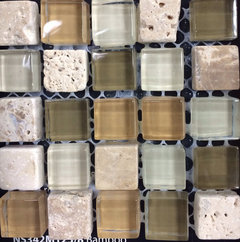
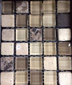
Cappucinno or Bamboo?

12 years ago
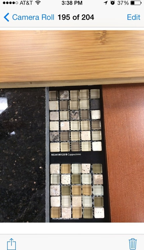
I have narrowed down my choices to these two. On the right is the cabinet in Maple Auburn Glaze, left is the countertop which is Black Galaxy and on top is the floor which is Bamboo. I like them both. But which do u think goes best? Thanks!

Comments (59)

  • 12 years ago

    I don't think it will make it too dark.
    ahpeste thanked Ann
  • PRO
    12 years ago
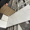
    What color is your wall? I actually like the 2nd one. It looks fresh and I think it compliments your light floor and darker cabinet.
    ahpeste thanked DecoFan
  • 12 years ago

    Beige
  • PRO
    12 years ago

    I prefer the second choice. Ties all of your elements together!
    ahpeste thanked Lori Dennis, ASID, LEED AP
  • PRO
    12 years ago
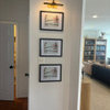
    I like the bottom one. Seems more cheerful and picks up the golden tones of the wood. And the (what looks like) sagey green in it could be a nice accent color.
    ahpeste thanked Garuda Woven Art Rugs
  • 12 years ago
    My vote is the bottom tile. The orange/rust hue in it goes better with the wood colors.
    ahpeste thanked Lauran Palmer Kobe
  • 12 years ago
    I say bottom one. both will work but the bottom one seems to really tie all the colors together.
    ahpeste thanked 3wizkids
  • 12 years ago
    4 vs 4 :-). Iam considering everything u say. The fresh look, compliments more, accents :-). Thanks! I should have a decission by Saturday.
  • PRO
    12 years ago
    The top one.
    ahpeste thanked Ku Interior Design
  • 12 years ago
    I think the top one compliments the sophisticated look of the black granite.
    ahpeste thanked Mary Grable
  • 12 years ago
    I like the rich colors of the top backsplash.
    ahpeste thanked User
  • 12 years ago
    Top one.
    ahpeste thanked Jolene
  • 12 years ago
    Top one!
    ahpeste thanked amended12
  • 12 years ago
    9 on Cappucinno , 4 on Bamboo
  • 12 years ago
    Top one.
    ahpeste thanked L Brass
  • 12 years ago
    Bottom one!
    ahpeste thanked Opal
  • 12 years ago
    I agree w/ Lori, second one matches best with your cabinet and floor colors.
    ahpeste thanked Sandra Mendes
  • 12 years ago
    Both will show as busy. Look at design books for inspiration using one or the other as an accent within the backsplash.
    ahpeste thanked User
  • 12 years ago
    Top one. Clean and fresh without looking matchy matchy.
    ahpeste thanked dawncarter1968
  • 12 years ago
    Tough one… If the cabinetry wasn't in the mix, I'd pick the top one. With the cabinetry, however, I'd choose the bottom one.
    ahpeste thanked Chandani
  • PRO
    12 years ago
    Both are great choices. My pick would be the top one.
    ahpeste thanked By Design
  • 12 years ago
    I personally like the top one, but I'm not sure if it's because everything is in close proximity too each other in your photo. The top is a cooler set of colors and the bottom is much warmer. And the bottom one does "match" better with the colors from the cabinets and flooring. However, I feel like there is too much of the warm orange/rust hues in the bottom one. But I tend to be drawn to more cooler, calmer colors. I think the bottom would be a brighter kitchen and the top a calmer feeling kitchen but you would still have the warmth from the cabinets and floor.
    ahpeste thanked ee5154
  • PRO
    12 years ago
    the one on the top looks best.. the lower one looks liek you are trying to match the color of the wood.
    ahpeste thanked Specialty Doors
  • 12 years ago
    I already voted for the top one, but wanted to mention that I chose it because I think it's a bit better with the countertop, which is what I feel it needs to work the best with. Also, it doesn't compete at all with the floor and cabinets and I agree with ee5154 - the bottom one just might be too orangey.
    ahpeste thanked Ann
  • 12 years ago
    I like the top one
    ahpeste thanked kirawalker
  • PRO
    12 years ago
    Bamboo, much lighter more brighter :)
    ahpeste thanked Lion Windows and Doors
  • 12 years ago
    16 votes for Cappucinno which is on top - compliments well
    with the countertop, sophisticated, calmer, cooler tones, rich, bold, clean

    13 vote for Bamboo - lighter, brighter, fresh, ties all elements together, warm tones, brightens up the kitchen, kinf of matchy matchy, cheerful

    I appreciate all opinions. Im having a hard time, honestly, the reason why I summarize all
    comments
  • 12 years ago
    Btw, heres a closer look
  • 12 years ago
    I just don't think there is enough black in the Bamboo to work well with the counter. I think it will look random rather than planned. Actually, I'm not sure I see any black at all in it.
  • 12 years ago
    last modified: 12 years ago
    Ann, there is no black in the bamboo at all. It picks the spots of the countertop which is like
    Copper/ orangey color, the cabinets and floor. But do u think those 2 are good options for the backsplash?
  • 12 years ago
    I personally prefer the bamboo but as a border tile to say... a travertine.
    ahpeste thanked lucidos
  • 12 years ago
    Lucidos, Its a small backsplash... I wont be doing anything
    like that. Thanks for ur opinion
  • 12 years ago
    Well, ahpeste, I always worry about backsplashes being "too busy" for the countertop, but it does look like your countertop is quite plain so I think the cappucinno might work in your kitchen. I'm liking the bamboo choice less and less as this discussion continues.
    ahpeste thanked Ann
  • 12 years ago
    I vote for Cappuccino
    ahpeste thanked Cheri Eaklor
  • 12 years ago
    Bamboo is my vote
    ahpeste thanked Debra Forsyth Callaghan
  • 12 years ago
    Both are nice. Since the Bamboo has the greens and tans, if you want to bring those colors in elsewhere in the kitchen I think that would be a good choice and kind of give you a nice starting point for the rest of the decor or wall colors in the room. But, if you don't necessarily want to pull in these colors, I personally would go for the Capuccino because it's more neutral and would give you more options in accessories without having to wonder if they will clash with the backsplash at all. Good luck deciding!
    ahpeste thanked jurusu
  • 12 years ago
    Carpaccio
    ahpeste thanked Nancy Travisinteriors
  • 12 years ago
    As you know I prefer Cappucinno but opinions seem pretty evenly divided. Pick the one that speaks to you, you won't go wrong with either.
    ahpeste thanked saratogaswizzlestick
  • 12 years ago
    Top one
    ahpeste thanked Laura Fore Myers
  • 12 years ago
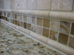
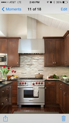
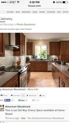
    @ann I dont like my kitchen to look busy, one of the reasons I chose Black Galaxy but dont want it to look plain boring so I thought will play with the backsplash a bit since it wont need so much. I truly love pic #1, I asked who manufactured the backsplash but no answer. Pic #2 is my inspiration for the backaplash above.
  • 12 years ago
    20 on top vs 14 bottom. Thank u so much for ur votes!
  • 12 years ago
    Honestly, I don't think the cappucinno will be too busy - I think you're on the right track and it will be beautiful!
  • 12 years ago
    Top one
    ahpeste thanked Amber Maidment
  • 12 years ago
    Ames Tile & Stone is the manufacturer. Bliss series. :-)
  • 12 years ago
    Arlene, i meant for the manufacturer for the photo 4 messages on top
    Of yours.
  • 12 years ago
    I like the bottom one. It brings out the warm tones of the cabinets best.
    ahpeste thanked sbrustein
  • 12 years ago
    So which did you choose??? :-)
  • 12 years ago
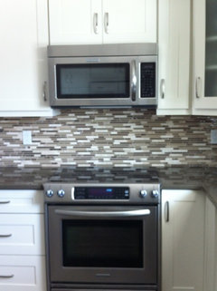
    I got cappuccino in the strips.
  • 12 years ago
    Love the strips!
  • 12 years ago
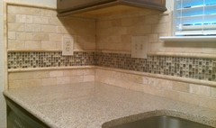
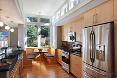
    Ahpeste - This pic was on the screen when I logged in this morning. Probably very similar to the look you'll get.
    [houzz=
    Kitchen · More Info
    ]
0