Software
Houzz Logo Print
risris

Floor plan feedback?

12 years ago
last modified: 12 years ago
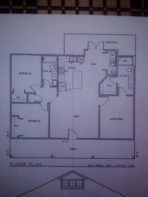
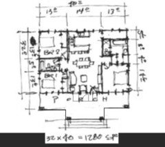
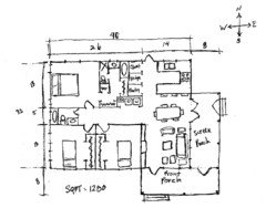
My mom is planning to build a house to sell on a lot she owns. This is the first plan back so far from her architect. She asked me for some feedback - my initial thought was to swap the dining nook and kitchen so you're not staring into the kitchen when you walk through the front door.

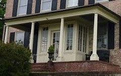
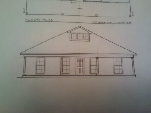
What do y'all think? We'd love any feedback about my idea, the floor plan, or the elevation. Really anything is helpful! We're trying to give it a gracious, Southern feel while maintaining economical proportions - the whole house is just over 1200 sq/ft.

Thank you!

Comments (84)

  • PRO
    12 years ago
    I think you covered everybody in your list of two buyers; 1, 2, and 3.
  • 12 years ago
    @Western Design: Um, let's keep the term "aging in place" and disregard the other. Thanks for the additional perspective, though!

    @Mark Bischak: Haha my thoughts as well.
  • 12 years ago
    Windows over bathtubs are a very bad design idea.
  • 12 years ago
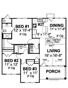
    I'm not good at this but just want to contribute an additional idea. Might something more like this work?
    risris thanked restart
  • PRO
    12 years ago
    I completely agree you don't want to walk in the front door and see the kitchen and the kitchen work area. You have excellent instincts on that. Depending on what you prefer for your solar orientation, I might suggest getting the Master bedroom and bath to the back of the house to give you more privacy from the street. The master bedroom aligning with the back of the house and the master bathroom stacked behind it toward the front of the house. Hope this helps! Karen
  • PRO
    12 years ago
    Here are a few thoughts (apologies to anyone who has already weighed in here - I haven't read through all these comments):

    -Can you place the 2nd bath between BR2 & BR3? Your question about the nook really starts with this bath. If you turn the bath 90 degrees and move as suggested, you can slide the kitchen and nook over and loose all of the angled walls in the plan.
    -The master closet is tiny. While it looks large in plan, the reality is there won't be much hanging space (again due to the angled wall).
    -Think about a more elegant entry sequence into the house and the master bedroom. You simply walk from one space to another without much transition. I could almost live with the main entry as is since this is such a small house - almost like a cottage.
    -Craftsman Bungalows often entered into directly into a living space but usually did this off to one side of the space. Entering directly into the center of the room will make this room hard to furnish.
    -Maybe rework the master closet a bit to move the door into the master BR?

    Just random thoughts without much in the way of advice I'm afraid. My last comment is that some more thought should be expended on circulation through this plan after it's furnished. Try cutting out some paper furniture templates and arrange them in this plan - I see problems.

    Good luck.
  • PRO
    12 years ago
    Maybe lose the nook altogether as a table will not fit anyways, make a bigger island with seating and or a banquette seat. Maybe even take the master suite to the back with it's own terrace exit. I Like the bath between the bedrooms idea makes sense and it can be a Jack&Jill thing. You don't wan to throw to many walls up in a small place like this but yes the living space will be hard to furnish no room for a tv viewing/conversation area with the center door. The kitchen can most definitely work off the entrance as long as it properly laid out and connected to the living space. I think someone has to take this onto paper to scale and play with the adjacency, flow etc.. Good luck
  • PRO
    12 years ago
    Shuler has come up with a far superior layout. I was doodling with a layout that put the living room and kitchen on the east exterior wall (if north is up) putting the bedrooms together. This would give the ability to have a main entrance to the house close to the parking. Good job Shuler!
  • PRO
    12 years ago
    Thanks Mark. I do love an efficient floor plan. You a LIT or Mich Grad?
  • PRO
  • PRO
    12 years ago
    no arguing shuler's layout
  • PRO
    12 years ago
    Step Brother went there. He's an EE in Vegas now.
  • 12 years ago
    Make the front door grander,,,wider, maye add side lights,
  • PRO
    12 years ago
    The Shuler plan is one sweet little layout.
  • PRO
    12 years ago
    Only thing that could make this a bit sweeter is a foyer/vestibule with an entry closet...
  • 12 years ago
    last modified: 12 years ago
    Thank you, Shuler Architecture! That plan is beyond perfect! And such a gift for you to take the time to think through and draw it for us - I am fully aware that we should have to pay good money for work like that. Houzz is so amazing, that it links pros like you with folks like me here in rural FL.
  • 12 years ago
    last modified: 12 years ago
    And @Mark Bischak - yes, this house is oriented facing South. I do rather like the idea of taking Shuler's plan and perhaps shifting all the public spaces to the east side, if only to bring more natural light into the main body of the house.
  • PRO
    12 years ago
    I agree the Shuler plan is the best! One question for Shuler - what is the space between the back wall of the master bathroom and the back exterior wall of the house to be used for? If it's the Master Closet, I don't see how you get to it from the Master Suite? Only an entrance from the kitchen. Also, that was very gracious of you to do that drawing for risris!
  • PRO
    12 years ago
    I assume that five foot space is the utility room. And the X across from the watercloset is where the refrigerator would go, opening to the kitchen.
  • PRO
    12 years ago
    last modified: 12 years ago
    Good morning everyone. Go to bed late and wake up to an inbox full of comments. Houzz is an amazing community.

    You are welcome risris. Truth is my I worked my little sketch up very quickly and it really needs some work to flesh out the details.

    @By Design - the space in the back of the house is a laundry/pantry space. A little shallow but quite deep. You can run some uppers/lowers with a stacking washer/dryer at the far end. Add a utility sink and you are set up.

    @Bischak - the X space in the master bath area is the shower. I guess finding a spot for the refrigerator needs to be thought through yet. Probably between the sink and the back door. If you opted for an alcove tub/shower in the Master Bath, then you could adopt @Bischak's idea and place the refrigerator where I was thinking the shower would go. The work triangle of the kitchen gets stretched out a bit but you do preserve a cleaner kitchen.

    Need coffee - brain is hardly working yet.
    risris thanked Shuler Architecture
  • PRO
    12 years ago
    One more thing - I looked at the plan with the idea that you would maintain the current elevation.
  • PRO
    12 years ago
    last modified: 12 years ago
    Don't want to mess with perfection here.. But some space reserved for a dedicated entry with some closets could really add the needed storage and add that transitional space from the outside. I'm sure Shuler can make it like it's supposed to be.. and please excuse the 3rd grade drafting
  • 12 years ago
    Love the idea of a bumped-out entry, rgk. Simple but would add so much to the functionality of the house.

    @Shuler (and anyone else) - speaking of the elevation, any thoughts re. the dormer, roofline, windows, trim profiles, etc?
  • PRO
    12 years ago
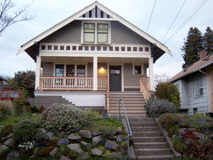
    The dormer is an elaborate decoration IMO, especially since there is no access to an upper level or attic. If you are adding this simply to add interest to the roof line, then think about a gable roof form with some windows at the end. Below is an image of my own house which is a classic bungalow. The gable roof adds a lot of visual weight to the front of the building while providing decent cover for my porch.
  • PRO
    12 years ago
    with the gable, maybe provide an upstairs? a bonus loft/work space or even move the master suite? Just thinking out-loud.
  • 12 years ago
    Thank you risris for the like. It looks sort of scrappy up next to the real architects here though. They've got excellent ideas for the place. Hope it works out and best wishes!
  • PRO
    12 years ago
    Hi risris - if you have your architect rework your plan, post it online again. Seems like there is a lot of genuine interest in how your project turns out.
  • 12 years ago
    I will definitely keep everyone posted as any updates/decisions are made. I've sent a link to this discussion to my mom but haven't yet had a chance to talk with her about it.
  • PRO
    12 years ago
    Risris - I suggest you contact Shuler Architecture privately to see if it is feasible to retain him to provide architectural services for you. If it can not work out, I am sure he can advise you on a good direction to take. Good luck and please keep us all updated.
  • 12 years ago
    last modified: 12 years ago
    Ok update time! I met with my mom for lunch a couple days ago and we talked about a way forward. She visited the lot again, and noticed that if we centered the house/porch as originally planned, the view out the front would be directly onto the porch of the house across the street. And... it's a bit of a junky view.

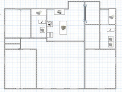
    She asked if we could move the public spaces to the east (which is essentially what you suggested, Mark B.). Shuler, I hope you don't mind, but I took the plan you drew and moved some of the pieces around. I sent it to my mom, she said that she liked it but wasn't crazy about the long hallway which she percieves to be a waste of space. I'm not sure how to cluster bedrooms on one side without a hallway, though.

    Anyway, what do y'all think? By the way, Shuler, thank you again for the original plan. Copying yours was like an education in drafting.
  • 12 years ago
    Just a variation of your new plan. Should be the same sq. footage. You could always wrap the porch around the side and even around the back if the budget allows. It opens up the living room area a bit more and even sneaks in a coat closet at the front door. By stepping the front of the house out, it also adds a little character instead of going with a square box.

    Hope the attachment comes through.
  • PRO
    12 years ago
    Hi risris,

    My initial comment is that while you have turned to the plan 90 degrees, you left the footprint of the building in the same orientation as previously. By making this one change, a lot of new inefficiencies are introduced into the plan that end up compromising the master bedroom and bath especially. Also, you have reconfigured the Mud Room into separate spaces at the periphery of the Great Room that detract from it's elegance in my mind. The upside is you now have a lot of daylight filtering into this space that wasn't there previously.

    As you are discovering, planning small houses is almost always a game of zero sum choices - decisions made in one part of the plan have impact on other parts of the plan. My goal with small houses is to continually juggle the pieces of the design puzzle until I land upon the mix that maximizes the benefits for my clients.

    So my basic question is can you take the previous plan and simply rotate it 90 degress? End loading this footprint as you are doing in this sketch just seems to compromise to a lot of the really nice features of the previous plan. Also, one of my basic planning rules is halls are the death of small houses. That new hallway in the middle of your plan has to come from somewhere and my gut tells me the master suite is going to take a real hit. Overall, it just seems like your mom will get a better bang for her buck with the previous plan.

    That said, I'll work up a thumbnail for you a little later today. I'm out the door to a meeting.
  • PRO
    12 years ago
    Shuler is right, I can't wait to see what he comes up with.
  • 12 years ago
    Me too, Mark!

    Your feedback makes a lot of sense, Shuler. I just wish I could see what you see when you look at a plan. Like I said before, this is turning into an education for me!
  • PRO
    12 years ago
    I'm not sure if this has been brought up yet, but I'm a big fan of pocket doors. Putting in pocket doors for bathrooms and walk in closets free up a lot of room and makes the space seem larger.
  • PRO
    12 years ago
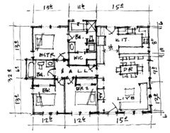
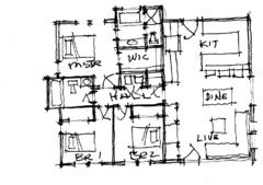
    Ok, here's my next pass. I essentially took your plan, smoothed out a few of the rough areas and then added a couple of ideas. The biggest changes are cantilevered bays at each of the baths to give a little more breathing room to circulation in the bedroom wing of the house. I also added a coat closet thanks to rgkDESIGNS insightful comments.

    There are a lot of doors to the exterior that create circulation paths in the plan. These paths carve things up a bit but I think these are embedded in the spaces they flow through to the point that these paths don't create inefficiencies.

    The one major downside as I see it is the laundry which is currently in the master WIC. I'm noodling on this one yet and ideally see it accessed from the hall. I am trying to preserve a nice walk-in for your mom and the laundry isn't cooperating at this point. Maybe in the next round I'll see something that makes better sense.
  • PRO
    12 years ago
    last modified: 12 years ago
    A couple suggestions, not necessarily to do but to think about.

    Move the master bedroom door & wall out into the hallway to allow access into the closet directly from the master bedroom. I'm not sure how this works dimensionally.

    Put the stack washer/dryer behind the kitchen door between the refrigerator and exterior wall.

    Rotate Master bathroom sink & vanity 90 degrees counterclockwise and pick up a little room in the walk-in closet.

    Everything else seems to look great.
  • PRO
    12 years ago
    Some more thoughts...

    Kitchen: Your range area will usually be the 'showpiece' of the kitchen. I would give it prominence by moving to where the sink is now. You would of course have to split the windows on either side of the range, or create a non operable window behind the range.The sink could be placed on the front counter facing the dining room, so as you are prepping/cleaning you can be facing your guests/family even TV, this is also closer to the ref. Don't forget to work in a full height pantry. If no clearance for dining table, one could consider extending the front counter into a built in table, adding valuable counter space. (Even could reconfigure the cabinets to include a freestanding island.)

    Laundry: ( other than the option to move it as per MB) why not just put the laundry in the coat closet and take some space from BR#2 closet for a new entry coat closet. gaining WIC space, still keeping the noise isolated.

    Master Bath: If you move the master entry wall down as per MB than consider adding a double vanity.

    Squeezing every inch from this puppy... Good plan as well...
  • PRO
    12 years ago
    Ok, here's another look. I've incorporated some of Bischak's and rgkDesign's feedback and think this version is close to being a wrap. While the vanity in the master bath shows a single bowl, there is enough space there for two. I also repurposed the hallway into something more than a transit path from point A to point B by placing the laundry closet there. Putting the luandry in the corner of the kitchen moves it too far from the bedrooms/baths in my mind and starts to make this plan seem like an apartment instead of a house. I also wanted to preserve as much cabinetry as possible in the kitchen since we lost the pantry. I'm thinking the space between the refrigerator and door can be a full height pantry unit.

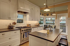
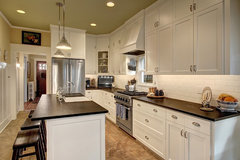
    rgkDESIGN: your feedback about the range placement is valid but my experience with clients and Kitchen layouts has taught me that there is no single answer to the question of kitchen design. Some clients like sinks on island/peninsulas and others don't. I agree that you can place a window over a range as I did in the kitchen remodel below (editor's note: shameless self-promotion plug). Generally, there is an entire kitchen design phase I work through with clients after resolving the space planning in any given plan. That next phase is racing toward risris shortly.

    Queen Anne Kitchen Remodel 1 · More Info

    Queen Anne Kitchen Remodel 1 · More Info
    risris thanked Shuler Architecture
  • PRO
    12 years ago
    It's beautiful.
  • PRO
    12 years ago
    shuler... my thoughts were just another take to what's already been proposed.. design is an evolution starting with the clients needs habits lifestyle etc and this is a limited forum .. yet the outcome is amazing... I say one can take this and run with it
  • 12 years ago
    last modified: 12 years ago
    Thank you again, Shuler and everyone else. Sending this new plan to my mom now, I'll let you know once we decide on next steps. I agree, it's absolutely beautiful.

    Also, I just can't help from asking - how much time have you spent thinking about and drawing each of these plans for us, Shuler?
  • PRO
    12 years ago
    last modified: 12 years ago
    Typically, a thumbnail sketch takes about 10-15 mins. All told, I've spent about 45 mins. doing sketches (this last one I did 2x because the first version was too illegible).
  • PRO
    12 years ago
    than the posting .. discussing .. thinking about it at odd times .. ;)
  • 12 years ago
    last modified: 12 years ago
    Plus the years of training and experience and collaborative effort the three of you did on this plan: Shuler, rgk and Mark Bischak. It's not just the time on this plan, its all the experience leading up to the time IMO. :)
  • 12 years ago
    This was very interesting. Shows the kind of thought and expertise you get when pro's are on the job.
  • 12 years ago
    I agree that I'd rather walk in a see the dining area than the kitchen. I also agree that the door delivering you right into the living room lacks definition entry space. Lastly, I disagree with the comment that said to avoid angled walls, angled walls keep things from being boring as long as it's planned out to maximize space. I think angled walls make having bedroom doors into the living room far more tolerable and they are well located in this plan.
  • PRO
    12 years ago
    the first angled walls are bad. Second needs something beautiful in the way from entrance door. Now we look only fridge side
  • 12 years ago
    last modified: 12 years ago
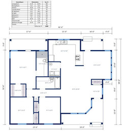
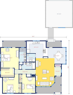
    If you're looking for a traditional southern bungalow with approx. 1200 sq. ft. take a look at this plan I configured for a friend. I've also attached a slightly larger version of approx. 1500-1600 sq. ft. The larger plan allows significantly more storage space and more comfortable bedroom sizes.

    The plan incorporates the porches that are signatures of older southern homes, but also incorporates a modern, open floor plan among the main living areas. The MBR is at what would be the quietest corner of the home - farthest away from the street intersection.

    The kitchen, while open, has an area that is tucked away from the living room view (next to fridge) so you can keep some things out of site. The partition wall (or built-in cabinet) at the end of the peninsula also gives some separation between the living area and the kitchen. Notice that all the plumbing is gathered in one area, with the baths, laundry and kitchen all adjacent.

    The angled living room windows and the bank of windows wrapping around the dining area would be particularly attractive on a corner lot.

    The porch off the Dining area could be expanded to serve as a open-air terrace or a screened area covered by a pergola extending to a garage/parking area.

    The footage table in the smaller plan estimates 1,282 sq. ft., but that includes some overlapped space between the dining room and living area.

    I am a designer but not an architect. If you like either plan feel free to take it to your architect to decide on details and finishes and have your blueprints drawn. In any event let me know what you think --- I would enjoy any feedback.