Software
Houzz Logo Print
jburzell

Help me decide on this blue & white bedroom!

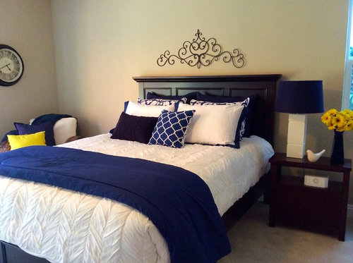
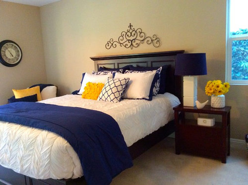
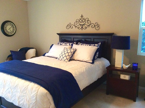
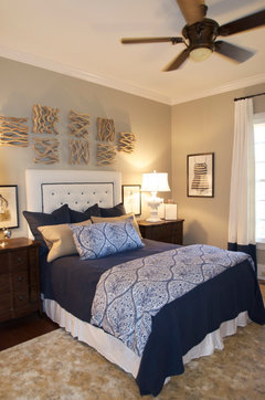
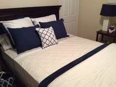
I'm decorating the master bath in this remodeled home in blue & whites. I can't decide which of the three options to use for bedding! Which do you prefer: the 1st combination of blue & white with the yellow accents, the second mix or just the blue & white alone?
Option 1: First mix of blue/white/yellow
Option 2: Another mix of blue/white/yellow
Option 3: Blue & white alone

Comments (35)

  • PRO
    12 years ago
    last modified: 12 years ago
    The heading should say "bedroom" not bath - no edit button for the post! We have different furniture to pair this with and some different ways to make up the bed - I'll post as soon as the new room is set up. You can't see the darker blue pillows in the back - because of that I'm considering using a white headboard and side tables we have with a couple of different options for the chair (one is blue the other white) - maybe even a wrought iron headboard we have on hand. Any and all suggestions are welcome. I'll post the final version. Thank you all!.
  • 12 years ago
    Blue and white, but change out the clock for a white one. Crisp clean modern
    HomeScapes Home Staging San Diego thanked kimsgotstyle
  • 12 years ago
    I'm sorry, I don't like the clock on the wall. I'm sure a lovely piece of art, maybe a landscape with sunflowers, will look more attractive and peaceful than a constant reminder that time flies by when you're sleeping ;-) I voted for option 2.
    HomeScapes Home Staging San Diego thanked Carolina
  • 12 years ago
    Blue and white, with different color flowers, Marks suggestion of coral would be perfect. No colored pillows though, and I agree with everyone about the clock, just looks wrong.
    I'd take away yellow pillow (out of room), put the trellis pillow on chair with small solid lumbar in front of the patterned shams, put the white ones behind the patterned shams.
    HomeScapes Home Staging San Diego thanked mefor
  • 12 years ago
    It's a clock
    HomeScapes Home Staging San Diego thanked Brandi Nash Hicks
  • 12 years ago
    Yes, it is a clock.
    HomeScapes Home Staging San Diego thanked mefor
  • PRO
    12 years ago
    I'm torn between option 2 & 3 - I like the pop of color, but I think the yellow is a little too bright. Mark's suggestion of coral is interesting. And I agree with folks about the clock - art would be better.
    HomeScapes Home Staging San Diego thanked User
  • 12 years ago
    Since the furniture is so dark, I think softer colors would be nice...remove the heavy looking blanket on the bed...
    HomeScapes Home Staging San Diego thanked mlisowsky
  • 12 years ago
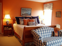
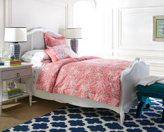
    I would prefer art in place of the clock. I think the yellow is too bright and that coral would be too expected. The lamp shade is a perfect match to the navy. I could keep going, but it looks too staged, everything matches too well. I found these on Houzz. They show a little something that is "off" in each room. The coral bedroom looks as if someone was laying against the headboard and used the pillow as a headrest.
    West Hollywood · More Info
    Transitional Bedroom · More Info
    Orange and navy bedroom · More Info
    LYFORD BEDROOM · More Info
    HomeScapes Home Staging San Diego thanked hanna1984
  • 12 years ago
    If you were to switch the dark navy pillows with the blue & white then you would notice the navy pillows and not have to use a white headboard. I would like to see another color for impact like the coral or orange. Definitely change out the clock for artwork with color that you would incorporate into the scheme.
    HomeScapes Home Staging San Diego thanked Katarina Moka-Black
  • PRO
    12 years ago
    I personally like #3 better, but would use white pillowcases against the dark headboard. The yellow is too bright. The clock should be replaced with a piece of art which will give you many accent colors to choose from...
    Blue Lyrics Fine Art Print · More Info
    HomeScapes Home Staging San Diego thanked Home Transitions
  • PRO
    12 years ago
    We voted for 3, as did most. Which did you/homeowners decide on?
    HomeScapes Home Staging San Diego thanked Perfectly Placed for You
  • PRO
    12 years ago
    Thank you all for your input! You all have a good eye! Actually, the room itself is just a staging area so the clock isn't really part of the final proposed layout - we used a room that is staged just to see the linens on the bed and how they worked together. We wouldn't be using the clock or the furniture as it is. The artwork I'll post soon - we are going back and forth between 3 small paintings of Santorini Greece (so lots of blues and whites) in white frames & an abstract painting in blues & white. The bed that we may use is a white one similar to this. @KMB Staging, that's a great idea, I'll switch the back two pillows so the white is in the back and I may be able to use this bed frame/headboard instead of the white set. The poll question is really just about the linens themselves and whether or not to use the yellow accents. Some people seem to like the yellow, some not - I love the coral and have some nice coral accent pieces in storage, so I'll try that and post it when we have another chance to play with the linens.
  • PRO
    12 years ago
    These are some of the art selections we are looking at. The photos of Santorini are fairly small and are framed in white - the total size for each one is about 13"x13" & they may look good lined up side by side over the bed depending on which headboard looks best with the bedding. The third painting might look OK across the room, it's too tall/vertical to go over the bed with a headboard.
  • PRO
    12 years ago
    I like the balanced composition of yellow you are proposing with the 3rd artwork. Yellow is happy, makes you notice...blue and white alone is indeed classic too. So many colors can go with the neutral blue&white scheme; you really can't go wrong!
    HomeScapes Home Staging San Diego thanked DKWozniak Design/Build LLC
  • PRO
    12 years ago
    I love the pop of yellow! The 3rd photo would work well in the room as well!
    HomeScapes Home Staging San Diego thanked Perfect Piece Interiors
  • 12 years ago
    Wow, reading through these makes me realize how important it is to get the details right. Instead of answering the color question, everyone was focused on the clock! I go with room #3, but with a different accent color. The yellow is too bright and your eye goes straight to that. I personally like raspberry or pale green, but that is just personal preference.
    HomeScapes Home Staging San Diego thanked countrydesignhome
  • PRO
    12 years ago
    @counrtrydesignhome - thank you for voting - this has been so much fun to follow! One thing it taught me was to crop the photos before I post - the clock wasn't supposed to be a part of the poll :-) - we were just using that room to set up - so I'll be more careful to get just the subject matter in the photos next time - and I've learned a lot of people would prefer more muted colors - I like that too but I think the bright yellows in the daisies at springtime just felt right after a long winter! Thank you all for your great feedback - differences in opinion keep life interesting!
  • 12 years ago
    HomeScapes, the sum of the parts make the whole! Without the other props, the results may have been skewed in a way you would never have picked up on. We may have all said it looks great or it looks boring. The bedding is very nice, actually. But you can play it up or play it down with the accessories. That's how you make the sale. :)
    HomeScapes Home Staging San Diego thanked hanna1984
  • 12 years ago
    I like the picture with the yellow pillow on the bed.
    HomeScapes Home Staging San Diego thanked teambell
  • PRO
    12 years ago
    last modified: 12 years ago
    @hanna1984: so true! Next poll: crop first or bring out the entire room (wouldn't quite fit in my car this day)! We'll get a better idea when we post the final outcome pretty soon. The poll started when our staff had strong opinions on the bright yellow & the bedding, so I was trying to narrow the initial question to just the bedding and linens themselves. Step-by-step I'll build the room starting with the bedding. The next decision will be the bed frame/head board and side tables & chair. Then come the finishing details like the art, lamps & other decor. The fun for me is that I can take this set and play it up in some homes with the yellow or use corals, reds, you name it! If we get to do the house on the marina I'm definitely going to try out the red accent and sailboat decor for a nautical look. I love Houzz because you get great diversity and lots of ideas. It's a wonderful forum. Thank you for voting!
  • 12 years ago
    I look forward to your coming polls! I love to learn from pros! Thanks :)
    HomeScapes Home Staging San Diego thanked hanna1984
  • 12 years ago
    The prints of Santorini are beautiful but if you are going to use the yellow then I would go with the still life.
    HomeScapes Home Staging San Diego thanked hasinajiwani
  • 12 years ago
    I like all of them. Just remove the clock and the scrolly thing over the bed and you're done!
    HomeScapes Home Staging San Diego thanked decoenthusiaste
  • PRO
    12 years ago
    I love the blue with the bright yellow. I would reverse the large shams, usint the white against the dark headboard & the blue print as the second layer. As far as deco pillow on a bed, My preferrence would be a long approx 16 x 54" Yellow. Agree with removing the scroll & doing art. Pretty room!
    HomeScapes Home Staging San Diego thanked Judy Roberson Designer
  • 12 years ago
    So many great choices! ( I am a little jealous you have a staging area to work with! Lucky girl.)
    HomeScapes Home Staging San Diego thanked Teresa Rutherford
  • 12 years ago
    I recently took the folded blanket off the foot of my bed. I was impressed by the wide expanse of neutral color from the pillows to the bottom of the bed. Could be folded blankets are folding as a trend.
    HomeScapes Home Staging San Diego thanked mfwolfe
  • 12 years ago
    For some reason I just noticed the detail on the comforter! The rouching is fabulous! If that is a duvet cover, put a thicker, fluffier duvet in it. Wow!
    HomeScapes Home Staging San Diego thanked hanna1984
  • PRO
    12 years ago
    @hanna1984 - I love the ruching, it's pretty and also great for staging because it doesn't need ironing! I have some sheets that are white with a blue band that I'm adding to this set so now I'm making it up with the pillows at the top with the white in the back, then the blue/white and the bed folded back to see the sheets - then the blue blanket with the white, ruched duvet tri-folded at the end...mfwolfe may be right that the folded comforters at the foot of the bed are going 'out' but I'm still loving the look the way it is now - will post more photos soon of the final bedding project :-)
  • 12 years ago
    Sounds beautiful! Don't forget to post the pictures! :)
    HomeScapes Home Staging San Diego thanked hanna1984
  • PRO
    12 years ago
    last modified: 12 years ago
    We're still getting in more of the bedding and accessories I ordered for this set - the striped sheets and new duvet with the blue border arrived - we will be ironing it all to smooth things out. Two small paintings of Santorini, Greece are on their way to use as the art in the room. I am still deciding on whether to use this furniture set for the bed frame or a white head and footboard with white side tables. We'll decide on the accent colors at the very end when we can play with pillows. Since we are staging we don't know exactly who we are decorating for, unlike interior design - so we try to appeal to a broad range of potential buyers. What do you think? After looking at the first photos we'll probably go back to the ruched comforter for more texture.
  • 12 years ago
    I would consider existing room color when choosing the furniture as well. On a darker wall the white may be a nice contrast. On a white wall it may get lost. Love the new bedding.
  • PRO
    12 years ago
    @ the sellable home, LLC - very true! I can wait to decide on the furniture until we know what house it's going into...most of the time the wall color has already been selected since we do vacants and the property is ready to sell when we go in - usually they don't want us to change the wall color - so if that's predetermined, what I can change is the furniture and bedroom set - if they're open to changing paint colors, we can work with that...good point! Thank you!
  • 11 years ago
    i would love to see the Santorini pictures once you have them framed. I have several pics I took while on a trip to Greece that I would like to use in my master bedroom with a blue and white color scheme so your ideas are just what i am looking for. Can't decide whether to go blue and white or use navy with khaki/taupe on the bed.