Software
Houzz Logo Print
susanagraph

Living Room Upgrades: Mixing Modern & Traditional & Rug Help

12 years ago
last modified: 12 years ago
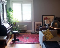
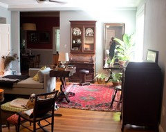
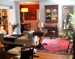
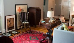
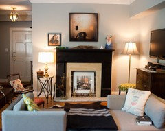
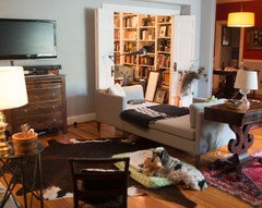
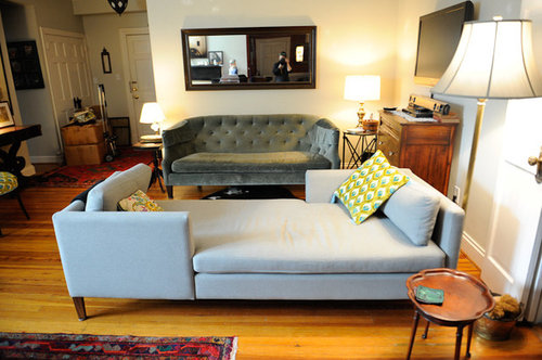
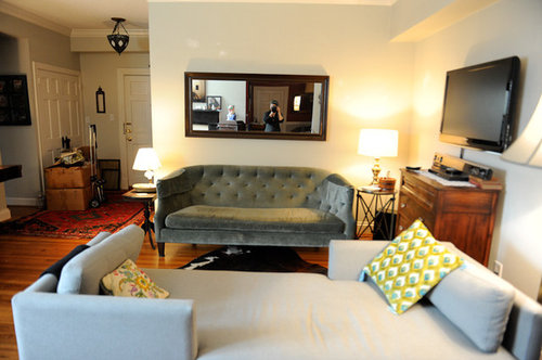
I'm upgrading the living room and bought the tete a tete sofa from Room & Board which I love to divide the space and leave it open. I am going to paint the room a light gray/almost white and looking for rug suggestions to unify the room. I am thinking just a light gray rug as well? I will move the oriental rugs to another room.

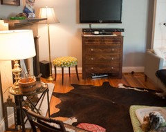
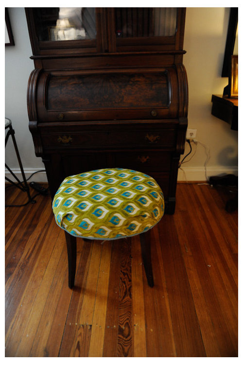
We have lots of photo and artwork to put on the walls so I am not scared of the monochromatic theme. I am thinking of using the chartreuse fabric I recovered the stool with to make small pillows for both couches to unify them.

I also think I will need to make some lighting upgrades. The antiques are all family stuff and I've already edited down as much as I am comfortable with. Where the lone chair is next to the window we are going to find a comfortable reading chair for the DH.

I have more pictures but I guess you can only post 4. Thanks so much for your thoughts and help - any suggestions welcome. I appreciate all your perspectives.
Susana

Comments (95)

  • 12 years ago
    I like the secretary where the FP was. I think both walls at the ends of the room are too short for the FP. That's why I'd want to see it where the secretary originally was and the settee turned to face it. That's where you can add a pair of accent chairs right and left of the FP. I like the TV in the darker corner where but simply switched from one wall to another. Shouldn't be any glare there.
    Susana thanked decoenthusiaste
  • PRO
    12 years ago
    Deco, it sounds like you and I are suggesting a similar idea.

    Before you buy chairs (don't want you to buy the wrong size again) Susana, can you try

    -leaving secretary on the back wall
    -moving out settee
    -moving hearth to the wall where the secretary originally was.

    Let's see how that looks.
  • 12 years ago
    CDR - I really think the FP needs the largest wall, don't you?
  • PRO
    12 years ago
    Right......fp on wall between window and entrance. That is what I was saying. Is that what you are saying, deco?

    I like secretary on back far wall, because it is so massive.
    Susana thanked CDR Design, LLC
  • PRO
    12 years ago
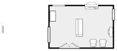
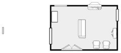
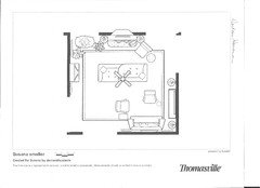
    Here is a really rough plan of how you might arrange your room. The dimensions could be way off, but a shot.
  • 12 years ago
    Yes - that appears to be the longest wall. I think CDR left the entrance off the floor plan. It is to the right of the FP location there, right? If you'll copy that plan and put in what's missing and the measurements, scanning it back in, I'll take a look at working with it tomorrow night.
    Susana thanked decoenthusiaste
  • PRO
    12 years ago
    Hey, I warned you it was rough.....my "short" version. Right, I missed the front entrance!
    LOL

    Susan, yes, we need dimensions of the room. I took a guess.
    Susana thanked CDR Design, LLC
  • 12 years ago
    You all are so helpful! I couldn't figure out how to do or where to find a program for one of those floor plans. Dimensions are : from entrance long wall with window: 18' (the window at the extends 72" into the room from the left); the width of the room is 16.5'. The wall adjacent to the foyer (the short wall where the blue sofa is/was is 10' as is the wall where the tv is but needs some accomodation for the french door opening onto that wall.
  • 12 years ago
    I don't think two chairs will fit next to each other in the floor plan but perhaps another on the other side of the tv. Thanks again ladies (?) - I can't believe how generous you are with your time.
  • PRO
    12 years ago
    One thing you could do is to close one of the doors to the library.......the door near the tv.

    That way, the wall there that is currently 10 feet, suddenly is extended and you could fit the 2 chairs.

    I don't think you want one chair on each side of the couch, because then you run into the back of a chair when you enter.

    You also could place one chair on each side of the fireplace.
    Susana thanked CDR Design, LLC
  • 12 years ago
    Still willing to work up a floor plan if you'll provide the measurements.
  • 12 years ago
    Oh thanks, I did provide the measurements three messages up: basically 18 feet by 16.5 feet. The short walls are 10 feet wide.
  • 12 years ago
    Thanks - will give it a shot.
  • PRO
    12 years ago
    Deco, the plan I drew was 16 by 24. So, my width is correct, but the length I had wrong.
  • 12 years ago
    Probably won't get to it tonight - other things to do - but will try tomorrow a.m.
  • 12 years ago
    no hurry - i'm going on a road trip for the next two weeks - so I will not be getting to it right away. Thank you!
  • PRO
    12 years ago
    Here is corrected plan with updated dimensions. Please feel free to play around with it deco and see what you would change! Would love to see any more ideas.

    Have a good trip, Susana.
  • PRO
    12 years ago
    Sorry, that was the old one. Here is the new one.
  • 12 years ago
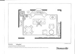
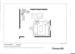
    Added a few extra pieces - armless accent chairs, a glass table and chairs for entertaining, two armchairs and a hassock at the TV corner and a low credenza under it. Wall mounted lamps flank it. Your secretary is on the left and your pedestal table creates a bit of a visual "foyer" as you enter. Wall under the bulkhead is floor to ceiling art with track spots mounted on the bulkhead if possible. Wall by the window should be floor to ceiling mix of art and mirrors (new and antique) to draw in light from the window. Individual art lighting can also serve as additional sources for the art and a bit of general lighting. I show a 20x12 rug anchoring it all. Sorry if some of the proportions for your existing pieces aren't to scale, but I think you can see the direction here.
  • PRO
    12 years ago
    Deco, that looks great. I think, though, we are still off in measurements. Susana is saying the room is 18 x 16.5.
  • 12 years ago
    last modified: 12 years ago
    I guess I was using your measurement for one direction and hers for another. She must be using wide angle or pano. Doesn't look that small. Did she ever give a size on the FP or secretary? I thought the wall from the entry door was 18' and the window another 6' for 24' x 16' the way she stated it Friday at 5:52pm.
    Do you think it could b 24 x 16.5? I have trouble believing that window wall is only 18 feet total - I think she was giving wall measurements without doors included - just space for art and furniture on the walls. What do you think? We may not know for 2 weeks!
  • PRO
    12 years ago
    "You all are so helpful! I couldn't figure out how to do or where to find a program for one of those floor plans. Dimensions are : from entrance long wall with window: 18' (the window at the extends 72" into the room from the left); the width of the room is 16.5'. The wall adjacent to the foyer (the short wall where the blue sofa is/was is 10' as is the wall where the tv is but needs some accomodation for the french door opening onto that wall."

    I took that to mean the entire length is 18' and the width is 16.5. So, from where that settee originally was to the opposite wall, 18'. Then width, 16.5'.

    No dimensions on fp or secretary that I can remember.

    It is a challenging room to be sure. Yeh, we may be in suspension for 2 weeks.
  • 12 years ago
    last modified: 12 years ago
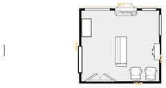
    This is the last one for me until we have good measurements on the furniture, especially tete-a-tete and settee, which I've put back into the space. Added another pair of wall lamps or sconces at the FP to help light the space. May have the 18 and 16.5 reversed, but what to you think, CDR?
  • PRO
    12 years ago
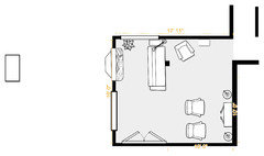
    Well, as much as I love the tete a tete, I think it would be lovely as a seat in the middle of a room with almost no other furniture. It is just too crowded otherwise.

    Here is what I think would be a good plan:

    -Move the secretary out. It is just too large and massive and doesn't work in the room. It looks like it can go in the back hall.

    -Move the fireplace back where it was. Place the tete a tete facing the fireplace, set just beyond the end of the window. Susana had it like that once and said she liked that.

    -Place 2 chairs facing tv.

    That way, the space is open when you walk in. There are 2 separate seating areas, room to walk, and no traffic is walking through the seating area.

    Console table could stay in entrance are, maybe with a couple of chairs added on each side of it.

    I would guess the tete a tete to be about 8 feet.
    Susana thanked CDR Design, LLC
  • PRO
    12 years ago
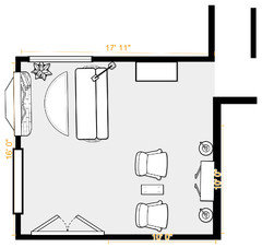
    Here is my latest suggestion. It looks to me like the entrance area is beyond the 18 feet wall.
    Susana thanked CDR Design, LLC
  • 12 years ago
    last modified: 12 years ago
    Seems that doorway opening to the right of the red cross poster and left of the hall closet is missing in your plan, CDR. Trying to keep it from being so linear. Do you think it is possible to gobble up some corner space for the TV so the chair arrangement won't align with the TAT? Really needs some softening and curves without blocking the path. We really need to know the FP and TAT sizes to do much good here. I still think the wall from the window to that door opening is longer than we're showing.
    That red cross pic is pretty large!
  • PRO
    12 years ago
    I am showing opening to the right of red cross pic. See it?

    Susana said room is about 18 feet long and window takes up about 6 feet of that. That leave about 12 feet.

    Could put tv in corner unit and then 45 degree the 2 chairs, which would add some interest and create a natural "walkway behind the chairs from front hall to library.

    Yes, we need more specific measurements.
  • 12 years ago
    I thought that opening was more inside the footprint of the room instead of the hall. Maybe not. Pix can be so misleading sometimes. I like it when the poster draws out and measures it for us - so much easier than guestimating!
  • PRO
    12 years ago
    My guess is the opening is sort of half-in/half-out of the footprint of the room. Just going by photos. Not sure.

    Well, we have done our best for now and maybe Susana can give us more measurements.
  • 12 years ago
    Susana -
    I think you have a better and smarter sense of design than 99% of the people commenting on this site, including the "professionals," so just put things where you think they should go, and it will work.
    I thought the contrast between the 2 couches was a big plus, and having the big art above the table was great. My only real issue with the original design was the looming television, but then I have a low tolerance for flat screens.
    Don't hate the Victrola. It's cool and unusual, and definitely a conversation starter. Does it still work? Display it with the lid up. The tonearm and controls are so "Steam punk!" It looked nice in the corner next to the sofa, so it doesn't stick out in the room like an unoccupied plinth. Polish up the finish. There's no substitute for old wood.
    I'd like to see the room with your photos and other art in the mix.
    Keep it eclectic and keep us posted!
    Susana thanked keenplanner
  • 12 years ago
    OK, am on the road! but the dimensions for the tete a tete are 85w 35d 27h. The blue velvet sofa is approx 77" x 30. The secretary is approx 36 wide by 30 deep and the fireplace is about 5' I think. The foyer area is an additional rectangle added on to where that opening is and is not changeable. We have an antique hat/coat stand in one area and double doors that lead to a closet on the other side. There is a small study door next to the hatstand and a bathroom on the other side of the red cross poster which is about 30" wide I would imagine too.

    The secretary is staying - the fireplace might be downsized to something small and marble depending on if I ever find one in my price range and can fathom getting it installed - they are so heavy.

    Who knows I might find something here in Mississippi?

    Thanks for all your input.
  • PRO
    12 years ago
    last modified: 12 years ago
    Hi Susana! Thanks for the measurements. Here is an updated version of what I am recommending. My plan is based on howI think the room would function best, given how you said you plan to use the room. Have a great trip!
  • 12 years ago
    This plan separates the gallery from the FP/TV area. Should allow for a real "gallery" feeling upon entering and for social gatherings, and a more cozy corner for just relaxing at home.
  • PRO
    12 years ago
    I do like that both of our drawings do not have the tete a tete in the tv viewing area. I like how decoenthusiaste incorporated the settee.

    I think one of these or a combination will make your space functional.

    A room can look really artsy, but if the room doesn't function for your needs, then it is just an artsy room.
  • 12 years ago
    We'll see! I think we've provided lots of options. Only living in the space can determine what, if any of our suggestions, works for Susana. My gallery-owning aunt in Paris had a lovely gray silk "everything room" with a wall of windows looking out to Sacre Coeur. She had electrified picture rails on all walls, and whenever she introduced a new artist to her "stable" she hosted a cocktail party for them in this lovely space. It had a dining corner, a living corner, a grand piano corner, a canary corner (to match the yellow silk drapes) and the wall of windows looking out to the view was anchored with a bank of cabinets filled with her art supplies, drawers for canvases, etc. A huge crystal chandy hung in the center. It was really something! That's the room I had in mind for this rendition of Susana's space - just a bit scaled down!
  • 12 years ago
    Let' see I would clear out the fire place area & mantel except for the rug. Place the Blue Antique couch in front of the fireplace.Also the round side table.
    Place the mirror above the mantle. Place one of the largest plants on the hearth. The small cabinet should be moved to another room.I would change the window treatments.
    Leave the secretary in That location, however move it towards the window. If there isn't 3' from the couch to the secretary leave it where it is.
    Mount the TV on the wall next to the secretary. Purchase or if you have 2 comfortable chair place in front of the TV. This is only if it fit and flow. The key 3' space to walk through.
    The other couch should be placed kitty corner where the antique couch was. Place the floor lamp behind that couch. I would place a coffee table there also. Place books accessories, etc. on the coffee table.
    The cabinet the was below the TV should be relocated. If you have a dinning room would be excellent place to put it.Now if it stores stereo and DVD relocate it with the TV. My goal is to eliminate big pieces of furniture.
    Now the Table next to the secretary I would place it centered on that wall where the TV was. Above that I would place pictures including some of your photography. Also include a plant on that table a lamp closest to the library. And place books there.
    You have wonderful furniture and items in there. You needed it flow, however I wanted create areas. In front of the fireplace ambience. If you can fit 2 chairs in front of the TV. Call it entertainment area & on the other side lounging comfortable for guest.
    Pictures in a group above the kitty corner couch.
    This room really inspired me to go back into interiors. Thank You,
  • 12 years ago
    I forgot any furniture,rugs etc.I didn't mention remove.I would love to see the library. Because it is an extension of that room.
  • 12 years ago
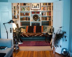
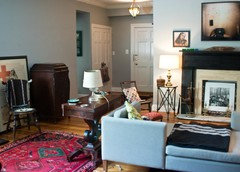
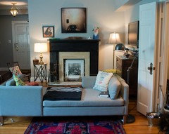
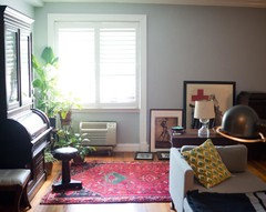
    Ok, well I'm sure you thought you would never hear from me again, but progress moves slowly on the homefront. Repainted the room Ben Moore's Covington Gray. Put blue sofa in library, moved secretary to where hearth was and mantel against short wall next to the foyer area. The tv remains to be negotiated with me agreeing that it should at least go down and getting a different piece to put underneath it.

    Two matching chairs near the hearth of small stature will complete the mix. And DH wants a winglike chair for next to the window next to where the Victrola currently is. We will update lights when the seating is figured out. Can't wait to get my butane hearth this winter! Thanks for all your input!
  • 12 years ago
    last modified: 12 years ago
    I'm thinking of getting Room & Board's murphy swivel chairs or a upholstered knobbed wood chair, both with a small footprint. Amazing what a dif paint can make.
  • 12 years ago
    Ugh, I wish you could preview the images before submitting.
  • PRO
    12 years ago
    Susana, good to hear from you! The paint looks great! Love the sofa in the library!!

    The fireplace area looks really cozy!

    One suggestion would be to move the end table by the tete a tete to the other side. It seems very large there and sort of in the middle of the room.
    Susana thanked CDR Design, LLC
  • 12 years ago
    Yes, I agree. Things will still be edited/sorted out as I add the three missing chairs to the room and hang up the art and get the tv taken care of.
  • 12 years ago
    Settee works well in the library! Still a bit chaotic in the other area though. Are you sure about adding more to it?
  • PRO
    12 years ago
    You may want to concentrate on the "business" in the room being the art gallery. The other many items are a distraction. Perhaps you aren't finished? Examples: the little tub on the table with the lamp, small items on the larger side table, the small items on the mantle.
  • 12 years ago
    I agree CDR - which is why my last floor plan was more gallery oriented for the most part with the corner providing a place to keep the home fires burning and watch TV.
  • 12 years ago
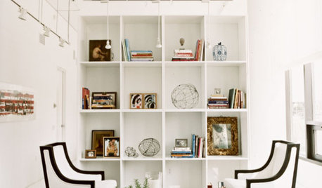
    This was featured on Houzz recently and it reminded me of your room. I love your style.

    Sophisticated Chic Loft · More Info

    https://www.houzz.com/magazine/room-of-the-day-new-york-style-for-an-la-living-room-stsetivw-vs~27688419
    Susana thanked sondramartina
  • PRO
    12 years ago
    I think your arrangement is a good one, deco. However, it assumes that Susanna is willing to move out something----the wurlitzer or the large buffet.

    Too many small little pieces in the room and too many large, dark pieces in the room for the average person.

    In the end, Susanna, you have to create a room that works and feels good for you. Just giving you my input.
  • 12 years ago
    Thanks for your comments and input everyone. @ decoenthusiaste - the room is not finished yet, I just positioned the large pieces, the little pieces will go when I replace them with some comfortable chairs. And nothing is merched or styled yet, like the mantle, and the nut bucket on the table. I will put final photos when all is complete (in about a year ; ) - but yes, right now the clutter remains as we are still very much in medias res. I am just relieved we found places for the two sofa/settee pieces. Once we upgrade the lighting and chairs and place the art on the walls I think the experience will be much different. I just work better in stages.

    @sondramartina. Thank you - I love that loft studio. I've been debating what color palette, I love blues and greens, but wondering if I should do more monochromatic on the furniture. But my goal is to get to antique chairs in need of reupholstering and find some great fabric to incorporate those ideas.

    Finding the right chairs takes some time. Small footprint, comfortable, elegant, not too expensive.
  • 12 years ago
    It is a process - enjoy it and let us see the results!
    Susana thanked decoenthusiaste
  • PRO
    12 years ago
    Thanks, Susana. That makes total sense. I think a more neutral palette will allow your art gallery to shine.
    Susana thanked CDR Design, LLC