Software
Houzz Logo Print
radiosity

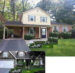
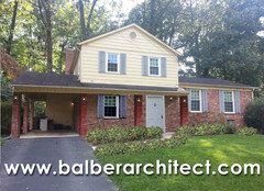
Looking to update and improve curb appeal, 60s colonial

12 years ago
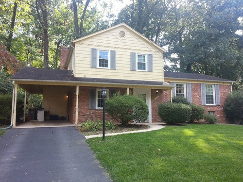
The previous owner did not maintain the siding well and the cost to repair rotting boards/sand/change paint color etc is closing in on the price of new Hardiplank siding and gutters making that decision pretty easy. I am looking for some color combo suggestions that would complement the brick to freshen up the look. I also had considered a straight-edged shingled look above the dentil molding for the upper triangle of siding but no other home in the area has that look so we would probably stand out and look too trendy with that. Should the post/columns be updated in some way or is that character that should stay?

Comments (33)

  • 12 years ago
    I'm no expert, but I'll answer if only to bump it back up the thread. I like your house. I really like the gray of the shutters. I'd consider a light gray for the upper. It won't pop, but it would be nice I think. I'd also beef up the posts that hold up the roof and carport. The just look a litle frail for their purpose to me. Hope you get lots of good advice.
  • PRO
    12 years ago
    I would add planters, paint your door a new color other then white, update your landscaping with more flowers .... just a few ideas!
  • 12 years ago
    Would consider a straight post....
  • 12 years ago
    Agree with lilion about the posts needed to be beefed up. Also like the idea of straight posts.
  • PRO
    12 years ago
    the shrub on the left is blocking too much of the front door. remove and plant one closer to drive way or under front window. also add another one under far right window, and expand the bed out around the side walk. if you can widen the walk way that would be great too. the door would look great blue.
  • 12 years ago
    The funny thing about the shutters is they were light blue but have sunbleached to gray. The front door is hard to see but light blue as well with a white storm door. I really don't think the storm door is necessary. I will probably remove it.

    I tend to agree about the left bush - it does block a lot of the front walkway. It probably was intended to be the height of the right one and was just let go.

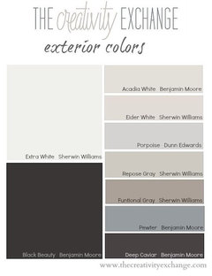
    How about color suggestions for the house/shutters/trim? Grays are my first choice. anything is better than that yellow in my mind.
  • PRO
    12 years ago
    Have you thought about adding window baskets? Its an easy way to add curb appeal that won't break the bank.
  • PRO
    12 years ago
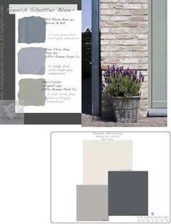
    i love the blue and green scales, and gray all would go great with your roof.
  • 12 years ago
    Definitely replace the posts. Get new, larger house numbers. Update the light fixture at the front door.
    As to the siding color, I think grey is a safe choice. Lovely home.
  • PRO
    12 years ago
    This is an easy one wrap the post with cedar and replace the shutters with cedar give the roof demension with architectural shingles paint the siding one color and facia boards another like trim should be a little land scape and bam your the best looking house on the street
  • PRO
    12 years ago
    Maybe even paint the front door red it always looks good on a brick house
  • 12 years ago
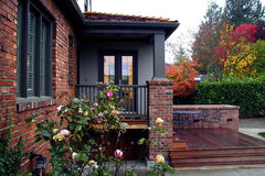
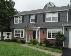
    Beef up the columns and beams as in the gray photo. The dark and light gray exterior photo is one of my favorite combinations with red brick.

    Magnolia Residence 03 · More Info

    Exterior - Front · More Info
  • 12 years ago
    Dar that first photo was one I really loved and saved today. Hardiplank has a color called Monterrey Taupe that is pretty nice. It's a neutral with a nice balance of gray/tan in it.
    Zach - I'll definitely look at wrapping the posts. Those posts sit right at the edge of the concrete though so that may be an issue.
  • 12 years ago
    Agree you should replace the posts. The color seems fine to me, maybe paint the front door black or other accent color. I would remove the overgrown landscaping and redo both beds with low shrubs and flowers, maybe add a tree in the lawn. If you have the money, convert the carport into a garage.
  • PRO
    12 years ago
    Hi radiosphere! We have to agree with Zach when it comes to replacing you existing shutters with cedar. Our Premium Wood line of shutters is available in three different types of wood: Western Red Cedar, Spanish Cedar and Mahogany. Cedar is our first choice because of the natural, fine-grained appearance. It is universally regarded as one of the most attractive and durable woods.

    We also have to recommend that if you choose to replace your shutters, that you replace them with ones that are properly fitted. Shutters should typically measure out to half the size of the window. In your instance, they are a bit too small for your windows.

    Feel free to use our Shutter Snapshot application to see what your home would look like with properly fitted, authentic shutters. Our slate stone is our standard Gray when choosing colors.

    http://www.timberlane.com/resource-center/shutter-snapshot/
  • 12 years ago
    Wrapping your columns to make them more substantial is an excellent idea. A stained Cedar may be too rustic for your home. I might recommend a simple and clean painted finish. Wood shutters with hinges are always a must. They are instant character and, when hinged, they give a depth and shadow that shutters simply screwed into the siding cannot have. If you are a "do-it-yourselfer", board and batten shutters are easy to make using 1x4s. This link is a quick how-to, but I personally recommend four boards across instead of three. (depending upon the size of your window opening)

    http://www.cozycottagecute.com/2011/05/how-to-make-board-and-batten-shutters.html

    The entrance is always important and a saturated color for the entry door would make a great first impression. Losing the storm door will make a huge difference and a few great planters and a little landscaping will go along way.

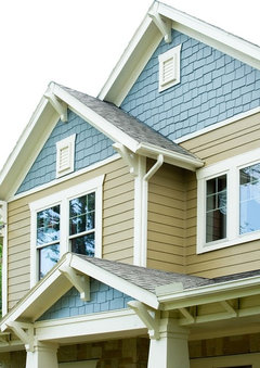
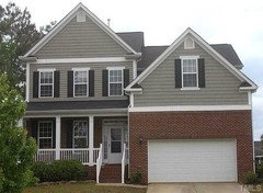
    As to the siding selection for the second level, your house would definitely look great in a shingle as shown in Dar's second photo. Hardie makes a comparable product that looks very good and is quite durable. Don't be afraid to paint your brick. Painted brick will always have texture and can allow you to have a little fun as you make this house into your home.
  • 12 years ago
    Very nice shutters Sarah - thanks for the link! The storm door is definitely going, just no need for it. I could never bring myself to paint the brick on this one - I really like the mottled/dappled colors in it.

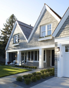
    What about something like this with Hardishingles in the upper triangle of the front and straight lap siding on the lower section?

    Greenlake Custom Home · More Info
  • 12 years ago
    Love your inspiration and the plan for Hardishingles in the upper triangle and lap siding on the lower section it will dress up your home tremendously :)
  • PRO
    12 years ago
    last modified: 12 years ago
    the wall gray.
  • 12 years ago
    I like it though I don't think major changes like that are within my budget.
  • 12 years ago
    Another one that stands out.

    James Hardie · More Info
  • 12 years ago
    last modified: 12 years ago
    What I like about the two inspiration pics you chose radiosphere is the change in materials and the attention to detail (lap siding/shingle siding/gable vent/roof corbels). Are you leaning toward the blue for the gable end shingles? If you do that it will shorten your home visually because you already have a color change from brick to siding.

    IMO, I would have the change in materials from lap to shingle, but have the same color and bring the detail in by changing out the shutters to proper size and functional looking and changing out the gable vent to something larger.
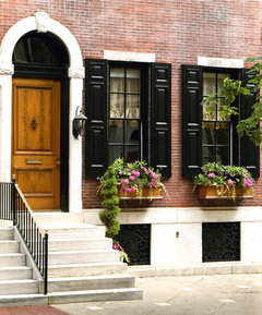
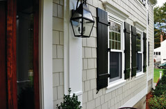
    Shutters like one of these
    Traditional Entry · More Info

    James Hardie · More Info
  • 12 years ago
    I would stay single color for both (perhaps Monterrey Taupe, Heathered Moss or Boothbay Blue?) - anything more would tend to look busy and stand out in a not so good way in this neighborhood. Which shutters are too small? I saw an earlier post saying that as well but they all seem to be near half the size of the window.
  • 12 years ago
    last modified: 12 years ago
    Here is a short but excellent article on proper shutters with photos. Take a minute to read it and you will never look at shutters the same way :)
    http://www.lifeofanarchitect.com/residential-architecture-101-shutters/

    Any of those colors you like would work. I lean toward Monterrey Taupe or Heathered Moss but it is your home :)
  • 11 years ago
    Selected Hardie Plank last year. Website has an exterior design section that lets you "see" your selections on your house. Very useful. I would recommend the list mist siding with Williamsburg Blue shutters and door. Both are grey tinged but the shutters and doors will be dark enough to give a nice contrast.
  • 11 years ago
    light mist not list mist. Sorry.
  • PRO
    11 years ago
    The problem is the massing. The house is appearing top-heavy and this trait is being accentuated by the thin columns supporting the front lower roof. This can be remedied without having to get crazy in terms of $$$. The main thing you have to do is soften the upper massing by bringing the “heaviness” to the bottom where it belongs. Fur out the structural front columns with brick (match the existing brick best you can)…maybe 16”x16”. We’re trying to bring in materials that are used elsewhere in the building and bring them to the forefront so the design looks unified. Add solar-powered sconces to match the front door (that sconce is very common and shouldn’t be hard to match at all). By making them solar powered you won’t have to worry about running electrical through the furred out columns unless you want them switched (trying to save you money). You need to increase the soffit by encasing that as well. I’m talking about the structural beam that runs at the top of the columns that supports the roof…that needs to be thickened both width and height (it appears to be very small…only 6” or so which again is out of proportion). Then lastly the easy stuff: nix all the bushes and the out-dated front light, go to Lowe’s or Home Depot and find your favorite low-lying/low-maintenance plant and buy a lot of them to landscape the front as I show in my rendering. By keeping the landscaping low and clean it will show off the bold columns and draw your eye to them as opposed to the second level portion of the house. The sconces on the columns will enhance the columns and show off the rhythm of the columns, which will once again draw your eyes to the columns. The fact that I am showing brick columns is important as well. Not only does the materiality match the home, but brick by nature feels heavy and grounds a building. These small things will make a huge difference in terms of correcting the massing issue. Good luck! :)
  • 11 years ago
    I like the grey
  • 11 years ago
    Nice landscaping out front will make be difference, trees too big
  • 11 years ago
    This would look nice with your dark to of and brick.

    http://www.kaycan.com/fr/wp-content/themes/kaycan/images/tab_img-sage.jpg
  • 11 years ago
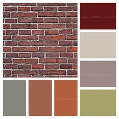
    blenheimnewzeland, love your color choices for matching the red brick. Looks like there's something for everyone. It seems everyone's first inclination is to paint the brick but with all those choices it's not necessary.
  • 11 years ago

    POSTED APRIL 2014