

canvas wall art
13 years ago
Featured Answer
Sort by:Oldest
Comments (13)
 13 years ago
- 13 years agolast modified: 13 years ago
Related Professionals
St. Louis Interior Designers & Decorators · Tucson Interior Designers & Decorators · Pullman Interior Designers & Decorators · Des Moines Architects & Building Designers · Twin Falls Architects & Building Designers · Spokane Architects & Building Designers · Riverton Architects & Building Designers · Cumberland Kitchen & Bathroom Designers · Fayetteville Kitchen & Bathroom Designers · Nashville Kitchen & Bathroom Designers · Elgin Kitchen & Bathroom Designers · Edison Kitchen & Bathroom Designers · Phoenix Kitchen & Bathroom Designers · Murrieta Kitchen & Bathroom Designers · Wenatchee Kitchen & Bathroom Designers- 13 years ago
- 13 years ago
- 13 years ago
 13 years ago
 13 years ago
 13 years ago
- 13 years ago
 13 years ago
 PRO13 years ago
 13 years ago




Related Stories
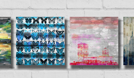
SHOP HOUZZShop Houzz: Enchanting Canvas Art Sale
Save up to 30% on colorful but soothing paintings to dress a wall
Full Story0

DECORATING GUIDESMy Houzz: Walls and Shelves Are This Collector's Colorful Canvas
French flea market finds, antique toys, folk art and family keepsakes all have a place in this creative consultant's San Francisco apartment
Full Story
SHOP HOUZZShop Houzz: Save up to 30% on Canvas Art
Nod to animals and Americana with canvas art that’s on sale
Full Story0

COLORAdding Color to Your Blank Canvas
Painting Not an Option? Here's How to Personalize Your Space Anyway
Full Story
SHOP HOUZZAbstract Canvas Art Sale
Save up to 20% on eye-catching artwork in a variety of themes and palettes
Full Story0
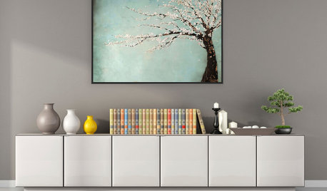
SHOP HOUZZShop Houzz: Oversized Canvas Print Sale
Save up to 65% on oversized abstract-style prints now through September 20, 2015
Full Story
LIGHTINGTranslucent Surfaces: A Canvas for Light and Shadow
Look at the Effects You Can Create With Translucent Panels Inside and Out
Full Story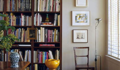
12 Ways Art and Books Can Tell Your Story
Your home may be the ultimate blank canvas. Give every room meaning with books and artwork that speak to you
Full Story
HOUZZ TOURSMy Houzz: Geometric Detail Inspires Artful Home
New Jersey painter and stained-glass artist uses her home as the ultimate canvas
Full Story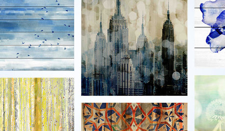
SHOP HOUZZShop Houzz: Save on Eye-Catching Wall Art
Bold art to set the mood in your space, up to 40% off
Full Story0



Staged for Perfection