
Search results for "High continuous shelf" in Home Design Ideas
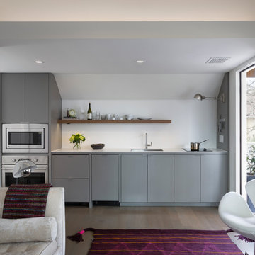
 Cuppett Kilpatrick Architecture + Interior Design
Kitchenette utilizes mini-dishwasher and refrigerator drawers. Cabinet color is Benjamin Moore, Chelsea Gray. photo by Whit Preston
Trendy single-wall kitchen photo in Austin with flat-panel cabinets and gray cabinets
Trendy single-wall kitchen photo in Austin with flat-panel cabinets and gray cabinets
 Orange Home • Design | Remodel | Build
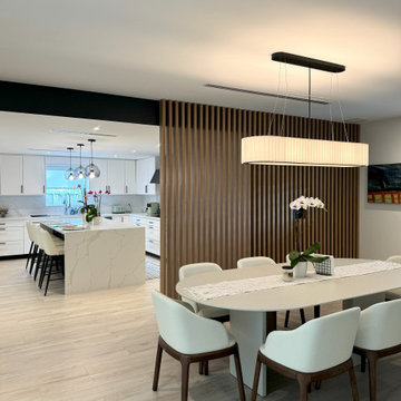
Located in the charming High Pines neighborhood, this project was born out of necessity and vision. The homeowners—a couple with three young daughters—had outgrown their dated home but found that the cost and compromises of buying a new property in Miami simply didn’t make sense. Instead, they chose to invest in a full-scale renovation, tailored to enhance their lifestyle, maximize space, and modernize every corner of their home.
The transformation included opening up the kitchen to create more connected living spaces, enclosing a discreet laundry room, remodeling all bedrooms and bathrooms, creating a resort-style outdoor retreat with a new pool, patio, and outdoor kitchen, and building an 800-square-foot master suite addition. The result is a cohesive, family-friendly design that balances style, comfort, and function.
Main Living Areas
At the heart of the home, the kitchen showcases custom Shaker-style cabinetry, sleek quartz countertops, and a spacious central island designed for entertaining. Pendant lights above the island add warmth and character, while linear diffusers subtly enhance airflow. Custom refrigerator panels create a cohesive, high-end aesthetic, all set atop durable wood-look porcelain tile flooring that extends throughout the living spaces.
Flowing effortlessly into the living room, the open-concept design promotes comfort and sophistication. Recessed and linear LED lighting highlight a striking tropical wood feature wall, while a wood slat divider adds architectural interest and provides subtle separation without sacrificing openness. Hidden within this feature wall is a discreet door leading to a new, efficiently designed laundry room.
Master Suite Addition
A major highlight of the renovation is the luxurious 800-square-foot master suite addition, a serene retreat offering privacy and indulgence. The master bedroom features linear LED lights, elegant pendant lighting, and a space-saving pocket door that enhances flow.
The adjoining master bathroom evokes a spa-like atmosphere, with a massive shower and built-in steam room as the centerpiece. A bold black-and-white geometric tile pattern brings striking visual contrast, complemented by globe-style light fixtures, a sleek vanity, dark wood cabinetry, and soft-toned hexagon tile flooring. A custom walk-in closet with tailored cabinetry completes the suite with a blend of organization and luxury.
Outdoor Living
The outdoor space was completely reimagined to function as an extension of the home—ideal for both relaxation and entertaining. The redesigned pool features a modern aesthetic with a party bench and sun shelf. The patio ceiling is finished in Thermo Wood Ayous for a warm, natural feel, while the gourmet outdoor kitchen boasts porcelain countertops, dark blue cabinetry with stainless steel hardware, and a high-end stainless steel grill.
Additional Spaces
Throughout the home, the existing bedrooms and bathrooms were fully renovated to meet the needs of the growing family. Custom mahogany and painted Shaker-style vanities, porcelain tile, glass shower enclosures, new doors, flooring, and upgraded closet systems bring functionality and design into every corner.
Curb Appeal
The renovation begins at the front door with a striking modern tropical wood entry, porcelain tile pathway, and a stucco clapboard façade. Rich Thermo Wood Ayous soffits add depth and warmth to the exterior, creating a welcoming and cohesive aesthetic that hints at the thoughtful transformation within.
 ZeroEnergy Design
ZeroEnergy Design (ZED) created this modern home for a progressive family in the desirable community of Lexington.
Thoughtful Land Connection. The residence is carefully sited on the infill lot so as to create privacy from the road and neighbors, while cultivating a side yard that captures the southern sun. The terraced grade rises to meet the house, allowing for it to maintain a structured connection with the ground while also sitting above the high water table. The elevated outdoor living space maintains a strong connection with the indoor living space, while the stepped edge ties it back to the true ground plane. Siting and outdoor connections were completed by ZED in collaboration with landscape designer Soren Deniord Design Studio.
Exterior Finishes and Solar. The exterior finish materials include a palette of shiplapped wood siding, through-colored fiber cement panels and stucco. A rooftop parapet hides the solar panels above, while a gutter and site drainage system directs rainwater into an irrigation cistern and dry wells that recharge the groundwater.
Cooking, Dining, Living. Inside, the kitchen, fabricated by Henrybuilt, is located between the indoor and outdoor dining areas. The expansive south-facing sliding door opens to seamlessly connect the spaces, using a retractable awning to provide shade during the summer while still admitting the warming winter sun. The indoor living space continues from the dining areas across to the sunken living area, with a view that returns again to the outside through the corner wall of glass.
Accessible Guest Suite. The design of the first level guest suite provides for both aging in place and guests who regularly visit for extended stays. The patio off the north side of the house affords guests their own private outdoor space, and privacy from the neighbor. Similarly, the second level master suite opens to an outdoor private roof deck.
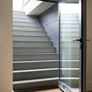
Light and Access. The wide open interior stair with a glass panel rail leads from the top level down to the well insulated basement. The design of the basement, used as an away/play space, addresses the need for both natural light and easy access. In addition to the open stairwell, light is admitted to the north side of the area with a high performance, Passive House (PHI) certified skylight, covering a six by sixteen foot area. On the south side, a unique roof hatch set flush with the deck opens to reveal a glass door at the base of the stairwell which provides additional light and access from the deck above down to the play space.
Energy. Energy consumption is reduced by the high performance building envelope, high efficiency mechanical systems, and then offset with renewable energy. All windows and doors are made of high performance triple paned glass with thermally broken aluminum frames. The exterior wall assembly employs dense pack cellulose in the stud cavity, a continuous air barrier, and four inches exterior rigid foam insulation. The 10kW rooftop solar electric system provides clean energy production. The final air leakage testing yielded 0.6 ACH 50 - an extremely air tight house, a testament to the well-designed details, progress testing and quality construction. When compared to a new house built to code requirements, this home consumes only 19% of the energy.
Architecture & Energy Consulting: ZeroEnergy Design
Landscape Design: Soren Deniord Design
Paintings: Bernd Haussmann Studio
Photos: Eric Roth Photography
Find the right local pro for your project
 Redstone Kitchens
Costa Christ
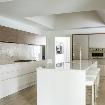
Kitchen - mid-sized modern l-shaped medium tone wood floor and brown floor kitchen idea in Dallas with an undermount sink, flat-panel cabinets, white cabinets, quartz countertops, white backsplash, stone slab backsplash, stainless steel appliances and an island
Kitchen - mid-sized modern l-shaped medium tone wood floor and brown floor kitchen idea in Dallas with an undermount sink, flat-panel cabinets, white cabinets, quartz countertops, white backsplash, stone slab backsplash, stainless steel appliances and an island
 ZeroEnergy Design
This modern green home offers both a vacation destination on Cape Cod near local family members and an opportunity for rental income.
FAMILY ROOTS. A West Coast couple living in the San Francisco Bay Area sought a permanent East Coast vacation home near family members living on Cape Cod. As academic professionals focused on sustainability, they sought a green, energy efficient home that was well-aligned with their values. With no green homes available for sale on Cape Cod, they decided to purchase land near their family and build their own.
SLOPED SITE. Comprised of a 3/4 acre lot nestled in the pines, the steeply sloping terrain called for a plan that embraced and took advantage of the slope. Of equal priority was optimizing solar exposure, preserving privacy from abutters, and creating outdoor living space. The design accomplished these goals with a simple, rectilinear form, offering living space on the both entry and lower/basement levels. The stepped foundation allows for a walk-out basement level with light-filled living space on the down-hill side of the home. The traditional basement on the eastern, up-hill side houses mechanical equipment and a home gym. The house welcomes natural light throughout, captures views of the forest, and delivers entertainment space that connects indoor living space to outdoor deck and dining patio.
MODERN VISION. The clean building form and uncomplicated finishes pay homage to the modern architectural legacy on the outer Cape. Durable and economical fiber cement panels, fixed with aluminum channels, clad the primary form. Cedar clapboards provide a visual accent at the south-facing living room, which extends a single roof plane to cover the entry porch.
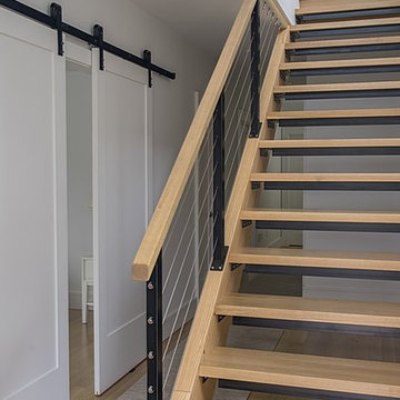
SMART USE OF SPACE. On the entry level, the “L”-shaped living, dining, and kitchen space connects to the exterior living, dining, and grilling spaces to effectively double the home’s summertime entertainment area. Placed at the western end of the entry level (where it can retain privacy but still claim expansive downhill views) is the master suite with a built-in study. The lower level has two guest bedrooms, a second full bathroom, and laundry. The flexibility of the space—crucial in a house with a modest footprint—emerges in one of the guest bedrooms, which doubles as home office by opening the barn-style double doors to connect it to the bright, airy open stair leading up to the entry level. Thoughtful design, generous ceiling heights and large windows transform the modest 1,100 sf* footprint into a well-lit, spacious home. *(total finished space is 1800 sf)
RENTAL INCOME. The property works for its owners by netting rental income when the owners are home in San Francisco. The house especially caters to vacationers bound for nearby Mayo Beach and includes an outdoor shower adjacent to the lower level entry door. In contrast to the bare bones cottages that are typically available on the Cape, this home offers prospective tenants a modern aesthetic, paired with luxurious and green features. Durable finishes inside and out will ensure longevity with the heavier use that comes with a rental property.
COMFORT YEAR-ROUND. The home is super-insulated and air-tight, with mechanical ventilation to provide continuous fresh air from the outside. High performance triple-paned windows complement the building enclosure and maximize passive solar gain while ensuring a warm, draft-free winter, even when sitting close to the glass. A properly sized air source heat pump offers efficient heating & cooling, and includes a carefully designed the duct distribution system to provide even comfort throughout the house. The super-insulated envelope allows us to significantly reduce the equipment capacity, duct size, and airflow quantities, while maintaining unparalleled thermal comfort.
ENERGY EFFICIENT. The building’s shell and mechanical systems play instrumental roles in the home’s exceptional performance. The building enclosure reduces the most significant energy glutton: heating. Continuous super-insulation, thorough air sealing, triple-pane windows, and passive solar gain work together to yield a miniscule heating load. All active energy consumers are extremely efficient: an air source heat pump for heating and cooling, a heat pump hot water heater, LED lighting, energy recovery ventilation (ERV), and high efficiency appliances. The result is a home that uses 70% less energy than a similar new home built to code requirements.
OVERALL. The home embodies the owners’ goals and values while comprehensively enabling thermal comfort, energy efficiency, a vacation respite, and supplementary income.
PROJECT TEAM
ZeroEnergy Design - Architect & Mechanical Designer
A.F. Hultin & Co. - Contractor
Pamet Valley Landscape Design - Landscape & Masonry
Lisa Finch - Original Artwork
European Architectural Supply - Windows
Eric Roth Photography - Photography

 TKS Design Group
Download our free ebook, Creating the Ideal Kitchen. DOWNLOAD NOW
For many, extra time at home during COVID left them wanting more from their homes. Whether you realized the shortcomings of your space or simply wanted to combat boredom, a well-designed and functional home was no longer a want, it became a need. Tina found herself wanting more from her Old Irving Park home and reached out to The Kitchen Studio about adding function to her kitchen to make the most of the available real estate.
At the end of the day, there is nothing better than returning home to a bright and happy space you love. And this kitchen wasn’t that for Tina. Dark and dated, with a palette from the past and features that didn’t make the most of the available square footage, this remodel required vision and a fresh approach to the space. Lead designer, Stephanie Cole’s main design goal was better flow, while adding greater functionality with organized storage, accessible open shelving, and an overall sense of cohesion with the adjoining family room.
The original kitchen featured a large pizza oven, which was rarely used, yet its footprint limited storage space. The nearby pantry had become a catch-all, lacking the organization needed in the home. The initial plan was to keep the pizza oven, but eventually Tina realized she preferred the design possibilities that came from removing this cumbersome feature, with the goal of adding function throughout the upgraded and elevated space. Eliminating the pantry added square footage and length to the kitchen for greater function and more storage. This redesigned space reflects how she lives and uses her home, as well as her love for entertaining.
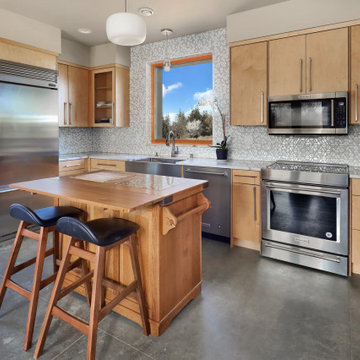
The kitchen features a classic, clean, and timeless palette. White cabinetry, with brass and bronze finishes, contrasts with rich wood flooring, and lets the large, deep blue island in Woodland’s custom color Harbor – a neutral, yet statement color – draw your eye.
The kitchen was the main priority. In addition to updating and elevating this space, Tina wanted to maximize what her home had to offer. From moving the location of the patio door and eliminating a window to removing an existing closet in the mudroom and the cluttered pantry, the kitchen footprint grew. Once the floorplan was set, it was time to bring cohesion to her home, creating connection between the kitchen and surrounding spaces.
The color palette carries into the mudroom, where we added beautiful new cabinetry, practical bench seating, and accessible hooks, perfect for guests and everyday living. The nearby bar continues the aesthetic, with stunning Carrara marble subway tile, hints of brass and bronze, and a design that further captures the vibe of the kitchen.
Every home has its unique design challenges. But with a fresh perspective and a bit of creativity, there is always a way to give the client exactly what they want [and need]. In this particular kitchen, the existing soffits and high slanted ceilings added a layer of complexity to the lighting layout and upper perimeter cabinets.
While a space needs to look good, it also needs to function well. This meant making the most of the height of the room and accounting for the varied ceiling features, while also giving Tina everything she wanted and more. Pendants and task lighting paired with an abundance of natural light amplify the bright aesthetic. The cabinetry layout and design compliments the soffits with subtle profile details that bring everything together. The tile selections add visual interest, drawing the eye to the focal area above the range. Glass-doored cabinets further customize the space and give the illusion of even more height within the room.
While her family may be grown and out of the house, Tina was focused on adding function without sacrificing a stunning aesthetic and dreamy finishes that make the kitchen the gathering place of any home. It was time to love her kitchen again, and if you’re wondering what she loves most, it’s the niche with glass door cabinetry and open shelving for display paired with the marble mosaic backsplash over the range and complimenting hood. Each of these features is a stunning point of interest within the kitchen – both brag-worthy additions to a perimeter layout that previously felt limited and lacking.
Whether your remodel is the result of special needs in your home or simply the excitement of focusing your energy on creating a fun new aesthetic, we are here for it. We love a good challenge because there is always a way to make a space better – adding function and beauty simultaneously.
 Bellingham Bay Builders
The Twin Peaks Passive House + ADU was designed and built to remain resilient in the face of natural disasters. Fortunately, the same great building strategies and design that provide resilience also provide a home that is incredibly comfortable and healthy while also visually stunning.
This home’s journey began with a desire to design and build a house that meets the rigorous standards of Passive House. Before beginning the design/ construction process, the homeowners had already spent countless hours researching ways to minimize their global climate change footprint. As with any Passive House, a large portion of this research was focused on building envelope design and construction. The wall assembly is combination of six inch Structurally Insulated Panels (SIPs) and 2x6 stick frame construction filled with blown in insulation. The roof assembly is a combination of twelve inch SIPs and 2x12 stick frame construction filled with batt insulation. The pairing of SIPs and traditional stick framing allowed for easy air sealing details and a continuous thermal break between the panels and the wall framing.
Beyond the building envelope, a number of other high performance strategies were used in constructing this home and ADU such as: battery storage of solar energy, ground source heat pump technology, Heat Recovery Ventilation, LED lighting, and heat pump water heating technology.
In addition to the time and energy spent on reaching Passivhaus Standards, thoughtful design and carefully chosen interior finishes coalesce at the Twin Peaks Passive House + ADU into stunning interiors with modern farmhouse appeal. The result is a graceful combination of innovation, durability, and aesthetics that will last for a century to come.
Despite the requirements of adhering to some of the most rigorous environmental standards in construction today, the homeowners chose to certify both their main home and their ADU to Passive House Standards. From a meticulously designed building envelope that tested at 0.62 ACH50, to the extensive solar array/ battery bank combination that allows designated circuits to function, uninterrupted for at least 48 hours, the Twin Peaks Passive House has a long list of high performance features that contributed to the completion of this arduous certification process. The ADU was also designed and built with these high standards in mind. Both homes have the same wall and roof assembly ,an HRV, and a Passive House Certified window and doors package. While the main home includes a ground source heat pump that warms both the radiant floors and domestic hot water tank, the more compact ADU is heated with a mini-split ductless heat pump. The end result is a home and ADU built to last, both of which are a testament to owners’ commitment to lessen their impact on the environment.

Sponsored
Columbus, OH

Structural Remodeling
Franklin County's Heavy Timber Specialists | Best of Houzz 2020!
 Paper Moon Painting
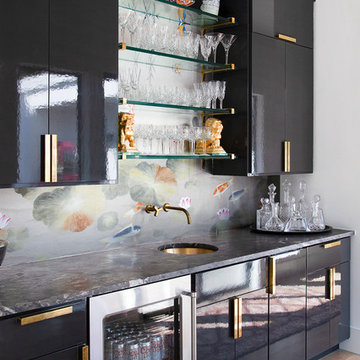
Fabulous home bar where we installed the koi wallpaper backsplash and painted the cabinets in a high-gloss black lacquer!
Example of a mid-sized trendy single-wall medium tone wood floor and brown floor wet bar design in Austin with an undermount sink, flat-panel cabinets, black cabinets, marble countertops and black countertops
Example of a mid-sized trendy single-wall medium tone wood floor and brown floor wet bar design in Austin with an undermount sink, flat-panel cabinets, black cabinets, marble countertops and black countertops
 ZeroEnergy Design
This modern green home offers both a vacation destination on Cape Cod near local family members and an opportunity for rental income.
FAMILY ROOTS. A West Coast couple living in the San Francisco Bay Area sought a permanent East Coast vacation home near family members living on Cape Cod. As academic professionals focused on sustainability, they sought a green, energy efficient home that was well-aligned with their values. With no green homes available for sale on Cape Cod, they decided to purchase land near their family and build their own.
SLOPED SITE. Comprised of a 3/4 acre lot nestled in the pines, the steeply sloping terrain called for a plan that embraced and took advantage of the slope. Of equal priority was optimizing solar exposure, preserving privacy from abutters, and creating outdoor living space. The design accomplished these goals with a simple, rectilinear form, offering living space on the both entry and lower/basement levels. The stepped foundation allows for a walk-out basement level with light-filled living space on the down-hill side of the home. The traditional basement on the eastern, up-hill side houses mechanical equipment and a home gym. The house welcomes natural light throughout, captures views of the forest, and delivers entertainment space that connects indoor living space to outdoor deck and dining patio.
MODERN VISION. The clean building form and uncomplicated finishes pay homage to the modern architectural legacy on the outer Cape. Durable and economical fiber cement panels, fixed with aluminum channels, clad the primary form. Cedar clapboards provide a visual accent at the south-facing living room, which extends a single roof plane to cover the entry porch.
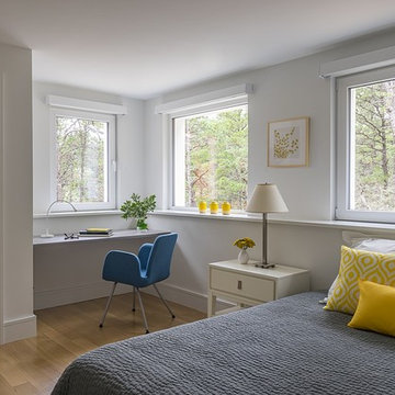
SMART USE OF SPACE. On the entry level, the “L”-shaped living, dining, and kitchen space connects to the exterior living, dining, and grilling spaces to effectively double the home’s summertime entertainment area. Placed at the western end of the entry level (where it can retain privacy but still claim expansive downhill views) is the master suite with a built-in study. The lower level has two guest bedrooms, a second full bathroom, and laundry. The flexibility of the space—crucial in a house with a modest footprint—emerges in one of the guest bedrooms, which doubles as home office by opening the barn-style double doors to connect it to the bright, airy open stair leading up to the entry level. Thoughtful design, generous ceiling heights and large windows transform the modest 1,100 sf* footprint into a well-lit, spacious home. *(total finished space is 1800 sf)
RENTAL INCOME. The property works for its owners by netting rental income when the owners are home in San Francisco. The house especially caters to vacationers bound for nearby Mayo Beach and includes an outdoor shower adjacent to the lower level entry door. In contrast to the bare bones cottages that are typically available on the Cape, this home offers prospective tenants a modern aesthetic, paired with luxurious and green features. Durable finishes inside and out will ensure longevity with the heavier use that comes with a rental property.
COMFORT YEAR-ROUND. The home is super-insulated and air-tight, with mechanical ventilation to provide continuous fresh air from the outside. High performance triple-paned windows complement the building enclosure and maximize passive solar gain while ensuring a warm, draft-free winter, even when sitting close to the glass. A properly sized air source heat pump offers efficient heating & cooling, and includes a carefully designed the duct distribution system to provide even comfort throughout the house. The super-insulated envelope allows us to significantly reduce the equipment capacity, duct size, and airflow quantities, while maintaining unparalleled thermal comfort.
ENERGY EFFICIENT. The building’s shell and mechanical systems play instrumental roles in the home’s exceptional performance. The building enclosure reduces the most significant energy glutton: heating. Continuous super-insulation, thorough air sealing, triple-pane windows, and passive solar gain work together to yield a miniscule heating load. All active energy consumers are extremely efficient: an air source heat pump for heating and cooling, a heat pump hot water heater, LED lighting, energy recovery ventilation (ERV), and high efficiency appliances. The result is a home that uses 70% less energy than a similar new home built to code requirements.
OVERALL. The home embodies the owners’ goals and values while comprehensively enabling thermal comfort, energy efficiency, a vacation respite, and supplementary income.
PROJECT TEAM
ZeroEnergy Design - Architect & Mechanical Designer
A.F. Hultin & Co. - Contractor
Pamet Valley Landscape Design - Landscape & Masonry
Lisa Finch - Original Artwork
European Architectural Supply - Windows
Eric Roth Photography - Photography
 Bellingham Bay Builders
The Twin Peaks Passive House + ADU was designed and built to remain resilient in the face of natural disasters. Fortunately, the same great building strategies and design that provide resilience also provide a home that is incredibly comfortable and healthy while also visually stunning.
This home’s journey began with a desire to design and build a house that meets the rigorous standards of Passive House. Before beginning the design/ construction process, the homeowners had already spent countless hours researching ways to minimize their global climate change footprint. As with any Passive House, a large portion of this research was focused on building envelope design and construction. The wall assembly is combination of six inch Structurally Insulated Panels (SIPs) and 2x6 stick frame construction filled with blown in insulation. The roof assembly is a combination of twelve inch SIPs and 2x12 stick frame construction filled with batt insulation. The pairing of SIPs and traditional stick framing allowed for easy air sealing details and a continuous thermal break between the panels and the wall framing.
Beyond the building envelope, a number of other high performance strategies were used in constructing this home and ADU such as: battery storage of solar energy, ground source heat pump technology, Heat Recovery Ventilation, LED lighting, and heat pump water heating technology.
In addition to the time and energy spent on reaching Passivhaus Standards, thoughtful design and carefully chosen interior finishes coalesce at the Twin Peaks Passive House + ADU into stunning interiors with modern farmhouse appeal. The result is a graceful combination of innovation, durability, and aesthetics that will last for a century to come.
Despite the requirements of adhering to some of the most rigorous environmental standards in construction today, the homeowners chose to certify both their main home and their ADU to Passive House Standards. From a meticulously designed building envelope that tested at 0.62 ACH50, to the extensive solar array/ battery bank combination that allows designated circuits to function, uninterrupted for at least 48 hours, the Twin Peaks Passive House has a long list of high performance features that contributed to the completion of this arduous certification process. The ADU was also designed and built with these high standards in mind. Both homes have the same wall and roof assembly ,an HRV, and a Passive House Certified window and doors package. While the main home includes a ground source heat pump that warms both the radiant floors and domestic hot water tank, the more compact ADU is heated with a mini-split ductless heat pump. The end result is a home and ADU built to last, both of which are a testament to owners’ commitment to lessen their impact on the environment.
 Hollub Homes
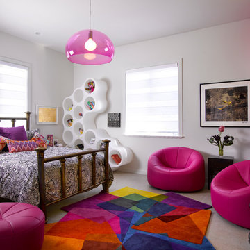
Hollub Homes | Interior design by Helene Hollub | Ken Hayden Photography
Example of a trendy girl carpeted kids' room design in Miami with white walls
Example of a trendy girl carpeted kids' room design in Miami with white walls
 Prutting & Company Custom Builders
Jason Schmidt
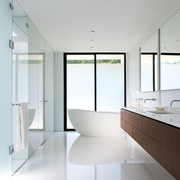
Example of a minimalist master white floor bathroom design in New York with an undermount sink, flat-panel cabinets, dark wood cabinets and white walls
Example of a minimalist master white floor bathroom design in New York with an undermount sink, flat-panel cabinets, dark wood cabinets and white walls
 Think Chic Interiors LLC
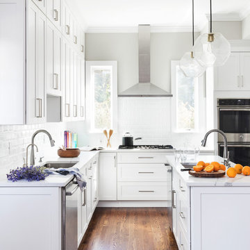
What do you do when you have a small narrow kitchen with high ceilings? you build up! in this kitchen we used every inch of space. creating a u shaped kitchen with a narrow island in the center and cabinets all the way up the 10 foot ceiling. The white shaker cabinets, white quartz counter tops and white beveled subway tiles, all help create a clean and minimalist look that does not cramp the space.

Sponsored
Columbus, OH

Hope Restoration & General Contracting
Columbus Design-Build, Kitchen & Bath Remodeling, Historic Renovations
 EAG Studio
Refined Continuity: Bridging Classical Architecture and Modern Living
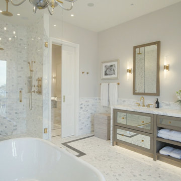
This comprehensive remodel of a grand Cow Hollow residence reimagines a historically expressive envelope through a lens of contemporary livability, precision detailing, and material restraint. The design approach carefully balances the home’s classical proportions and ornamental heritage with a refined, modern sensibility—evident in the disciplined palette of warm neutrals, soft plasters, pale oak flooring, and tailored millwork. Circulation has been clarified and subtly expanded to enhance spatial flow, while openings are leveraged to capture light, garden outlooks, and distant water views. Throughout, architectural interventions are executed with a high level of craft, ensuring that new insertions—whether cabinetry, railings, or apertures—read as seamless continuations of the original structure rather than applied elements.
The kitchen serves as the operational and visual anchor of the home, conceived as a sculptural yet highly functional environment. Custom rift-cut cabinetry, softened through a desaturated finish, is paired with honed stone surfaces and integrated brass hardware to create a quiet, tactile richness. A monolithic island establishes a central gathering point, while perimeter work zones are carefully layered with concealed storage, integrated appliances, and open, backlit shelving that elevates everyday objects into curated displays. The adjacent bar and entertaining areas extend this language, reinforcing a cohesive hospitality-driven program. In parallel, the primary bathroom is designed as a serene, spa-like retreat, where bookmatched stone, frameless glass enclosures, and finely detailed metalwork converge. The composition prioritizes symmetry, clarity, and light—balancing generous volumes with intimate moments through integrated lighting, custom vanities, and a restrained material hierarchy.
The library and ancillary living spaces introduce a more intimate scale, anchored by bespoke built-ins that combine closed storage with illuminated display niches, creating depth and rhythm along the walls. Here, material transitions and furniture integration are handled with particular nuance, allowing the architecture to support both quiet retreat and social gathering. A continuous language of custom railings—executed in refined metal profiles—threads through the interior and extends outward, where the exterior gate and garden elements have been reinterpreted to align with the home’s renewed identity. The entry sequence is now defined by a calibrated interplay of solidity and transparency, with sculptural metalwork and landscape integration establishing a sense of arrival that is both secure and elegant. Collectively, the project reflects a holistic transformation—one that elevates performance, livability, and aesthetic clarity while preserving the inherent dignity of the original architecture.
 USI Design & Remodeling
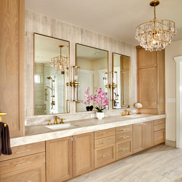
Located in Argyle, Texas, this comprehensive whole-home renovation was conceived by USI Design & Remodeling who reimagined the home's interior architecture, transforming a collection of compartmentalized rooms into a cohesive environment designed for modern living, entertaining, and daily comfort. The project encompassed the kitchen, family room, dining room, lounge, office, primary bathroom, and supporting circulation spaces, creating a unified experience that feels both expansive and intentional. Throughout the home, refined materials, custom millwork, and carefully curated finishes establish a sense of understated luxury while maintaining warmth and livability.
At the heart of the renovation is a completely reconfigured kitchen and gathering space designed around functionality, hospitality, and visual connection. Architectural barriers were removed to improve sightlines and circulation, allowing the kitchen, dining, and family spaces to function as a single integrated living environment. A dramatic five-foot workstation sink anchors the kitchen, while custom cabinetry and furniture-inspired details elevate the space beyond conventional residential design. Adjacent to the kitchen, the former pantry, laundry, and service corridor were reimagined as a hybrid scullery and utility suite, creating a highly functional support space that discreetly accommodates food preparation, storage, organization, and household operations without compromising the elegance of the primary living areas.
The renovation extends beyond aesthetics to create a home tailored to the family's evolving needs. The primary bathroom was transformed into a spa-inspired retreat, while the lounge, office, and dining spaces were redesigned to support both everyday living and entertaining. Consistent architectural detailing, layered textures, and thoughtful proportions establish continuity throughout the residence, allowing each room to feel connected to the larger design narrative. The result is a sophisticated yet approachable home that balances practical performance with timeless design, delivering a renewed living experience that is both highly functional and distinctly luxurious.
 Studio Sage Interiors
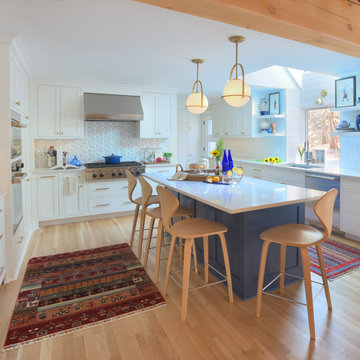
The original kitchen, although generous in size, was out of touch with our clients personal style. When a plumbing mishap caused significant damage to the space, the homeowners seized the opportunity to create the culinary workspace of their dreams.
At the top of their wish list was a well designed kitchen, both aesthetically and functionally. State of the art appliances were selected based on the client's functional requirements and the optimal layout was tailored to family dinners and occasional entertaining. At the heart of the existing kitchen was a large and highly utilized island, keeping this was a high priority. An unused audio cabinet with outdated components was removed to create a much needed dry bar. The large refrigerator, and beverage fridge drawers were concealed behind custom made cabinetry panels and were positioned adjacent to the family seating area for easy access. Attributes such as spice storage, silver dividers and a tall pantry storage ensured everything had its place.
Sherwin Williams, indigo batik (as seen on the island) was carried through the home allowing a visual connection throughout the home while the bright white perimeter cabinets created lightness and dramatic contrast. Brass hardware and decorative lighting gave the space a hint of understated glamour while pulling the warm tones found in the lattice of veining in the cambria quartz countertop.
It is hard not to notice, however, the dramatic impact of the large ceramic, three dimensional, hexagon tiles that highlight the range wall. Companion subway tiles created continuity throughout the expansive kitchen, adorning the backsplash through the rest of the space.
 Precision Homecrafters, LLC
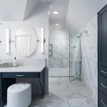
The Inverness Bathroom remodel had these goals: to complete the work while allowing the owner to continue to use their workshop below the project's construction, to provide a high-end quality product that was low-maintenance to the owners, to allow for future accessibility, more natural light and to better meet the daily needs of both the husband's and wife's lifestyles.
The first challenge was providing the required structural support to continue to clear span the two cargarage below which housed a workshop. The sheetrock removal, framing and sheetrock repairs and painting were completed first so the owner could continue to use his workshop, as requested. The HVAC supply line was originally an 8" duct that barely fit in the roof triangle between the ridge pole and ceiling. In order to provide the required air flow to additional supply vents in ceiling, a triangular duct was fabricated allowing us to use every square inch of available space. Since every exterior wall in the space adjoined a sloped ceiling, we installed ventilation baffles between each rafter and installed spray foam insulation.This project more than doubled the square footage of usable space. The new area houses a spaciousshower, large bathtub and dressing area. The addition of a window provides natural light. Instead of a small double vanity, they now have a his-and-hers vanity area. We wanted to provide a practical and comfortable space for the wife to get ready for her day and were able to incorporate a sit down make up station for her. The honed white marble looking tile is not only low maintenance but creates a clean bright spa appearance. The custom color vanities and built in linen press provide the perfect contrast of boldness to create the WOW factor. The sloped ceilings allowed us to maximize the amount of usable space plus provided the opportunity for the built in linen press with drawers at the bottom for additional storage. We were also able to combine two closets and add built in shelves for her. This created a dream space for our client that craved organization and functionality. A separate closet on opposite side of entrance provided suitable and comfortable closet space for him. In the end, these clients now have a large, bright and inviting master bath that will allow for complete accessibility in the future.

Sponsored
Delaware, OH

Buckeye Basements, Inc.
Central Ohio's Basement Finishing ExpertsBest Of Houzz '13-'21
 Tiny Digs
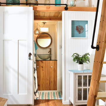
The beach theme continues in the bathroom with a vessel sink that sits atop a glass shelf showing the sea shells and glass underneath. The sliding door is adorned with a mermaid handle. Tongue and groove cedar planks line the ceiling and Winter Wheat Bamboo Flooring is from Lumber Liquidators. And plenty of turquoise accents round out the décor.
Photo credit: Shane McKenzie
 Milgard Windows & Doors
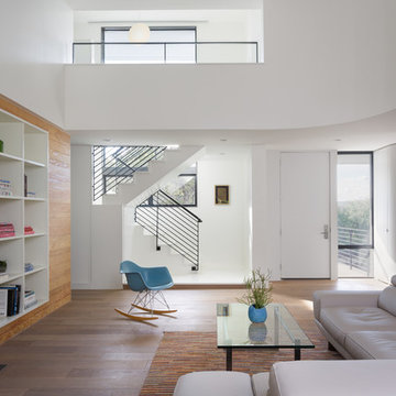
The Kiguchi family moved into their Austin, Texas home in 1994. Built in the 1980’s as part of a neighborhood development, they happily raised their family here but longed for something more contemporary. Once they became empty nesters, they decided it was time for a major remodel. After spending many years visiting Austin AIA Home Tours that highlight contemporary residential architecture, they had a lot of ideas and in 2013 were ready to interview architects and get their renovation underway.
The project turned into a major remodel due to an unstable foundation. Architects Ben Arbib and Ed Hughey, of Arbib Hughey Design were hired to solve the structural issue and look for inspiration in the bones of the house, which sat on top of a hillside and was surrounded by great views.
Unfortunately, with the old floor plan, the beautiful views were hidden by small windows that were poorly placed. In order to bring more natural light into the house the window sizes and configurations had to be addressed, all while keeping in mind the homeowners desire for a modern look and feel.
To achieve a more contemporary and sophisticated front of house, a new entry was designed that included removing a two-story bay window and porch. The entrance of the home also became more integrated with the landscape creating a template for new foliage to be planted. Older exterior materials were updated to incorporate a more muted palette of colors with a metal roof, dark grey siding in the back and white stucco in the front. Deep eaves were added over many of the new large windows for clean lines and sun protection.
“Inside it was about opening up the floor plan, expanding the views throughout the house, and updating the material palette to get a modern look that was also warm and inviting,” said Ben from Arbib Hughey Design. “Prior to the remodel, the house had the typical separation of rooms. We removed the walls between them and changed all of the windows to Milgard Thermally Improved Aluminum to connect the inside with the outside. No matter where you are you get nice views and natural light.”
The architects wanted to create some drama, which they accomplished with the window placement and opening up the interior floor plan to an open concept approach. Cabinetry was used to help delineate intimate spaces. To add warmth to an all-white living room, white-washed oak wood floors were installed and pine planks were used around the fireplace. The large windows served as artwork bringing the color of nature into the space.
An octagon shaped, elevated dining room, (named “the turret”), had a big impact on the design of the house. They architects rounded the corners and added larger window openings overlooking a new sunken garden. The great room was also softened by rounding out the corners and that circular theme continued throughout the house, being picked up in skylight wells and kitchen cabinetry. A staircase leading to a catwalk was added and the result was a two-story window wall that flooded the home with natural light.
When asked why Milgard® Thermally Improved Aluminum windows were selected, the architectural team listed many reasons:
1) Aesthetics: “We liked the slim profiles and narrow sightlines. The window frames never get in the way of the view and that was important to us. They also have a very contemporary look that went well with our design.”
2) Options: “We liked that we could get large sliding doors that matched the windows, giving us a very cohesive look and feel throughout the project.”
3) Cost Effective: “Milgard windows are affordable. You get a good product at a good price.”
4) Custom Sizes: “Milgard windows are customizable, which allowed us to get the right window for each location.”
Ready to take on your own traditional to modern home remodeling project? Arbib Hughey Design advises, “Work with a good architect. That means picking a team that is creative, communicative, listens well and is responsive. We think it’s important for an architect to listen to their clients and give them something they want, not something the architect thinks they should have. At the same time you want an architect who is willing and able to think outside the box and offer up design options that you may not have considered. Design is about a lot of back and forth, trying out ideas, getting feedback and trying again.”
The home was completely transformed into a unique, contemporary house perfectly integrated with its site. Internally the home has a natural flow for the occupants and externally it is integrated with the surroundings taking advantage of great natural light. As a side note, it was highly praised as part of the Austin AIA homes tour.
 TKS Design Group
Download our free ebook, Creating the Ideal Kitchen. DOWNLOAD NOW
For many, extra time at home during COVID left them wanting more from their homes. Whether you realized the shortcomings of your space or simply wanted to combat boredom, a well-designed and functional home was no longer a want, it became a need. Tina found herself wanting more from her Old Irving Park home and reached out to The Kitchen Studio about adding function to her kitchen to make the most of the available real estate.
At the end of the day, there is nothing better than returning home to a bright and happy space you love. And this kitchen wasn’t that for Tina. Dark and dated, with a palette from the past and features that didn’t make the most of the available square footage, this remodel required vision and a fresh approach to the space. Lead designer, Stephanie Cole’s main design goal was better flow, while adding greater functionality with organized storage, accessible open shelving, and an overall sense of cohesion with the adjoining family room.
The original kitchen featured a large pizza oven, which was rarely used, yet its footprint limited storage space. The nearby pantry had become a catch-all, lacking the organization needed in the home. The initial plan was to keep the pizza oven, but eventually Tina realized she preferred the design possibilities that came from removing this cumbersome feature, with the goal of adding function throughout the upgraded and elevated space. Eliminating the pantry added square footage and length to the kitchen for greater function and more storage. This redesigned space reflects how she lives and uses her home, as well as her love for entertaining.
The kitchen features a classic, clean, and timeless palette. White cabinetry, with brass and bronze finishes, contrasts with rich wood flooring, and lets the large, deep blue island in Woodland’s custom color Harbor – a neutral, yet statement color – draw your eye.
The kitchen was the main priority. In addition to updating and elevating this space, Tina wanted to maximize what her home had to offer. From moving the location of the patio door and eliminating a window to removing an existing closet in the mudroom and the cluttered pantry, the kitchen footprint grew. Once the floorplan was set, it was time to bring cohesion to her home, creating connection between the kitchen and surrounding spaces.
The color palette carries into the mudroom, where we added beautiful new cabinetry, practical bench seating, and accessible hooks, perfect for guests and everyday living. The nearby bar continues the aesthetic, with stunning Carrara marble subway tile, hints of brass and bronze, and a design that further captures the vibe of the kitchen.
Every home has its unique design challenges. But with a fresh perspective and a bit of creativity, there is always a way to give the client exactly what they want [and need]. In this particular kitchen, the existing soffits and high slanted ceilings added a layer of complexity to the lighting layout and upper perimeter cabinets.
While a space needs to look good, it also needs to function well. This meant making the most of the height of the room and accounting for the varied ceiling features, while also giving Tina everything she wanted and more. Pendants and task lighting paired with an abundance of natural light amplify the bright aesthetic. The cabinetry layout and design compliments the soffits with subtle profile details that bring everything together. The tile selections add visual interest, drawing the eye to the focal area above the range. Glass-doored cabinets further customize the space and give the illusion of even more height within the room.
While her family may be grown and out of the house, Tina was focused on adding function without sacrificing a stunning aesthetic and dreamy finishes that make the kitchen the gathering place of any home. It was time to love her kitchen again, and if you’re wondering what she loves most, it’s the niche with glass door cabinetry and open shelving for display paired with the marble mosaic backsplash over the range and complimenting hood. Each of these features is a stunning point of interest within the kitchen – both brag-worthy additions to a perimeter layout that previously felt limited and lacking.
Whether your remodel is the result of special needs in your home or simply the excitement of focusing your energy on creating a fun new aesthetic, we are here for it. We love a good challenge because there is always a way to make a space better – adding function and beauty simultaneously.
1