
Search results for "Knock down texture" in Home Design Ideas
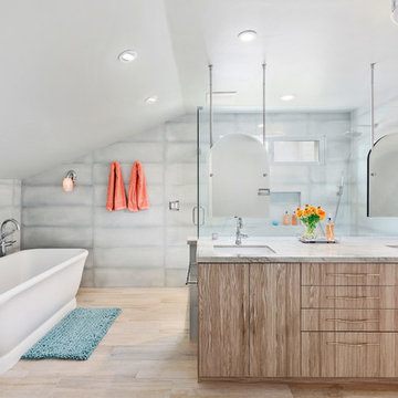
 TaylorPro Design and Remodeling, Inc.
"Kerry Taylor was professional and courteous from our first meeting forwards. We took a long time to decide on our final design but Kerry and his design team were patient and respectful and waited until we were ready to move forward. There was never a sense of being pushed into anything we didn’t like. They listened, carefully considered our requests and delivered an awesome plan for our new bathroom. Kerry also broke down everything so that we could consider several alternatives for features and finishes and was mindful to stay within our budget. He accommodated some on-the-fly changes, after construction was underway and suggested effective solutions for any unforeseen problems that arose.
Having construction done in close proximity to our master bedroom was a challenge but the excellent crew TaylorPro had on our job made it relatively painless: courteous and polite, arrived on time daily, worked hard, pretty much nonstop and cleaned up every day before leaving. If there were any delays, Kerry made sure to communicate with us quickly and was always available to talk when we had concerns or questions."
This Carlsbad couple yearned for a generous master bath that included a big soaking tub, double vanity, water closet, large walk-in shower, and walk in closet. Unfortunately, their current master bathroom was only 6'x12'.
Our design team went to work and came up with a solution to push the back wall into an unused 2nd floor vaulted space in the garage, and further expand the new master bath footprint into two existing closet areas. These inventive expansions made it possible for their luxurious master bath dreams to come true.
Just goes to show that, with TaylorPro Design & Remodeling, fitting a square peg in a round hole could be possible!
Photos by: Jon Upson
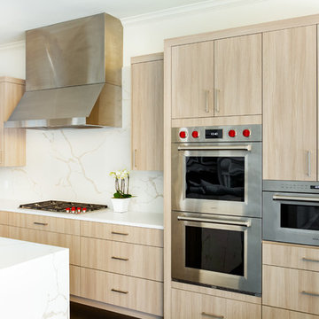
 Kitchen Design Concepts
These clients had recently moved to Texas and really needed to remodel a few spaces in the home - the kitchen was number 1 priority! Wanting a clean and modern update, while keeping the room warm and inviting, we think we hit the mark.
Cabinets are from Ultracraft. The perimeter is their Metropolis Door in Melamine - Silver Elm vertical grain. The island we contrasted with the Acrilux II Lux door in Pure White (gloss). Cabinet hardware from from Atlas Homewares, the IT pull in brushed nickel.
Counters we were able to pull two different materials together. The perimeter counter material was Pure White from Caesarstone - very simple. Brought in some pattern with Quartzmaster Calcutta Borghini on the backsplash, and on the island. The mitered waterfall edge gives it an extra "oomph" that we just love.
For fixtures, we kept things fairly simple. A Blanco super single bowl sink, and California Faucets Corsano Pull down at the island. We paired with a matching soap dispenser and air switch.
The appliances were also important, so we took some time mixing and matching what was needed and what worked well within the budget. From Wolf we have a gas cooktop, Double oven and Microwave. We opted for a Best Vent Hood and blower, Electrolux Refrigerator ad Bosch Dishwasher to round out the selections.
 InnovationLand
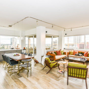
Houston Interior Designer Lisha Maxey took this Museum District condo from the dated, mirrored walls of the 1980s to Mid Century Modern with a gallery look featuring the client’s art collection.
The place was covered with glued-down, floor-to-ceiling mirrors,” says Lisha Maxey, senior designer for Homescapes of Houston and principal at LGH Design Services in Houston. “When we took them off the walls, the walls came apart. We ended up taking them down to the studs."
The makeover took six months to complete, primarily because of strict condo association rules that only gave the Houston interior designers very limited access to the elevator – through which all materials and team members had to go.
“Monday through Friday, we could only be noisy from 10 a.m. to 2 p.m., and if we had to do something extra loud, like sawing or drilling, we had to schedule it with the management and they had to communicate that to the condo owners. So it was just a lot of coordination. But a lot of Inner City Loopers live in these kinds of buildings, so we’re used to handling that kind of thing.”
The client, a child psychiatrist in her 60s, recently moved to Houston from northeast Texas to be with friends. After being widowed three years ago, she decided it was time to let go of the traditionally styled estate that wasn’t really her style anyway. An avid diver who has traveled around the world to pursue her passion, she has amassed a large collection of art from her travels. Downsizing to 1,600 feet and wanting to go more contemporary, she wanted the display – and the look – more streamlined.
“She wanted clean lines and muted colors, with the main focus being her artwork,” says Maxey. “So we made the space a palette for that.”
Enter the white, gallery-grade paint she chose for the walls: “It’s halfway between satin and flat,” explains Maxey. “It’s not glossy and it’s not chalky – just very smooth and clean."
Adding to the gallery theme is the satin nickel track lighting with lamps aimed to highlight pieces of art. “This lighting has no wires,” notes Maxey. “It’s powered by a positive and negative conduit.”
The new flooring throughout is a blended-grey porcelain tile that looks like wood planks. “It’s gorgeous, natural-looking and combines all the beauty of wood with the durability of tile,” says Maxey. “We used it throughout the condo to unify the space.”
After Maxey started looking at the client’s bright, vibrant, colorful artwork, she felt the palette couldn’t stay as muted anymore. Hence the Mid Century Modern orange leather sofas from West Elm and bright green chairs from Joybird, plus the throw pillows in different textures, patterns and shades of gold, orange and green.
The concave lines of the Danish-inspired chairs, she notes, help them look beautiful from all the way around – a key to designing spaces for loft living.
“The table in the living room is very interesting,” notes Maxey. “It was handmade for the client in 1974 and has a signature on it from the artist. She was adamant about including the piece, which has all these hand-painted black-and-white art tiles on the top. I took one look at it and said ‘It’s not really going to go.’”
However, after cutting 6 inches off the bottom and making it look a little distressed, the table ended up being the perfect complement to the sofas.
The dining room table – from Design Within Reach – is a solid piece of mahogany, the chair upholstery a mix of grey velvet and leather and the legs a shiny brass. “The side chairs are leather and the end ones are velvet,” says Maxey. “It’s a nice textural mix that lends depth and texture.”The galley kitchen, meanwhile, has been lightened and brightened, with new, white contemporary cabinetry, quartz countertops mimicking the look of Carrara marble, stainless steel appliances and a velvet green bench seat for a punch of color.The two bathrooms have been updated with contemporary white vanities and vessel sinks and the master bath now features a walk-in shower tiled in Dolomite white marble (the floor is Bianco Carrara marble mosaic, done in a herringbone pattern).In the master bedroom, Homescapes of Houston knocked down a wall between two smaller closets with swing doors to make one large walk-in closet with pocket doors. The closet in the guest bedroom also came out 13 more inches.The client’s artwork throughout personalizes the space and tells the story of a life. There’s a huge bowl of shells from the client’s diving adventures, framed art from her child psychiatry patients and a 16th century wood carving from a monastery that’s been in her family forever.
“Her collection is quite impressive,” says Maxey. “There’s even a framed piece of autographed songs written by John Lennon.” (You can see this black-framed piece of art on the wall in the photo above of two green chairs).
“We’re extremely happy with how the project turned out, and so is the client,” says Maxey. “No expense was spared for her. It was a labor of love and we were excited to do it.”
Find the right local pro for your project
 InnovationLand
Houston Interior Designer Lisha Maxey took this Museum District condo from the dated, mirrored walls of the 1980s to Mid Century Modern with a gallery look featuring the client's art collection.
"The place was covered with glued-down, floor-to-ceiling mirrors," says Lisha Maxey, senior designer for Homescapes of Houston and principal at LGH Design Services in Houston. "When we took them off the walls, the walls came apart. We ended up taking them down to the studs."
The makeover took six months to complete, primarily because of strict condo association rules that only gave the Houston interior designers very limited access to the elevator - through which all materials and team members had to go.
"Monday through Friday, we could only be noisy from 10 a.m. to 2 p.m., and if we had to do something extra loud, like sawing or drilling, we had to schedule it with the management and they had to communicate that to the condo owners. So it was just a lot of coordination. But a lot of Inner City Loopers live in these kinds of buildings, so we're used to handling that kind of thing."
The client, a child psychiatrist in her 60s, recently moved to Houston from northeast Texas to be with friends. After being widowed three years ago, she decided it was time to let go of the traditionally styled estate that wasn't really her style anyway. An avid diver who has traveled around the world to pursue her passion, she has amassed a large collection of art from her travels. Downsizing to 1,600 feet and wanting to go more contemporary, she wanted the display - and the look - more streamlined.
"She wanted clean lines and muted colors, with the main focus being her artwork," says Maxey. "So we made the space a palette for that."
Enter the white, gallery-grade paint she chose for the walls: "It's halfway between satin and flat," explains Maxey. "It's not glossy and it's not chalky - just very smooth and clean."
Adding to the gallery theme is the satin nickel track lighting with lamps aimed to highlight pieces of art. "This lighting has no wires," notes Maxey. "It's powered by a positive and negative conduit."
The new flooring throughout is a blended-grey porcelain tile that looks like wood planks. "It's gorgeous, natural-looking and combines all the beauty of wood with the durability of tile," says Maxey. "We used it throughout the condo to unify the space."
After Maxey started looking at the client's bright, vibrant, colorful artwork, she felt the palette couldn't stay as muted anymore. Hence the Mid Century Modern orange leather sofas from West Elm and bright green chairs from Joybird, plus the throw pillows in different textures, patterns and shades of gold, orange and green.
The concave lines of the Danish-inspired chairs, she notes, help them look beautiful from all the way around - a key to designing spaces for loft living.
"The table in the living room is very interesting," notes Maxey. "It was handmade for the client in 1974 and has a signature on it from the artist. She was adamant about including the piece, which has all these hand-painted black-and-white art tiles on the top. I took one look at it and said 'It's not really going to go.'"
However, after cutting 6 inches off the bottom and making it look a little distressed, the table ended up being the perfect complement to the sofas.
The dining room table - from Design Within Reach - is a solid piece of mahogany, the chair upholstery a mix of grey velvet and leather and the legs a shiny brass. "The side chairs are leather and the end ones are velvet," says Maxey. "It's a nice textural mix that lends depth and texture."
The galley kitchen, meanwhile, has been lightened and brightened, with white quartz countertops and backsplashes mimicking the look of Carrara marble, stainless steel appliances and a velvet green bench seat for a punch of color. The cabinets are painted a cool grey color called "Silverplate."
The two bathrooms have been updated with contemporary white vanities and vessel sinks and the master bath now features a walk-in shower tiled in Dolomite white marble (the floor is Bianco Carrara marble mosaic, done in a herringbone pattern.
In the master bedroom, Homescapes of Houston knocked down a wall between two smaller closets with swing doors to make one large walk-in closet with pocket doors. The closet in the guest bedroom also came out 13 more inches.
The client's artwork throughout personalizes the space and tells the story of a life. There's a huge bowl of shells from the client's diving adventures, framed art from her child psychiatry patients and a 16th century wood carving from a monastery that's been in her family forever.
"Her collection is quite impressive," says Maxey. "There's even a framed piece of autographed songs written by John Lennon." (You can see this black-framed piece of art on the wall in the photo above of two green chairs).
"We're extremely happy with how the project turned out, and so is the client," says Maxey. "No expense was spared for her. It was a labor of love and we were excited to do it."
 InnovationLand
Houston Interior Designer Lisha Maxey took this Museum District condo from the dated, mirrored walls of the 1980s to Mid Century Modern with a gallery look featuring the client’s art collection.
The place was covered with glued-down, floor-to-ceiling mirrors,” says Lisha Maxey, senior designer for Homescapes of Houston and principal at LGH Design Services in Houston. “When we took them off the walls, the walls came apart. We ended up taking them down to the studs."
The makeover took six months to complete, primarily because of strict condo association rules that only gave the Houston interior designers very limited access to the elevator – through which all materials and team members had to go.
“Monday through Friday, we could only be noisy from 10 a.m. to 2 p.m., and if we had to do something extra loud, like sawing or drilling, we had to schedule it with the management and they had to communicate that to the condo owners. So it was just a lot of coordination. But a lot of Inner City Loopers live in these kinds of buildings, so we’re used to handling that kind of thing.”
The client, a child psychiatrist in her 60s, recently moved to Houston from northeast Texas to be with friends. After being widowed three years ago, she decided it was time to let go of the traditionally styled estate that wasn’t really her style anyway. An avid diver who has traveled around the world to pursue her passion, she has amassed a large collection of art from her travels. Downsizing to 1,600 feet and wanting to go more contemporary, she wanted the display – and the look – more streamlined.
“She wanted clean lines and muted colors, with the main focus being her artwork,” says Maxey. “So we made the space a palette for that.”
Enter the white, gallery-grade paint she chose for the walls: “It’s halfway between satin and flat,” explains Maxey. “It’s not glossy and it’s not chalky – just very smooth and clean."
Adding to the gallery theme is the satin nickel track lighting with lamps aimed to highlight pieces of art. “This lighting has no wires,” notes Maxey. “It’s powered by a positive and negative conduit.”
The new flooring throughout is a blended-grey porcelain tile that looks like wood planks. “It’s gorgeous, natural-looking and combines all the beauty of wood with the durability of tile,” says Maxey. “We used it throughout the condo to unify the space.”
After Maxey started looking at the client’s bright, vibrant, colorful artwork, she felt the palette couldn’t stay as muted anymore. Hence the Mid Century Modern orange leather sofas from West Elm and bright green chairs from Joybird, plus the throw pillows in different textures, patterns and shades of gold, orange and green.
The concave lines of the Danish-inspired chairs, she notes, help them look beautiful from all the way around – a key to designing spaces for loft living.
“The table in the living room is very interesting,” notes Maxey. “It was handmade for the client in 1974 and has a signature on it from the artist. She was adamant about including the piece, which has all these hand-painted black-and-white art tiles on the top. I took one look at it and said ‘It’s not really going to go.’”
However, after cutting 6 inches off the bottom and making it look a little distressed, the table ended up being the perfect complement to the sofas.
The dining room table – from Design Within Reach – is a solid piece of mahogany, the chair upholstery a mix of grey velvet and leather and the legs a shiny brass. “The side chairs are leather and the end ones are velvet,” says Maxey. “It’s a nice textural mix that lends depth and texture.”The galley kitchen, meanwhile, has been lightened and brightened, with new, white contemporary cabinetry, quartz countertops mimicking the look of Carrara marble, stainless steel appliances and a velvet green bench seat for a punch of color.The two bathrooms have been updated with contemporary white vanities and vessel sinks and the master bath now features a walk-in shower tiled in Dolomite white marble (the floor is Bianco Carrara marble mosaic, done in a herringbone pattern).In the master bedroom, Homescapes of Houston knocked down a wall between two smaller closets with swing doors to make one large walk-in closet with pocket doors. The closet in the guest bedroom also came out 13 more inches.The client’s artwork throughout personalizes the space and tells the story of a life. There’s a huge bowl of shells from the client’s diving adventures, framed art from her child psychiatry patients and a 16th century wood carving from a monastery that’s been in her family forever.
“Her collection is quite impressive,” says Maxey. “There’s even a framed piece of autographed songs written by John Lennon.” (You can see this black-framed piece of art on the wall in the photo above of two green chairs).
“We’re extremely happy with how the project turned out, and so is the client,” says Maxey. “No expense was spared for her. It was a labor of love and we were excited to do it.”
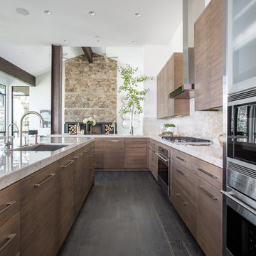
 Jaffa Group Design Build
This beautiful kitchen built by Peppertree Kitchen and Bath with cabinets of architectural-grade, rift-sawn white oak veneer. It has a wire-brushed texture with a custom satin and glaze.
 Hartmann&Forbes
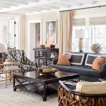
Natural Roman Shade: LE1301 Barege
Designer: Amy Weaver
Photographer: Jessica Klewicki Glynn
Transitional living room photo in Portland
Transitional living room photo in Portland
Sponsored
Sunbury, OH

J.Holderby - Renovations
Franklin County's Leading General Contractors - 2X Best of Houzz!
 Collaborative Interior Design
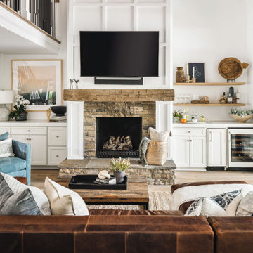
We took advantage of the double volume ceiling height in the living room and added millwork to the stone fireplace, a reclaimed wood beam and a gorgeous, chandelier. The sliding doors lead out to the sundeck and the lake beyond. TV's mounted above fireplaces tend to be a little high for comfortable viewing from the sofa, so this tv is mounted on an adjustable pull down bracket for use when the fireplace is not turned on. Floating white oak shelves replaced upper cabinets above the bar area.
 Newschool Builders LLC
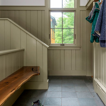
This custom home is nestled between Sugarbush and Mad River Glen. The project consisted of knocking down a large part of the original structure and building a new 3000sf wing and then joining the two together. A durable hand split Cedar shingle exterior combined with many architectural trim details made for a stunning and durable envelope.
The noteworthy interior details included reclaimed barn board on the walls, custom cabinetry and builtins, a locally fabricated metal staircase railing, with the clients home mountain resort (Mad River Glen) banner incorporated in the balustrade system. The home combined with the beautiful landscaping, pond, and mountain views make for an amazing sanctuary for our clients to retreat too in both the winter and summer seasons.
 Brian David Roberts | Interior Planning & Design
virginiarobertsphotography.com
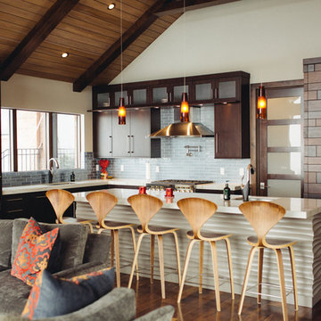
Mid-sized transitional l-shaped dark wood floor open concept kitchen photo in Salt Lake City with an undermount sink, dark wood cabinets, blue backsplash, stainless steel appliances, an island, flat-panel cabinets, marble countertops and glass tile backsplash
Mid-sized transitional l-shaped dark wood floor open concept kitchen photo in Salt Lake City with an undermount sink, dark wood cabinets, blue backsplash, stainless steel appliances, an island, flat-panel cabinets, marble countertops and glass tile backsplash
 The Weber Studio
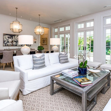
Living room - large coastal formal and enclosed light wood floor living room idea in Miami with white walls
 Newschool Builders LLC
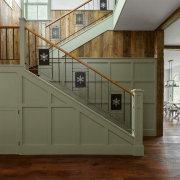
This custom home is nestled between Sugarbush and Mad River Glen. The project consisted of knocking down a large part of the original structure and building a new 3000sf wing and then joining the two together. A durable hand split Cedar shingle exterior combined with many architectural trim details made for a stunning and durable envelope.
The noteworthy interior details included reclaimed barn board on the walls, custom cabinetry and builtins, a locally fabricated metal staircase railing, with the clients home mountain resort (Mad River Glen) banner incorporated in the balustrade system. The home combined with the beautiful landscaping, pond, and mountain views make for an amazing sanctuary for our clients to retreat too in both the winter and summer seasons.
 Performance Kitchens & Home
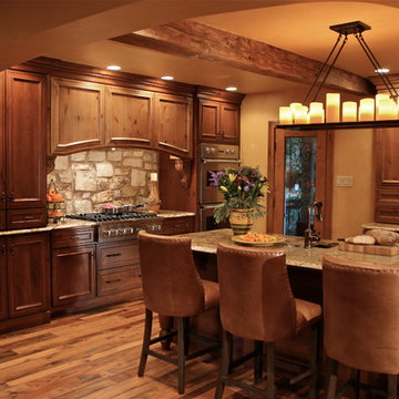
This Mediterranean-inspired kitchen blends warm wood cabinetry, natural stone accents, and hand-crafted architectural details to create a space rich in texture and Old-World charm. The custom cabinets feature deep, luxurious stain tones that pair beautifully with the stone hood surround and arched cooking niche—signature elements often found in high-end Mediterranean kitchen design. Wide-plank flooring and softly curved ceiling lines add warmth and authenticity, making the kitchen feel inviting and timeless.
A large center island anchors the layout, offering both prep space and comfortable seating for casual dining. Decorative corbels, carved posts, and wrought-iron touches elevate the handcrafted aesthetic while modern appliances blend seamlessly into the design. This luxury Mediterranean kitchen remodel balances elegance and functionality, giving homeowners a warm, character-filled space perfect for entertaining, cooking, and gathering. Text us at (484) 278-1764 or Call us (215) 482-0700 to get more info about Design, Design-Build and other ways we can help you make your dream a reality!

Sponsored
Columbus, OH
Free consultation for landscape design!

Peabody Landscape Group
Franklin County's Reliable Landscape Design & Contracting
 restyle design, llc
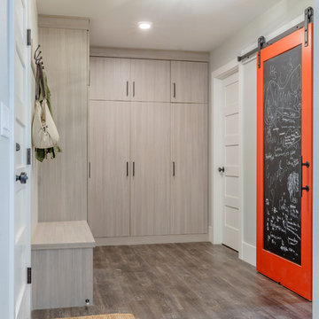
This ranch was a complete renovation! We took it down to the studs and redesigned the space for this young family. We opened up the main floor to create a large kitchen with two islands and seating for a crowd and a dining nook that looks out on the beautiful front yard. We created two seating areas, one for TV viewing and one for relaxing in front of the bar area. We added a new mudroom with lots of closed storage cabinets, a pantry with a sliding barn door and a powder room for guests. We raised the ceilings by a foot and added beams for definition of the spaces. We gave the whole home a unified feel using lots of white and grey throughout with pops of orange to keep it fun.
 Ku Interior Design
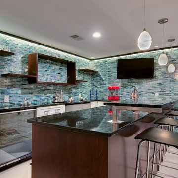
Wall cabinets were removed to open up the space and make way for open shelving. New countertops, door & drawer fronts, and wood finish on the peninsula complete the revamped bar / kitchen.
Copyright -©Teri Fotheringham Photography 2013
 Newschool Builders LLC
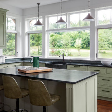
This custom home is nestled between Sugarbush and Mad River Glen. The project consisted of knocking down a large part of the original structure and building a new 3000sf wing and then joining the two together. A durable hand split Cedar shingle exterior combined with many architectural trim details made for a stunning and durable envelope.
The noteworthy interior details included reclaimed barn board on the walls, custom cabinetry and builtins, a locally fabricated metal staircase railing, with the clients home mountain resort (Mad River Glen) banner incorporated in the balustrade system. The home combined with the beautiful landscaping, pond, and mountain views make for an amazing sanctuary for our clients to retreat too in both the winter and summer seasons.
 Axis Mundi
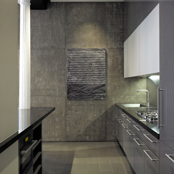
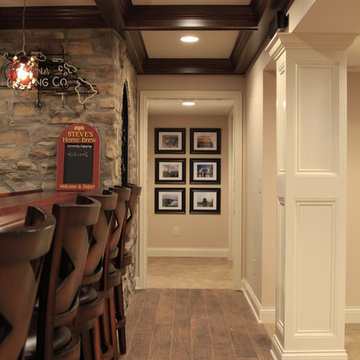
This NoHo apartment, in a landmarked circa 1870 building designed by Stephen Decatur Hatch and converted to lofts in 1987, had been interestingly renovated by a rock musician before being purchased by a young hedge fund manager and his gallery director girlfriend. Naturally, the couple brought to the project their collection of painting, photography and sculpture, mostly by young emerging artists. Axis Mundi accommodated these pieces within a neutral palette accented with occasional flashes of bright color that referenced the various artworks. Major furniture pieces – a sectional in the library, a 12-foot-long dining table–along with a rich blend of textures such as leather, linen, fur and warm woods, helped bring the sprawling dimensions of the loft down to human scale.
Photography: Mark Roskams
Sponsored
Delaware, OH

Buckeye Basements, Inc.
Central Ohio's Basement Finishing ExpertsBest Of Houzz '13-'21
 Stalburg Design
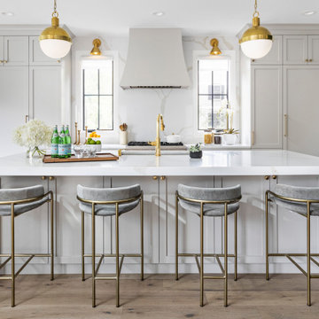
This stylish, family friendly kitchen is also an entertainer’s dream! This young family desired a bright, spacious kitchen that would function just as well for the family of 4 everyday, as it would for hosting large events (in a non-covid world). Apart from these programmatic goals, our aesthetic goal was to accommodate all the function and mess into the design so everything would be neatly hidden away behind beautiful cabinetry and panels.
The navy, bifold buffet area serves as an everyday breakfast and coffee bar, and transforms into a beautiful buffet spread during parties (we’ve been there!). The fridge drawers are great for housing milk and everyday items during the week, and both kid and adult beverages during parties while keeping the guests out of the main cooking zone. Just around the corner you’ll find the high gloss navy bar offering additional beverages, ice machine, and barware storage – cheers!
Super durable quartz with a marbled look keeps the kitchen looking neat and bright, while withstanding everyday wear and tear without a problem. The practical waterfall ends at the island offer additional damage control in bringing that hard surface all the way down to the beautiful white oak floors.
Underneath three large window walls, a built-in banquette and custom table provide a comfortable, intimate dining nook for the family and a few guests while the stunning chandelier ties in nicely with the other brass accents in the kitchen. The thin black window mullions offer a sharp, clean contrast to the crisp white walls and coordinate well with the dark banquette.
Thin, tall windows on either side of the range beautifully frame the stunningly simple, double curvature custom hood, and large windows in the bar/butler’s pantry allow additional light to really flood the space and keep and airy feel. The textured wallpaper in the bar area adds a touch of warmth, drama and interest while still keeping things simple.
 Klopf Architecture
Klopf Architecture and Jesse Ososki Art remodeled an existing Eichler atrium home into a brighter, more open, and more functional version of its original self.
The goals were to preserve the Eichler look and feel without the need to strictly adhere to it. The scope of work included re-configuring the master bedroom/bath, the kitchen, and the hall bath/laundry area, as well as updating interior finishes throughout to be more sophisticated.
The owners are detail-oriented and were very involved in the design process, down to the selection of lighting controls and stainless steel faceplates.Their design aesthetic leans toward the Scandinavian — light and bright, with simple straight lines and pure geometric shapes.
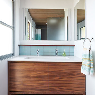
The finish flooring is large porcelain tile (24” x 24”) in a neutral grey tone, providing a uniform backdrop against which other materials can stand out. The same tile continues into the shower floor (with a different finish texture for slip-resistance) and up the shower/tub walls (in a smaller size). Heath Classic Field ceramic tile in Modern Blue was used sparingly, to add color at the hall bath vanity backsplash and at the shampoo niches in both bathrooms. Back-painted soda glass in pale blue to match the Heath tile was used at the kitchen backsplash. This same accent color was also used at the front entry atrium door. Kitchen cabinetry, countertops, appliances, and light fixtures are all white, making the kitchen feel more airy and light. Countertops are Caesarstone Blizzard.
The owners chose to keep some of the original Eichler elements: the concrete masonry fireplace; the stained tongue-and-groove redwood ceiling decking; and the luan wall paneling. The luan paneling was lightly sanded, cleaned, and re-stained. The owners also kept an added element that was installed by a previous owner: sliding shoji panels at all bedroom windows and sliding glass doors, for both privacy and sun control. Grooves were cut into the new tile flooring for the shoji panels to slide in, creating a more integrated look. Walnut was used to add warmth and contrast at the kitchen bar top and niche, the bathroom vanities, and the window sill/ledge under the kitchen window.
This Burlingame Eichler Remodel is a 2,121 sf, 4 bedroom/2 bath home located in the heart of Silicon Valley.
Klopf Architecture Project Team: John Klopf, Klara Kevane and Yegvenia Torres Zavala
Contractor: Jesse Ososki Art
Structural Engineer: Emmanuel Pun
Photography ©2018 Mariko Reed
Location: Burlingame, CA
Year completed: 2017
 Blackline Renovations
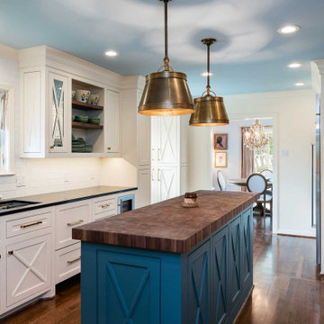
To open up space and make the kitchen feel larger without knocking down walls, Blackline Renovations made the hall entry from the kitchen to the dining room wider. We also relocated the refrigerator and oven and minimized the depth of the full-height cabinets near the range to give the couple enough space for a beautiful new functional narrow island.
1