
Search results for "I'd expect" in Home Design Ideas

 Dovetail Renovation, Inc.
Example of a classic l-shaped medium tone wood floor eat-in kitchen design in Minneapolis with an undermount sink, shaker cabinets, white cabinets, blue backsplash, subway tile backsplash, stainless steel appliances and an island

 The Tiny Project
Alek Lisefski / tiny-project.com
Bedroom - contemporary light wood floor bedroom idea in San Francisco with white walls and no fireplace
Bedroom - contemporary light wood floor bedroom idea in San Francisco with white walls and no fireplace

 Donald Lococo Architects
Located on farmland in McLean, Virginia, the American Farmhouse balances the expected comforts of a new home with the bucolic beauty of an old farmhouse. The final site plan still has evidence showing parallel courses of the barn’s destiny. The house mass is broken and lowered so that the home can remain secondary to the monolithic barn structure. Earthy and elemental materials are selected for the home that reference the barn without directly mimicking it. Wooden members found inside the barn and from other barns bridge ceilings and are used in floors along with rustic slate adding to a sense of simplicity to the farmhouse design.
The age and patina of the barn is reflected in the house’s textural use of board and batten and field stone layered similar to stone foundations. The original development plan was to demolish the existing barn and construct three suburban homes. Part of an endangered breed, as one of the few remaining barns in the area, it was originally viewed as a challenge in a luxury home construction with several difficulties posed to the impending project: it would be expensive to renovate, vulnerable to demolition, and threatened by urban sprawl. However, instead of trying to alter or destroy the barn, the structure was fully embraced into the traditional architecture project as a centerpiece and was used as the inspiration for the home. The new house was sited parallel to the barn so that views to the barn gable were accessible.
Find the right local pro for your project

 STIMAMIGLIO conceptluxurydesign
Kitchen - mid-sized contemporary master medium tone wood floor kitchen idea with flat-panel cabinets, white cabinets, white walls, a trough sink and solid surface countertops

 Ronda Batchelor
Ronda Batchelor,
Galley laundry room with folding counter, dirty clothes bins on rollers underneath, clean clothes baskets for each family member, sweater drying racks with built in fan, and built in ironing board.

 Euro Tech Cabinetry and Remodeling Corp
Example of a classic dark wood floor kitchen design in Chicago with white cabinets, granite countertops, gray backsplash, stainless steel appliances and an island

 41 West
Here's what our clients from this project had to say:
We LOVE coming home to our newly remodeled and beautiful 41 West designed and built home! It was such a pleasure working with BJ Barone and especially Paul Widhalm and the entire 41 West team. Everyone in the organization is incredibly professional and extremely responsive. Personal service and strong attention to the client and details are hallmarks of the 41 West construction experience. Paul was with us every step of the way as was Ed Jordon (Gary David Designs), a 41 West highly recommended designer. When we were looking to build our dream home, we needed a builder who listened and understood how to bring our ideas and dreams to life. They succeeded this with the utmost honesty, integrity and quality!
41 West has exceeded our expectations every step of the way, and we have been overwhelmingly impressed in all aspects of the project. It has been an absolute pleasure working with such devoted, conscientious, professionals with expertise in their specific fields. Paul sets the tone for excellence and this level of dedication carries through the project. We so appreciated their commitment to perfection...So much so that we also hired them for two more remodeling projects.
We love our home and would highly recommend 41 West to anyone considering building or remodeling a home.
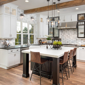


 User
UserRead more: https://www.homepolish.com/journal/kelly-oxford-la-office-interior-design?p=hp-houzz
Photos by Bethany Nauert
 Donald Lococo Architects
Located on farmland in McLean, Virginia, the American Farmhouse balances the expected comforts of a new home with the bucolic beauty of an old farmhouse. The final site plan still has evidence showing parallel courses of the barn’s destiny. The house mass is broken and lowered so that the home can remain secondary to the monolithic barn structure. Earthy and elemental materials are selected for the home that reference the barn without directly mimicking it. Wooden members found inside the barn and from other barns bridge ceilings and are used in floors along with rustic slate adding to a sense of simplicity to the farmhouse design.
The age and patina of the barn is reflected in the house’s textural use of board and batten and field stone layered similar to stone foundations. The original development plan was to demolish the existing barn and construct three suburban homes. Part of an endangered breed, as one of the few remaining barns in the area, it was originally viewed as a challenge in a luxury home construction with several difficulties posed to the impending project: it would be expensive to renovate, vulnerable to demolition, and threatened by urban sprawl. However, instead of trying to alter or destroy the barn, the structure was fully embraced into the traditional architecture project as a centerpiece and was used as the inspiration for the home. The new house was sited parallel to the barn so that views to the barn gable were accessible.

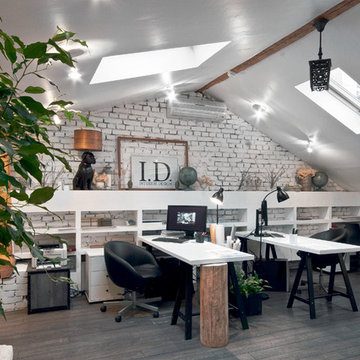
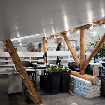
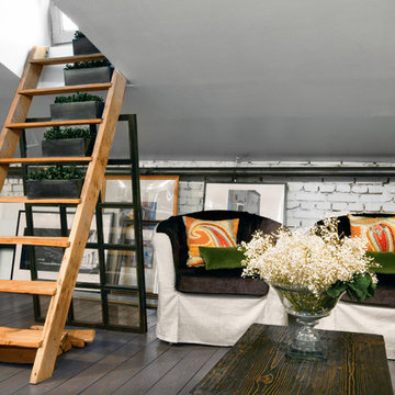
 I.D.interior design
фото Кирилл Овчинников
Living room - farmhouse light wood floor living room idea in Moscow
Living room - farmhouse light wood floor living room idea in Moscow

 Robin Gonzales Interiors
Contrast is the key to this gorgeous transitional family room. Soft greige walls are in contrast with the platinum silk draperies and charcoal sofa. Custom lounge chairs in gold ikat add a touch of glamour to this formal living space. Modern art keeps it fresh and fun.

 Blue Heron Signature Homes
Designed and built by Terramor Homes in Raleigh, NC. The initial and sole objective of setting the tone of this home began and was entirely limited to the foyer and stairwell to which it opens- setting the stage for the expectations, mood and style of this home upon first arrival.
Photography: M. Eric Honeycutt

 Tamara Rosenbloom Design LLC
My clients had outgrown their builder’s basic home and had plenty of room to expand on their 10 acres. Working with a local architect and a talented contractor, we designed an addition to create 3 new bedrooms, a bathroom scaled for all 3 girls, a playroom and a master retreat including 3 fireplaces, sauna, steam shower, office or “creative room”, and large bedroom with folding glass wall to capitalize on their view. The master suite, gym, pool and tennis courts are still under construction, but the girls’ suite and living room space are complete and dust free. Each child’s room was designed around their preference of color scheme and each girl has a unique feature that makes their room truly their own. The oldest daughter has a secret passage hidden behind what looks like built in cabinetry. The youngest daughter wanted to “swing”, so we outfitted her with a hanging bed set in front of a custom mural created by a Spanish artist. The middle daughter is an elite gymnast, so we added monkey bars so she can cruise her room in style. The girls’ bathroom suite has 3 identical “stations” with abundant storage. Cabinetry in black walnut and peacock blue and white quartz counters with white marble backsplash are durable and beautiful. Two shower stalls, designed with a colorful and intricate tile design, prevent bathroom wait times and a custom wall mural brings a little of the outdoors in.
Photos by Mike Martin www.martinvisualtours.com
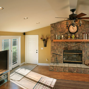
Sponsored
Westerville, OH

Custom Home Works
Franklin County's Award-Winning Design, Build and Remodeling Expert

 Eldorado Stone
The goal of this master suite remodel was to design a luxurious yet simple environment that was not only beautiful but also comfortable, and designer Lori Wiles brought the transformation to life.
The remodel was a transformation of the unused storage area in the bottom level of the clients’ home. Wiles' creative problem solving did more than just hide basement remodel problems like low ductwork and poorly located pipes. Instead, these obstacles served as a source of inspiration for some of the most interesting aspects of her design, such as the angular wood-paneled headboard wall with built-in nightstands.
Following a stone, fire, water, and wood theme, the materials used in this master suite strongly relate to nature. Water flows to the tub from the stone accent wall in the bathroom, and an opposing stone wall in the bedroom creates a dramatic backdrop for a seating area. Both walls contain candle-filled niches and Cherry wood is employed throughout, creating warmth and continuity.
To further achieve the natural look and feel of the bathroom, Wiles incorporated a variety of stones. The shower and immediate area around the freestanding tub feature pebble accent flooring that complement the surrounding large, rectangular tile floors. Eldorado Stone’s Black River Stacked Stone was chosen because it offered different textures and dimensions of the black, rugged, stacked stone, resulting in an organic environment that provides relief from the flat surfaces.
By using quality materials such as Eldorado Stone, designer Lori Wiles was able to create a zen-like space that exceeded her client’s expectations.
Eldorado Stone Profile Featured: Black River Stacked Stone installed with a Dry-Stack grout technique
Designer: Lori Wiles Design
Website: www.loriwilesdesign.com
Phone: (319) 310-6214
Contact Lori Wiles Design
Houzz: www.houzz.com/pro/loriwiles/lori-wiles-design
Facebook: www.facebook.com/pages/Lori-Wiles-Design
Pinterest: www.pinterest.com/loriwilesdesign/
Photography: Lori Wiles Design
Mason: Iowa Stone Supply
Website: www.iowastonesupply.com
Phone: (319) 533-4299
Contact Iowa Stone Supply
Eastern Iowa Showroom (Monday-Friday 7:30-4:00 or by appointment)
1530 Stamy Road
Hiawatha, IA 52233
Central Iowa Showroom (by appointment)
2913 99th Street
Urbandale, IA 50322
Facebook: www.facebook.com/pages/Iowa-Stone-Supply
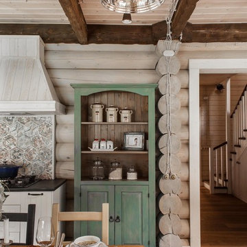
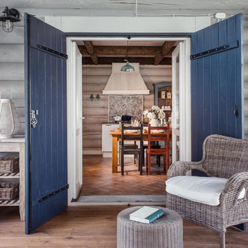


 J Design Group - Interior Designers Miami - Modern
Ocean front, Luxury home in Miami Beach
Projects by J Design Group, Your friendly Interior designers firm in Miami, FL. at your service.
AVENTURA MAGAZINE selected our client’s luxury 5000 Sf ocean front apartment in Miami Beach, to publish it in their issue and they Said:
Story by Linda Marx, Photography by Daniel Newcomb
Light & Bright
New York snowbirds redesigned their Miami Beach apartment to take advantage of the tropical lifestyle.
New York snowbirds redesigned their Miami Beach apartment to take advantage of the tropical lifestyle.
WHEN INTERIOR DESIGNER JENNIFER CORREDOR was asked to recreate a four-bedroom, six-bath condominium at The Bath Club in Miami Beach, she seized the opportunity to open the rooms and better utilize the vast ocean views.
In five months last year, the designer transformed a dark and closed 5,000-square-foot unit located on a high floor into a series of sweeping waterfront spaces and updated the well located apartment into a light and airy retreat for a sports-loving family of five.
“They come down from New York every other weekend and wanted to make their waterfront home a series of grand open spaces,” says Jennifer Corrredor, of the J. Design Group in Miami, a firm specializing in modern and contemporary interiors. “Since many of the rooms face the ocean, it made sense to open and lighten up the home, taking advantage of the awesome views of the sea and the bay.”
The designer used 40 x 40 all white tile throughout the apartment as a clean base. This way, her sophisticated use of color would stand out and bring the outdoors in.
The close-knit family members—two parents and three boys in college—like to do things together. But there were situations to overcome in the process of modernizing and opening the space. When Jennifer Corredor was briefed on their desires, nothing seemed too daunting. The confident designer was ready to delve in. For example, she fixed an area at the front door
that was curved. “The wood was concave so I straightened it out,” she explains of a request from the clients. “It was an obstacle that I overcame as part of what I do in a redesign. I don’t consider it a difficult challenge. Improving what I see is part of the process.”
She also tackled the kitchen with gusto by demolishing a wall. The kitchen had formerly been enclosed, which was a waste of space and poor use of available waterfront ambience. To create a grand space linking the kitchen to the living room and dining room area, something had to go. Once the wall was yesterday’s news, she relocated the refrigerator and freezer (two separate appliances) to the other side of the room. This change was a natural functionality in the new open space. “By tearing out the wall, the family has a better view of the kitchen from the living and dining rooms,” says Jennifer Corredor, who also made it easier to walk in and out of one area and into the other. “The views of the larger public space and the surrounding water are breathtaking.
Opening it up changed everything.”
They clients can now see the kitchen from the living and dining areas, and at the same time, dwell in an airy and open space instead of feeling stuck in a dark enclosed series of rooms. In fact, the high-top bar stools that Jennifer Corredor selected for the kitchen can be twirled around to use for watching TV in the living room.
In keeping with the theme of moving seamlessly from one room to the other, Corredor designed a subtle wall of glass in the living room along with lots of comfortable seating. This way, all family members feel at ease while relaxing, talking, or watching sporting events on the large flat screen television. “For this room, I wanted more open space, light and a supreme airy feeling,” she says. “With the glass design making a statement, it quickly became the star of the show.”…….
….. To add texture and depth, Jennifer Corredor custom created wood doors here, and in other areas of the home. They provide a nice contrast to the open Florida tropical feel. “I added character to the openness by using exotic cherry wood,” she says. “I repeated this throughout the home and it works well.”
Known for capturing the client’s vision while adding her own innovative twists, Jennifer Corredor lightened the family room, giving it a contemporary and modern edge with colorful art and matching throw pillows on the sofas. She added a large beige leather ottoman as the center coffee table in the room. This round piece was punctuated with a bold-toned flowering plant atop. It effortlessly matches the pillows and colors of the contemporary canvas.
Jennifer Corredor also gutted all of the bathrooms, resulting in a major redesign of the master. She jettisoned the whirlpool and created the dazzling illusion of a floating tub. From an area where there were two toilets, she eliminated one to make a grand rectangular shower, which became an overall showpiece. The master bath went from being just a functional water closet to a sophisticated spa-like space. “The client said I was ‘delicious’ after seeing the change,” laughed Jennifer Corredor, who emphasized that her clients love their part-time life in South Florida more each time they come down. Even when the husband has to work from their Miami Beach digs, he is surrounded by tropical beauty. For instance, there are times when the master bedroom must double as the husband’s home office.
The room had to be large enough to accommodate a working space for this purpose. So Jennifer Corredor placed an appropriate table near the window and across from the king-size bed. “No blocking of the amazing water view was necessary,” she says. “I kept an open space with a lot of white so It functions well and the work space fits right in.” She repeated the bold modern art in the room as well as in the guest bedroom, which also has a workspace for the sons when they are home from school and need to study.
The designer is still happy and glowing with the results of her toil in this apartment. She gets a “spiritual feeling” when she walks inside. “It is so peaceful and serene, with subtle hints of explosive statements,” she says. “The entire space is open, yet anchored by the warmth of the exotic woods.” The client wrote Jennifer Corredor a letter at the end of the project congratulating her on a
job well done. She revealed that owning a Miami Beach home was her husband’s dream 30 years ago. “Now we have a quality perfect yet practical home,” she wrote to the designer. “You solved the challenges, and the end
result far exceeds our expectations. We love it.”
Thanks for your interest in our Contemporary Interior Design projects and if you have any question please do not hesitate to ask us.
http://www.JDesignGroup.com
305.444.4611
Modern Interior designer Miami. Contemporary
Miami
Miami Interior Designers
Miami Interior Designer
Interior Designers Miami
Interior Designer Miami
Modern Interior Designers
Modern Interior Designer
Modern interior decorators
Modern interior decorator
Contemporary Interior Designers
Contemporary Interior Designer
Interior design decorators
Interior design decorator
Interior Decoration and Design
Black Interior Designers
Black Interior Designer
Interior designer
Interior designers
Interior design decorators
Interior design decorator
Home interior designers
Home interior designer
Interior design companies
Interior decorators
Interior decorator
Decorators
Decorator
Miami Decorators
Miami Decorator
Decorators Miami
Decorator Miami
Interior Design Firm
Interior Design Firms
Interior Designer Firm
Interior Designer Firms
Interior design
Interior designs
home decorators
Interior decorating Miami
Best Interior Designers.
225 Malaga Ave.
Coral Gable, FL 33134
http://www.JDesignGroup.com
305.444.4611
1