
Search results for "Account transit" in Home Design Ideas

 AGM Home Store, LLC
Makeup mirrors are a woman’s or a man’s best friend, they can save you from foundation lines, overgrown eyebrows, and other preventable beauty blunders. Before shopping for a quality makeup mirror, we recommend narrowing down your choices by learning which type of makeup mirror will not only look great in your bathroom, but have you looking your best as well. Magnifying mirrors will give you a new perspective on your skin while cosmetic mirrors are designed to give you red carpet style in the comfort of your own home. Magnifying mirrors can also be found as double face mirrors, with different magnifications on each mirror face. The most popular magnification is 5x as it is ideal for brow tweezing and perfecting eyeliner. Facial mirrors are great for the man of the bathroom and make shaving safer and easier. Lighted Makeup Mirrors are ideal if you want to make the most of each brush, line, and stroke when applying your makeup. Wall Mounted Makeup Mirrors are becoming increasingly popular, we know find them as a standard in hotel rooms. Many of them have extendable arms, which gives you the freedom to adjust it as needed for better lighting or positioning. Additionally, many lighted mirrors today are also wall mounted, which gives you another option to choose from. The best part is several lighted makeup mirrors are now battery powered, which saves you the headaches of hardwired installations. Free Standing Makeup Mirrors, probably the most popular option in this category. Free standing makeup mirrors are fashionable and trendy. They are easy to move from one room to the other or simply closer to a window or better lighting. No matter the type of makeup mirror you choose, you can always rely on one to help you transform into a professional makeup artist and aid you in your quest for flawless skin. Browse our large selection of European makeup mirror collections:

 TVL Creative Ltd.
There’s nothing as wonderful as walking into a mid-century gem with clients who love the character of their new home. Our goal for this project was to incorporate the mid-century bones of this home into a new design that would better meet the contemporary needs of our clients. We started by taking down the walls that had separated this kitchen from the rest of the home and creating a welcoming space that blended seamlessly with the new open concept. The new kitchen design was a win for our clients with increased storage, more work surfaces, and a peninsula with plenty of seating. We utilized wood finishes through out this space with light wood flooring, medium-tones on the cabinetry, and darker wood accents throughout giving us a beautiful balance and a calm backdrop. This home had beautiful horizontal lines that we wanted to accentuate, so we selected a dark wood finish for the central beam and tied it in with the dark finish on the wood fireplace mantel and the stair handrail to emphasize the horizontal features. But we never miss an opportunity for a fun mid-century pop, and this home provided plenty of inspiration! The boomerang hardware on the cabinets and escher backsplash tiles give us great geometric elements to break up the clean lines of the rest of the space. One of our favorite features of this home was the original plaster ceilings with the custom hand troweled texture. We knew from the beginning that this was an element we wanted to maintain and accentuate, so when we opened up the kitchen and added recessed lighting we reached out to a local plaster artisan to carry the texture throughout the space, and we couldn’t be happier with the results. This design brings together the mid-century aesthetics of clean lines and fun patterns with the modern-day functionality our clients were looking for in their new kitchen.

Find the right local pro for your project




 Village Home Stores
Wood beadboard in a kitchen remodeled from start to finish by Village Home Stores.
Eat-in kitchen - mid-sized transitional galley dark wood floor eat-in kitchen idea in Chicago with an undermount sink, flat-panel cabinets, dark wood cabinets, quartz countertops, beige backsplash, mosaic tile backsplash, stainless steel appliances and no island
Eat-in kitchen - mid-sized transitional galley dark wood floor eat-in kitchen idea in Chicago with an undermount sink, flat-panel cabinets, dark wood cabinets, quartz countertops, beige backsplash, mosaic tile backsplash, stainless steel appliances and no island







 Ahmed Hassanen
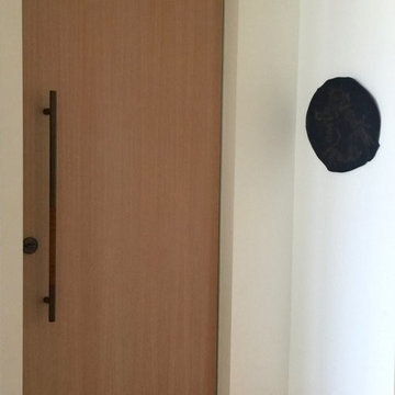
Dressing area - Hinged doors closet with special sand blasted glass and inner drawers .
Dressing room - large modern gender-neutral laminate floor and yellow floor dressing room idea with glass-front cabinets and medium tone wood cabinets
Dressing room - large modern gender-neutral laminate floor and yellow floor dressing room idea with glass-front cabinets and medium tone wood cabinets


 Nathan Fell Architecture
Inspiration for a mid-sized modern gray two-story gable roof remodel in New Orleans with a shingle roof and a gray roof
Sponsored
Fredericksburg, OH

High Point Cabinets
Columbus' Experienced Custom Cabinet Builder | 4x Best of Houzz Winner

 KURV Architecture DPC (Alex Hughes Architects)
Located in the heart of Manhattan’s Lower East Side, the building was erected on a shallow commercial lot between two 120 year old masonry buildings and a new residential rental building. 330 Grand Street is a mix of 725 SF 1BRs and 1050 SF 2BR apartments. It also contains a 1100 SF two story duplex as well as private and public rooftop space, large private balconies for most units and two large private terraces for the ground floor units.
330 Grand Street was originally designed and approved at the NYC DOB as a prefabricated modular building. During the pandemic, as shipping costs skyrocketed putting the project at risk, we suggested redesigning the building as a reinforced cast-in-place concrete structure. Concrete was readily available and prices had not been affected by the demand increase that many other materials suffered in the pandemic. We took this opportunity to raise floor to ceiling heights, enlarge high performance windows and redistribute the buildings MEPFS and Structural Systems to create very open floor plans.
The challenge was to create a luxurious sensorial living experience with very limited means. In a city with very high construction costs, low cost residential buildings in the area are usually devoid of good quality, design and character. Our approach was to aim high for the end user, prioritizing natural light, open space with long visual perspectives, high ceilings and as always, rejecting the use of predefined building templates.
Our biggest challenge was to ensure that the small spaces feel as clean cut, large and bright as possible. Several unique design decisions were made to ensure low cost and high quality;
Floor plans were laid out so that spaces were wide open and free of clutter from mechanical or structural interruptions. Therefore all infrastructure was placed in lateral demising walls, which in turn act as the unit’s storage and kitchen. The apartments feel wide open, are super quiet and have more storage space than any other comparable apartment in the city.
To solve the problem of the site’s shallow commercial lot which is typically prone to dark interior spaces we focused our attention on the building’s envelope. Instead of the usual small punched window openings, oversized high performance windows were designed to ensure that light penetrated as far as possible into the units. In the smaller 1BR units, the full 50’ depth of the lot is perceived by partitioning spaces with sliding pocket doors that can be retracted to allow deep visual perspectives, making the sight lines in the space feel longer, larger, more ample than normal. In addition to the full height glazing, each unit above the 2nd floor receives a 7 foot covered balcony, adding 120 to 240 sf to each apartment, something unusual in New York City buildings. The space is large enough for a full size dining table, when the weather permits being outside.
We also worked hard to ensure modularity. For example, all kitchen units are all identical throughout the building. The idea of modularity and the economy of the repetitive unit is exercised to the maximum through the building.
Hardware, appliances, flooring, wall coverings and material finishes are all carefully selected to feel bespoke, high quality and unique.
It was important to KURV that the result of this work manifest into something that would deeply connect with the end user and sustain relationships with the consumers of this space.
All images by KURV Architecture ©



 camilleriparismode
 projects and design team were approached to rethink a previously unused double height room in a wonderful villa. the lower part of the room was planned as a sitting and dining area, the sub level above as a tv den and games room. as the occupants enjoy their time together as a family, as well as their shared love of books, a floor-to-ceiling library was an ideal way of using and linking the large volume. the large library covers one wall of the room spilling into the den area above. it is given a sense of movement by the differing sizes of the verticals and shelves, broken up by randomly placed closed cupboards. the floating marble fireplace at the base of the library unit helps achieve a feeling of lightness despite it being a complex structure, while offering a cosy atmosphere to the family area below. the split-level den is reached via a solid oak staircase, below which is a custom made wine room. the staircase is concealed from the dining area by a high wall, painted in a bold colour on which a collection of paintings is displayed.
photos by: brian grech



 Gia Gregory Designs
Gregory Design Group
Example of a mid-sized classic 3/4 beige tile and porcelain tile porcelain tile alcove bathtub design in Charlotte with an undermount sink, raised-panel cabinets, dark wood cabinets, granite countertops, a two-piece toilet and beige walls
Example of a mid-sized classic 3/4 beige tile and porcelain tile porcelain tile alcove bathtub design in Charlotte with an undermount sink, raised-panel cabinets, dark wood cabinets, granite countertops, a two-piece toilet and beige walls



41