
Search results for "Adding clutter" in Home Design Ideas
 EmV Design Build
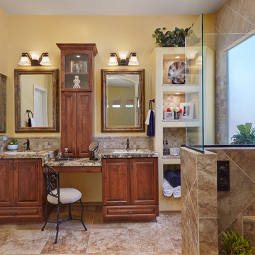
Robin Stancliff photo credits.My goal with this project was to create a glamorous, luxurious bathroom with plenty of space and a Mediterranean-inspired aesthetic. My client felt as though her old bathroom was constantly cluttered and filled with wasted space. As a dancer, she
wanted her bathroom to be a place where she could prepare for her performances, and also relax and unwind after her performances. Since she never used her tub, I removed it and expanded the shower, providing an extra foot of shower space. Because she
loves the travertine floor that was already in the bathroom, I found a porcelain look-alike to include in the shower, and for the shower bench. The original travertine in the bathroom was impossible to find, but locating the porcelain look-alike was a worthwhile challenge which resulted in a budget-friendly shower that is beautiful and easy to clean at the same time. This remodeled bathroom also includes open shelving
to display artwork and store items, as well as a special vanity designed with makeup application in mind. The height of the vanity was increased to executive height, adding custom convenience for the client. I also increased lighting throughout the bathroom,
replacing the original lighting with LED, and adding light into the center tower of the vanity as well as the display shelving. The new design of the vanity added extra space for storing makeup and toiletries to reduce clutter, and it also helped my client ergonomically. By blending unique textures and warm colors, I was able to create a
gorgeous bathroom evocative of a Tuscan home with a spa-like feel.
 Powell Construction
These homeowners came to us wanting to upgrade the curb appeal of their home and improve the layout of the interior. They hoped for an entry that would welcome guests to their home both inside and out, while also creating more defined and purposeful space within the home. The main goals of the project were to add a covered wrap around porch, add more windows for natural light, create a formal entry that housed the client’s baby grand piano, and add a home office for the clients to work from home.
With a dated exterior and facade that lacked dimension, there was little charm to be had. The front door was hidden from visitors and a lack of windows made the exterior unoriginal. We approached the exterior design pulling inspiration from the farmhouse style, southern porches, and craftsman style homes. Eventually we landed on a design that added numerous windows to the front façade, reminiscent of a farmhouse, and turned a Dutch hipped roof into an extended gable roof, creating a large front porch and adding curb appeal interest. By relocating the entry door to the front of the house and adding a gable accent over this new door, it created a focal point for guests and passersby. In addition to those design elements, we incorporated some exterior shutters rated for our northwest climate that echoed the southern style homes our client loved. A greige paint color (Benjamin Moore Cape May Cobblestone) accented with a white trim (Benjamin Moore Swiss Coffee) and a black front door, shutters, and window box (Sherwin Williams Black Magic) all work together to create a charming and welcoming façade.
On the interior we removed a half wall and coat closet that separated the original cramped entryway from the front room. The front room was a multipurpose space that didn’t have a designated use for the family, it became a catch-all space that was easily cluttered. Through the design process we came up with a plan to split the spaces into 2 rooms, a large open semi-formal entryway and a home office. The semi-formal entryway was intentionally designed to house the homeowner’s baby grand piano – a real showstopper. The flow created by this entryway is welcoming and ushers you into a beautifully curated home.
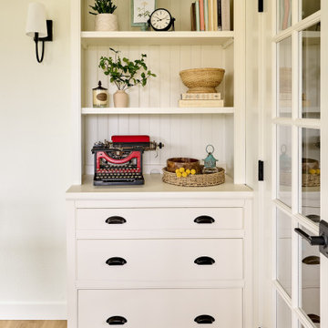
A new office now sits right off the entryway with beautiful French doors, built-in cabinetry, and an abundance of natural light – everything that one dreams of for their home office. The home office looks out to the front porch and front yard as well as the pastural side yard where the children frequently play. The office is an ideal location for a moment of inspiration, reflection, and focus. A warm white paint (Benjamin Moore Swiss Coffee) combined with the newly installed light oak luxury vinyl plank flooring runs throughout the home, creating continuity and a neutral canvas. Traditional and schoolhouse style statement light fixtures coordinate with the black door hardware for an added level of contrast.
There is one more improvement that made a big difference to this family. In the family room, we added a built-in window seat. This created a cozy nook that is used by all for reading and extra seating. This relatively small improvement had a big impact on how the family uses and enjoys the space.
 Post Services Inc
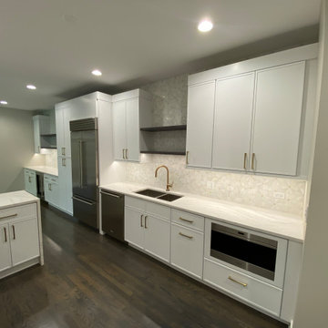
This kitchen is a haven of luxury, meticulously crafted with premium materials that harmonize to create a sophisticated yet functional space. The Sub-Zero refrigerator anchors the kitchen with its sleek stainless steel finish, integrated seamlessly into the custom cabinetry. This appliance not only provides unparalleled refrigeration but also complements the kitchen’s clean, cohesive lines.
The countertops and island are crafted from exquisite quartz, featuring subtle veining that enhances the visual appeal and offers a polished, durable surface perfect for meal preparation and entertaining. The waterfall edge on the island adds a modern touch, extending the quartz's beauty and creating a seamless flow from top to floor.
The backsplash is a work of art, composed of delicate marble tiles in a geometric pattern. Each tile adds texture and depth, with a soft shimmer that captures the light, adding a layer of visual intrigue to the kitchen. Dark wood open shelving complements the cabinetry and provides a practical yet stylish space for showcasing decorative items, adding warmth and contrast to the overall light palette.
A brushed brass faucet over the deep stainless steel sink serves as a stunning focal point, with the warm brass finish echoed in the hardware throughout the cabinetry. This choice of material brings warmth and elegance to the space, pairing beautifully with the quartz counters and adding a touch of opulence.
The custom cabinetry, finished in a soft, matte white, provides ample storage, keeping the kitchen organized and clutter-free. Each cabinet and drawer is adorned with brushed brass handles, adding a refined detail that enhances the room’s luxurious ambiance.
Dark hardwood floors anchor the space, their rich tones adding depth and providing a striking contrast to the light cabinetry and counters. The recessed lighting is strategically placed, casting a warm glow over the entire room, highlighting the textures and finishes that make this kitchen a feast for the senses.
This kitchen is the ultimate blend of form and function, where every material and design element has been carefully selected to create a space that is as beautiful as it is practical. From the high-end appliances to the artful finishes, this kitchen offers an elevated experience, turning the everyday act of cooking into an indulgent pleasure.
Find the right local pro for your project
 EmV Design Build
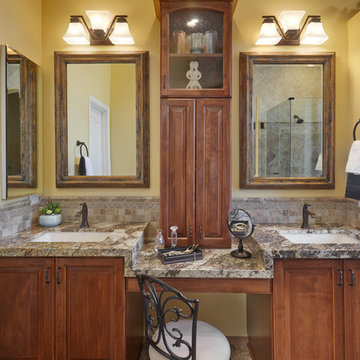
Robin Stancliff photo credits.My goal with this project was to create a glamorous, luxurious bathroom with plenty of space and a Mediterranean-inspired aesthetic. My client felt as though her old bathroom was constantly cluttered and filled with wasted space. As a dancer, she
wanted her bathroom to be a place where she could prepare for her performances, and also relax and unwind after her performances. Since she never used her tub, I removed it and expanded the shower, providing an extra foot of shower space. Because she
loves the travertine floor that was already in the bathroom, I found a porcelain look-alike to include in the shower, and for the shower bench. The original travertine in the bathroom was impossible to find, but locating the porcelain look-alike was a worthwhile challenge which resulted in a budget-friendly shower that is beautiful and easy to clean at the same time. This remodeled bathroom also includes open shelving
to display artwork and store items, as well as a special vanity designed with makeup application in mind. The height of the vanity was increased to executive height, adding custom convenience for the client. I also increased lighting throughout the bathroom,
replacing the original lighting with LED, and adding light into the center tower of the vanity as well as the display shelving. The new design of the vanity added extra space for storing makeup and toiletries to reduce clutter, and it also helped my client ergonomically. By blending unique textures and warm colors, I was able to create a
gorgeous bathroom evocative of a Tuscan home with a spa-like feel.
 Drury Design
THE SETUP
The original primary bathroom was characterized by a disjointed and segmented layout. The shower featured a bulky glass-block enclosure that overwhelmed the space visually. There was a considerable amount of open, unused space, and despite having a his and hers vanity, the arrangement lacked personal space for each user, as they shared the conjoined space between the sinks. The toilet was inconveniently located right by the door, with a half-wall partition meant to provide privacy but instead contributing to a cramped and unbalanced feel. Overall, the bathroom’s layout and design were fragmented, failing to make the most of the available space and lacking adequate storage solutions.
Design objectives:
- Reconfigure the layout to enhance functionality and flow.
- Create an elegant, upscale aesthetic that is light and bright.
- Incorporate specialized storage solutions for female hair care needs.
- Increase overall storage capacity.
- Develop a spa-like shower experience.
- Provide a significant wow factor to the space.
THE REMODEL
Design challenges to be solved:
- Repositioning the toilet to a more suitable location.
- Designing hair care storage solutions without cluttering the elegant space.
- Balancing an upscale, elegant design with a feminine touch in the color palette.
- Increasing the brightness of the room without adding windows.
- Completely replacing the existing shower to create a spa-like experience.
- Planning new storage solutions without adding bulkiness or clutter to the cabinetry.
THE RENEWED SPACE
Design solutions:
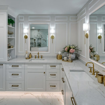
Toilet Relocation: Moved the toilet by the window, creating a better overall layout that also opened up two full walls for cabinetry and storage solutions.
Specialized Vanity Storage: The left side of the left vanity is the wife’s. Open shelves facing across the vanity can be used for decorative or daily needs items. Pull-out docking drawers with power outlets and metal basins handle hot hair appliances.
Bright and Elegant Color Scheme: White cabinets, countertops, floors, and shower walls keep the space bright. The just-off-white wall color with a hint of pink adds a feminine touch. Thin wainscoting with white trim offers traditional-leaning elegance.
Layered Lighting Strategy: Ceiling can lights, sconces, lighted mirrors, and toe-kick lighting were installed. Natural light-rated bulbs keep the space bright and natural-feeling.
Spa-Like Shower: An extra-large shower was created using the same floor tile materials for continuity. Equipped with a Kohler Anthem system with a shower head, hand-held, and four body sprays. His and Hers niches for separate body care product storage.
Enhanced Storage Solutions: Added a linen cabinet within the vanity area for efficient storage of towels and bathroom essentials.
This elegant bathroom feels incredibly spacious now. The color palette and lights keep the room bright and cheery. Gold fixtures, the herringbone pattern on the floor, and exquisite trim work add an elegant touch. With the husband and wife having their own vanity wall sections joined at the corner, each user truly has their own space within the space. The clients are very happy with the final result.
 Drury Design
The Setup
For this primary bath, our clients—empty nesters who recently updated their entire first floor—wanted a fresh, sophisticated look that would harmonize with the rest of their home’s new design. The original space included a large corner tub and a layout that, while functional, felt outdated and oversized for their needs. The goal was to update the bathroom with a layout that suited them perfectly without moving walls or major fixtures.
Design objectives:
Remove the large, outdated corner tub and replace it with a freestanding tub
Expand and modernize the shower while keeping privacy in mind
Update cabinetry for more organized, efficient storage
Improve lighting with stylish yet understated fixtures to brighten the room
Create a cozy, timeless atmosphere in the large space, maintaining functionality
The Remodel
Design challenges to be solved:
Striking Balance with Lighting – The clients wanted a statement fixture that could enhance the overall design without feeling overwhelming or taking away from the open, airy atmosphere.
Maximizing Existing Footprint – The clients wanted to avoid altering the floor plan, meaning the layout remained mostly the same. The focus was on enhancing the room’s functionality within the existing footprint.
Retaining Coziness – With the removal of the oversized tub deck, there was a need to keep the space from feeling too vast and empty, ensuring it felt cozy and inviting despite the open layout.
Adding Hidden Storage – The master closet was not attached to the bathroom, and the clients wanted a discreet way to store a hamper within the bath area without cluttering the room.
The Renewed Space
Design solutions:
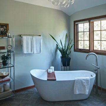
Freestanding Tub on an Angle – Replacing the old corner tub with a sleek, freestanding tub allowed the space to feel open and modern. Positioned at an angle, the tub brings balance to the layout and provides an inviting focal point while still preserving walk-around space for added functionality.
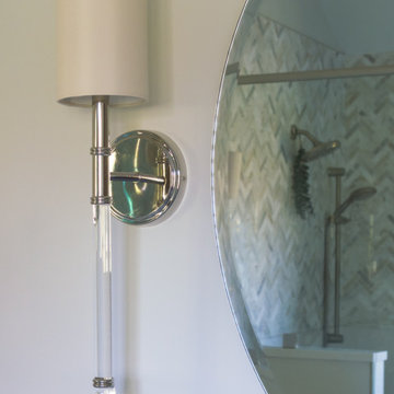
Expanded Shower with Privacy Enhancements – The original, smaller shower was transformed with a larger footprint, half-wall for privacy, and contemporary brushed nickel fixtures, adding both style and function. A herringbone marble accent tile halfway up the shower walls adds a touch of sophistication without overwhelming the space.
Custom Vanity with Built-in Hamper – A small pull-out hamper was added to the corner of the vanity, providing discreet storage and eliminating the need for a standalone basket. The cabinetry was reconfigured to be more functional and organized for the couple’s daily routines.
Lighting that Complements the Room – The lighting selection was central to the redesign, with the client gravitating toward a bubble chandelier she had admired. After exploring several options, they chose a smaller size to provide a soft accent without dominating the space, tying in with the bathroom’s overall light and airy feel.
The newly remodeled primary bath exudes a classic, calm atmosphere with a carefully chosen mix of textures and materials. The large porcelain floor tiles mimic the look of wood, lending a warm, traditional touch. Lightly textured cream tiles and brushed nickel fixtures create a soft and cohesive look, while the subtle herringbone marble accent in the shower adds just the right amount of elegance. Round mirrors above the vanities complement the curves of the freestanding tub, softening the room’s overall look and adding a touch of femininity. The result is a bright, timeless space tailored perfectly for the homeowners’ lifestyle.
 Drury Design
THE SETUP
The original primary bathroom was characterized by a disjointed and segmented layout. The shower featured a bulky glass-block enclosure that overwhelmed the space visually. There was a considerable amount of open, unused space, and despite having a his and hers vanity, the arrangement lacked personal space for each user, as they shared the conjoined space between the sinks. The toilet was inconveniently located right by the door, with a half-wall partition meant to provide privacy but instead contributing to a cramped and unbalanced feel. Overall, the bathroom’s layout and design were fragmented, failing to make the most of the available space and lacking adequate storage solutions.
Design objectives:
- Reconfigure the layout to enhance functionality and flow.
- Create an elegant, upscale aesthetic that is light and bright.
- Incorporate specialized storage solutions for female hair care needs.
- Increase overall storage capacity.
- Develop a spa-like shower experience.
- Provide a significant wow factor to the space.
THE REMODEL
Design challenges to be solved:
- Repositioning the toilet to a more suitable location.
- Designing hair care storage solutions without cluttering the elegant space.
- Balancing an upscale, elegant design with a feminine touch in the color palette.
- Increasing the brightness of the room without adding windows.
- Completely replacing the existing shower to create a spa-like experience.
- Planning new storage solutions without adding bulkiness or clutter to the cabinetry.
THE RENEWED SPACE
Design solutions:
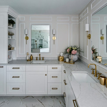
Toilet Relocation: Moved the toilet by the window, creating a better overall layout that also opened up two full walls for cabinetry and storage solutions.
Specialized Vanity Storage: The left side of the left vanity is the wife’s. Open shelves facing across the vanity can be used for decorative or daily needs items. Pull-out docking drawers with power outlets and metal basins handle hot hair appliances.
Bright and Elegant Color Scheme: White cabinets, countertops, floors, and shower walls keep the space bright. The just-off-white wall color with a hint of pink adds a feminine touch. Thin wainscoting with white trim offers traditional-leaning elegance.
Layered Lighting Strategy: Ceiling can lights, sconces, lighted mirrors, and toe-kick lighting were installed. Natural light-rated bulbs keep the space bright and natural-feeling.
Spa-Like Shower: An extra-large shower was created using the same floor tile materials for continuity. Equipped with a Kohler Anthem system with a shower head, hand-held, and four body sprays. His and Hers niches for separate body care product storage.
Enhanced Storage Solutions: Added a linen cabinet within the vanity area for efficient storage of towels and bathroom essentials.
This elegant bathroom feels incredibly spacious now. The color palette and lights keep the room bright and cheery. Gold fixtures, the herringbone pattern on the floor, and exquisite trim work add an elegant touch. With the husband and wife having their own vanity wall sections joined at the corner, each user truly has their own space within the space. The clients are very happy with the final result.

Sponsored
Columbus, OH

Structural Remodeling
Franklin County's Heavy Timber Specialists | Best of Houzz 2020!
 Drury Design
The Setup
For this primary bath, our clients—empty nesters who recently updated their entire first floor—wanted a fresh, sophisticated look that would harmonize with the rest of their home’s new design. The original space included a large corner tub and a layout that, while functional, felt outdated and oversized for their needs. The goal was to update the bathroom with a layout that suited them perfectly without moving walls or major fixtures.
Design objectives:
Remove the large, outdated corner tub and replace it with a freestanding tub
Expand and modernize the shower while keeping privacy in mind
Update cabinetry for more organized, efficient storage
Improve lighting with stylish yet understated fixtures to brighten the room
Create a cozy, timeless atmosphere in the large space, maintaining functionality
The Remodel
Design challenges to be solved:
Striking Balance with Lighting – The clients wanted a statement fixture that could enhance the overall design without feeling overwhelming or taking away from the open, airy atmosphere.
Maximizing Existing Footprint – The clients wanted to avoid altering the floor plan, meaning the layout remained mostly the same. The focus was on enhancing the room’s functionality within the existing footprint.
Retaining Coziness – With the removal of the oversized tub deck, there was a need to keep the space from feeling too vast and empty, ensuring it felt cozy and inviting despite the open layout.
Adding Hidden Storage – The master closet was not attached to the bathroom, and the clients wanted a discreet way to store a hamper within the bath area without cluttering the room.
The Renewed Space
Design solutions:
Freestanding Tub on an Angle – Replacing the old corner tub with a sleek, freestanding tub allowed the space to feel open and modern. Positioned at an angle, the tub brings balance to the layout and provides an inviting focal point while still preserving walk-around space for added functionality.
Expanded Shower with Privacy Enhancements – The original, smaller shower was transformed with a larger footprint, half-wall for privacy, and contemporary brushed nickel fixtures, adding both style and function. A herringbone marble accent tile halfway up the shower walls adds a touch of sophistication without overwhelming the space.
Custom Vanity with Built-in Hamper – A small pull-out hamper was added to the corner of the vanity, providing discreet storage and eliminating the need for a standalone basket. The cabinetry was reconfigured to be more functional and organized for the couple’s daily routines.
Lighting that Complements the Room – The lighting selection was central to the redesign, with the client gravitating toward a bubble chandelier she had admired. After exploring several options, they chose a smaller size to provide a soft accent without dominating the space, tying in with the bathroom’s overall light and airy feel.
The newly remodeled primary bath exudes a classic, calm atmosphere with a carefully chosen mix of textures and materials. The large porcelain floor tiles mimic the look of wood, lending a warm, traditional touch. Lightly textured cream tiles and brushed nickel fixtures create a soft and cohesive look, while the subtle herringbone marble accent in the shower adds just the right amount of elegance. Round mirrors above the vanities complement the curves of the freestanding tub, softening the room’s overall look and adding a touch of femininity. The result is a bright, timeless space tailored perfectly for the homeowners’ lifestyle.
 Drury Design
The Setup:
After purchasing this home, the homeowners faced a unique opportunity to reimagine their kitchen and nearby spaces. Water damage from a burst pipe had left much of the home’s interior in need of repair, and while the existing kitchen was functional and in relatively good shape, it didn’t align with the family’s vision for their new home. The layout included a peninsula that wasn’t ideal, and there were some druthers with the nearby pantry.
Since the space needed to be rebuilt anyway, the homeowners saw this as a chance to create a kitchen that was both highly functional for their four young children and timeless in its design. The project also included a refresh of the adjacent message center and dining room — spaces that play key roles in the family’s daily life. The goal was to create a cohesive flow between these areas, balancing modern functionality with the craftsman-inspired character of the rest of the home.
Design Objectives:
- Replace the outdated peninsula with a large island to maximize counter space and create new seating options.
- Open up the space visually by removing soffits and rethinking the cabinetry layout.
Incorporate concealed refrigeration and freezer units to provide significant storage for the family while maintaining a streamlined aesthetic.
- Integrate black cabinetry into the design without making the space feel harsh or heavy.
- Ensure the lighting plan balances functional task lighting with ambient accent lighting.
- Avoid visual clutter in the cabinetry design while still giving a nod to the craftsman aesthetic.
- Incorporate a slab backsplash as a key design feature.
Design Challenges:
- The outdated peninsula left dead space in the kitchen and lacked sufficient seating for the family.
- The cooktop wall was cramped, with small cabinets flanking the hood, limited storage, and soffits that made the space feel closed-in.
- The family needed significant refrigeration space (two refrigerators and a freezer) but wanted to avoid a cluttered look with visible stainless steel appliances.
- Adding black cabinetry risked making the space feel too dark or heavy.
- The original lighting plan was insufficient, particularly over the dining table where a decorative fixture proved too dim.
- The family wanted shaker-style drawer fronts to match the home’s arts-and-crafts design but worried that too much shaker cabinetry might look overly busy.
- Prioritizing a slab backsplash in the wish list priority planning.
The Renewed Space
Design Solutions:
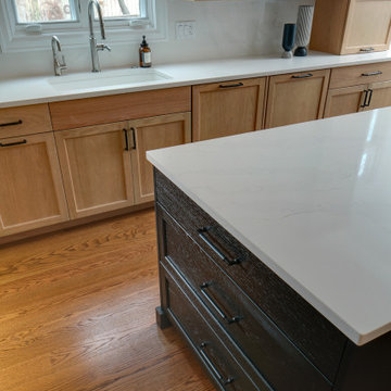
- A functional island: The peninsula was replaced with a large island that provides continuous countertop space for prepping and serving. The island also features seating for four people, creating a central hub for informal meals and activities.
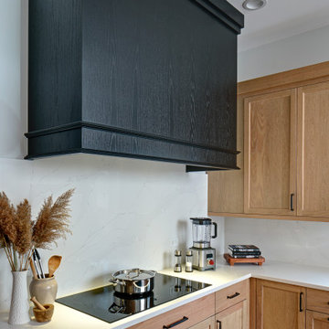
- Streamlined cooktop wall: The soffits were removed, and the upper cabinets on the cooktop wall were eliminated to create a more open, streamlined design. A custom oversized hood became the focal point of the wall, with the blower unit offset inside it to align with the cooktop while maintaining exterior visual symmetry.
- Concealed refrigeration: Two column refrigerators and one freezer were integrated into the cabinetry, concealing them behind wood paneling that blends seamlessly with the overall design.
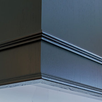
- Warm black cabinetry: The black cabinetry was crafted from hickory with a visible grain, softening its appearance and adding warmth. The grain detail gives the cabinetry a rich, textured look that avoids feeling stark or overpowering.
- Additional lighting: In the dining area, recessed can lights were added during an additional installation phase to supplement the gorgeous decorative fixture’s dim output. The new lighting plan creates a layered effect, combining functional task lighting with softer ambient lighting.
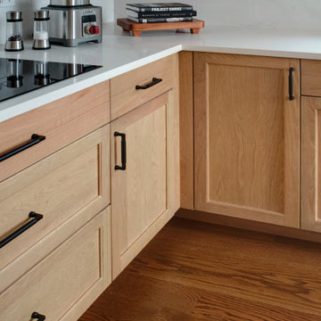
- Simplified cabinetry details: Slab drawer fronts were used on the upper drawers, while five-piece shaker fronts (with slightly less prominent rail and stile pieces) were reserved for the middle and lower drawers. This approach simplified the overall look while maintaining the craftsman-inspired aesthetic.
- Slab backsplash priority: The slab backsplash was prioritized by making thoughtful adjustments elsewhere, like opting not to extend cabinetry to the ceiling, which also helped visually prioritize the gorgeous slab backsplash. This decision also enhanced the kitchen’s furniture-like feel, aligning with the home’s craftsman character.
- This kitchen perfectly balances practicality with timeless style. By addressing the family’s functional needs — ample seating, smart storage, and effective lighting — while incorporating thoughtful design elements like warm black cabinetry and a striking slab backsplash, Alicia created a space that works beautifully for a busy household. The result is a cohesive, inviting kitchen that honors the home’s craftsman roots and will serve the family well for years to come.
 Drury Design
The Setup:
After purchasing this home, the homeowners faced a unique opportunity to reimagine their kitchen and nearby spaces. Water damage from a burst pipe had left much of the home’s interior in need of repair, and while the existing kitchen was functional and in relatively good shape, it didn’t align with the family’s vision for their new home. The layout included a peninsula that wasn’t ideal, and there were some druthers with the nearby pantry.
Since the space needed to be rebuilt anyway, the homeowners saw this as a chance to create a kitchen that was both highly functional for their four young children and timeless in its design. The project also included a refresh of the adjacent message center and dining room — spaces that play key roles in the family’s daily life. The goal was to create a cohesive flow between these areas, balancing modern functionality with the craftsman-inspired character of the rest of the home.
Design Objectives:
- Replace the outdated peninsula with a large island to maximize counter space and create new seating options.
- Open up the space visually by removing soffits and rethinking the cabinetry layout.
Incorporate concealed refrigeration and freezer units to provide significant storage for the family while maintaining a streamlined aesthetic.
- Integrate black cabinetry into the design without making the space feel harsh or heavy.
- Ensure the lighting plan balances functional task lighting with ambient accent lighting.
- Avoid visual clutter in the cabinetry design while still giving a nod to the craftsman aesthetic.
- Incorporate a slab backsplash as a key design feature.
Design Challenges:
- The outdated peninsula left dead space in the kitchen and lacked sufficient seating for the family.
- The cooktop wall was cramped, with small cabinets flanking the hood, limited storage, and soffits that made the space feel closed-in.
- The family needed significant refrigeration space (two refrigerators and a freezer) but wanted to avoid a cluttered look with visible stainless steel appliances.
- Adding black cabinetry risked making the space feel too dark or heavy.
- The original lighting plan was insufficient, particularly over the dining table where a decorative fixture proved too dim.
- The family wanted shaker-style drawer fronts to match the home’s arts-and-crafts design but worried that too much shaker cabinetry might look overly busy.
- Prioritizing a slab backsplash in the wish list priority planning.
The Renewed Space
Design Solutions:
- A functional island: The peninsula was replaced with a large island that provides continuous countertop space for prepping and serving. The island also features seating for four people, creating a central hub for informal meals and activities.
- Streamlined cooktop wall: The soffits were removed, and the upper cabinets on the cooktop wall were eliminated to create a more open, streamlined design. A custom oversized hood became the focal point of the wall, with the blower unit offset inside it to align with the cooktop while maintaining exterior visual symmetry.
- Concealed refrigeration: Two column refrigerators and one freezer were integrated into the cabinetry, concealing them behind wood paneling that blends seamlessly with the overall design.
- Warm black cabinetry: The black cabinetry was crafted from hickory with a visible grain, softening its appearance and adding warmth. The grain detail gives the cabinetry a rich, textured look that avoids feeling stark or overpowering.
- Additional lighting: In the dining area, recessed can lights were added during an additional installation phase to supplement the gorgeous decorative fixture’s dim output. The new lighting plan creates a layered effect, combining functional task lighting with softer ambient lighting.
- Simplified cabinetry details: Slab drawer fronts were used on the upper drawers, while five-piece shaker fronts (with slightly less prominent rail and stile pieces) were reserved for the middle and lower drawers. This approach simplified the overall look while maintaining the craftsman-inspired aesthetic.
- Slab backsplash priority: The slab backsplash was prioritized by making thoughtful adjustments elsewhere, like opting not to extend cabinetry to the ceiling, which also helped visually prioritize the gorgeous slab backsplash. This decision also enhanced the kitchen’s furniture-like feel, aligning with the home’s craftsman character.
- This kitchen perfectly balances practicality with timeless style. By addressing the family’s functional needs — ample seating, smart storage, and effective lighting — while incorporating thoughtful design elements like warm black cabinetry and a striking slab backsplash, Alicia created a space that works beautifully for a busy household. The result is a cohesive, inviting kitchen that honors the home’s craftsman roots and will serve the family well for years to come.
 Drury Design
The Setup:
After purchasing this home, the homeowners faced a unique opportunity to reimagine their kitchen and nearby spaces. Water damage from a burst pipe had left much of the home’s interior in need of repair, and while the existing kitchen was functional and in relatively good shape, it didn’t align with the family’s vision for their new home. The layout included a peninsula that wasn’t ideal, and there were some druthers with the nearby pantry.
Since the space needed to be rebuilt anyway, the homeowners saw this as a chance to create a kitchen that was both highly functional for their four young children and timeless in its design. The project also included a refresh of the adjacent message center and dining room — spaces that play key roles in the family’s daily life. The goal was to create a cohesive flow between these areas, balancing modern functionality with the craftsman-inspired character of the rest of the home.
Design Objectives:
- Replace the outdated peninsula with a large island to maximize counter space and create new seating options.
- Open up the space visually by removing soffits and rethinking the cabinetry layout.
Incorporate concealed refrigeration and freezer units to provide significant storage for the family while maintaining a streamlined aesthetic.
- Integrate black cabinetry into the design without making the space feel harsh or heavy.
- Ensure the lighting plan balances functional task lighting with ambient accent lighting.
- Avoid visual clutter in the cabinetry design while still giving a nod to the craftsman aesthetic.
- Incorporate a slab backsplash as a key design feature.
Design Challenges:
- The outdated peninsula left dead space in the kitchen and lacked sufficient seating for the family.
- The cooktop wall was cramped, with small cabinets flanking the hood, limited storage, and soffits that made the space feel closed-in.
- The family needed significant refrigeration space (two refrigerators and a freezer) but wanted to avoid a cluttered look with visible stainless steel appliances.
- Adding black cabinetry risked making the space feel too dark or heavy.
- The original lighting plan was insufficient, particularly over the dining table where a decorative fixture proved too dim.
- The family wanted shaker-style drawer fronts to match the home’s arts-and-crafts design but worried that too much shaker cabinetry might look overly busy.
- Prioritizing a slab backsplash in the wish list priority planning.
The Renewed Space
Design Solutions:
- A functional island: The peninsula was replaced with a large island that provides continuous countertop space for prepping and serving. The island also features seating for four people, creating a central hub for informal meals and activities.
- Streamlined cooktop wall: The soffits were removed, and the upper cabinets on the cooktop wall were eliminated to create a more open, streamlined design. A custom oversized hood became the focal point of the wall, with the blower unit offset inside it to align with the cooktop while maintaining exterior visual symmetry.
- Concealed refrigeration: Two column refrigerators and one freezer were integrated into the cabinetry, concealing them behind wood paneling that blends seamlessly with the overall design.
- Warm black cabinetry: The black cabinetry was crafted from hickory with a visible grain, softening its appearance and adding warmth. The grain detail gives the cabinetry a rich, textured look that avoids feeling stark or overpowering.
- Additional lighting: In the dining area, recessed can lights were added during an additional installation phase to supplement the gorgeous decorative fixture’s dim output. The new lighting plan creates a layered effect, combining functional task lighting with softer ambient lighting.
- Simplified cabinetry details: Slab drawer fronts were used on the upper drawers, while five-piece shaker fronts (with slightly less prominent rail and stile pieces) were reserved for the middle and lower drawers. This approach simplified the overall look while maintaining the craftsman-inspired aesthetic.
- Slab backsplash priority: The slab backsplash was prioritized by making thoughtful adjustments elsewhere, like opting not to extend cabinetry to the ceiling, which also helped visually prioritize the gorgeous slab backsplash. This decision also enhanced the kitchen’s furniture-like feel, aligning with the home’s craftsman character.
- This kitchen perfectly balances practicality with timeless style. By addressing the family’s functional needs — ample seating, smart storage, and effective lighting — while incorporating thoughtful design elements like warm black cabinetry and a striking slab backsplash, Alicia created a space that works beautifully for a busy household. The result is a cohesive, inviting kitchen that honors the home’s craftsman roots and will serve the family well for years to come.
 Drury Design
The Setup:
After purchasing this home, the homeowners faced a unique opportunity to reimagine their kitchen and nearby spaces. Water damage from a burst pipe had left much of the home’s interior in need of repair, and while the existing kitchen was functional and in relatively good shape, it didn’t align with the family’s vision for their new home. The layout included a peninsula that wasn’t ideal, and there were some druthers with the nearby pantry.
Since the space needed to be rebuilt anyway, the homeowners saw this as a chance to create a kitchen that was both highly functional for their four young children and timeless in its design. The project also included a refresh of the adjacent message center and dining room — spaces that play key roles in the family’s daily life. The goal was to create a cohesive flow between these areas, balancing modern functionality with the craftsman-inspired character of the rest of the home.
Design Objectives:
- Replace the outdated peninsula with a large island to maximize counter space and create new seating options.
- Open up the space visually by removing soffits and rethinking the cabinetry layout.
Incorporate concealed refrigeration and freezer units to provide significant storage for the family while maintaining a streamlined aesthetic.
- Integrate black cabinetry into the design without making the space feel harsh or heavy.
- Ensure the lighting plan balances functional task lighting with ambient accent lighting.
- Avoid visual clutter in the cabinetry design while still giving a nod to the craftsman aesthetic.
- Incorporate a slab backsplash as a key design feature.
Design Challenges:
- The outdated peninsula left dead space in the kitchen and lacked sufficient seating for the family.
- The cooktop wall was cramped, with small cabinets flanking the hood, limited storage, and soffits that made the space feel closed-in.
- The family needed significant refrigeration space (two refrigerators and a freezer) but wanted to avoid a cluttered look with visible stainless steel appliances.
- Adding black cabinetry risked making the space feel too dark or heavy.
- The original lighting plan was insufficient, particularly over the dining table where a decorative fixture proved too dim.
- The family wanted shaker-style drawer fronts to match the home’s arts-and-crafts design but worried that too much shaker cabinetry might look overly busy.
- Prioritizing a slab backsplash in the wish list priority planning.
The Renewed Space
Design Solutions:
- A functional island: The peninsula was replaced with a large island that provides continuous countertop space for prepping and serving. The island also features seating for four people, creating a central hub for informal meals and activities.
- Streamlined cooktop wall: The soffits were removed, and the upper cabinets on the cooktop wall were eliminated to create a more open, streamlined design. A custom oversized hood became the focal point of the wall, with the blower unit offset inside it to align with the cooktop while maintaining exterior visual symmetry.
- Concealed refrigeration: Two column refrigerators and one freezer were integrated into the cabinetry, concealing them behind wood paneling that blends seamlessly with the overall design.
- Warm black cabinetry: The black cabinetry was crafted from hickory with a visible grain, softening its appearance and adding warmth. The grain detail gives the cabinetry a rich, textured look that avoids feeling stark or overpowering.
- Additional lighting: In the dining area, recessed can lights were added during an additional installation phase to supplement the gorgeous decorative fixture’s dim output. The new lighting plan creates a layered effect, combining functional task lighting with softer ambient lighting.
- Simplified cabinetry details: Slab drawer fronts were used on the upper drawers, while five-piece shaker fronts (with slightly less prominent rail and stile pieces) were reserved for the middle and lower drawers. This approach simplified the overall look while maintaining the craftsman-inspired aesthetic.
- Slab backsplash priority: The slab backsplash was prioritized by making thoughtful adjustments elsewhere, like opting not to extend cabinetry to the ceiling, which also helped visually prioritize the gorgeous slab backsplash. This decision also enhanced the kitchen’s furniture-like feel, aligning with the home’s craftsman character.
- This kitchen perfectly balances practicality with timeless style. By addressing the family’s functional needs — ample seating, smart storage, and effective lighting — while incorporating thoughtful design elements like warm black cabinetry and a striking slab backsplash, Alicia created a space that works beautifully for a busy household. The result is a cohesive, inviting kitchen that honors the home’s craftsman roots and will serve the family well for years to come.
 Drury Design
THE SETUP
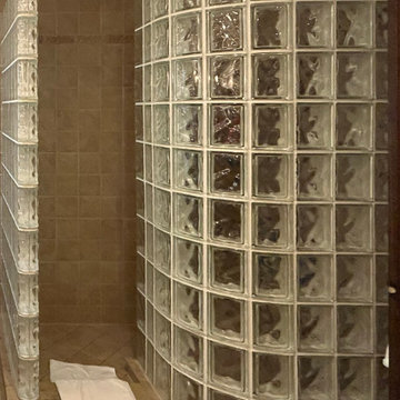
The original primary bathroom was characterized by a disjointed and segmented layout. The shower featured a bulky glass-block enclosure that overwhelmed the space visually. There was a considerable amount of open, unused space, and despite having a his and hers vanity, the arrangement lacked personal space for each user, as they shared the conjoined space between the sinks. The toilet was inconveniently located right by the door, with a half-wall partition meant to provide privacy but instead contributing to a cramped and unbalanced feel. Overall, the bathroom’s layout and design were fragmented, failing to make the most of the available space and lacking adequate storage solutions.
Design objectives:
- Reconfigure the layout to enhance functionality and flow.
- Create an elegant, upscale aesthetic that is light and bright.
- Incorporate specialized storage solutions for female hair care needs.
- Increase overall storage capacity.
- Develop a spa-like shower experience.
- Provide a significant wow factor to the space.
THE REMODEL
Design challenges to be solved:
- Repositioning the toilet to a more suitable location.
- Designing hair care storage solutions without cluttering the elegant space.
- Balancing an upscale, elegant design with a feminine touch in the color palette.
- Increasing the brightness of the room without adding windows.
- Completely replacing the existing shower to create a spa-like experience.
- Planning new storage solutions without adding bulkiness or clutter to the cabinetry.
THE RENEWED SPACE
Design solutions:
Toilet Relocation: Moved the toilet by the window, creating a better overall layout that also opened up two full walls for cabinetry and storage solutions.
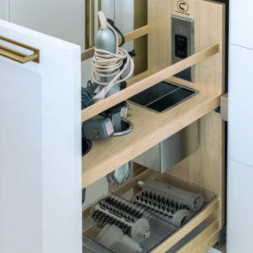
Specialized Vanity Storage: The left side of the left vanity is the wife’s. Open shelves facing across the vanity can be used for decorative or daily needs items. Pull-out docking drawers with power outlets and metal basins handle hot hair appliances.
Bright and Elegant Color Scheme: White cabinets, countertops, floors, and shower walls keep the space bright. The just-off-white wall color with a hint of pink adds a feminine touch. Thin wainscoting with white trim offers traditional-leaning elegance.
Layered Lighting Strategy: Ceiling can lights, sconces, lighted mirrors, and toe-kick lighting were installed. Natural light-rated bulbs keep the space bright and natural-feeling.
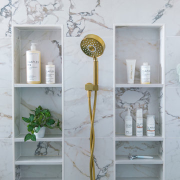
Spa-Like Shower: An extra-large shower was created using the same floor tile materials for continuity. Equipped with a Kohler Anthem system with a shower head, hand-held, and four body sprays. His and Hers niches for separate body care product storage.
Enhanced Storage Solutions: Added a linen cabinet within the vanity area for efficient storage of towels and bathroom essentials.
This elegant bathroom feels incredibly spacious now. The color palette and lights keep the room bright and cheery. Gold fixtures, the herringbone pattern on the floor, and exquisite trim work add an elegant touch. With the husband and wife having their own vanity wall sections joined at the corner, each user truly has their own space within the space. The clients are very happy with the final result.

Sponsored
Columbus, OH

Wannemacher Interiors
Customized Award-Winning Interior Design Solutions in Franklin Cnty OH
 Drury Design
THE SETUP
The original primary bathroom was characterized by a disjointed and segmented layout. The shower featured a bulky glass-block enclosure that overwhelmed the space visually. There was a considerable amount of open, unused space, and despite having a his and hers vanity, the arrangement lacked personal space for each user, as they shared the conjoined space between the sinks. The toilet was inconveniently located right by the door, with a half-wall partition meant to provide privacy but instead contributing to a cramped and unbalanced feel. Overall, the bathroom’s layout and design were fragmented, failing to make the most of the available space and lacking adequate storage solutions.
Design objectives:
- Reconfigure the layout to enhance functionality and flow.
- Create an elegant, upscale aesthetic that is light and bright.
- Incorporate specialized storage solutions for female hair care needs.
- Increase overall storage capacity.
- Develop a spa-like shower experience.
- Provide a significant wow factor to the space.
THE REMODEL
Design challenges to be solved:
- Repositioning the toilet to a more suitable location.
- Designing hair care storage solutions without cluttering the elegant space.
- Balancing an upscale, elegant design with a feminine touch in the color palette.
- Increasing the brightness of the room without adding windows.
- Completely replacing the existing shower to create a spa-like experience.
- Planning new storage solutions without adding bulkiness or clutter to the cabinetry.
THE RENEWED SPACE
Design solutions:
Toilet Relocation: Moved the toilet by the window, creating a better overall layout that also opened up two full walls for cabinetry and storage solutions.
Specialized Vanity Storage: The left side of the left vanity is the wife’s. Open shelves facing across the vanity can be used for decorative or daily needs items. Pull-out docking drawers with power outlets and metal basins handle hot hair appliances.
Bright and Elegant Color Scheme: White cabinets, countertops, floors, and shower walls keep the space bright. The just-off-white wall color with a hint of pink adds a feminine touch. Thin wainscoting with white trim offers traditional-leaning elegance.
Layered Lighting Strategy: Ceiling can lights, sconces, lighted mirrors, and toe-kick lighting were installed. Natural light-rated bulbs keep the space bright and natural-feeling.
Spa-Like Shower: An extra-large shower was created using the same floor tile materials for continuity. Equipped with a Kohler Anthem system with a shower head, hand-held, and four body sprays. His and Hers niches for separate body care product storage.
Enhanced Storage Solutions: Added a linen cabinet within the vanity area for efficient storage of towels and bathroom essentials.
This elegant bathroom feels incredibly spacious now. The color palette and lights keep the room bright and cheery. Gold fixtures, the herringbone pattern on the floor, and exquisite trim work add an elegant touch. With the husband and wife having their own vanity wall sections joined at the corner, each user truly has their own space within the space. The clients are very happy with the final result.
 Drury Design
THE SETUP
The original primary bathroom was characterized by a disjointed and segmented layout. The shower featured a bulky glass-block enclosure that overwhelmed the space visually. There was a considerable amount of open, unused space, and despite having a his and hers vanity, the arrangement lacked personal space for each user, as they shared the conjoined space between the sinks. The toilet was inconveniently located right by the door, with a half-wall partition meant to provide privacy but instead contributing to a cramped and unbalanced feel. Overall, the bathroom’s layout and design were fragmented, failing to make the most of the available space and lacking adequate storage solutions.
Design objectives:
- Reconfigure the layout to enhance functionality and flow.
- Create an elegant, upscale aesthetic that is light and bright.
- Incorporate specialized storage solutions for female hair care needs.
- Increase overall storage capacity.
- Develop a spa-like shower experience.
- Provide a significant wow factor to the space.
THE REMODEL
Design challenges to be solved:
- Repositioning the toilet to a more suitable location.
- Designing hair care storage solutions without cluttering the elegant space.
- Balancing an upscale, elegant design with a feminine touch in the color palette.
- Increasing the brightness of the room without adding windows.
- Completely replacing the existing shower to create a spa-like experience.
- Planning new storage solutions without adding bulkiness or clutter to the cabinetry.
THE RENEWED SPACE
Design solutions:
Toilet Relocation: Moved the toilet by the window, creating a better overall layout that also opened up two full walls for cabinetry and storage solutions.
Specialized Vanity Storage: The left side of the left vanity is the wife’s. Open shelves facing across the vanity can be used for decorative or daily needs items. Pull-out docking drawers with power outlets and metal basins handle hot hair appliances.
Bright and Elegant Color Scheme: White cabinets, countertops, floors, and shower walls keep the space bright. The just-off-white wall color with a hint of pink adds a feminine touch. Thin wainscoting with white trim offers traditional-leaning elegance.
Layered Lighting Strategy: Ceiling can lights, sconces, lighted mirrors, and toe-kick lighting were installed. Natural light-rated bulbs keep the space bright and natural-feeling.
Spa-Like Shower: An extra-large shower was created using the same floor tile materials for continuity. Equipped with a Kohler Anthem system with a shower head, hand-held, and four body sprays. His and Hers niches for separate body care product storage.
Enhanced Storage Solutions: Added a linen cabinet within the vanity area for efficient storage of towels and bathroom essentials.
This elegant bathroom feels incredibly spacious now. The color palette and lights keep the room bright and cheery. Gold fixtures, the herringbone pattern on the floor, and exquisite trim work add an elegant touch. With the husband and wife having their own vanity wall sections joined at the corner, each user truly has their own space within the space. The clients are very happy with the final result.
 Powell Construction
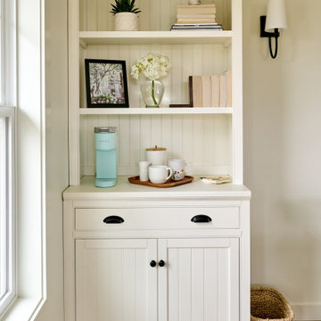
These homeowners came to us wanting to upgrade the curb appeal of their home and improve the layout of the interior. They hoped for an entry that would welcome guests to their home both inside and out, while also creating more defined and purposeful space within the home. The main goals of the project were to add a covered wrap around porch, add more windows for natural light, create a formal entry that housed the client’s baby grand piano, and add a home office for the clients to work from home.
With a dated exterior and facade that lacked dimension, there was little charm to be had. The front door was hidden from visitors and a lack of windows made the exterior unoriginal. We approached the exterior design pulling inspiration from the farmhouse style, southern porches, and craftsman style homes. Eventually we landed on a design that added numerous windows to the front façade, reminiscent of a farmhouse, and turned a Dutch hipped roof into an extended gable roof, creating a large front porch and adding curb appeal interest. By relocating the entry door to the front of the house and adding a gable accent over this new door, it created a focal point for guests and passersby. In addition to those design elements, we incorporated some exterior shutters rated for our northwest climate that echoed the southern style homes our client loved. A greige paint color (Benjamin Moore Cape May Cobblestone) accented with a white trim (Benjamin Moore Swiss Coffee) and a black front door, shutters, and window box (Sherwin Williams Black Magic) all work together to create a charming and welcoming façade.
On the interior we removed a half wall and coat closet that separated the original cramped entryway from the front room. The front room was a multipurpose space that didn’t have a designated use for the family, it became a catch-all space that was easily cluttered. Through the design process we came up with a plan to split the spaces into 2 rooms, a large open semi-formal entryway and a home office. The semi-formal entryway was intentionally designed to house the homeowner’s baby grand piano – a real showstopper. The flow created by this entryway is welcoming and ushers you into a beautifully curated home.
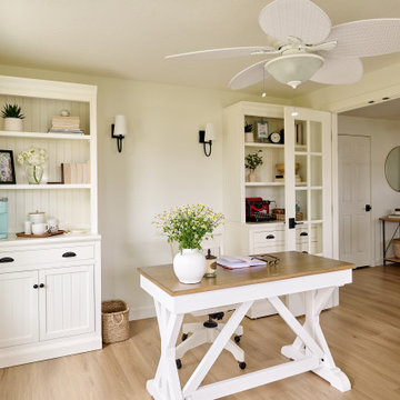
A new office now sits right off the entryway with beautiful French doors, built-in cabinetry, and an abundance of natural light – everything that one dreams of for their home office. The home office looks out to the front porch and front yard as well as the pastural side yard where the children frequently play. The office is an ideal location for a moment of inspiration, reflection, and focus. A warm white paint (Benjamin Moore Swiss Coffee) combined with the newly installed light oak luxury vinyl plank flooring runs throughout the home, creating continuity and a neutral canvas. Traditional and schoolhouse style statement light fixtures coordinate with the black door hardware for an added level of contrast.
There is one more improvement that made a big difference to this family. In the family room, we added a built-in window seat. This created a cozy nook that is used by all for reading and extra seating. This relatively small improvement had a big impact on how the family uses and enjoys the space.
 Powell Construction
These homeowners came to us wanting to upgrade the curb appeal of their home and improve the layout of the interior. They hoped for an entry that would welcome guests to their home both inside and out, while also creating more defined and purposeful space within the home. The main goals of the project were to add a covered wrap around porch, add more windows for natural light, create a formal entry that housed the client’s baby grand piano, and add a home office for the clients to work from home.
With a dated exterior and facade that lacked dimension, there was little charm to be had. The front door was hidden from visitors and a lack of windows made the exterior unoriginal. We approached the exterior design pulling inspiration from the farmhouse style, southern porches, and craftsman style homes. Eventually we landed on a design that added numerous windows to the front façade, reminiscent of a farmhouse, and turned a Dutch hipped roof into an extended gable roof, creating a large front porch and adding curb appeal interest. By relocating the entry door to the front of the house and adding a gable accent over this new door, it created a focal point for guests and passersby. In addition to those design elements, we incorporated some exterior shutters rated for our northwest climate that echoed the southern style homes our client loved. A greige paint color (Benjamin Moore Cape May Cobblestone) accented with a white trim (Benjamin Moore Swiss Coffee) and a black front door, shutters, and window box (Sherwin Williams Black Magic) all work together to create a charming and welcoming façade.
On the interior we removed a half wall and coat closet that separated the original cramped entryway from the front room. The front room was a multipurpose space that didn’t have a designated use for the family, it became a catch-all space that was easily cluttered. Through the design process we came up with a plan to split the spaces into 2 rooms, a large open semi-formal entryway and a home office. The semi-formal entryway was intentionally designed to house the homeowner’s baby grand piano – a real showstopper. The flow created by this entryway is welcoming and ushers you into a beautifully curated home.
A new office now sits right off the entryway with beautiful French doors, built-in cabinetry, and an abundance of natural light – everything that one dreams of for their home office. The home office looks out to the front porch and front yard as well as the pastural side yard where the children frequently play. The office is an ideal location for a moment of inspiration, reflection, and focus. A warm white paint (Benjamin Moore Swiss Coffee) combined with the newly installed light oak luxury vinyl plank flooring runs throughout the home, creating continuity and a neutral canvas. Traditional and schoolhouse style statement light fixtures coordinate with the black door hardware for an added level of contrast.
There is one more improvement that made a big difference to this family. In the family room, we added a built-in window seat. This created a cozy nook that is used by all for reading and extra seating. This relatively small improvement had a big impact on how the family uses and enjoys the space.

Sponsored
Columbus, OH

Hope Restoration & General Contracting
Columbus Design-Build, Kitchen & Bath Remodeling, Historic Renovations
 Drury Design
The Setup:
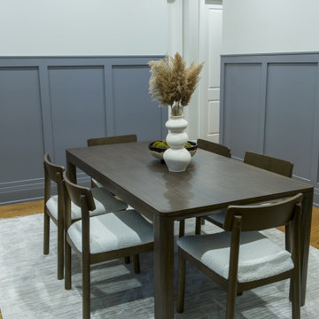
After purchasing this home, the homeowners faced a unique opportunity to reimagine their kitchen and nearby spaces. Water damage from a burst pipe had left much of the home’s interior in need of repair, and while the existing kitchen was functional and in relatively good shape, it didn’t align with the family’s vision for their new home. The layout included a peninsula that wasn’t ideal, and there were some druthers with the nearby pantry.
Since the space needed to be rebuilt anyway, the homeowners saw this as a chance to create a kitchen that was both highly functional for their four young children and timeless in its design. The project also included a refresh of the adjacent message center and dining room — spaces that play key roles in the family’s daily life. The goal was to create a cohesive flow between these areas, balancing modern functionality with the craftsman-inspired character of the rest of the home.
Design Objectives:
- Replace the outdated peninsula with a large island to maximize counter space and create new seating options.
- Open up the space visually by removing soffits and rethinking the cabinetry layout.
Incorporate concealed refrigeration and freezer units to provide significant storage for the family while maintaining a streamlined aesthetic.
- Integrate black cabinetry into the design without making the space feel harsh or heavy.
- Ensure the lighting plan balances functional task lighting with ambient accent lighting.
- Avoid visual clutter in the cabinetry design while still giving a nod to the craftsman aesthetic.
- Incorporate a slab backsplash as a key design feature.
Design Challenges:
- The outdated peninsula left dead space in the kitchen and lacked sufficient seating for the family.
- The cooktop wall was cramped, with small cabinets flanking the hood, limited storage, and soffits that made the space feel closed-in.
- The family needed significant refrigeration space (two refrigerators and a freezer) but wanted to avoid a cluttered look with visible stainless steel appliances.
- Adding black cabinetry risked making the space feel too dark or heavy.
- The original lighting plan was insufficient, particularly over the dining table where a decorative fixture proved too dim.
- The family wanted shaker-style drawer fronts to match the home’s arts-and-crafts design but worried that too much shaker cabinetry might look overly busy.
- Prioritizing a slab backsplash in the wish list priority planning.
The Renewed Space
Design Solutions:
- A functional island: The peninsula was replaced with a large island that provides continuous countertop space for prepping and serving. The island also features seating for four people, creating a central hub for informal meals and activities.
- Streamlined cooktop wall: The soffits were removed, and the upper cabinets on the cooktop wall were eliminated to create a more open, streamlined design. A custom oversized hood became the focal point of the wall, with the blower unit offset inside it to align with the cooktop while maintaining exterior visual symmetry.
- Concealed refrigeration: Two column refrigerators and one freezer were integrated into the cabinetry, concealing them behind wood paneling that blends seamlessly with the overall design.
- Warm black cabinetry: The black cabinetry was crafted from hickory with a visible grain, softening its appearance and adding warmth. The grain detail gives the cabinetry a rich, textured look that avoids feeling stark or overpowering.
- Additional lighting: In the dining area, recessed can lights were added during an additional installation phase to supplement the gorgeous decorative fixture’s dim output. The new lighting plan creates a layered effect, combining functional task lighting with softer ambient lighting.
- Simplified cabinetry details: Slab drawer fronts were used on the upper drawers, while five-piece shaker fronts (with slightly less prominent rail and stile pieces) were reserved for the middle and lower drawers. This approach simplified the overall look while maintaining the craftsman-inspired aesthetic.
- Slab backsplash priority: The slab backsplash was prioritized by making thoughtful adjustments elsewhere, like opting not to extend cabinetry to the ceiling, which also helped visually prioritize the gorgeous slab backsplash. This decision also enhanced the kitchen’s furniture-like feel, aligning with the home’s craftsman character.
- This kitchen perfectly balances practicality with timeless style. By addressing the family’s functional needs — ample seating, smart storage, and effective lighting — while incorporating thoughtful design elements like warm black cabinetry and a striking slab backsplash, Alicia created a space that works beautifully for a busy household. The result is a cohesive, inviting kitchen that honors the home’s craftsman roots and will serve the family well for years to come.
 Drury Design
The Setup
For this primary bath, our clients—empty nesters who recently updated their entire first floor—wanted a fresh, sophisticated look that would harmonize with the rest of their home’s new design. The original space included a large corner tub and a layout that, while functional, felt outdated and oversized for their needs. The goal was to update the bathroom with a layout that suited them perfectly without moving walls or major fixtures.
Design objectives:
Remove the large, outdated corner tub and replace it with a freestanding tub
Expand and modernize the shower while keeping privacy in mind
Update cabinetry for more organized, efficient storage
Improve lighting with stylish yet understated fixtures to brighten the room
Create a cozy, timeless atmosphere in the large space, maintaining functionality
The Remodel
Design challenges to be solved:
Striking Balance with Lighting – The clients wanted a statement fixture that could enhance the overall design without feeling overwhelming or taking away from the open, airy atmosphere.
Maximizing Existing Footprint – The clients wanted to avoid altering the floor plan, meaning the layout remained mostly the same. The focus was on enhancing the room’s functionality within the existing footprint.
Retaining Coziness – With the removal of the oversized tub deck, there was a need to keep the space from feeling too vast and empty, ensuring it felt cozy and inviting despite the open layout.
Adding Hidden Storage – The master closet was not attached to the bathroom, and the clients wanted a discreet way to store a hamper within the bath area without cluttering the room.
The Renewed Space
Design solutions:
Freestanding Tub on an Angle – Replacing the old corner tub with a sleek, freestanding tub allowed the space to feel open and modern. Positioned at an angle, the tub brings balance to the layout and provides an inviting focal point while still preserving walk-around space for added functionality.
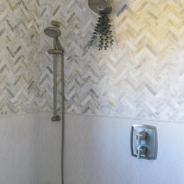
Expanded Shower with Privacy Enhancements – The original, smaller shower was transformed with a larger footprint, half-wall for privacy, and contemporary brushed nickel fixtures, adding both style and function. A herringbone marble accent tile halfway up the shower walls adds a touch of sophistication without overwhelming the space.
Custom Vanity with Built-in Hamper – A small pull-out hamper was added to the corner of the vanity, providing discreet storage and eliminating the need for a standalone basket. The cabinetry was reconfigured to be more functional and organized for the couple’s daily routines.
Lighting that Complements the Room – The lighting selection was central to the redesign, with the client gravitating toward a bubble chandelier she had admired. After exploring several options, they chose a smaller size to provide a soft accent without dominating the space, tying in with the bathroom’s overall light and airy feel.
The newly remodeled primary bath exudes a classic, calm atmosphere with a carefully chosen mix of textures and materials. The large porcelain floor tiles mimic the look of wood, lending a warm, traditional touch. Lightly textured cream tiles and brushed nickel fixtures create a soft and cohesive look, while the subtle herringbone marble accent in the shower adds just the right amount of elegance. Round mirrors above the vanities complement the curves of the freestanding tub, softening the room’s overall look and adding a touch of femininity. The result is a bright, timeless space tailored perfectly for the homeowners’ lifestyle.
 Drury Design
THE SETUP
The original primary bathroom was characterized by a disjointed and segmented layout. The shower featured a bulky glass-block enclosure that overwhelmed the space visually. There was a considerable amount of open, unused space, and despite having a his and hers vanity, the arrangement lacked personal space for each user, as they shared the conjoined space between the sinks. The toilet was inconveniently located right by the door, with a half-wall partition meant to provide privacy but instead contributing to a cramped and unbalanced feel. Overall, the bathroom’s layout and design were fragmented, failing to make the most of the available space and lacking adequate storage solutions.
Design objectives:
- Reconfigure the layout to enhance functionality and flow.
- Create an elegant, upscale aesthetic that is light and bright.
- Incorporate specialized storage solutions for female hair care needs.
- Increase overall storage capacity.
- Develop a spa-like shower experience.
- Provide a significant wow factor to the space.
THE REMODEL
Design challenges to be solved:
- Repositioning the toilet to a more suitable location.
- Designing hair care storage solutions without cluttering the elegant space.
- Balancing an upscale, elegant design with a feminine touch in the color palette.
- Increasing the brightness of the room without adding windows.
- Completely replacing the existing shower to create a spa-like experience.
- Planning new storage solutions without adding bulkiness or clutter to the cabinetry.
THE RENEWED SPACE
Design solutions:
Toilet Relocation: Moved the toilet by the window, creating a better overall layout that also opened up two full walls for cabinetry and storage solutions.
Specialized Vanity Storage: The left side of the left vanity is the wife’s. Open shelves facing across the vanity can be used for decorative or daily needs items. Pull-out docking drawers with power outlets and metal basins handle hot hair appliances.
Bright and Elegant Color Scheme: White cabinets, countertops, floors, and shower walls keep the space bright. The just-off-white wall color with a hint of pink adds a feminine touch. Thin wainscoting with white trim offers traditional-leaning elegance.
Layered Lighting Strategy: Ceiling can lights, sconces, lighted mirrors, and toe-kick lighting were installed. Natural light-rated bulbs keep the space bright and natural-feeling.
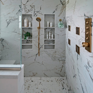
Spa-Like Shower: An extra-large shower was created using the same floor tile materials for continuity. Equipped with a Kohler Anthem system with a shower head, hand-held, and four body sprays. His and Hers niches for separate body care product storage.
Enhanced Storage Solutions: Added a linen cabinet within the vanity area for efficient storage of towels and bathroom essentials.
This elegant bathroom feels incredibly spacious now. The color palette and lights keep the room bright and cheery. Gold fixtures, the herringbone pattern on the floor, and exquisite trim work add an elegant touch. With the husband and wife having their own vanity wall sections joined at the corner, each user truly has their own space within the space. The clients are very happy with the final result.
19