
Search results for "Adding clutter" in Home Design Ideas
 TOC design & construction inc.
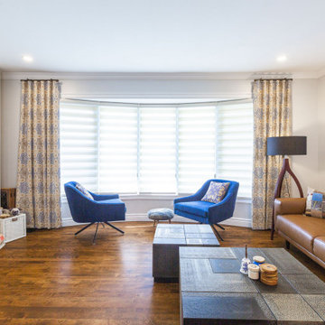
OPEN CONCEPT DINING & LIVING SPACE
Open concept, free from clutter and colorful
Homeowners’ request: We want the spaces to connect with each other and free from clutter.
Designer secret: by adding small touches of the royal blue theme, relocating the fireplace, staining the existing wood floors and adding bright white moldings. I was able to create a more open, inviting and warm atmosphere to this once dark and gloomy space.
Materials used: EXISTING WOOD FLOORS; Sanded, stained special walnut with a satin finish – FURNITURE; COUNTERS; Maison Corbeil – FIRE PLACE TILE; Nolita color white 2 ½” x 10” installed brick pattern– WINDOW COVERING – store alterner with custom grommet pleated curtain side panels – WALL PAINT; 6206-21 Sketch paper – ACCENTS & ACCESSORIES; by client
 Cabinet-S-Top
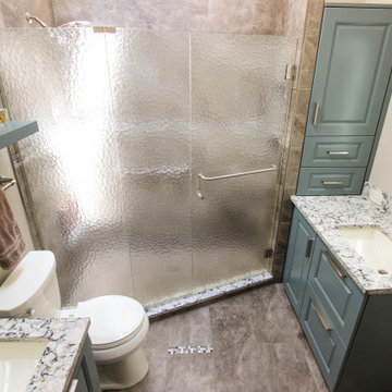
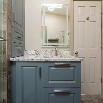
In this master bathroom project, a fiberglass shower was removed and replaced with a more modern larger custom tiled shower with a frameless glass door. We were able to minimize clutter in this small space by adding custom drawers for storage while working around plumbing. An additional sink was added to make the room more functional. Lighted mirrors were utilized to simplify the design and eliminate the need for additional light fixtures, therefore removing visual clutter.
 Cabinet-S-Top
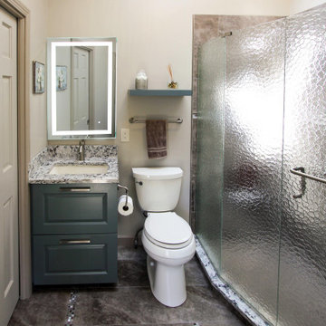
In this master bathroom project, a fiberglass shower was removed and replaced with a more modern larger custom tiled shower with a frameless glass door. We were able to minimize clutter in this small space by adding custom drawers for storage while working around plumbing. An additional sink was added to make the room more functional. Lighted mirrors were utilized to simplify the design and eliminate the need for additional light fixtures, therefore removing visual clutter.
Find the right local pro for your project
 Virgil Interiors
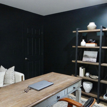
This office was a catch all space in the house. We took this cluttered space and gave it some love. We first cleared out the clutter, added some paint to the walls and door (Benjamin Moore's Black Forest Green). We brought in a beautiful, patterned rug to accent out the floors. We then added curtains to bring in a cozy and relaxed atmosphere. We finished up the space with antique, modern, and traditional pieces.
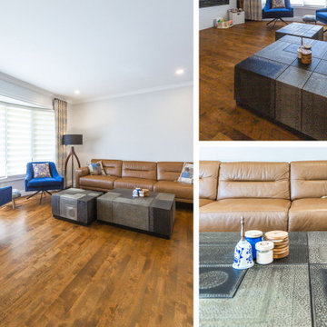 TOC design & construction inc.
OPEN CONCEPT DINING & LIVING SPACE
Open concept, free from clutter and colorful
Homeowners’ request: We want the spaces to connect with each other and free from clutter.
Designer secret: by adding small touches of the royal blue theme, relocating the fireplace, staining the existing wood floors and adding bright white moldings. I was able to create a more open, inviting and warm atmosphere to this once dark and gloomy space.
Materials used: EXISTING WOOD FLOORS; Sanded, stained special walnut with a satin finish – FURNITURE; COUNTERS; Maison Corbeil – FIRE PLACE TILE; Nolita color white 2 ½” x 10” installed brick pattern– WINDOW COVERING – store alterner with custom grommet pleated curtain side panels – WALL PAINT; 6206-21 Sketch paper – ACCENTS & ACCESSORIES; by client
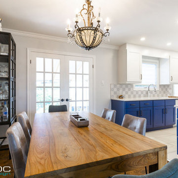 TOC design & construction inc.
OPEN CONCEPT DINING & LIVING SPACE
Open concept, free from clutter and colorful
Homeowners’ request: We want the spaces to connect with each other and free from clutter.
Designer secret: by adding small touches of the royal blue theme, relocating the fireplace, staining the existing wood floors and adding bright white moldings. I was able to create a more open, inviting and warm atmosphere to this once dark and gloomy space.
Materials used: EXISTING WOOD FLOORS; Sanded, stained special walnut with a satin finish – FURNITURE; COUNTERS; Maison Corbeil – FIRE PLACE TILE; Nolita color white 2 ½” x 10” installed brick pattern– WINDOW COVERING – store alterner with custom grommet pleated curtain side panels – WALL PAINT; 6206-21 Sketch paper – ACCENTS & ACCESSORIES; by client
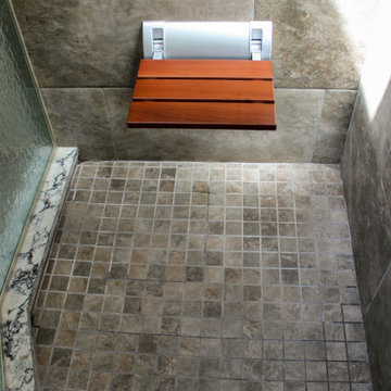 Cabinet-S-Top
In this master bathroom project, a fiberglass shower was removed and replaced with a more modern larger custom tiled shower with a frameless glass door. We were able to minimize clutter in this small space by adding custom drawers for storage while working around plumbing. An additional sink was added to make the room more functional. Lighted mirrors were utilized to simplify the design and eliminate the need for additional light fixtures, therefore removing visual clutter.

Sponsored
Columbus, OH

Wannemacher Interiors
Customized Award-Winning Interior Design Solutions in Franklin Cnty OH
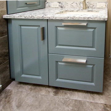 Cabinet-S-Top
In this master bathroom project, a fiberglass shower was removed and replaced with a more modern larger custom tiled shower with a frameless glass door. We were able to minimize clutter in this small space by adding custom drawers for storage while working around plumbing. An additional sink was added to make the room more functional. Lighted mirrors were utilized to simplify the design and eliminate the need for additional light fixtures, therefore removing visual clutter.
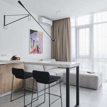
 Maryna Chyrak
The kitchen island sits facing the floor-to-ceiling façade windows, but it's the dining area that gets the full city view. A single articulated wall lamp above the island serves three zones at once — kitchen, dining, and living room — becoming the space's central design element without adding visual clutter.
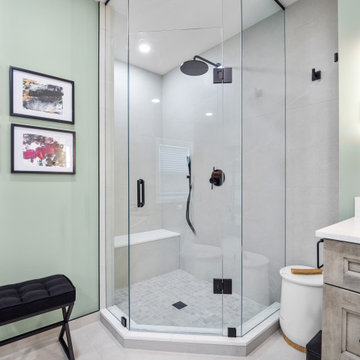
 Sosna Inc
An Ensuite Transformation in Richmond Hill
This project showcases how we helped a wonderful retired couple in Richmond Hill transform their dated and dysfunctional master ensuite into a tranquil spa-like retreat. These lovely empty nesters, in their mid to late 70s, envisioned a space where they could truly relax and enjoy their time at home, especially when their family and grandkids came to visit. We were so honored to help them bring that vision to life.
Understanding Their Needs:
From our initial conversations, it was clear how much this couple valued comfort and tranquility. The existing ensuite, unfortunately, fell short of providing either. For the wife, the leaky deck-mount tub was a major disappointment, as she deeply cherished her long, hot baths. The husband, meanwhile, was eager to replace the outdated and cumbersome toilet/bidet combo with a modern, single-piece smart toilet – a desire for both convenience and a touch of modern luxury. The shower stall was cramped, dark, and plagued by mold, while the large double vanity, despite its size, lacked functional storage. It simply wasn't the relaxing oasis they deserved.
Addressing Their Concerns:
We understood that undertaking a renovation can be stressful, especially when you're not going to be on-site for much of the process. This couple was understandably concerned about potential delays, workmanship quality, and the possibility of unforeseen issues arising while they were away. We made it our priority to address each of these concerns with transparency, open communication, and a commitment to delivering on our promises.
Our Personalized Solutions:
We worked closely with the couple to develop solutions that perfectly matched their needs and desires:
● A Sanctuary for Soaking: The leaky deck-mount tub was replaced with a beautiful, freestanding oval tub – easier to access and offering a more contemporary aesthetic. The wife's vision of a small decorative table nearby for her bath essentials added a personal touch, creating a true spa-like experience.
● Modern Comfort and Convenience: The separate toilet and bidet were replaced with a sleek, high-tech smart toilet, fulfilling the husband's wish and adding a touch of modern luxury to their daily routine.
● A Bright and Inviting Shower: The cramped and moldy shower stall was completely transformed. We demolished the existing bulkhead and built a custom walk-in shower with frameless glass, a built-in bench, and a niche for toiletries. The result was a dramatically brighter and more spacious shower experience.
● Storage and Style: A semi-custom double vanity with ample cabinets and drawers was installed, finally providing each of them with dedicated storage and eliminating
countertop clutter. This seemingly small change made a huge difference in their daily lives.
● A Calming Atmosphere: We carefully selected a calming spa-like color palette, incorporating muted, neutral tones and high-quality finishes to create a truly relaxing and inviting atmosphere.
Navigating the Challenges Together:
Renovations rarely go perfectly smoothly, and this project was no exception. We encountered delays with plumbing fixture deliveries, which threatened our timeline. However, by leveraging our established relationships with reliable suppliers, we were able to find alternative solutions
and minimize the impact on the project schedule. We also faced a minor setback when the initially chosen grey vanity went out of stock. Working closely with the couple, we explored other options and ultimately selected a stunning sandstone-stained maple finish, which, as it turned out, complemented the other design elements beautifully. These moments reinforced the importance of open communication and collaboration throughout the process.
The Joy of Transformation:
The final result was truly remarkable. The transformed ensuite is a testament to the power of thoughtful design and meticulous execution. The space now features large-format, light-colored concrete-look porcelain tiles, creating a bright and airy feel. The sandstone-stained maple vanity, topped with a quartz countertop, serves as a beautiful focal point against the muted green walls. Matte black plumbing fixtures, hardware, and accessories add a touch of modern sophistication. The custom frameless shower glass enclosure enhances the spaciousness of the shower, while the smart toilet provides the ultimate in comfort and convenience.
A Space to Cherish:
The renovation has made a profound difference in this couple's daily lives. The wife can now indulge in her beloved long, hot baths in a truly tranquil setting. The husband enjoys the modern convenience of his new smart toilet. The spacious and bright walk-in shower is both beautiful and functional. And the new vanity provides ample storage, keeping the countertop clutter-free and contributing to the overall sense of peace and calm. This ensuite is no longer just a bathroom; it's a personal spa, a sanctuary within their home, where they can relax, rejuvenate, and enjoy their time together.
Memorable Moments and Hiccups:
● Budget Adjustment: After finalizing the initial design, we worked closely with the clients to reselect the freestanding tub to ensure it aligned perfectly with their budget. ● Vanity Setback: The unexpected out-of-stock situation with the original vanity color required a quick and effective re-selection process, which ultimately led to an even better design outcome. This highlighted the importance of flexibility and collaboration during a renovation.
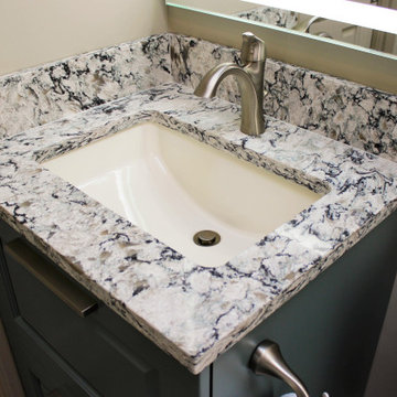 Cabinet-S-Top
In this master bathroom project, a fiberglass shower was removed and replaced with a more modern larger custom tiled shower with a frameless glass door. We were able to minimize clutter in this small space by adding custom drawers for storage while working around plumbing. An additional sink was added to make the room more functional. Lighted mirrors were utilized to simplify the design and eliminate the need for additional light fixtures, therefore removing visual clutter.
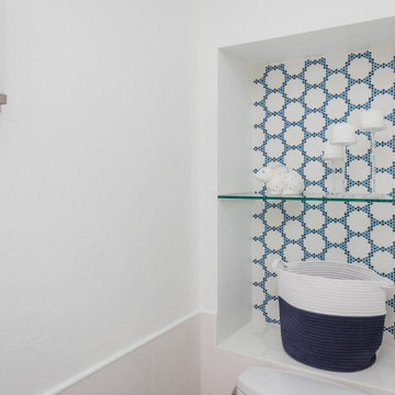
 Ku Interior Design
A recessed wall niche adds convenient storage within the water closet while introducing another thoughtful design detail. Lined with the custom blue-and-white micro-hex mosaic used throughout the bathroom, the niche reinforces the project's cohesive design language while maximizing function without adding visual clutter.
 Cabinet-S-Top
In this master bathroom project, a fiberglass shower was removed and replaced with a more modern larger custom tiled shower with a frameless glass door. We were able to minimize clutter in this small space by adding custom drawers for storage while working around plumbing. An additional sink was added to make the room more functional. Lighted mirrors were utilized to simplify the design and eliminate the need for additional light fixtures, therefore removing visual clutter.

Sponsored
Columbus, OH

Hope Restoration & General Contracting
Columbus Design-Build, Kitchen & Bath Remodeling, Historic Renovations
 Drury Design
THE SETUP
This client lives in a great high-rise condo in downtown Chicago. Alicia has already remodeled a few areas of her home, including her kitchen and home office. The bathroom is one of the last big places the client wanted to update. The existing bathroom had a large, outdated whirlpool tub in the corner. It was a darker space that had a lack of natural light. There are no windows (due to the bathroom’s location within the high-rise building). So, the idea was to brighten up the space and give the client an updated, elegant primary bathroom that is more her style and tailor-made for her routines.
Design Objectives:
- Make the space brighter.
- Create different daily routine stations to maximize functionality while keeping things clutter-free – a makeup station, a blow-dry station, and a sink-needs station.
- Achieve the client’s specific style and function needs while also keeping the look and design open to future possibilities: different users of the space/resale clients.
Design Challenges:
- Toilet cannot be moved. (In a high-rise, you can’t really move plumbing around too much when reimagining a space)
- Existing bathroom had a soffit that hid a lot of electrical wiring, so completely removing the soffit wasn’t an option.
- The blow-dry station needs to accommodate the client’s preference for standing up.
- Finding a place for the make-up station, which the client wants oriented for sitting.
- Create storage within the shower that can eliminate the clutter of personal care products that are actually needed every day. Do this, while keeping the client’s favorite things about the existing shower: the shower bench, a tub filler faucet (for rinsing shaving cream when shaving legs) and a low niche for placing her foot when shaving her legs.
THE RENEWED SPACE
Design Solutions:
- Extended a bit of wall near the toilet to give the commode its own area within the space, but without closing it off into a claustrophobic WC.
- Worked within the reality of the existing soffit situation, reshaping it to align with the new shower. Can lights were also added. Installed a beautiful ceiling light fixture that works within the new soffit shape, commanding attention and adding light, as if the sofit shape was chosen for it.
- Created a nice, furniture-looking 42”-high cabinet with pullout drawers to be the blow-dry station, complete with a mirror and a nice top. The pullout drawers are all powered, concealing a Dyson dryer and curling iron (and all the accoutrements) while keeping them plugged in, which is ideal for easy usage and put away. A stylish mirror on the wall above the cabinet, and proper lighting, make this the perfect blow-dry station. The top has a grommet that can accommodate a power cord should the client ever want to have a powered device on top of the cabinet.
- Put the sit-down makeup station where the tub used to be, putting the mirror back into a new recessed wall just a bit, allowing the area to have more room.
- Created a niche in the shower’s inner wall so that you can’t see it unless you are literally inside the shower. At the client’s request, it also has a hook so she can hang her loofa. Hiding the utility niche in this way allowed us to use the full main wall of the shower as a canvas for a beautiful accent stripe of raised decorative tile. The new shower has her old favorites, too: the tub filler, foot niche and bench.
Alicia’s client loves her new primary bathroom, especially the blow dry area. It is very accommodating for her, as a tall lady, while being very easy to use. The drawers store everything. Being powered, they make using already-plugged in appliances very easy to use and put away.
Her previous makeup station was a freestanding vanity with a single drawer, so beauty products were all over the surface top. With her new makeup station, everything is nicely tucked away and organized in drawers.
The new lighting is fantastic and the colors are light and soft. The clients loves the overall look and feel of her new bathroom and raves about how well the functionality-minded design makes her morning routine – and her life – easier and enjoyable!
 7 Day Kitchens
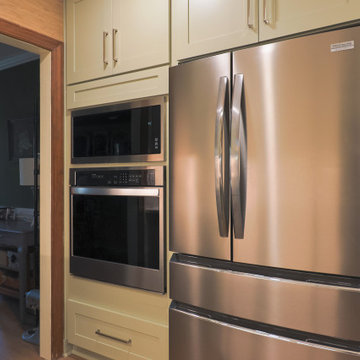
This project features a modern transitional kitchen with clean lines and natural tones, designed to open up the space, improve functionality, and create a more refined everyday living experience. Located in an upscale private enclave in South Charlotte, the home sits within a setting known for its balance of quiet residential living and proximity to areas like SouthPark and Quail Hollow Club. The original kitchen felt closed in, so one wall was opened up and the layout was reworked to create a more open flow, allowing for better movement, improved sightlines, and a more natural gathering space around the island.
The design leans modern while maintaining warmth through transitional elements. Perimeter cabinetry in L&C Shallow Green introduces a muted, earthy tone that moves away from traditional white kitchens while still keeping the space light and inviting. The cabinet style remains shaker but with slimmer profiles and minimal detailing, paired with Amerdeco brushed satin hardware featuring clean, straight bar pulls. Calacatta Elysio countertops add subtle movement and contrast, while the Zellige Pearl Opal backsplash in a horizontal stacked layout delivers a clean, modern texture that is enhanced by under-cabinet lighting. A Kraus Kore stainless steel apron-front sink provides a streamlined, modern take on a classic feature, and a Z Line stainless steel range hood serves as a strong visual focal point with its exposed chimney design. Decorative end panels and consistent cabinetry throughout maintain a cohesive and intentional look.
Functionality was a key priority throughout the project. The updated layout improves workflow, while integrated storage solutions maximize usability without adding visual clutter. The result is a space that feels open, efficient, and easy to live in. The overall design balances modern simplicity with subtle warmth through elements like shaker cabinetry and natural flooring, preventing the space from feeling overly stark. This kitchen reflects a clear shift toward a more modern aesthetic while maintaining the comfort and familiarity that define transitional design.
 TOC design & construction inc.
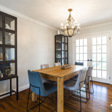
OPEN CONCEPT DINING & LIVING SPACE
Open concept, free from clutter and colorful
Homeowners’ request: We want the spaces to connect with each other and free from clutter.
Designer secret: by adding small touches of the royal blue theme, relocating the fireplace, staining the existing wood floors and adding bright white moldings. I was able to create a more open, inviting and warm atmosphere to this once dark and gloomy space.
Materials used: EXISTING WOOD FLOORS; Sanded, stained special walnut with a satin finish – FURNITURE; COUNTERS; Maison Corbeil – FIRE PLACE TILE; Nolita color white 2 ½” x 10” installed brick pattern– WINDOW COVERING – store alterner with custom grommet pleated curtain side panels – WALL PAINT; 6206-21 Sketch paper – ACCENTS & ACCESSORIES; by client
 Cabinet-S-Top
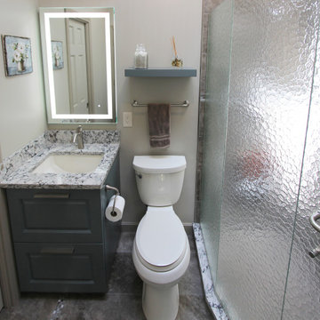
In this master bathroom project, a fiberglass shower was removed and replaced with a more modern larger custom tiled shower with a frameless glass door. We were able to minimize clutter in this small space by adding custom drawers for storage while working around plumbing. An additional sink was added to make the room more functional. Lighted mirrors were utilized to simplify the design and eliminate the need for additional light fixtures, therefore removing visual clutter.

Sponsored
Delaware, OH

Buckeye Basements, Inc.
Central Ohio's Basement Finishing ExpertsBest Of Houzz '13-'21
 Drury Design
THE SETUP
This client lives in a great high-rise condo in downtown Chicago. Alicia has already remodeled a few areas of her home, including her kitchen and home office. The bathroom is one of the last big places the client wanted to update. The existing bathroom had a large, outdated whirlpool tub in the corner. It was a darker space that had a lack of natural light. There are no windows (due to the bathroom’s location within the high-rise building). So, the idea was to brighten up the space and give the client an updated, elegant primary bathroom that is more her style and tailor-made for her routines.
Design Objectives:
- Make the space brighter.
- Create different daily routine stations to maximize functionality while keeping things clutter-free – a makeup station, a blow-dry station, and a sink-needs station.
- Achieve the client’s specific style and function needs while also keeping the look and design open to future possibilities: different users of the space/resale clients.
Design Challenges:
- Toilet cannot be moved. (In a high-rise, you can’t really move plumbing around too much when reimagining a space)
- Existing bathroom had a soffit that hid a lot of electrical wiring, so completely removing the soffit wasn’t an option.
- The blow-dry station needs to accommodate the client’s preference for standing up.
- Finding a place for the make-up station, which the client wants oriented for sitting.
- Create storage within the shower that can eliminate the clutter of personal care products that are actually needed every day. Do this, while keeping the client’s favorite things about the existing shower: the shower bench, a tub filler faucet (for rinsing shaving cream when shaving legs) and a low niche for placing her foot when shaving her legs.
THE RENEWED SPACE
Design Solutions:
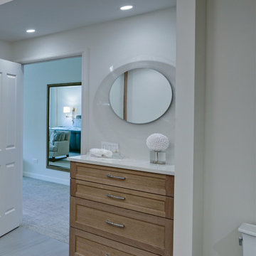
- Extended a bit of wall near the toilet to give the commode its own area within the space, but without closing it off into a claustrophobic WC.
- Worked within the reality of the existing soffit situation, reshaping it to align with the new shower. Can lights were also added. Installed a beautiful ceiling light fixture that works within the new soffit shape, commanding attention and adding light, as if the sofit shape was chosen for it.
- Created a nice, furniture-looking 42”-high cabinet with pullout drawers to be the blow-dry station, complete with a mirror and a nice top. The pullout drawers are all powered, concealing a Dyson dryer and curling iron (and all the accoutrements) while keeping them plugged in, which is ideal for easy usage and put away. A stylish mirror on the wall above the cabinet, and proper lighting, make this the perfect blow-dry station. The top has a grommet that can accommodate a power cord should the client ever want to have a powered device on top of the cabinet.
- Put the sit-down makeup station where the tub used to be, putting the mirror back into a new recessed wall just a bit, allowing the area to have more room.
- Created a niche in the shower’s inner wall so that you can’t see it unless you are literally inside the shower. At the client’s request, it also has a hook so she can hang her loofa. Hiding the utility niche in this way allowed us to use the full main wall of the shower as a canvas for a beautiful accent stripe of raised decorative tile. The new shower has her old favorites, too: the tub filler, foot niche and bench.
Alicia’s client loves her new primary bathroom, especially the blow dry area. It is very accommodating for her, as a tall lady, while being very easy to use. The drawers store everything. Being powered, they make using already-plugged in appliances very easy to use and put away.
Her previous makeup station was a freestanding vanity with a single drawer, so beauty products were all over the surface top. With her new makeup station, everything is nicely tucked away and organized in drawers.
The new lighting is fantastic and the colors are light and soft. The clients loves the overall look and feel of her new bathroom and raves about how well the functionality-minded design makes her morning routine – and her life – easier and enjoyable!
 Drury Design
THE SETUP
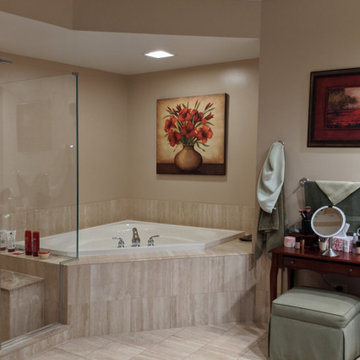
This client lives in a great high-rise condo in downtown Chicago. Alicia has already remodeled a few areas of her home, including her kitchen and home office. The bathroom is one of the last big places the client wanted to update. The existing bathroom had a large, outdated whirlpool tub in the corner. It was a darker space that had a lack of natural light. There are no windows (due to the bathroom’s location within the high-rise building). So, the idea was to brighten up the space and give the client an updated, elegant primary bathroom that is more her style and tailor-made for her routines.
Design Objectives:
- Make the space brighter.
- Create different daily routine stations to maximize functionality while keeping things clutter-free – a makeup station, a blow-dry station, and a sink-needs station.
- Achieve the client’s specific style and function needs while also keeping the look and design open to future possibilities: different users of the space/resale clients.
Design Challenges:
- Toilet cannot be moved. (In a high-rise, you can’t really move plumbing around too much when reimagining a space)
- Existing bathroom had a soffit that hid a lot of electrical wiring, so completely removing the soffit wasn’t an option.
- The blow-dry station needs to accommodate the client’s preference for standing up.
- Finding a place for the make-up station, which the client wants oriented for sitting.
- Create storage within the shower that can eliminate the clutter of personal care products that are actually needed every day. Do this, while keeping the client’s favorite things about the existing shower: the shower bench, a tub filler faucet (for rinsing shaving cream when shaving legs) and a low niche for placing her foot when shaving her legs.
THE RENEWED SPACE
Design Solutions:
- Extended a bit of wall near the toilet to give the commode its own area within the space, but without closing it off into a claustrophobic WC.
- Worked within the reality of the existing soffit situation, reshaping it to align with the new shower. Can lights were also added. Installed a beautiful ceiling light fixture that works within the new soffit shape, commanding attention and adding light, as if the sofit shape was chosen for it.
- Created a nice, furniture-looking 42”-high cabinet with pullout drawers to be the blow-dry station, complete with a mirror and a nice top. The pullout drawers are all powered, concealing a Dyson dryer and curling iron (and all the accoutrements) while keeping them plugged in, which is ideal for easy usage and put away. A stylish mirror on the wall above the cabinet, and proper lighting, make this the perfect blow-dry station. The top has a grommet that can accommodate a power cord should the client ever want to have a powered device on top of the cabinet.
- Put the sit-down makeup station where the tub used to be, putting the mirror back into a new recessed wall just a bit, allowing the area to have more room.
- Created a niche in the shower’s inner wall so that you can’t see it unless you are literally inside the shower. At the client’s request, it also has a hook so she can hang her loofa. Hiding the utility niche in this way allowed us to use the full main wall of the shower as a canvas for a beautiful accent stripe of raised decorative tile. The new shower has her old favorites, too: the tub filler, foot niche and bench.
Alicia’s client loves her new primary bathroom, especially the blow dry area. It is very accommodating for her, as a tall lady, while being very easy to use. The drawers store everything. Being powered, they make using already-plugged in appliances very easy to use and put away.
Her previous makeup station was a freestanding vanity with a single drawer, so beauty products were all over the surface top. With her new makeup station, everything is nicely tucked away and organized in drawers.
The new lighting is fantastic and the colors are light and soft. The clients loves the overall look and feel of her new bathroom and raves about how well the functionality-minded design makes her morning routine – and her life – easier and enjoyable!
 Furniture Row
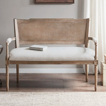
This settee brings the return of rattan to life through its handwoven cane back, paired with a softly weathered wood frame for balance and structure . It's the kind of mixed-material piece the trend celebrates — light and organic rather than heavy or formal, so it layers in. texture without adding visual clutter. Styled with a linen cushion, a curated side table, and casual accents like books and a woven basket, it shows how rattan can soften a room while still feeling approachable and inviting.
28