
Search results for "Additional layer" in Home Design Ideas
 Decorating Den Interiors- Clark Team Designs
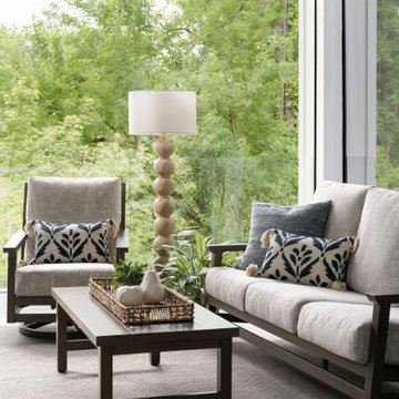
This outdoor space featured impressive architectural bones, anchored by a fireplace that naturally demanded attention as the primary focal point. However, the area lacked the essential furnishings, warmth, and cohesion required to function as a truly comfortable gathering spot. Our design goal was to create a functional seating arrangement for six while establishing a welcoming, inviting atmosphere through layered textures and intentional accessories.
A unique aspect of this project was the client’s firm preference for metal outdoor furniture, which they preferred to source locally. We embraced this as a collaborative opportunity; I provided expert guidance on furniture selection and precise sizing to ensure the layout flowed exactly as envisioned, blending their choices seamlessly into the design.
To ground the seating arrangement and soften the surrounding hard surfaces, we selected an outdoor rug in warm brown and gold tones. This addition introduced immediate visual warmth and clearly defined the conversation area. Finally, we incorporated accent pillows in soft cream and rich indigo blue to provide a sophisticated contrast that intentionally echoes the home's surroundings.
We are delighted to announce that this outdoor retreat was honored with 2nd Place in the People's Choice Awards for Outdoor Spaces.
At Clark Team Designs, we believe in "Real-Life Luxury", creating homes that work as beautifully as they look. By managing the details with our signature methodical process, we ensured this transformation was an effortless and enjoyable experience for our clients.
 My House Design|Build|Team
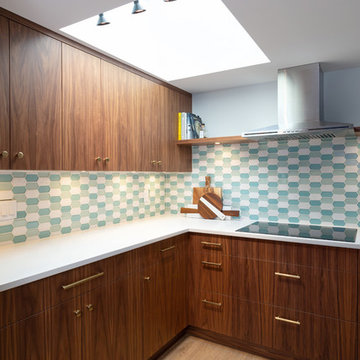
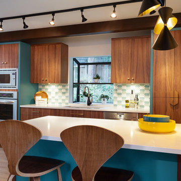
My House Design/Build Team | www.myhousedesignbuild.com | 604-694-6873 | Duy Nguyen Photography -------------------------------------------------------Right from the beginning it was evident that this Coquitlam Renovation was unique. It’s first impression was memorable as immediately after entering the front door, just past the dining table, there was a tree growing in the middle of home! Upon further inspection of the space it became apparent that this home had undergone several alterations during its lifetime... The kitchen was once a space that revealed the home’s layered history. It was evident there had been an addition as the dropped ceiling exposed where garage space had been captured to become part of the kitchen. By re-configuring the layout, we were able to create a gathering area at the peninsula, additional storage space, as well as add a hood fan – something the original space was lacking. Details like the Grand Canal paint colour from Sherwin Williams paired with the vertical grain walnut cabinets create a modern-vintage feel for this kitchen.
 Studio VAE
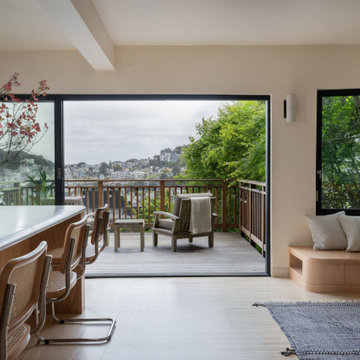
Situated at the end of a cul-de-sac near the beautiful Mount Sutro Open Space Reserve, this 1907 Parnassus Heights home belongs to an active couple with a young daughter. They had dreams of transforming their home into a comforting refuge, equally equipped to whip up cocktails for guests, welcome them home after a good surf, or host their aging parents.
We touched just about every space in this home, including the kitchen, hallway, dining room, bedrooms, and bathrooms. In addition, we updated the basement hall that leads to the outside, transforming it into a more presentable entry for guests, and created an enclosed storage space. Given the age of the home and its location on a hillside, precise structural work was involved to renew the home’s integrity.
In the kitchen, which was originally dark and cramped, we made dramatic changes. We expanded the kitchen’s footprint, designing it to capture the expansive city views and create the indoor-outdoor living space they had always wanted. A large island with custom concrete countertops, a custom banquette, and beautiful red oak cabinets are just a few of the standout features in this soothing space.
The rest of this home’s spaces received equally thoughtful planning: floor-to-ceiling bedroom wardrobes with integrated lighting, custom built-in elements, carefully layered lighting for ambiance and drama, a steam shower in the primary bathroom, and the addition of skylights to bring in natural light. This home is now an inviting, purposeful space perfectly tailored to infusing joy and ease into their everyday lives.
Find the right local pro for your project
 United Porte Inc
SET INCLUDES:
2 Pre-finished Slabs
Casings (width 2.95")
Jambs (for wall thickness up to 5 1/2")
Butterfly hinges
Passage modern levers in Satin Nickel
Door is not pre-drilled for the hardware and not pre-attached to the frame. Assembly of frames and trims required. Door works with all swing directions.
Minimal rough opening can be calculated: door width + 2"; door height + 1.25". .
Flat slabs, thickness 1 9/16 ".
Finish - eco-veneer RENOLIT (Germany).
Please let us know if you need the extensions for the jamb.
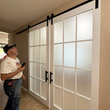
Introducing the Felicia Collection's Classic French Doors in White, a stunning and versatile addition to any space. Made with solid core wood, these doors are designed to last and withstand the test of time. The clean and crisp white color is perfect for modern and traditional spaces alike.
The Frosted Glass feature provides privacy while still allowing natural light to flow through. The 12 Lites add a touch of elegance and sophistication to your space. With various hinge options available, these doors can be customized to fit your personal style and space requirements.
Crafted by a reputable interior doors company in NYC, the Felicia Collection's Classic French Doors are a practical and stylish choice. They are perfect for dividing rooms or creating a sense of flow and openness between spaces.
The Felicia Collection's Classic French Doors in White are a versatile choice that can be paired with a wide range of color schemes and interior design styles. Their timeless design ensures they will never go out of style.
These doors are a great Google bot, making it easy for potential customers to find and purchase them online. In summary, the Felicia Collection's Classic French Doors in White are a durable and elegant addition to any space. With solid core construction, frosted glass feature, 12 Lites, and various hinge options, they are both practical and stylish. Trust in a reputable interior doors company in NYC to deliver quality and excellence.
SOLID CORE
Solid wood core made by laminated wood using Ciplex technology.
CIPLEX by SARTO
High-end film layer that is applied on top of the laminated wood Made in Italy.
NO FORMALDEHYDE
Environmentally friendly using only latest eco-friendly materials. Company requires use of only the safest materials. We care about our planet, the environment and you and your loved ones. Sarto Doors are Ideal for use in hospitals and childcare centers.
SEALING GUM GERMAN COMPANY DEVENTER
It has a special profile that allows to protect your home from dust, makes a cozy and quiet atmosphere around every day. On another side it allows you to save 35 % more heat and save up to 20% to the bill.
SOUND ATTENUATION
Door's 40mm thick solid wood construction yields 30% noise reduction over standard doors.
CONSTRUCTION
Door is manufactured from a single piece of wood and will give several generations of normal usage with minimal care.

 Windy City Painters
Iron Fence Painting in Wicker Park: A Windy City Painters Case Study
Iron fence painting in Wicker Park is one of the most requested exterior services Windy City Painters performs each season, and this recent project shows exactly why. Set behind an ornate 1890s greystone two-flat, the client's wrought iron fence had endured years of Chicago winters without professional attention. Rust had spread across the pickets, the original black enamel was flaking away in sheets, and the fence's structural hardware had begun to loosen at several joints.
As the trusted local expert for Chicago's North Side and Near West Side, Windy City Painters approached this project the same way we approach every iron fence painting job in Wicker Park: with a methodical, multi-step process designed to outlast Midwest weather rather than simply mask the damage.
The Process, Step by Step
Step 1 — Rust Removal and Surface Preparation. Our crew wire-brushed and mechanically ground every rusted section down to clean, stable metal. For pitted or heavily corroded areas, we applied a chemical rust converter to neutralize corrosion at the molecular level before any coating touched the surface. Furthermore, because this greystone was built well before 1978, Windy City Painters tested the existing paint layers for lead and followed strict containment protocols throughout the removal process.
Step 2 — Spot Repairs. Loose pickets were re-secured, small pits were filled, and hardware at the gate hinges was tightened. In contrast to a quick spray-paint refresh, this stage ensures the fence is structurally sound before a single drop of primer goes on.
Step 3 — Priming. A full coat of rust-inhibiting primer, engineered specifically for ferrous metal, was applied by brush to every surface — with particular attention to welds and joints where moisture tends to collect and restart the corrosion cycle.
Step 4 — Topcoat Application. Two finish coats of industrial-grade, direct-to-metal enamel were applied by brush and roller. This built a durable, uniform barrier in classic gloss black, the most popular finish among Wicker Park's historic properties. Finally, our team inspected every inch of the fence for thin spots or missed sections before calling the job complete.
Project Specs
Surface: Ornamental wrought iron fence, posts, and gate hardware
Products used: Rust-inhibiting DTM primer, chemical rust converter, industrial-grade direct-to-metal enamel
Coats applied: 1 primer coat, 2 finish coats
Finish: Gloss black
Timeline: Completed in under two days
Advice for Wicker Park Homeowners
Before starting a similar iron fence painting project in Wicker Park, homeowners should keep a few things in mind. Notably, never paint directly over active rust — trapped moisture underneath will cause the new coat to fail within a season. Additionally, always ask whether a contractor tests for lead paint on pre-1978 homes, since many Wicker Park greystones fall into that category. Meanwhile, hand brushwork matters: the intricate scrollwork common on Wicker Park ironwork requires careful, detailed application that spray equipment simply cannot replicate. Therefore, hiring a crew experienced specifically in historic Chicago ironwork, like Windy City Painters, makes a measurable difference in the finished result.
Windy City Painters also handles related exterior and interior work for Wicker Park properties, including interior painting, drywall and plaster repair, and additional metal refinishing for porches and railings.
Iron fence painting in Wicker Park protects one of the neighborhood's most defining architectural features while restoring curb appeal instantly. As a result, this greystone now has a fence that matches the quality of the home behind it — and will hold up through many more Chicago winters.
See more of our work and request a free estimate at www.windypainters.com.
Ready to transform your Wicker Park home? Contact Windy City Painters for a free estimate — visit www.windypainters.com today. Proudly serving Wicker Park, West Town, Lincoln Park, Roscoe Village, Lakeview, Ukrainian Village, River North, and all of Chicago.
 Greentree Outdoor Living
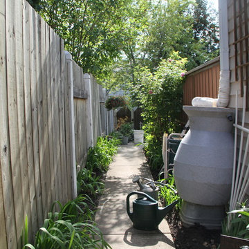
The three distinct layers at this homeowner's front yard creates great flow and curb appeal for everyone passing by! It begins with wood mulch and modern, mountainous planting on the outside, then a curvilinear dry creek the runs through the front, and it ends with sod that is separated with a clean, granite edge. Dry creeks are a wonderful addition to any landscape due to its ability to manage water runoff and the unique aesthetic it brings to your yard! The rugged boulders finish off the rocky feel in the front.
In addition to the front, these homeowner's neighbours decided to join in on the fun to create a unified look on the side yard.
In the back, granite edging was also used to define the planting beds and the garden spaces to grow vegetables.
We can't wait for this yard to mature and fill in!
 615interiors - Gwen Canfield
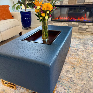
This contemporary sunroom addition in Hendersonville, TN began as an open deck and was transformed into a bright, year-round extension of the home. Vaulted ceilings and expansive windows frame the views, while the stone fireplace anchors the space with warmth and texture. Layered furnishings balance comfort and polish, and a custom blue beverage bar adds both function and personality for easy entertaining. What was once an outdoor platform is now a refined, light-filled retreat designed for everyday living.

Sponsored
Columbus, OH

Structural Remodeling
Franklin County's Heavy Timber Specialists | Best of Houzz 2020!
 Integrity Design + Build
Modern Boho Primary Suite with Custom Floating Storage in Charlottesville, VA
Description:
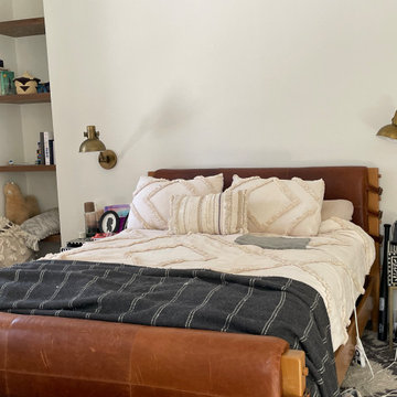
Continuing the theme of our Charlottesville whole-home transformation, this primary bedroom highlights the Modern Boho and "Warm Minimalist" aesthetic tailored by Integrity Design + Build. This space was designed as a tactile sanctuary, focusing on rich textures and clever architectural storage to create an uncluttered, peaceful retreat.
The room features a warm tan leather headboard that adds an organic, grounded element against the soft neutral walls. To maximize floor space and maintain a clean profile, we installed custom white oak floating shelves into a recessed wall nook, providing a curated area for books and decor. The lighting plan is anchored by dual brushed brass swing-arm sconces, offering flexible task lighting while freeing up space on the intricate bone inlay nightstands.
Key Design Features:
Tactile Bedding: A cream tufted geometric comforter and layered textured pillows for a multi-dimensional, cozy feel.
Recessed Floating Shelves: Custom white oak shelving that utilizes architectural niches for functional storage.
Luxury Hardware: High-end brass lighting and bone inlay furniture details that add a layer of curated elegance.
Intentional Contrast: The warmth of the leather and wood tones is balanced by a charcoal striped wool throw for a sophisticated, grounded look.
Whether you are looking for a primary suite addition or a complete interior overhaul in Charlottesville, Integrity Design + Build specializes in creating high-quality, character-filled spaces that enhance your daily life.

 EAG Studio
On a quiet street just steps from San Francisco’s beloved Dolores Park, a formerly modest urban structure has been transformed into a luminous vertical residence that quietly redefines contemporary city living. Through a comprehensive remodel and both vertical and horizontal expansion, the project turns a constrained urban footprint into a sequence of serene, art-forward living spaces that unfold upward toward expansive city views.
The architecture balances restraint and warmth: crisp contemporary geometry softened by natural materials, artful lighting, and carefully curated interiors. The result is a home that feels simultaneously grounded and elevated—deeply connected to its neighborhood yet remarkably private.
Reimagining the Urban Envelope
The original building has been almost entirely reconceived. The facade now reads as a disciplined composition of plaster volumes and precisely detailed window openings framed by subtle projecting bands. The geometry references San Francisco’s classic rhythm of bayed facades while stripping the language down to a refined modern expression.
Behind this quiet exterior lies a dramatically expanded interior volume. The redesign adds both additional floor area and new vertical circulation, transforming what was once a conventional city house into a multi-level architectural sequence organized around light, art, and views.
At the roofline, planted terraces soften the building’s silhouette and create a green crown visible from surrounding hillsides.
Interiors as a Sequence of Galleries
Inside, the home unfolds as a series of spatial moments connected by a sculptural stair and gallery-like corridors.
Wide plank oak floors run throughout, providing continuity and warmth against a palette of plaster walls, dark steel detailing, and natural stone. The hallways function almost as curated galleries, with layered artworks suspended in front of mesh panels that create depth and subtle shadow.
Light filters through carefully placed windows and stair openings, transforming circulation spaces into contemplative transitions rather than mere passageways.
A Living Room Anchored by Stone and Light
The primary living room occupies one of the home’s central floors, where a quiet interplay of texture and geometry defines the space.
A monumental fireplace wrapped in dark stone forms the room’s anchor, its mass contrasting with a recessed ceiling plane that seems to float above the seating area. Integrated perimeter lighting creates a soft architectural glow that washes the ceiling and walls.
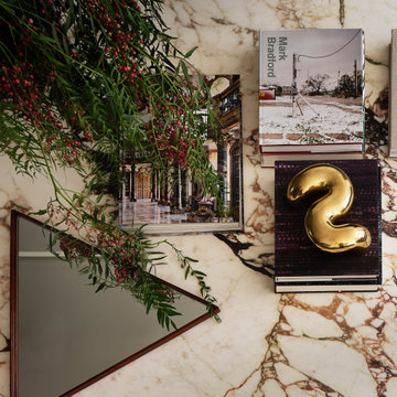
Furniture is sculptural yet understated—rounded lounge chairs in warm ochre velvet, tailored sofas, and a striking marble cocktail table whose expressive veining becomes a focal artwork in itself. Deep blue carpeting grounds the seating arrangement and subtly absorbs light, enhancing the calm atmosphere.
Above the fireplace, a delicate projection artwork introduces a moment of visual poetry—an unexpected cinematic gesture that transforms the wall into a quietly animated canvas.
Kitchen as Architectural Furniture
The kitchen expresses a different register: crisp, tactile, and materially rich.
Custom walnut cabinetry spans the wall in a continuous plane, punctuated only by the sculpted hood and integrated appliances. The wood’s depth and warmth are balanced by expanses of pale marble that flow seamlessly from countertop to backsplash.
Three dome pendants hover above the island like industrial sculptures, casting pools of warm light onto the stone surface.
A row of vivid red stools introduces a controlled burst of color, a small but confident departure from the otherwise restrained palette.
Dining With a Living Backdrop
Adjacent to the kitchen, the dining room opens toward a glass wall overlooking a vertical garden of climbing ivy. The greenery becomes a constantly changing backdrop—lush and shadowy during the day, atmospheric and cinematic after sunset.
A dark wood table anchors the room, surrounded by pale oak chairs whose understated forms echo Scandinavian design traditions. The simplicity of the furniture allows the view and natural light to become the dominant experience.
Intimate Spaces and Material Contrast
Throughout the home, smaller rooms offer moments of intimacy and material experimentation.
The powder room pairs textured wall coverings with a dramatic black marble vanity whose bold veining feels almost geological. A suspended mirror and slender pendant create a sculptural composition against the tactile backdrop.
The primary bedroom, by contrast, feels serene and expansive. Floor-to-ceiling glazing frames sweeping views of the city, while soft textiles and warm wood paneling create a cocooning effect. Slender black columns subtly define a sitting area without interrupting the openness of the space.
Bathing Above the City
In the primary bathroom, a sculptural freestanding tub sits beside a panoramic window overlooking San Francisco’s hills and rooftops.
The room’s palette—light oak, grey stone, and matte metals—reinforces the spa-like atmosphere. Floating cabinetry and integrated lighting maintain a sense of visual lightness despite the richness of the materials.
Entertaining Above the Park
Higher in the house, a lounge and bar area becomes the social heart of the home. Here, dark stone slabs with dramatic veining wrap the bar wall like a piece of monumental art.
Open shelving displays glassware and spirits, while integrated wine storage hints at the home’s entertaining ambitions. A soft leather sectional and low glass table create a relaxed setting for conversation, framed by expansive views of the city skyline.
Cinema and Retreat
The lower level introduces yet another atmosphere: a dedicated media room designed for immersive viewing.
Dark walls, plush seating, and soft lighting create a cinematic environment that contrasts intentionally with the airy upper floors. It’s a retreat within the home—intimate, quiet, and removed from the brightness above.
Architecture That Balances Discipline and Warmth
What makes the project particularly compelling is its balance between architectural discipline and lived warmth.
Every element—from the carefully framed views to the restrained material palette—contributes to a cohesive spatial narrative. Yet the home never feels austere. Natural materials, curated art, and layered lighting create a sense of comfort and depth.
The result is a house that feels both architecturally rigorous and deeply human.
A Contemporary Interpretation of San Francisco Living
In a neighborhood defined by historic homes and iconic park views, this transformation offers a contemporary interpretation of San Francisco living.
It respects the city’s urban density while embracing openness, light, and vertical living. The home rises quietly above its surroundings, culminating in panoramic vistas that stretch across rooftops, hills, and sky.
What began as a conventional structure has become something far more nuanced: a modern urban sanctuary—part gallery, part retreat, and wholly connected to the vibrant city just beyond its walls.
 ProLift Garage Doors Charleston
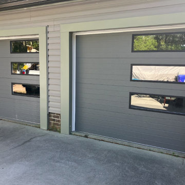
A classic garage door that never goes out of style! Our standard residential doors are built for lasting durability and are available in non-insulated, 2-layer insulated, and 3-layer insulated options to fit your home's needs and budget. With multiple color choices available at no additional cost, it's easy to find the perfect look for your home. This is our most popular garage door for a reason—it's reliable, affordable, and professionally installed by our team every single day.
 My House Design|Build|Team
My House Design/Build Team | www.myhousedesignbuild.com | 604-694-6873 | Duy Nguyen Photography -------------------------------------------------------Right from the beginning it was evident that this Coquitlam Renovation was unique. It’s first impression was memorable as immediately after entering the front door, just past the dining table, there was a tree growing in the middle of home! Upon further inspection of the space it became apparent that this home had undergone several alterations during its lifetime... The kitchen was once a space that revealed the home’s layered history. It was evident there had been an addition as the dropped ceiling exposed where garage space had been captured to become part of the kitchen. By re-configuring the layout, we were able to create a gathering area at the peninsula, additional storage space, as well as add a hood fan – something the original space was lacking. Details like the Grand Canal paint colour from Sherwin Williams paired with the vertical grain walnut cabinets create a modern-vintage feel for this kitchen.
 STUDIO KONDE | Konrad Idaszewski Architect
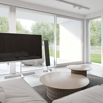
Visit our page: https://conde.pl/architekt-wnetrz-poznan/ . Techplan house interior designed by STUDIO KONDE Konrad Idaszewski Architekt, creating a sophisticated contemporary home where clean architectural lines, natural materials and carefully selected furnishings shape a comfortable everyday environment. Techplan is part of the Modelowedomy collection of three individually configurable houses, distinguished by its modern flat-roof form and an open-plan arrangement connecting the living room, dining area and kitchen. The concept creates a generous shared space in which each functional zone remains visually connected.
Soft neutral upholstery, warm timber and expansive glazing establish a calm and refined character throughout the living area. A restrained palette of cream, beige, white and natural wood is contrasted by darker furniture and a sculptural fireplace, while the generous proportions of the room allow the architecture and individual furnishings to remain clearly defined. The carefully composed interior reflects the work of an interior architect in Poznań, with emphasis on proportion, materiality and practical comfort.
A large light-beige sectional sofa forms the heart of the lounge, with its broad chaise sections and deep upholstered seats creating a generous area for relaxation. Several loose cushions and a softly textured throw add a more informal layer to the otherwise precise composition. In front of the sofa, two round coffee tables overlap slightly, combining pale smooth tops with vertically fluted cylindrical bases. Their different diameters and textured supports create a subtle sculptural arrangement against the large woven rug.
The television stands freely in front of the extensive glazing, supported by a slim white structure rather than mounted directly onto a wall. Two tall floor-standing speakers flank the screen, introducing narrow black vertical accents that contrast with the bright surroundings. The open media arrangement keeps the glazed façade unobstructed, allowing daylight and views of the garden to remain an important part of the interior.
On the opposite side of the room, a freestanding black wood-burning stove provides a strong architectural counterpoint to the light furniture. Its cylindrical flue extends vertically towards the ceiling, while the visible fire brings a warm glow into the neutral setting. Behind the stove, the wall is covered with three-dimensional white geometric panels with a faceted surface, creating a distinctive textured backdrop. Light falling across the relief produces subtle variations of shadow and gives the fireplace zone considerable visual depth.
Beneath the seating group, a large textured rug defines the lounge area and adds softness to the pale timber flooring. Its woven surface contrasts with the smooth coffee-table tops and the clean upholstery of the sofa, while the natural wood elements introduce additional warmth. The combination of tactile fabrics, ribbed furniture bases, timber and sculptural wall cladding gives the restrained colour palette a richer, layered character.
Full-height glazing stretches across the rear of the living space, opening the interior towards mature greenery, lawn and a white vertical garden fence. Natural daylight fills the room and emphasizes the generous proportions of the open-plan architecture, while the garden provides a calm green backdrop to the carefully controlled interior palette. Through the combination of flat-roof modern architecture, open living space, freestanding furniture, textured wall finishes and natural materials, Techplan presents a distinctive contemporary home created within the Modelowedomy collection by STUDIO KONDE in Poznań.
 EAG Studio
On a quiet street just steps from San Francisco’s beloved Dolores Park, a formerly modest urban structure has been transformed into a luminous vertical residence that quietly redefines contemporary city living. Through a comprehensive remodel and both vertical and horizontal expansion, the project turns a constrained urban footprint into a sequence of serene, art-forward living spaces that unfold upward toward expansive city views.
The architecture balances restraint and warmth: crisp contemporary geometry softened by natural materials, artful lighting, and carefully curated interiors. The result is a home that feels simultaneously grounded and elevated—deeply connected to its neighborhood yet remarkably private.
Reimagining the Urban Envelope
The original building has been almost entirely reconceived. The facade now reads as a disciplined composition of plaster volumes and precisely detailed window openings framed by subtle projecting bands. The geometry references San Francisco’s classic rhythm of bayed facades while stripping the language down to a refined modern expression.
Behind this quiet exterior lies a dramatically expanded interior volume. The redesign adds both additional floor area and new vertical circulation, transforming what was once a conventional city house into a multi-level architectural sequence organized around light, art, and views.
At the roofline, planted terraces soften the building’s silhouette and create a green crown visible from surrounding hillsides.
Interiors as a Sequence of Galleries
Inside, the home unfolds as a series of spatial moments connected by a sculptural stair and gallery-like corridors.
Wide plank oak floors run throughout, providing continuity and warmth against a palette of plaster walls, dark steel detailing, and natural stone. The hallways function almost as curated galleries, with layered artworks suspended in front of mesh panels that create depth and subtle shadow.
Light filters through carefully placed windows and stair openings, transforming circulation spaces into contemplative transitions rather than mere passageways.
A Living Room Anchored by Stone and Light
The primary living room occupies one of the home’s central floors, where a quiet interplay of texture and geometry defines the space.
A monumental fireplace wrapped in dark stone forms the room’s anchor, its mass contrasting with a recessed ceiling plane that seems to float above the seating area. Integrated perimeter lighting creates a soft architectural glow that washes the ceiling and walls.
Furniture is sculptural yet understated—rounded lounge chairs in warm ochre velvet, tailored sofas, and a striking marble cocktail table whose expressive veining becomes a focal artwork in itself. Deep blue carpeting grounds the seating arrangement and subtly absorbs light, enhancing the calm atmosphere.
Above the fireplace, a delicate projection artwork introduces a moment of visual poetry—an unexpected cinematic gesture that transforms the wall into a quietly animated canvas.
Kitchen as Architectural Furniture
The kitchen expresses a different register: crisp, tactile, and materially rich.
Custom walnut cabinetry spans the wall in a continuous plane, punctuated only by the sculpted hood and integrated appliances. The wood’s depth and warmth are balanced by expanses of pale marble that flow seamlessly from countertop to backsplash.
Three dome pendants hover above the island like industrial sculptures, casting pools of warm light onto the stone surface.
A row of vivid red stools introduces a controlled burst of color, a small but confident departure from the otherwise restrained palette.
Dining With a Living Backdrop
Adjacent to the kitchen, the dining room opens toward a glass wall overlooking a vertical garden of climbing ivy. The greenery becomes a constantly changing backdrop—lush and shadowy during the day, atmospheric and cinematic after sunset.
A dark wood table anchors the room, surrounded by pale oak chairs whose understated forms echo Scandinavian design traditions. The simplicity of the furniture allows the view and natural light to become the dominant experience.
Intimate Spaces and Material Contrast
Throughout the home, smaller rooms offer moments of intimacy and material experimentation.
The powder room pairs textured wall coverings with a dramatic black marble vanity whose bold veining feels almost geological. A suspended mirror and slender pendant create a sculptural composition against the tactile backdrop.
The primary bedroom, by contrast, feels serene and expansive. Floor-to-ceiling glazing frames sweeping views of the city, while soft textiles and warm wood paneling create a cocooning effect. Slender black columns subtly define a sitting area without interrupting the openness of the space.
Bathing Above the City
In the primary bathroom, a sculptural freestanding tub sits beside a panoramic window overlooking San Francisco’s hills and rooftops.
The room’s palette—light oak, grey stone, and matte metals—reinforces the spa-like atmosphere. Floating cabinetry and integrated lighting maintain a sense of visual lightness despite the richness of the materials.
Entertaining Above the Park
Higher in the house, a lounge and bar area becomes the social heart of the home. Here, dark stone slabs with dramatic veining wrap the bar wall like a piece of monumental art.
Open shelving displays glassware and spirits, while integrated wine storage hints at the home’s entertaining ambitions. A soft leather sectional and low glass table create a relaxed setting for conversation, framed by expansive views of the city skyline.
Cinema and Retreat
The lower level introduces yet another atmosphere: a dedicated media room designed for immersive viewing.
Dark walls, plush seating, and soft lighting create a cinematic environment that contrasts intentionally with the airy upper floors. It’s a retreat within the home—intimate, quiet, and removed from the brightness above.
Architecture That Balances Discipline and Warmth
What makes the project particularly compelling is its balance between architectural discipline and lived warmth.
Every element—from the carefully framed views to the restrained material palette—contributes to a cohesive spatial narrative. Yet the home never feels austere. Natural materials, curated art, and layered lighting create a sense of comfort and depth.
The result is a house that feels both architecturally rigorous and deeply human.
A Contemporary Interpretation of San Francisco Living
In a neighborhood defined by historic homes and iconic park views, this transformation offers a contemporary interpretation of San Francisco living.
It respects the city’s urban density while embracing openness, light, and vertical living. The home rises quietly above its surroundings, culminating in panoramic vistas that stretch across rooftops, hills, and sky.
What began as a conventional structure has become something far more nuanced: a modern urban sanctuary—part gallery, part retreat, and wholly connected to the vibrant city just beyond its walls.

Sponsored
Columbus, OH

Hope Restoration & General Contracting
Columbus Design-Build, Kitchen & Bath Remodeling, Historic Renovations
 Pacific Pro Group
Home Addition, Framing, Structural Engineering, Geotechnical Engineering, Blueprints, Plans, Permits, Pacific Pro Group, Design, Architectural Design, Custom Build
 Drury Design
The Setup:
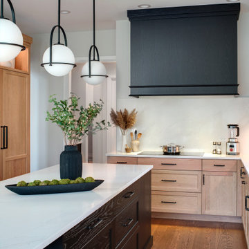
After purchasing this home, the homeowners faced a unique opportunity to reimagine their kitchen and nearby spaces. Water damage from a burst pipe had left much of the home’s interior in need of repair, and while the existing kitchen was functional and in relatively good shape, it didn’t align with the family’s vision for their new home. The layout included a peninsula that wasn’t ideal, and there were some druthers with the nearby pantry.
Since the space needed to be rebuilt anyway, the homeowners saw this as a chance to create a kitchen that was both highly functional for their four young children and timeless in its design. The project also included a refresh of the adjacent message center and dining room — spaces that play key roles in the family’s daily life. The goal was to create a cohesive flow between these areas, balancing modern functionality with the craftsman-inspired character of the rest of the home.
Design Objectives:
- Replace the outdated peninsula with a large island to maximize counter space and create new seating options.
- Open up the space visually by removing soffits and rethinking the cabinetry layout.
Incorporate concealed refrigeration and freezer units to provide significant storage for the family while maintaining a streamlined aesthetic.
- Integrate black cabinetry into the design without making the space feel harsh or heavy.
- Ensure the lighting plan balances functional task lighting with ambient accent lighting.
- Avoid visual clutter in the cabinetry design while still giving a nod to the craftsman aesthetic.
- Incorporate a slab backsplash as a key design feature.
Design Challenges:
- The outdated peninsula left dead space in the kitchen and lacked sufficient seating for the family.
- The cooktop wall was cramped, with small cabinets flanking the hood, limited storage, and soffits that made the space feel closed-in.
- The family needed significant refrigeration space (two refrigerators and a freezer) but wanted to avoid a cluttered look with visible stainless steel appliances.
- Adding black cabinetry risked making the space feel too dark or heavy.
- The original lighting plan was insufficient, particularly over the dining table where a decorative fixture proved too dim.
- The family wanted shaker-style drawer fronts to match the home’s arts-and-crafts design but worried that too much shaker cabinetry might look overly busy.
- Prioritizing a slab backsplash in the wish list priority planning.
The Renewed Space
Design Solutions:
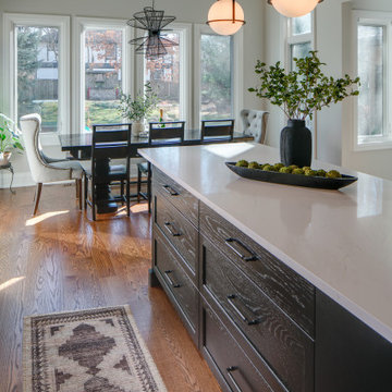
- A functional island: The peninsula was replaced with a large island that provides continuous countertop space for prepping and serving. The island also features seating for four people, creating a central hub for informal meals and activities.
- Streamlined cooktop wall: The soffits were removed, and the upper cabinets on the cooktop wall were eliminated to create a more open, streamlined design. A custom oversized hood became the focal point of the wall, with the blower unit offset inside it to align with the cooktop while maintaining exterior visual symmetry.
- Concealed refrigeration: Two column refrigerators and one freezer were integrated into the cabinetry, concealing them behind wood paneling that blends seamlessly with the overall design.
- Warm black cabinetry: The black cabinetry was crafted from hickory with a visible grain, softening its appearance and adding warmth. The grain detail gives the cabinetry a rich, textured look that avoids feeling stark or overpowering.
- Additional lighting: In the dining area, recessed can lights were added during an additional installation phase to supplement the gorgeous decorative fixture’s dim output. The new lighting plan creates a layered effect, combining functional task lighting with softer ambient lighting.
- Simplified cabinetry details: Slab drawer fronts were used on the upper drawers, while five-piece shaker fronts (with slightly less prominent rail and stile pieces) were reserved for the middle and lower drawers. This approach simplified the overall look while maintaining the craftsman-inspired aesthetic.
- Slab backsplash priority: The slab backsplash was prioritized by making thoughtful adjustments elsewhere, like opting not to extend cabinetry to the ceiling, which also helped visually prioritize the gorgeous slab backsplash. This decision also enhanced the kitchen’s furniture-like feel, aligning with the home’s craftsman character.
- This kitchen perfectly balances practicality with timeless style. By addressing the family’s functional needs — ample seating, smart storage, and effective lighting — while incorporating thoughtful design elements like warm black cabinetry and a striking slab backsplash, Alicia created a space that works beautifully for a busy household. The result is a cohesive, inviting kitchen that honors the home’s craftsman roots and will serve the family well for years to come.
 Michael Nash Design, Build & Homes
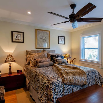
Built in the early 1950s, this small urban townhouse is located in North Old Town Alexandria in an area currently undergoing major redevelopment. The neighborhood is popular with, and affordable for, young people and families, and very convenient to Washington, DC.
In its heyday, the townhouse touted a stately brick exterior, plaster walls, tongue and groove wood flooring and beautiful wooden staircase. Sixty years later, however, the homeowners were faced with crumbling masonry, sagging floors, a double layer of wallpaper over the plaster walls, a crumbling staircase, a dysfunctional kitchen and small, dark second floor rooms. Additionally, the basement had a low ceiling, moldy and cinder block walls, no plumbing and a large boiler taking up most of the space.
The homeowners’ goal was to restore the exterior’s historic look while creating an interior up-to-date for the 21st Century. To turn their vision into reality, they turned to Michael Nash Design, Build & Homes.
Design Solutions
To maintain the townhome’s historic exterior, the Michael Nash team carefully removed, salvaged, restored and reused existing brick masonry. Matching fascia boards and windows were combined with existing windows to complete the exterior renovation.
All interior walls were gutted and reframed. New electrical work, new insulation and new drywall were installed. Much of the home’s original trim was salvaged and reused, as was a piece of art glass, all to keep a bit of the past in the renovation.
The sagging subfloors were fixed, new hard wood floors were installed and a new staircase and railing were designed in a style similar to the original.
The solid wall between the kitchen and the dining room was removed, plumbing was relocated for a new sink location and the kitchen got expanded with an island into the dining room. Closet and plumbing stacks were relocated to allow a new space for fridge. Stainless steel appliances, granite countertops and custom cabinetry highlight the new modern kitchen.
The plan called for redesigning the three bedrooms on the second floor to allow a larger bathroom, walk-in closet and wider hallways. In addition to new roofing, a large skylight was installed to allow natural light into the bathroom and the upper hallway.
The basement was totally revamped. New plumbing was put in place for a full bathroom, laundry room and a den. New e-grass window was installed in the basement to bring this basement up to current building codes.
This homeowners love the neighborhood and now their home gives them the opportunity to stay in the same location.
 Cabinet Cures of The Triangle
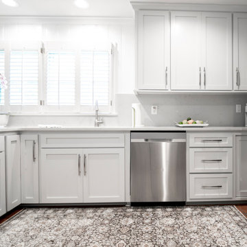
At Cabinet Cures of the Triangle, come to your home and remove all the doors, drawer fronts, molding, and hardware. We provide brand new solid wood doors and drawer fronts that we professionally finish at our shop. Style and color/stain are the client's preferences.
The new doors all come standard with new, hidden soft close hinges.
We also finish 1/4” wood, and all molding in the same color as your doors and drawers, so everything matches exactly.
At your home, we reface all exterior boxes with the finished 1/4” wood, replace all crown molding, light rail molding, and base (shoe) molding, and install the new doors, drawer fronts, and hardware.
To ensure the most professional finish, our finishing process for every item (doors, drawer fronts, molding, finish wood, etc.) involves multiple layers of stain/primer/top coat/finish and includes sanding before every coat.
In Addition to the standard refacing process, we did:
- Addition pull out for the trash bin.
- The refrigerator cabinet was extended from 12” to 24” depth, to cover and surround the fridge.

Sponsored
Columbus, OH
Structural Remodeling
Franklin County's Heavy Timber Specialists | Best of Houzz 2020!
 Endless Ideas Interiors Inc.
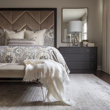
We custom designed this plush upholstered headboard, framed in a rich dark wood, to be the focal point of the room. Layers of soft, textured bedding in neutral patterns add dimension while inviting warmth. We opted to use generous sized bachelor chests as nightstands, providing the clients with additional deep drawer storage. The top drawers are perfect to keep clutter tucked away, and the beautiful hand-blown glass lamps introduce a touch of understated glamour.
 Drury Design
The Setup:
After purchasing this home, the homeowners faced a unique opportunity to reimagine their kitchen and nearby spaces. Water damage from a burst pipe had left much of the home’s interior in need of repair, and while the existing kitchen was functional and in relatively good shape, it didn’t align with the family’s vision for their new home. The layout included a peninsula that wasn’t ideal, and there were some druthers with the nearby pantry.
Since the space needed to be rebuilt anyway, the homeowners saw this as a chance to create a kitchen that was both highly functional for their four young children and timeless in its design. The project also included a refresh of the adjacent message center and dining room — spaces that play key roles in the family’s daily life. The goal was to create a cohesive flow between these areas, balancing modern functionality with the craftsman-inspired character of the rest of the home.
Design Objectives:
- Replace the outdated peninsula with a large island to maximize counter space and create new seating options.
- Open up the space visually by removing soffits and rethinking the cabinetry layout.
Incorporate concealed refrigeration and freezer units to provide significant storage for the family while maintaining a streamlined aesthetic.
- Integrate black cabinetry into the design without making the space feel harsh or heavy.
- Ensure the lighting plan balances functional task lighting with ambient accent lighting.
- Avoid visual clutter in the cabinetry design while still giving a nod to the craftsman aesthetic.
- Incorporate a slab backsplash as a key design feature.
Design Challenges:
- The outdated peninsula left dead space in the kitchen and lacked sufficient seating for the family.
- The cooktop wall was cramped, with small cabinets flanking the hood, limited storage, and soffits that made the space feel closed-in.
- The family needed significant refrigeration space (two refrigerators and a freezer) but wanted to avoid a cluttered look with visible stainless steel appliances.
- Adding black cabinetry risked making the space feel too dark or heavy.
- The original lighting plan was insufficient, particularly over the dining table where a decorative fixture proved too dim.
- The family wanted shaker-style drawer fronts to match the home’s arts-and-crafts design but worried that too much shaker cabinetry might look overly busy.
- Prioritizing a slab backsplash in the wish list priority planning.
The Renewed Space
Design Solutions:
- A functional island: The peninsula was replaced with a large island that provides continuous countertop space for prepping and serving. The island also features seating for four people, creating a central hub for informal meals and activities.
- Streamlined cooktop wall: The soffits were removed, and the upper cabinets on the cooktop wall were eliminated to create a more open, streamlined design. A custom oversized hood became the focal point of the wall, with the blower unit offset inside it to align with the cooktop while maintaining exterior visual symmetry.
- Concealed refrigeration: Two column refrigerators and one freezer were integrated into the cabinetry, concealing them behind wood paneling that blends seamlessly with the overall design.
- Warm black cabinetry: The black cabinetry was crafted from hickory with a visible grain, softening its appearance and adding warmth. The grain detail gives the cabinetry a rich, textured look that avoids feeling stark or overpowering.
- Additional lighting: In the dining area, recessed can lights were added during an additional installation phase to supplement the gorgeous decorative fixture’s dim output. The new lighting plan creates a layered effect, combining functional task lighting with softer ambient lighting.
- Simplified cabinetry details: Slab drawer fronts were used on the upper drawers, while five-piece shaker fronts (with slightly less prominent rail and stile pieces) were reserved for the middle and lower drawers. This approach simplified the overall look while maintaining the craftsman-inspired aesthetic.
- Slab backsplash priority: The slab backsplash was prioritized by making thoughtful adjustments elsewhere, like opting not to extend cabinetry to the ceiling, which also helped visually prioritize the gorgeous slab backsplash. This decision also enhanced the kitchen’s furniture-like feel, aligning with the home’s craftsman character.
- This kitchen perfectly balances practicality with timeless style. By addressing the family’s functional needs — ample seating, smart storage, and effective lighting — while incorporating thoughtful design elements like warm black cabinetry and a striking slab backsplash, Alicia created a space that works beautifully for a busy household. The result is a cohesive, inviting kitchen that honors the home’s craftsman roots and will serve the family well for years to come.
 Robin's Nest Interiors
Updated Spec Home: Foyer and Great Room
In our last post, we introduced you to my mom and sister’s Updated Spec Home; the Foyer and Great Room will be featured in this post.
Foyer
As you enter their home, to the right is a hall closet and a french door which leads to the Basement. To the left is a long wall which was perfect for an extra long console table in a rustic finish that served as a sofa table in their previous home. I love repositioning furniture, and by using this table in the entry, it makes it feel new.
Additionally, we placed a vibrant piece of art previously used in my sister’s Bedroom above the table. This piece not only sets the tone for our color palette, it also makes the kind of statement you want in your Foyer – Wow! We added accessories and an unique lamp to complete the space.
Great Room
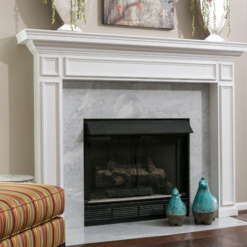
In the Great Room which is open to the Foyer, we installed our inspiration artwork in the place of honor over the mantel. Since the piece was vertical, it did not take up enough space. I do not like a “fussy” mantel with lots of accessories so we found these two vases in a silver leaf finish. They were perfect because they were large enough, but not too deep. Accessorizing mantels can be tricky because the majority of them are not deep. We went to Jan’s Floral Design to add vibrant color and interesting textures to the vases.
The original mantel was too small and uninspired. Therefore, we had our contractor Brad Anderson built a new one based on a photo of a mantel we liked. The new mantel has lots of great detail and is the appropriate proportion for the fireplace. We replaced beige 12×12 ceramic tiles with gorgeous large pieces of smoked carrara marble for a striking fireplace surround. Check out this other mantel that we updated.
For furniture, we purchased a shorter sofa in a gray tweed fabric. Typically, two throw pillows come with a sofa.We added a fun fringe to the pillows that came with the sofa. I recommend ordering pillows that match your sofa fabric and layering with custom pillows that support your color palette. We added a patterned custom pillow and a striped throw.
Next, we got a small scale recliner in a yummy gray leather for my mom and a chair and ottoman in a small scale mint and gray geometric pattern for my sister. We added an accent chair in a fun small scale stripe to fill a corner and add additional seating – which is always a good thing.
Remember that this was a Spec Home so there were no built-ins. As a result, we needed a media cabinet for the television and some bookcases to display my mom’s decorative box collection and my sister’s collection of blown colored glass. This set from Ballard Designs fit the bill perfectly. The back is open and airy with nice detail. The wood finish also adds a richness to the space.
My mom needed a space for her computer, and this small writing desk fit the space perfectly.
Finally, for finishing touches, we added a patterned rug, cornice boards in a mint leaf fabric, and great lamps for ambient lighting. These two rooms are stunning, vibrant and livable. Can’t wait to show you more in our next post! Enjoy!
Photo by Tim Furlong Jr.
84