
Search results for "Additional odds" in Home Design Ideas

 J.P. Hoffman Design Build
These homeowners came to J.P. Hoffman Design Build, looking for a creative solution to a problem they were told couldn’t be fixed. We defied the odds with our Design Build process and redesigned most of this Colonial’s first floor. Space for an island was number one on the want list. In order to achieve that goal, we did what we always do, We listened. We listened to what our client needed, how they used their space and how they envisioned their space. Then we designed a creative solution that made that seemingly unachievable vision, a reality. We removed the wall between the dining room and kitchen and expanded the kitchen cabinets into the hallway, once used to access the bathroom and garage. We simply re-routed the flow to the garage, through the now opened-up dining room, and in the process, created a new hallway with a coat closet, mudroom bench and access to the powder room which we also refreshed. In the kitchen, we relocated the slider leading out to the deck. This allowed for more cabinets and the floor space for that dream island. Our carpentry team installed a new kitchen window and slider, while modifying the existing deck to allow for the change. We installed new flooring, cabinets, countertops, plumbing fixtures and more. We receive lots of inquires about increasing function within the first floor. This project is a fantastic example of how it can be achieved, without an addition.

 San Luis Kitchen Co.
The owners of a charming home in the hills west of Paso Robles recently decided to remodel their not-so-charming kitchen. Referred to San Luis Kitchen by several of their friends, the homeowners visited our showroom and soon decided we were the best people to design a kitchen fitting the style of their home. We were delighted to get to work on the project right away.
When we arrived at the house, we found a small, cramped and out-dated kitchen. The ceiling was low, the cabinets old fashioned and painted a stark dead white, and the best view in the house was neglected in a seldom-used breakfast nook (sequestered behind the kitchen peninsula). This kitchen was also handicapped by white tile counters with dark grout, odd-sized and cluttered cabinets, and small ‘desk’ tacked on to the side of the oven cabinet. Due to a marked lack of counter space & inadequate storage the homeowner had resorted to keeping her small appliances on a little cart parked in the corner and the garbage was just sitting by the wall in full view of everything! On the plus side, the kitchen opened into a nice dining room and had beautiful saltillo tile floors.
Mrs. Homeowner loves to entertain and often hosts dinner parties for her friends. She enjoys visiting with her guests in the kitchen while putting the finishing touches on the evening’s meal. Sadly, her small kitchen really limited her interactions with her guests – she often felt left out of the mix at her own parties! This savvy homeowner dreamed big – a new kitchen that would accommodate multiple workstations, have space for guests to gather but not be in the way, and maybe a prettier transition from the kitchen to the dining (wine service area or hutch?) – while managing the remodel budget by reusing some of her major appliances and keeping (patching as needed) her existing floors.
Responding to the homeowner’s stated wish list and the opportunities presented by the home's setting and existing architecture, the designers at San Luis Kitchen decided to expand the kitchen into the breakfast nook. This change allowed the work area to be reoriented to take advantage of the great view – we replaced the existing window and added another while moving the door to gain space. A second sink and set of refrigerator drawers (housing fresh fruits & veggies) were included for the convenience of this mainly vegetarian cook – her prep station. The clean-up area now boasts a farmhouse style single bowl sink – adding to the ‘cottage’ charm. We located a new gas cook-top between the two workstations for easy access from each. Also tucked in here is a pullout trash/recycle cabinet for convenience and additional drawers for storage.
Running parallel to the work counter we added a long butcher-block island with easy-to-access open shelves for the avid cook and seating for friendly guests placed just right to take in the view. A counter-top garage is used to hide excess small appliances. Glass door cabinets and open shelves are now available to display the owners beautiful dishware. The microwave was placed inconspicuously on the end of the island facing the refrigerator – easy access for guests (and extraneous family members) to help themselves to drinks and snacks while staying out of the cook’s way.
We also moved the pantry storage away from the dining room (putting it on the far wall and closer to the work triangle) and added a furniture-like hutch in its place allowing the more formal dining area to flow seamlessly into the up-beat work area of the kitchen. This space is now also home (opposite wall) to an under counter wine refrigerator, a liquor cabinet and pretty glass door wall cabinet for stemware storage – meeting Mr. Homeowner’s desire for a bar service area.
And then the aesthetic: an old-world style country cottage theme. The homeowners wanted the kitchen to have a warm feel while still loving the look of white cabinetry. San Luis Kitchen melded country-casual knotty pine base cabinets with vintage hand-brushed creamy white wall cabinets to create the desired cottage look. We also added bead board and mullioned glass doors for charm, used an inset doorstyle on the cabinets for authenticity, and mixed stone and wood counters to create an eclectic nuance in the space. All in all, the happy homeowners now boast a charming county cottage kitchen with plenty of space for entertaining their guests while creating gourmet meals to feed them.
Credits:
Custom cabinetry by Wood-Mode Fine Custom Cabinetry
Contracting by Michael Pezzato of Lost Coast Construction
Stone counters by Pyramid M.T.M.
 House of L
Jason Miller of Pixelate Ltd.
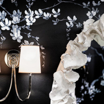
A formal powder room that lost its luster gets a huge makeover and regains glamour with this complete revamp. Originally, the room housed an oddly placed round vanity that floated in the middle of the room, making for a very awkward walking space to the commode room. A window that looked out to the exterior of the home prior to a Sun Room addition was left in creating another mar in the potential this generously sized bath offered if laid out properly. During the renovation, the plumbing was moved to the far right wall and sconces flanked either side. The center fixture was replaced with a flush-mount that filled the space nicely while still accentuating the overall design. The inspiration for the asian-motif floral mural came from the foyer (the bath is directly off of it) and its original moldings and black and white palette dating to the late 20's, which although had been repainted, still maintained the feel of that period. The sweeping blossoms lend a sense of whimsy and the saturated backdrop gives the blooms a dewy effect as if kissed by moonlight. The goal was to have an eye drawing element in the foyer since the door would be left open most of the time and the was definitely achieved by the graphic use of texture and color in this bath.
Find the right local pro for your project
 House of L
Jason Miller of Pixelate Ltd.
A formal powder room that lost its luster gets a huge makeover and regains glamour with this complete revamp. Originally, the room housed an oddly placed round vanity that floated in the middle of the room, making for a very awkward walking space to the commode room. A window that looked out to the exterior of the home prior to a Sun Room addition was left in creating another mar in the potential this generously sized bath offered if laid out properly. During the renovation, the plumbing was moved to the far right wall and sconces flanked either side. The center fixture was replaced with a flush-mount that filled the space nicely while still accentuating the overall design. The inspiration for the asian-motif floral mural came from the foyer (the bath is directly off of it) and its original moldings and black and white palette dating to the late 20's, which although had been repainted, still maintained the feel of that period. The sweeping blossoms lend a sense of whimsy and the saturated backdrop gives the blooms a dewy effect as if kissed by moonlight. The goal was to have an eye drawing element in the foyer since the door would be left open most of the time and the was definitely achieved by the graphic use of texture and color in this bath.

 Rosenberg Kolb Architects
Our client came to us with the idea of renovating some of the rooms for their three growing children, twin boys and a girl, in this apartment on Riverside Drive with breath-taking views of the Hudson River. The original bedrooms were crowded with built-in pieces and the boys used to share one room. As their needs are changing as they grow, our clients wanted to renovate their childish bedrooms and give them new bedrooms for each one of them that would still feel ‘updated’ and ‘grown up’ for many more years to come. A previously room used as a Den, was transformed into a bedroom for one of the boys, while the other one kept the original bedroom. Both spaces have similar materials and fabrics, but each has a color scheme that was developed from the kids’ favorite colors, the built-in desk, shelving and platform bed in dark mahogany gives the rooms a more masculine and grown up feel. The girl’s room was a very small and odd space with angled walls; to make the room more square and symmetrical, a new desk with shelves, built-in closet, night-stand and platform bed were installed around the perimeter of the room. This layout allowed for additional space for a reading chair, floor lamp and side table. The color palette for this bedroom was also based on the girl’s favorite colors: purple and green, which were wisely used over a background of cream color used throughout the cabinetry and carpet to avoid feeling overwhelming in the small space. Most of the vertical surfaces in all three rooms were covered in a tackable material so they could display posters and school work, yet the textile wall covering gives the walls a very elegant feel when the posters come off.
 J.P. Hoffman Design Build
These homeowners came to J.P. Hoffman Design Build, looking for a creative solution to a problem they were told couldn’t be fixed. We defied the odds with our Design Build process and redesigned most of this Colonial’s first floor. Space for an island was number one on the want list. In order to achieve that goal, we did what we always do, We listened. We listened to what our client needed, how they used their space and how they envisioned their space. Then we designed a creative solution that made that seemingly unachievable vision, a reality. We removed the wall between the dining room and kitchen and expanded the kitchen cabinets into the hallway, once used to access the bathroom and garage. We simply re-routed the flow to the garage, through the now opened-up dining room, and in the process, created a new hallway with a coat closet, mudroom bench and access to the powder room which we also refreshed. In the kitchen, we relocated the slider leading out to the deck. This allowed for more cabinets and the floor space for that dream island. Our carpentry team installed a new kitchen window and slider, while modifying the existing deck to allow for the change. We installed new flooring, cabinets, countertops, plumbing fixtures and more. We receive lots of inquires about increasing function within the first floor. This project is a fantastic example of how it can be achieved, without an addition.

 Quigley Architects
Modern House Productions
Family room - large traditional open concept medium tone wood floor family room idea in Minneapolis with a standard fireplace, a stone fireplace, a media wall and gray walls
Family room - large traditional open concept medium tone wood floor family room idea in Minneapolis with a standard fireplace, a stone fireplace, a media wall and gray walls
Sponsored
Columbus, OH

Structural Remodeling
Franklin County's Heavy Timber Specialists | Best of Houzz 2020!

 Gregory Thomas Residential Architecture
Kitchen
The kitchen is anchored as a gathering space with its blue-accented entertaining island. The island has plenty of seating for visiting with the cooks and for serving informal meals. The clean-up sink faces toward the east and the back deck and yard. To its right is a paneled dishwasher, and a built-in fridge that's readily accessible to the breakfast table (out of view here) and outdoor deck. To the left of the sink is an appliance garage with a lift-up door.
oak trim; new oak floors; Sub Zero refrigerator; Wolf range & hood; 3cm Brazilian Black granite counters with thumbnail edge detail; 3cm Verde Pavoa granite island with thumbnail edge; lower cabinets painted Seattle Mist by Benjamin Moore; upper cabinets painted Swiss Coffee by Benjamine Moore; island painted Dark Pewter by Benjamin Moore; 6" x 13" rhomboid glazed ceramic tile at backsplash by Walker Zanger.
Construction by CG&S Design-Build.
Photography by Tre Dunham, Fine focus Photography

 Michael Nash Design, Build & Homes
This growing family of six was struggling with a dysfunctional kitchen design. The center island had been installed at an odd angle that limited accessibility and traffic flow. Additionally, storage space was limited by poor cabinet design. Finally, doorways in and out of the kitchen were narrow and poorly located, especially for children dashing in and out.
Other design challenges included how to better use a 10’ x 12’ room for children’s jackets and toys and how to add a professional-quality gas range in a neighborhood were natural gas wasn’t available. The new design would address all of these issues.
DESIGN SOLUTIONS
The new kitchen design revolves around a more proportional island. Carefully placed in the center of the new space with seating for four, it includes a prep sink, a second dishwasher and a beverage center.
The distressed ebony-stained island and hutch provides a brilliant contrast between the white color cabinetry. White Carrera marble countertops and backsplash top both island and perimeter cabinets.
Tall, double stacked cabinetry lines two walls to maximize storage space. Across the room there was an unused wall that now contains a 36” tower fridge and freezer, both covered with matching panels, and a tall cabinet that contains a microwave, steam unit and warming drawer.
A propane tank was buried in the back yard to provide gas to a new 60” professional range and cooktop. A custom-made wood mantel hood blends perfectly with the cabinet style.
The old laundry room was reconfigured to have lots of locker space for all kids and added cabinetry for storage. A double entry door separated the new mudroom from the rest of the back hall. In the back hall the back windows were replaced with a set of French door and added decking to create a direct access to deck and backyard.
The end result is an open floor plan, high-end appliances, great traffic flow and pleasing colors. The homeowner calls it the “kitchen of her dreams.”
 Michael Nash Design, Build & Homes
This growing family of six was struggling with a dysfunctional kitchen design. The center island had been installed at an odd angle that limited accessibility and traffic flow. Additionally, storage space was limited by poor cabinet design. Finally, doorways in and out of the kitchen were narrow and poorly located, especially for children dashing in and out.
Other design challenges included how to better use a 10’ x 12’ room for children’s jackets and toys and how to add a professional-quality gas range in a neighborhood were natural gas wasn’t available. The new design would address all of these issues.
DESIGN SOLUTIONS
The new kitchen design revolves around a more proportional island. Carefully placed in the center of the new space with seating for four, it includes a prep sink, a second dishwasher and a beverage center.
The distressed ebony-stained island and hutch provides a brilliant contrast between the white color cabinetry. White Carrera marble countertops and backsplash top both island and perimeter cabinets.
Tall, double stacked cabinetry lines two walls to maximize storage space. Across the room there was an unused wall that now contains a 36” tower fridge and freezer, both covered with matching panels, and a tall cabinet that contains a microwave, steam unit and warming drawer.
A propane tank was buried in the back yard to provide gas to a new 60” professional range and cooktop. A custom-made wood mantel hood blends perfectly with the cabinet style.
The old laundry room was reconfigured to have lots of locker space for all kids and added cabinetry for storage. A double entry door separated the new mudroom from the rest of the back hall. In the back hall the back windows were replaced with a set of French door and added decking to create a direct access to deck and backyard.
The end result is an open floor plan, high-end appliances, great traffic flow and pleasing colors. The homeowner calls it the “kitchen of her dreams.”

 Tracey Stephens Design, LLC
Wing Wong/Memories TTL
Example of a mid-sized transitional u-shaped slate floor and gray floor eat-in kitchen design in New York with a farmhouse sink, recessed-panel cabinets, white cabinets, marble countertops, white backsplash, brick backsplash, paneled appliances and a peninsula
Example of a mid-sized transitional u-shaped slate floor and gray floor eat-in kitchen design in New York with a farmhouse sink, recessed-panel cabinets, white cabinets, marble countertops, white backsplash, brick backsplash, paneled appliances and a peninsula
 J.P. Hoffman Design Build
These homeowners came to J.P. Hoffman Design Build, looking for a creative solution to a problem they were told couldn’t be fixed. We defied the odds with our Design Build process and redesigned most of this Colonial’s first floor. Space for an island was number one on the want list. In order to achieve that goal, we did what we always do, We listened. We listened to what our client needed, how they used their space and how they envisioned their space. Then we designed a creative solution that made that seemingly unachievable vision, a reality. We removed the wall between the dining room and kitchen and expanded the kitchen cabinets into the hallway, once used to access the bathroom and garage. We simply re-routed the flow to the garage, through the now opened-up dining room, and in the process, created a new hallway with a coat closet, mudroom bench and access to the powder room which we also refreshed. In the kitchen, we relocated the slider leading out to the deck. This allowed for more cabinets and the floor space for that dream island. Our carpentry team installed a new kitchen window and slider, while modifying the existing deck to allow for the change. We installed new flooring, cabinets, countertops, plumbing fixtures and more. We receive lots of inquires about increasing function within the first floor. This project is a fantastic example of how it can be achieved, without an addition.
 J.P. Hoffman Design Build
These homeowners came to J.P. Hoffman Design Build, looking for a creative solution to a problem they were told couldn’t be fixed. We defied the odds with our Design Build process and redesigned most of this Colonial’s first floor. Space for an island was number one on the want list. In order to achieve that goal, we did what we always do, We listened. We listened to what our client needed, how they used their space and how they envisioned their space. Then we designed a creative solution that made that seemingly unachievable vision, a reality. We removed the wall between the dining room and kitchen and expanded the kitchen cabinets into the hallway, once used to access the bathroom and garage. We simply re-routed the flow to the garage, through the now opened-up dining room, and in the process, created a new hallway with a coat closet, mudroom bench and access to the powder room which we also refreshed. In the kitchen, we relocated the slider leading out to the deck. This allowed for more cabinets and the floor space for that dream island. Our carpentry team installed a new kitchen window and slider, while modifying the existing deck to allow for the change. We installed new flooring, cabinets, countertops, plumbing fixtures and more. We receive lots of inquires about increasing function within the first floor. This project is a fantastic example of how it can be achieved, without an addition.

Sponsored
Columbus, OH
Structural Remodeling
Franklin County's Heavy Timber Specialists | Best of Houzz 2020!
 Michael Nash Design, Build & Homes
This growing family of six was struggling with a dysfunctional kitchen design. The center island had been installed at an odd angle that limited accessibility and traffic flow. Additionally, storage space was limited by poor cabinet design. Finally, doorways in and out of the kitchen were narrow and poorly located, especially for children dashing in and out.
Other design challenges included how to better use a 10’ x 12’ room for children’s jackets and toys and how to add a professional-quality gas range in a neighborhood were natural gas wasn’t available. The new design would address all of these issues.
DESIGN SOLUTIONS
The new kitchen design revolves around a more proportional island. Carefully placed in the center of the new space with seating for four, it includes a prep sink, a second dishwasher and a beverage center.
The distressed ebony-stained island and hutch provides a brilliant contrast between the white color cabinetry. White Carrera marble countertops and backsplash top both island and perimeter cabinets.
Tall, double stacked cabinetry lines two walls to maximize storage space. Across the room there was an unused wall that now contains a 36” tower fridge and freezer, both covered with matching panels, and a tall cabinet that contains a microwave, steam unit and warming drawer.
A propane tank was buried in the back yard to provide gas to a new 60” professional range and cooktop. A custom-made wood mantel hood blends perfectly with the cabinet style.
The old laundry room was reconfigured to have lots of locker space for all kids and added cabinetry for storage. A double entry door separated the new mudroom from the rest of the back hall. In the back hall the back windows were replaced with a set of French door and added decking to create a direct access to deck and backyard.
The end result is an open floor plan, high-end appliances, great traffic flow and pleasing colors. The homeowner calls it the “kitchen of her dreams.”
 Twelve Stones Designs, LLC
The owners of this kitchen had spent the money to upgrade the finishes in their kitchen upon building the home 12 years ago, but after living in the space for several years they realized how nonfunctional the layout really was. The (then) two preschool aged children had grown into busy, hungry teenagers with many friends who also liked to hang out at the house. So the family needed a more functional kitchen with better traffic flow, space for daily activities revolving around the kitchen at different times of day, and a kitchen that could accommodate cooking for and serving large groups. Furthermore, the dark, traditional finishes no longer reflected the homeowners’ style. They requested a brighter, more relaxed, coastal style that reflected their love of the seaside cities they like to visit.
Originally, the kitchen was U-shaped with a narrow island in the middle. The island created narrow aisles that bottle-necked at the dishwasher, refrigerator, and cooktop areas. There was a pass-through from the foyer into the kitchen, but the owners never liked that the pass-through was also located so close to the powder room. The awkward proximity was unappealing and made guests feel uncomfortable.
The kitchen’s storage was made up of lots of narrow cabinets, apothecary drawers, clipped corner units, and very few drawers. It lacked useful storage for the larger items the family used on a daily basis. And the kitchen’s only pantry was small closet that had only builder-grade, narrow shelving with no illumination to be able to see the contents inside.
Overall, the kitchen’s lighting plan was poorly executed. Only six recessed cans illuminated the entire kitchen and nook areas. The under cabinet lighting was not evenly distributed either. In fact, the builder had mis-placed the under cabinet lighting around the decorative pilasters which made for choppy, dark cubbies. Further, the builder didn’t include any lighting over the sink or the bar area, which meant whoever was doing the dishes was always in their own shadow. That, coupled with the steep overhang of the game room above made the bar area feel like a dim, cavernous space that wasn’t inviting or task oriented. The kitchen looked out into the main living space, but the raised bar and a narrow wall (which held the only large cabinet in the kitchen) created more of a barrier than a relationship to the living room or breakfast nook. In fact, one couldn’t even see the breakfast nook from the cooktop or sink areas due to its orientation. The raised bar top was too narrow to comfortably sit to either dine at or chat from due to the lack of knee space. The the homeowners confided that the kitchen felt more like a dark, dirty prison than place where the family, or their guests, wanted to gather and commune.
The clients' needs and desires were:
➢ to create a kitchen that would be a space the family loved to be in; to relate to the adjacent spaces all around, and to have better flow for entertaining large groups
➢ to remove the walls between the breakfast nook and living area and to be able to utilize the natural light from the windows in both those areas
➢ to incorporate a functional chopping block for prepping fresh food for home cooked meals, an island with a large sink and drain board, 2 pull out trash cans, and seating for at least the 2 teens to eat or do homework
➢ to design a kitchen and breakfast nook with an airy, coastal, relaxed vibe that blended with the rest of the house's coastal theme
➢ to integrate a layered lighting plan which would include ample general illumination, specific task lighting, decorative lighting, and lots of illuminated storage
➢ to design a kitchen with not only more storage for all the husband’s kitchen gadgets and collection of oils and spices, but smart storage, including a coffee/breakfast bar and a place to store and conceal the toaster oven and microwave
➢ to find a way to utilize the large open space between the kitchen, pantry area, and breakfast nook
Twelve Stones Designs achieved the owner's goals by:
➢ removing the walls between the kitchen and living room to allow the natural light to filter in from the adjacent rooms and to create a connection between the kitchen, nook, and living spaces for a sense of unity and communion
➢ removing the existing pantry and designing 3 large pantry style cabinets with LED tape lights and rollout drawers to house lots of kitchen appliances, gadgets, and tons of groceries. We also took the cabinets all the way up to the 9’ ceiling for additional storage for seasonal items and bulk storage.
➢ designing 2 islands - 1 with a gorgeous black walnut chopping block that houses a drawer for chopping and carving knives and a custom double pull out trash unit for point of use utilization - and 1 that houses the dishwasher, a large Blanco Gourmet sink with integrated drain board, woven baskets for fresh root vegetables and kitchen towels, plenty of drawer storage for kitchen items, and bar seating for up to 4 diners.
➢ closing off the space between the kitchen and the powder room to create a beautiful new private alcove for the powder room as well as adding some decorative storage. This also gave us space to include more tall storage near the new range for precision placement of the husband’s extensive oil and spice collection as well as a location for a combo-steam oven the wife wanted for baking and cooking healthy meals.
The project is enhanced functionally by:
➢ incorporated USB and standard receptacles for the kids’ laptops and phone charging in the large island
➢ designing the small island to include additional open shelving for items used on a daily basis such as a variety of bowls, plates, and colanders. This set up also works well for the husband who prefers to “plate” his dinners in restaurant-style fashion before presenting them to the table.
➢ the integration of specific storage units, such as double stacked cutlery drawers, a custom spice pull-out, a Kuerig coffee and tea pod drawer, and custom double stacked utensil drawers
➢ moving the refrigerator to the old oven location - this eliminated the bottle neck as well as created a better relationship to the eating table. It also utilizes the floor space between the pantry, nook, and kitchen
➢ creating a banquet style breakfast nook - this banquette seating not only doubles the amount of seating for large gatherings but it better utilizes the odd space between the kitchen and the previous nook area. It also helps to create a distinct pathway from the mudroom room through the pantry area, kitchen, nook, and living room.
➢ the coffee/breakfast bar area which includes the perfect location for the concealed microwave and toaster oven, convenient storage for the coffee pods and tea accoutrements. Roll-out drawers below also house the smoothie maker, hot water kettle, and a plethora of smoothie-making ingredients such as protein powders, smoothie additives, etc. Furthermore, the drawers below the Keurig house measuring utensil, cutlery, baking supplies and tupperware storage.
➢ incorporating lots of wide drawers and pullouts to accommodate large cookware.
➢ utilizing as much vertical space as possible by building storage to the ceiling which accommodates the family’s abundant amount of serving platters, baking sheets, bakeware, casserole dishes, and additional cutting boards.
The project is enhanced aesthetically by:
➢ new 5-piece Versailles pattern porcelain tile that now seamlessly joins the entire down stairs area together creating a bright, cohesiveness feeling instead of choppy separated spaces - it also adds a coastal feeling
➢ designing a cabinet to conceal the microwave and toaster oven
➢ the coastal influenced light fixtures over the nook table and island
➢ the sandy colors of the Langdon Cambria countertops. The swirling pattern and sparkling quartz pieces remind the homeowner of black-and-tan sandy beaches
➢ the striped banquet seating whose creamy white background and blue-green stripes were the inspiration for the cabinet and wall colors.
➢ All the interior doors were painted black to coordinate with the blacks and grays in the backsplash tile and countertop. This also adds a hint of tailored formality to an otherwise casual space.
➢ the use of WAC's Oculux small aperture LED units for the overhead lighting complimented with Diode LED strips for task lighting under the cabinets and inside the pantry and glass wall cabinets. All of the lighting applications are on separate dimmer switches.
Innovative uses of materials or construction methods by Realty Restoration LLC:
➢ Each 1-1/2” x 3” block of reclaimed end-grain black walnut that makes up the center island chopping block was hand milled and built in the shop. It was designed to look substantial and proportional to the surrounding elements, executed by creating the 4 inch tall top with a solid wood chamfered edge band.
➢ The metal doors on either side of the vent hood were also custom designed for this project and built in the Realty Restoration LLC shop. They are made 1x2, 11-gauge mild steel with ribbed glass. Weighing 60 lbs a piece, heavy duty cabinet hinges were added to support the weight of the door and keep them from sagging.
➢ Under-cabinet receptacles were added along the range wall in order to have a clean, uninterrupted backsplash.
Design obstacles to overcome:
➢ Because we were removing the demising walls between the kitchen and living room, we had to find a way to plumb and vent the new island. We did this by tunneling through the slab (the slab had post tension cables which prevented us from just trenching) to run a new wet vent through a nearby structural wall. We pulled the existing hot and cold lines between upper floor joists and ran them down the structural wall as well and up through a conduit in the tunnel.
➢ Since we were converting from wall overs to a gas range it allowed us to utilize the 220 feed for the wall ovens to provide a new sub panel for all the new kitchen circuits
➢ Due to framing deficiencies inherited from the original build there was a 1-1/2” differential in the floor-to-ceiling height over a 20 foot span; by utilizing the process of cutting and furring coupled with the crown moulding details on the cabinet elevations we were able to mask the problem and provide seamless transitions between the cabinet components.
Evidence of superior craftsmanship:
➢ uniquely designed, one-of-a-kind metal “X” end panels on the large island. The end panels were custom made in the Realty Restoration LLC shop and fitted to the exact dimensions of the island. The welding seams are completely indistinguishable - the posts look like they are cut from a single sheet of metal
➢ square metal posts on the small island were also custom made and designed to compliment and carry through the metal element s throughout the kitchen
➢ the beautiful, oversized end panels on the pantry cabinets which give the breakfast nook a tailored look
➢ integrating a large format 5 piece Versailles tile pattern to seamlessly flow from the existing spaces into the new kitchen space
➢ By constructing a custom cabinet that jogged around a corner we could not remodel (housing the entry way coat closet) we were able to camouflage the adjacent wall offset within the upper and lower cabinets. By designing around the existing jog in the structural walls we accomplished a few things: we were able to find the space to house, and hide, the microwave and toaster oven yet still have a clean cohesive appearance from the kitchen side. Additionally, the owners were able to keep their much needed coat closet and we didn’t have to increase the budget with unnecessary structural work.
 Michael Nash Design, Build & Homes
This growing family of six was struggling with a dysfunctional kitchen design. The center island had been installed at an odd angle that limited accessibility and traffic flow. Additionally, storage space was limited by poor cabinet design. Finally, doorways in and out of the kitchen were narrow and poorly located, especially for children dashing in and out.
Other design challenges included how to better use a 10’ x 12’ room for children’s jackets and toys and how to add a professional-quality gas range in a neighborhood were natural gas wasn’t available. The new design would address all of these issues.
DESIGN SOLUTIONS
The new kitchen design revolves around a more proportional island. Carefully placed in the center of the new space with seating for four, it includes a prep sink, a second dishwasher and a beverage center.
The distressed ebony-stained island and hutch provides a brilliant contrast between the white color cabinetry. White Carrera marble countertops and backsplash top both island and perimeter cabinets.
Tall, double stacked cabinetry lines two walls to maximize storage space. Across the room there was an unused wall that now contains a 36” tower fridge and freezer, both covered with matching panels, and a tall cabinet that contains a microwave, steam unit and warming drawer.
A propane tank was buried in the back yard to provide gas to a new 60” professional range and cooktop. A custom-made wood mantel hood blends perfectly with the cabinet style.
The old laundry room was reconfigured to have lots of locker space for all kids and added cabinetry for storage. A double entry door separated the new mudroom from the rest of the back hall. In the back hall the back windows were replaced with a set of French door and added decking to create a direct access to deck and backyard.
The end result is an open floor plan, high-end appliances, great traffic flow and pleasing colors. The homeowner calls it the “kitchen of her dreams.”

 Zelaya Properties LLC
We used: Custom cherry cabinetry in Arts & Crafts Shaker style by Kabinart in Boulder and Espresso stains. Liberty Hardware Venetian bronze 1-1/2" cabinet knobs. KitchenAid Architect II Series 22 CF counter-depth French door refrigerator. KitchenAid Architect Series II 27" convection single wall oven. KitchenAid 36" 6-burner dual fuel freestanding commercial-style range. KitchenAid Architect II Series 24" dishwasher. Sharp Insight Pro Series 24" built-in microwave drawer (Model #KB6524PS). Crystorama Solaris 12" wide pendant lights in English bronze. Granite countertops in Brown Fantasy. 3"x6" polished marble backsplash.
Paint colors:
Walls: Glidden Silver Cloud 30YY 63/024
Ceilings/Trims/Doors: Glidden Swan White GLC23
Robert B. Narod Photography

Sponsored
Columbus, OH

Hope Restoration & General Contracting
Columbus Design-Build, Kitchen & Bath Remodeling, Historic Renovations


 House + House Architects
A tiny 1906 earthquake relief home nestled at the end of a narrow alley on the western slope of Telegraph Hill had been lifted above a garage in the 1930’s then added onto in the 1950’s. Built on the foundations of a church destroyed in the earthquake, the original home had an awkward plan, low ceilings, dark spaces and a collection of odd and clumsy materials. Positioned in the center of the block, with distant views to Nob Hill this is a distinctly urban setting, yet the home is surrounded by its neighbor’s gardens. Directly behind the home stood one of the largest Japanese maple trees in Northern California. This beautiful tree and its preservation prompted the architect to incorporate it as the focal point around which the new home evolved. During the remodel the 1950’s addition was demolished, the remaining structure gutted and 400 additional square feet were added to create a dramatic new contemporary home of high ceilings and flowing spaces all filled with natural light. Carefully skewed geometry and a sleek palette of materials in sensuous colors compliment the drama of space and garden.
In the shadow of the City’s historic landmark Coit Tower, this home is still a tiny wood sided bungalow from the street. The surprise hits immediately when one enters and an 18-foot high grid of windows embraces the Japanese Maple into the corner of the living room. The curving stairway wraps the bar, defining the kitchen and connects to an open bridge flying above to the secluded master bedroom. An arc of perforated steel off the master bedroom deck recalls the radiating forms inside, screening for privacy while filtering rays of sunlight. Radiating lines scored into the rose colored concrete further accentuate the rigorous geometry. Flush overlay birch cabinets are dyed purple for a continuing flow of color from the carpet. Black knobs, appliances, sink and laminate counters complete a composition, which starts with the black hex-crete concrete counter of the bar. Swirls ground into the aluminum facing of the bar wrap a sparkle into the foot of the stair. Sculpted walls shape the space and form niches, each washed with light from geometric fixtures, all linked by the rhythm of the steel cable rails. Smooth exterior grade plywood siding stained gray and turquoise provides crisp form on the exterior, at once in scale with the neighborhood, while denying scale altogether.
 House + House Architects
A tiny 1906 earthquake relief home nestled at the end of a narrow alley on the western slope of Telegraph Hill had been lifted above a garage in the 1930’s then added onto in the 1950’s. Built on the foundations of a church destroyed in the earthquake, the original home had an awkward plan, low ceilings, dark spaces and a collection of odd and clumsy materials. Positioned in the center of the block, with distant views to Nob Hill this is a distinctly urban setting, yet the home is surrounded by its neighbor’s gardens. Directly behind the home stood one of the largest Japanese maple trees in Northern California. This beautiful tree and its preservation prompted the architect to incorporate it as the focal point around which the new home evolved. During the remodel the 1950’s addition was demolished, the remaining structure gutted and 400 additional square feet were added to create a dramatic new contemporary home of high ceilings and flowing spaces all filled with natural light. Carefully skewed geometry and a sleek palette of materials in sensuous colors compliment the drama of space and garden.
In the shadow of the City’s historic landmark Coit Tower, this home is still a tiny wood sided bungalow from the street. The surprise hits immediately when one enters and an 18-foot high grid of windows embraces the Japanese Maple into the corner of the living room. The curving stairway wraps the bar, defining the kitchen and connects to an open bridge flying above to the secluded master bedroom. An arc of perforated steel off the master bedroom deck recalls the radiating forms inside, screening for privacy while filtering rays of sunlight. Radiating lines scored into the rose colored concrete further accentuate the rigorous geometry. Flush overlay birch cabinets are dyed purple for a continuing flow of color from the carpet. Black knobs, appliances, sink and laminate counters complete a composition, which starts with the black hex-crete concrete counter of the bar. Swirls ground into the aluminum facing of the bar wrap a sparkle into the foot of the stair. Sculpted walls shape the space and form niches, each washed with light from geometric fixtures, all linked by the rhythm of the steel cable rails. Smooth exterior grade plywood siding stained gray and turquoise provides crisp form on the exterior, at once in scale with the neighborhood, while denying scale altogether.
24