
Search results for "Additionally introduce" in Home Design Ideas

 TVL Creative Ltd.
This remodel took an extremely dark & dated kitchen and transformed it into a bright and airy happy place for our client. The existing conditions created a dark, hall-like kitchen that greatly lacked in function and did little to optimize storage. Realizing the potential of this truly massive space, we created a design that utilizes every inch of the kitchen and creates functional cooking and prep space as well as pantry storage and work nooks. Our first order of business was to demo out the blocky corner that separated the kitchen from the living room. This involved removing an existing fireplace, re-structuring a wall, and having an entirely new furnace installed in the basement to eliminate a duct running right through the corner we hoped to eliminate. After opening up the space, we focused on highlighting and brightening the room. New NuCore flooring was installed to give the kitchen a fresh look while offering optimal function and cleanability. Two-toned cabinets in a honey maple and painted silk were used to create a warm and comfortable balance throughout the space. New quartz countertops in MSI's canvas were installed, and butcher block was installed on the two desk areas to offer a warm visual relief and casual work surface. The color palette for the kitchen is reminiscent of a cozy apothecary; we utilized fresh greens with Sherwin Williams paint on the walls and Treviso Gray Sage glazed subway tiles on the backsplash. Over the sink, we designed a playful highlight with counter-to-ceiling mini brick mosaic in a dark crackle green. We introduced additional lighting throughout including new recessed lights, over-sink light, and under-cabinet lights. New appliances were introduced to the space as well, and we complimented the stainless steel of these fixtures to the transitional nickel hardware on the cabinets. This space now feels open and inviting, and is visible from the second you enter the front door! We are so proud of this result and so happy that our clients can enjoy this gorgeous kitchen for years to come.

 Barcelona Designs
The Womb Chair & Ottoman by Barcelona Designs originally designed by Eero Saarinen continues to be one of the most recognized representations of mid-century modernism. This Saarinen-inspired womb lounge chair and ottoman set has both pieces attached with cushions for maximum comfort and support. Sitting down has never looked so stylish before. The womb chair is the bastion of neo-futuristic artwork, for which designer Eero Saarinen was well-established for.
Additionally, the Saarinen Womb Chair and Ottoman provides unmatched comfort with molded foam over a fiberglass shell. The designer was able to create a piece that provides a relaxed sitting posture. Introduced in 1948, the Womb Chair and Ottoman is one of the most popular designs to come out of the 1940s. Saarinen realized that people sit in many different ways; he designed a chair that is comfortable whether lounging, slouching, or sitting with a leg thrown over the armrest. Paired with the Womb Ottoman, you may find yourself in the lap of luxury. Our high-quality reproduction is crafted of a wool mixed fabric in a variety of colors

 Bianchi Design
Previously, this yard was burdened by a typical boulder pile pool, that was heaped higher than typical, trying to hide the towering wall behind. At first, the clients sought merely to reconfigure the BBQ that was congesting the patio, but upon further analysis, they decided it was time to strip the entire yard, leaving only the pool shell. Bianchi’s solution introduced an array of four arbors to distract the eye from the wall behind, solving what the boulder waterfall could never do.
Additionally, the wall was painted a dark earth tone to add contrast and depth. This strategy enabled the wall to recede into the distance, while the agave blue grey arbors floated forward visually from the background. Previously, the patios were a hodgepodge of deck islands that were impossible to navigate, and were of insufficient size to arrange furniture on. A well organized patio streamlined the traffic flow and the living space, featuring a cast in place concrete fire pit and banco couch, as well as a new outdoor bistro, glowing with filtered light from the canvas shade sails overhead.
A turquoise glass overflow spa became the yards focal point, sharing the space between the pool and outdoor living. The striking symmetry of the spa and pot pedestal with regal cacti arrangement behind, flanked by the arbors on either side, created a stately first impression from the front door. This teaser was just a glimpse of what could not yet be seen serving as an invitation to explore and enjoy as the yard unfolds.
See more about this project & hear from the homeowner here: https://www.youtube.com/watch?v=7eT3RkLkg5w&feature=youtu.be
Find the right local pro for your project

 User
Think of the Noon Starter Kit as mission control center, but for your house. Play music, and even control your lighting with your voice using Amazon Alexa or Google Assistant.

 Zieba Builders, Inc.
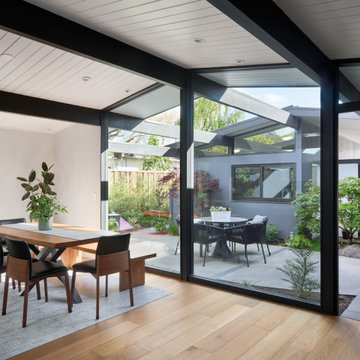
Built in the 1960’s, this 1,566 sq. ft. single story home needed updating and visual interests. The clients love to entertain and wanted to create a welcoming, fun atmosphere. Their wish lists were to have an enclosed courtyard to utilize the outdoor space, an open floor plan providing a bigger kitchen and better flow, and to incorporate a mid-century modern style.
The goal of this project was to create an open floor plan that would allow for better flow and function, thereby providing a more usable workspace and room for entertaining. We also incorporate the mid-century modern feel throughout the entire home from the inside to the out, bringing elements of design to all the spaces resulting in a completely uniform home.
Opening-up the space and removing any visual barriers resulted in the interior and exterior spaces appearing much larger. This allowed a much better flow into the space, and a flood of natural sunlight from the windows into the living area. We were able to enclose the outside front space with a rock wall and a gate providing additional square footage and a private outdoor living space. We also introduced materials such as IPE wood, stacked stone, and metal to incorporate into the exterior which created a warm, aesthetically pleasing, and mid-century modern courtyard.

 DDLA Design Landscape Architecture
Completed in 2019, this old school Tudor style home underwent a refreshing update to create a clean transitional style residence and completely new presence on the street. The previous front yard was tight and over planted and offered no parking for the owner or guests.
The owner asked DDLA Design to create an all new front entry to provide a more welcoming entry experience with new parking areas. To do this, we introduced a low stone retaining wall in the front yard to create a defined, circular driveway that provided a comfortable parking and turning radius for an estate of this scale. The front driveway used a combination of decorative pavers to create interesting patterns and borders to compliment the stone used on the entry steps and caps.
The front landscaping and planting areas were simplified using lower and more ornamental plantings to provide accents of color and evergreen background. Additional decorative urns were used to frame and accent the entry steps to the side garden and front door.
 TVL Creative Ltd.
This remodel took an extremely dark & dated kitchen and transformed it into a bright and airy happy place for our client. The existing conditions created a dark, hall-like kitchen that greatly lacked in function and did little to optimize storage. Realizing the potential of this truly massive space, we created a design that utilizes every inch of the kitchen and creates functional cooking and prep space as well as pantry storage and work nooks. Our first order of business was to demo out the blocky corner that separated the kitchen from the living room. This involved removing an existing fireplace, re-structuring a wall, and having an entirely new furnace installed in the basement to eliminate a duct running right through the corner we hoped to eliminate. After opening up the space, we focused on highlighting and brightening the room. New NuCore flooring was installed to give the kitchen a fresh look while offering optimal function and cleanability. Two-toned cabinets in a honey maple and painted silk were used to create a warm and comfortable balance throughout the space. New quartz countertops in MSI's canvas were installed, and butcher block was installed on the two desk areas to offer a warm visual relief and casual work surface. The color palette for the kitchen is reminiscent of a cozy apothecary; we utilized fresh greens with Sherwin Williams paint on the walls and Treviso Gray Sage glazed subway tiles on the backsplash. Over the sink, we designed a playful highlight with counter-to-ceiling mini brick mosaic in a dark crackle green. We introduced additional lighting throughout including new recessed lights, over-sink light, and under-cabinet lights. New appliances were introduced to the space as well, and we complimented the stainless steel of these fixtures to the transitional nickel hardware on the cabinets. This space now feels open and inviting, and is visible from the second you enter the front door! We are so proud of this result and so happy that our clients can enjoy this gorgeous kitchen for years to come.
Sponsored
Columbus, OH

Structural Remodeling
Franklin County's Heavy Timber Specialists | Best of Houzz 2020!
 DDLA Design Landscape Architecture
Completed in 2019, this old school Tudor style home underwent a refreshing update to create a clean transitional style residence and completely new presence on the street. The previous front yard was tight and over planted and offered no parking for the owner or guests.
The owner asked DDLA Design to create an all new front entry to provide a more welcoming entry experience with new parking areas. To do this, we introduced a low stone retaining wall in the front yard to create a defined, circular driveway that provided a comfortable parking and turning radius for an estate of this scale. The front driveway used a combination of decorative pavers to create interesting patterns and borders to compliment the stone used on the entry steps and caps.
The front landscaping and planting areas were simplified using lower and more ornamental plantings to provide accents of color and evergreen background. Additional decorative urns were used to frame and accent the entry steps to the side garden and front door.
 Bianchi Design
Previously, this yard was burdened by a typical boulder pile pool, that was heaped higher than typical, trying to hide the towering wall behind. At first, the clients sought merely to reconfigure the BBQ that was congesting the patio, but upon further analysis, they decided it was time to strip the entire yard, leaving only the pool shell. Bianchi’s solution introduced an array of four arbors to distract the eye from the wall behind, solving what the boulder waterfall could never do.
Additionally, the wall was painted a dark earth tone to add contrast and depth. This strategy enabled the wall to recede into the distance, while the agave blue grey arbors floated forward visually from the background. Previously, the patios were a hodgepodge of deck islands that were impossible to navigate, and were of insufficient size to arrange furniture on. A well organized patio streamlined the traffic flow and the living space, featuring a cast in place concrete fire pit and banco couch, as well as a new outdoor bistro, glowing with filtered light from the canvas shade sails overhead.
A turquoise glass overflow spa became the yards focal point, sharing the space between the pool and outdoor living. The striking symmetry of the spa and pot pedestal with regal cacti arrangement behind, flanked by the arbors on either side, created a stately first impression from the front door. This teaser was just a glimpse of what could not yet be seen serving as an invitation to explore and enjoy as the yard unfolds.
See more about this project & hear from the homeowner here: https://www.youtube.com/watch?v=7eT3RkLkg5w&feature=youtu.be
 DDLA Design Landscape Architecture
Completed in 2019, this old school Tudor style home underwent a refreshing update to create a clean transitional style residence and completely new presence on the street. The previous front yard was tight and over planted and offered no parking for the owner or guests.
The owner asked DDLA Design to create an all new front entry to provide a more welcoming entry experience with new parking areas. To do this, we introduced a low stone retaining wall in the front yard to create a defined, circular driveway that provided a comfortable parking and turning radius for an estate of this scale. The front driveway used a combination of decorative pavers to create interesting patterns and borders to compliment the stone used on the entry steps and caps.
The front landscaping and planting areas were simplified using lower and more ornamental plantings to provide accents of color and evergreen background. Additional decorative urns were used to frame and accent the entry steps to the side garden and front door.
 TVL Creative Ltd.
This remodel took an extremely dark & dated kitchen and transformed it into a bright and airy happy place for our client. The existing conditions created a dark, hall-like kitchen that greatly lacked in function and did little to optimize storage. Realizing the potential of this truly massive space, we created a design that utilizes every inch of the kitchen and creates functional cooking and prep space as well as pantry storage and work nooks. Our first order of business was to demo out the blocky corner that separated the kitchen from the living room. This involved removing an existing fireplace, re-structuring a wall, and having an entirely new furnace installed in the basement to eliminate a duct running right through the corner we hoped to eliminate. After opening up the space, we focused on highlighting and brightening the room. New NuCore flooring was installed to give the kitchen a fresh look while offering optimal function and cleanability. Two-toned cabinets in a honey maple and painted silk were used to create a warm and comfortable balance throughout the space. New quartz countertops in MSI's canvas were installed, and butcher block was installed on the two desk areas to offer a warm visual relief and casual work surface. The color palette for the kitchen is reminiscent of a cozy apothecary; we utilized fresh greens with Sherwin Williams paint on the walls and Treviso Gray Sage glazed subway tiles on the backsplash. Over the sink, we designed a playful highlight with counter-to-ceiling mini brick mosaic in a dark crackle green. We introduced additional lighting throughout including new recessed lights, over-sink light, and under-cabinet lights. New appliances were introduced to the space as well, and we complimented the stainless steel of these fixtures to the transitional nickel hardware on the cabinets. This space now feels open and inviting, and is visible from the second you enter the front door! We are so proud of this result and so happy that our clients can enjoy this gorgeous kitchen for years to come.
 Bianchi Design
Previously, this yard was burdened by a typical boulder pile pool, that was heaped higher than typical, trying to hide the towering wall behind. At first, the clients sought merely to reconfigure the BBQ that was congesting the patio, but upon further analysis, they decided it was time to strip the entire yard, leaving only the pool shell. Bianchi’s solution introduced an array of four arbors to distract the eye from the wall behind, solving what the boulder waterfall could never do.
Additionally, the wall was painted a dark earth tone to add contrast and depth. This strategy enabled the wall to recede into the distance, while the agave blue grey arbors floated forward visually from the background. Previously, the patios were a hodgepodge of deck islands that were impossible to navigate, and were of insufficient size to arrange furniture on. A well organized patio streamlined the traffic flow and the living space, featuring a cast in place concrete fire pit and banco couch, as well as a new outdoor bistro, glowing with filtered light from the canvas shade sails overhead.
A turquoise glass overflow spa became the yards focal point, sharing the space between the pool and outdoor living. The striking symmetry of the spa and pot pedestal with regal cacti arrangement behind, flanked by the arbors on either side, created a stately first impression from the front door. This teaser was just a glimpse of what could not yet be seen serving as an invitation to explore and enjoy as the yard unfolds.
See more about this project & hear from the homeowner here: https://www.youtube.com/watch?v=7eT3RkLkg5w&feature=youtu.be
 Klopf Architecture
Located in Palo Alto's flood zone, this Eichler home underwent a phased renovation thoughtfully redesigned to accommodate a growing family of five, with an emphasis on school proximity and nearby grandparents. The bedroom wing was completely reconfigured, including a new front addition as a guest suite for grandparents, expanding the house to five bedrooms and three baths. Taller 9-foot ceilings were introduced in some areas, enhancing the overall openness—a lofty goal for an Eichler.
The tranquil courtyard, a favorite spot for the family, was redesigned to allow parents to watch the kids while cooking. The backyard became a relaxing lounging area connected to the living room. Once dark living spaces were modernized by removing a low-hanging beam in the kitchen, adding skylights for natural light, and eliminating the fireplace to create a more functional entertainment space. Finally, new landscaping reflecting the client's heritage and some of the home's architectural elements, creates a harmonious indoor-outdoor flow.
Klopf Architecture Project Team: John Klopf, AIA and Angela Alexander
Interior Architecture: Klopf Architecture
Bathroom Materials and Light Fixture Selection: Lucile Glessner
Landscape Architect: Thuilot and Associates
Photography: ©2024 Mariko Reed
Year Completed: 2024
Location: Palo Alto, CA
Sponsored
Columbus, OH
Free consultation for landscape design!

Peabody Landscape Group
Franklin County's Reliable Landscape Design & Contracting
 Bianchi Design
Previously, this yard was burdened by a typical boulder pile pool, that was heaped higher than typical, trying to hide the towering wall behind. At first, the clients sought merely to reconfigure the BBQ that was congesting the patio, but upon further analysis, they decided it was time to strip the entire yard, leaving only the pool shell. Bianchi’s solution introduced an array of four arbors to distract the eye from the wall behind, solving what the boulder waterfall could never do.
Additionally, the wall was painted a dark earth tone to add contrast and depth. This strategy enabled the wall to recede into the distance, while the agave blue grey arbors floated forward visually from the background. Previously, the patios were a hodgepodge of deck islands that were impossible to navigate, and were of insufficient size to arrange furniture on. A well organized patio streamlined the traffic flow and the living space, featuring a cast in place concrete fire pit and banco couch, as well as a new outdoor bistro, glowing with filtered light from the canvas shade sails overhead.
A turquoise glass overflow spa became the yards focal point, sharing the space between the pool and outdoor living. The striking symmetry of the spa and pot pedestal with regal cacti arrangement behind, flanked by the arbors on either side, created a stately first impression from the front door. This teaser was just a glimpse of what could not yet be seen serving as an invitation to explore and enjoy as the yard unfolds.
See more about this project & hear from the homeowner here: https://www.youtube.com/watch?v=7eT3RkLkg5w&feature=youtu.be
 DDLA Design Landscape Architecture
Completed in 2019, this old school Tudor style home underwent a refreshing update to create a clean transitional style residence and completely new presence on the street. The previous front yard was tight and over planted and offered no parking for the owner or guests.
The owner asked DDLA Design to create an all new front entry to provide a more welcoming entry experience with new parking areas. To do this, we introduced a low stone retaining wall in the front yard to create a defined, circular driveway that provided a comfortable parking and turning radius for an estate of this scale. The front driveway used a combination of decorative pavers to create interesting patterns and borders to compliment the stone used on the entry steps and caps.
The front landscaping and planting areas were simplified using lower and more ornamental plantings to provide accents of color and evergreen background. Additional decorative urns were used to frame and accent the entry steps to the side garden and front door.
 RWH Architect PLLC
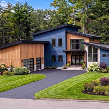
Set against a picturesque wooded landscape in Salem, New Hampshire, 6 Whistle Hill represents a bold approach to contemporary residential architecture. Designed by RWH Architect in collaboration with DHB Homes, this 4,000-square-foot custom residence introduces a distinctly modern architectural language to a community traditionally defined by more conventional home styles. Through striking geometry, carefully curated materials, and thoughtful spatial planning, the design balances architectural expression with warmth, functionality, and a strong connection to its natural surroundings.
The home's exterior is defined by its sculptural composition of intersecting shed rooflines, expansive glazing, and clean architectural forms. Rich vertical wood cladding contrasts with a deep blue façade, while natural stone elements ground the composition within the wooded setting. The interplay of materials, textures, and roof geometries creates a dynamic yet cohesive architectural identity. Particular attention was given to the home's proportions and massing, including the integration of an oversized three-car garage, ensuring that each element contributes to the overall design rather than competing with it.
A central design priority was creating a seamless relationship between the home's architecture, interior spaces, and surrounding landscape. Expansive windows were strategically positioned to maximize natural light, frame wooded views, and strengthen the connection between indoors and outdoors. Carefully considered sightlines, roof overhangs, and spatial orientation provide privacy without sacrificing openness, allowing the residence to feel both expansive and intimate.
Inside, the architectural approach emphasizes spatial continuity, understated sophistication, and the integration of everyday functionality. An open-concept kitchen, dining, and living area forms the heart of the home, anchored by a dramatic double-sided fireplace that serves as both a visual focal point and an architectural element connecting the primary gathering spaces. An open-riser staircase introduces another sculptural feature, reinforcing the home's contemporary character while maintaining visual openness between levels.
The kitchen combines refined material selections with thoughtful space planning, featuring Cabico cabinetry, integrated appliances, a full-height quartz backsplash, and a striking matte black waterfall island. A generously sized walk-in pantry, designed to blend seamlessly with the surrounding cabinetry, complements a dedicated coffee bar and thoughtfully organized mudroom. These integrated features reflect an approach to residential design in which practicality and aesthetics are equally considered.
The first-floor primary suite offers a private retreat, distinguished by Venetian plaster walls and ceilings that introduce subtle texture and warmth. Its adjoining bathroom features a microcement walk-in shower, matte black soaking tub, oversized double vanity, and separate water closet, creating a sophisticated, spa-like environment. A dedicated home office positioned near the suite provides additional flexibility while maintaining separation from the home's primary gathering areas.
Upstairs, three additional bedrooms, each with a walk-in closet, provide comfortable accommodations for family and guests. A private balcony, rear deck, and full walkout basement further extend the home's living possibilities, offering opportunities to engage with the surrounding landscape and accommodate evolving lifestyle needs.
Throughout the design process, RWH Architect focused on balancing bold contemporary forms with the practical demands of modern residential living. From carefully considered circulation and interior zoning to the relationship between exterior materials, glazing, and architectural massing, each design decision contributes to a unified architectural vision.
6 Whistle Hill demonstrates how contemporary architecture can introduce a fresh design perspective while remaining connected to its regional context. Through the collaboration of RWH Architect and DHB Homes, the residence brings together architectural innovation, sophisticated materiality, and exceptional craftsmanship to create a home that is visually distinctive, highly functional, and designed for the way people live today.
Architecture & Design: RWH Architect
Builder: DHB Homes
Location: Salem, New Hampshire
Project Type: Contemporary Custom Residence
Size: Approximately 4,000 SF
 TVL Creative Ltd.
This remodel took an extremely dark & dated kitchen and transformed it into a bright and airy happy place for our client. The existing conditions created a dark, hall-like kitchen that greatly lacked in function and did little to optimize storage. Realizing the potential of this truly massive space, we created a design that utilizes every inch of the kitchen and creates functional cooking and prep space as well as pantry storage and work nooks. Our first order of business was to demo out the blocky corner that separated the kitchen from the living room. This involved removing an existing fireplace, re-structuring a wall, and having an entirely new furnace installed in the basement to eliminate a duct running right through the corner we hoped to eliminate. After opening up the space, we focused on highlighting and brightening the room. New NuCore flooring was installed to give the kitchen a fresh look while offering optimal function and cleanability. Two-toned cabinets in a honey maple and painted silk were used to create a warm and comfortable balance throughout the space. New quartz countertops in MSI's canvas were installed, and butcher block was installed on the two desk areas to offer a warm visual relief and casual work surface. The color palette for the kitchen is reminiscent of a cozy apothecary; we utilized fresh greens with Sherwin Williams paint on the walls and Treviso Gray Sage glazed subway tiles on the backsplash. Over the sink, we designed a playful highlight with counter-to-ceiling mini brick mosaic in a dark crackle green. We introduced additional lighting throughout including new recessed lights, over-sink light, and under-cabinet lights. New appliances were introduced to the space as well, and we complimented the stainless steel of these fixtures to the transitional nickel hardware on the cabinets. This space now feels open and inviting, and is visible from the second you enter the front door! We are so proud of this result and so happy that our clients can enjoy this gorgeous kitchen for years to come.
Sponsored
Columbus, OH
Structural Remodeling
Franklin County's Heavy Timber Specialists | Best of Houzz 2020!
 Bianchi Design
Previously, this yard was burdened by a typical boulder pile pool, that was heaped higher than typical, trying to hide the towering wall behind. At first, the clients sought merely to reconfigure the BBQ that was congesting the patio, but upon further analysis, they decided it was time to strip the entire yard, leaving only the pool shell. Bianchi’s solution introduced an array of four arbors to distract the eye from the wall behind, solving what the boulder waterfall could never do.
Additionally, the wall was painted a dark earth tone to add contrast and depth. This strategy enabled the wall to recede into the distance, while the agave blue grey arbors floated forward visually from the background. Previously, the patios were a hodgepodge of deck islands that were impossible to navigate, and were of insufficient size to arrange furniture on. A well organized patio streamlined the traffic flow and the living space, featuring a cast in place concrete fire pit and banco couch, as well as a new outdoor bistro, glowing with filtered light from the canvas shade sails overhead.
A turquoise glass overflow spa became the yards focal point, sharing the space between the pool and outdoor living. The striking symmetry of the spa and pot pedestal with regal cacti arrangement behind, flanked by the arbors on either side, created a stately first impression from the front door. This teaser was just a glimpse of what could not yet be seen serving as an invitation to explore and enjoy as the yard unfolds.
See more about this project & hear from the homeowner here: https://www.youtube.com/watch?v=7eT3RkLkg5w&feature=youtu.be
 TVL Creative Ltd.
This remodel took an extremely dark & dated kitchen and transformed it into a bright and airy happy place for our client. The existing conditions created a dark, hall-like kitchen that greatly lacked in function and did little to optimize storage. Realizing the potential of this truly massive space, we created a design that utilizes every inch of the kitchen and creates functional cooking and prep space as well as pantry storage and work nooks. Our first order of business was to demo out the blocky corner that separated the kitchen from the living room. This involved removing an existing fireplace, re-structuring a wall, and having an entirely new furnace installed in the basement to eliminate a duct running right through the corner we hoped to eliminate. After opening up the space, we focused on highlighting and brightening the room. New NuCore flooring was installed to give the kitchen a fresh look while offering optimal function and cleanability. Two-toned cabinets in a honey maple and painted silk were used to create a warm and comfortable balance throughout the space. New quartz countertops in MSI's canvas were installed, and butcher block was installed on the two desk areas to offer a warm visual relief and casual work surface. The color palette for the kitchen is reminiscent of a cozy apothecary; we utilized fresh greens with Sherwin Williams paint on the walls and Treviso Gray Sage glazed subway tiles on the backsplash. Over the sink, we designed a playful highlight with counter-to-ceiling mini brick mosaic in a dark crackle green. We introduced additional lighting throughout including new recessed lights, over-sink light, and under-cabinet lights. New appliances were introduced to the space as well, and we complimented the stainless steel of these fixtures to the transitional nickel hardware on the cabinets. This space now feels open and inviting, and is visible from the second you enter the front door! We are so proud of this result and so happy that our clients can enjoy this gorgeous kitchen for years to come.
 TVL Creative Ltd.
Our client’s charming cottage was no longer meeting the needs of their family. We needed to give them more space but not lose the quaint characteristics that make this little historic home so unique. So we didn’t go up, and we didn’t go wide, instead we took this master suite addition straight out into the backyard and maintained 100% of the original historic façade.
Master Suite
This master suite is truly a private retreat. We were able to create a variety of zones in this suite to allow room for a good night’s sleep, reading by a roaring fire, or catching up on correspondence. The fireplace became the real focal point in this suite. Wrapped in herringbone whitewashed wood planks and accented with a dark stone hearth and wood mantle, we can’t take our eyes off this beauty. With its own private deck and access to the backyard, there is really no reason to ever leave this little sanctuary.
Master Bathroom
The master bathroom meets all the homeowner’s modern needs but has plenty of cozy accents that make it feel right at home in the rest of the space. A natural wood vanity with a mixture of brass and bronze metals gives us the right amount of warmth, and contrasts beautifully with the off-white floor tile and its vintage hex shape. Now the shower is where we had a little fun, we introduced the soft matte blue/green tile with satin brass accents, and solid quartz floor (do you see those veins?!). And the commode room is where we had a lot fun, the leopard print wallpaper gives us all lux vibes (rawr!) and pairs just perfectly with the hex floor tile and vintage door hardware.
Hall Bathroom
We wanted the hall bathroom to drip with vintage charm as well but opted to play with a simpler color palette in this space. We utilized black and white tile with fun patterns (like the little boarder on the floor) and kept this room feeling crisp and bright.
80