
Search results for "Adequately" in Home Design Ideas
 Pennsylvania Landscape & Nursery Association
PA Landscape Group INC http://www.palandscapegroup.com
Project Entry: Yellow Breeches Residence
2014 PLNA Awards for Landscape Excellence Winner
Category: Hardscaping-Residential $60,000-$120,000
Award Level: Bronze
Photo Description:
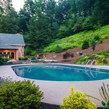
At this Yellow Breeches Residence our hardscape project went hand in hand with an addition to the back of the house, not uncommon. However, the new addition was designed in such a way that it created one opportunity to integrate an outdoor kitchen and living area into the design. With the pool already in place and the location of the house against a mountain side, after the addition was built it would cut off all access to add out living space in the future. So with careful thought and planning we set out to make sure that nothing was forgotten, from a kitchen area for congregating and preparing meals, to creating adequate patio space for entertaining, to assuring that the area was drained properly. The materials for the project were staged 6 months in advance of them being installed while the addition was being constructed and drainage work and base preparation for paving happened before the construction for the addition started.
The homeowners’ goal was to add an outdoor living space that had an updated feel, while still feeling as if it fit behind this mountainside home. The blending of the refined look of the Unilock Umbriano paver with the border of natural river stone was our way of meeting their request. Gravel-lock was applied to the gravel border so that it could act as spill over patio space when entertaining large groups.
Boulders where used to retain grade where needed and keep with the natural feel. Accent boulders were added to the slope to blend existing with the new. Natural slab step where used as the transition between the upper patio space and pool surround.
LED low voltage lighting was used to accent the plant material and structures as well as make the space usable for the evening hours. The lighting was installed up the mountainside to stretch out the landscape at night and give the landscape depth.
In the end the project exceeded the homeowners’ expectations and it is the most used room in the house we are told.
Photo Credit: Dimitri Ganas
 Renovisions
This kitchen had not been renovated since the salt box colonial house was built in the 1960’s. The new owner felt it was time for a complete refresh with some traditional details and adding in the owner’s contemporary tastes.
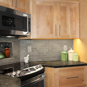
At initial observation, we determined the house had good bones; including high ceilings and abundant natural light from a double-hung window and three skylights overhead recently installed by our client. Mixing the homeowners desires required the skillful eyes of Cathy and Ed from Renovisions. The original kitchen had dark stained, worn cabinets, in-adequate lighting and a non-functional coat closet off the kitchen space. In order to achieve a true transitional look, Renovisions incorporated classic details with subtle, simple and cleaner line touches. For example, the backsplash mix of honed and polished 2” x 3” stone-look subway tile is outlined in brushed stainless steel strips creating an edgy feel, especially at the niche above the range. Removing the existing wall that shared the coat closet opened up the kitchen to allow adding an island for seating and entertaining guests.
We chose natural maple, shaker style flat panel cabinetry with longer stainless steel pulls instead of knobs, keeping in line with the clients desire for a sleeker design. This kitchen had to be gutted to accommodate the new layout featuring an island with pull-out trash and recycling and deeper drawers for utensils. Spatial constraints were top of mind and incorporating a convection microwave above the slide-in range made the most sense. Our client was thrilled with the ability to bake, broil and microwave from GE’s advantium oven – how convenient! A custom pull-out cabinet was built for his extensive array of spices and oils. The sink base cabinet provides plenty of area for the large rectangular stainless steel sink, single-lever multi-sprayer faucet and matching filtered water dispenser faucet. The natural, yet sleek green soapstone countertop with distinct white veining created a dynamic visual and principal focal point for the now open space.
While oak wood flooring existed in the entire first floor, as an added element of color and interest we installed multi-color slate-look porcelain tiles in the kitchen area. We also installed a fully programmable floor heating system for those chilly New England days. Overall, out client was thrilled with his Mission Transition.
 Spark Architecture & Interiors
Located in Florya, Istanbul, Ihlamur Apartment House has a total living area of 280 square meters consisting of kitchen, living room, bathroom, bedroom, children’s room and youth room.
The harmony of wood and black is dominant in its kitchen. By applying separate lighting to the food preparation and eating areas, both adequate lighting is provided and the kitchen appears to be separated according to its purpose. In addition, the use of pendant lighting made both the ceiling higher and the environment feel spacious. Instead of a dark color, light marble tiles are used on the floor. Color balance is achieved in the kitchen with tiles that match the marble-patterned matte black color used in the under-counter cabinets.
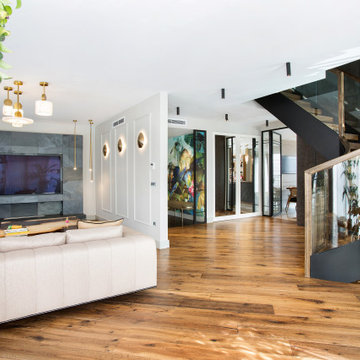
Thanks to the glass doors, the spaces are made to feel wider and more spacious than they are. In addition, this feeling is supported by the mirror in the hallway. Dark wood and matt black color dominate the staircase, which is desired to form a whole with the design of the house.
As in almost the whole house, pendant lightings are preferred in the living room. The bookcase, consisting of circular shaped matte black shelves in the living room, gave an aesthetic appearance to the environment. In addition, the mirror passing through the middle of the circular form not only supports the aesthetic image, but also appeals to the perception of width, making the room feel wider. The design of the living room was completed with the television unit designed in gray tones and simply.
A richer design has been made in the bathroom. A simple yet elegant bathroom design has been achieved by utilizing the harmony of black and gold.
A surface-mounted rail fixture is used in the youth room. Thus, the need for light is met. An L-shaped desk is placed in the corner and a work area is created. In this way, space was saved and an environment suitable for other activities and activities that could be done in the room was provided.
Blue tones and lighter colors are preferred in the children’s room. The wall was evaluated in two parts and boring was avoided.
In the bedroom, it is more minimalistic compared to other areas. The perfect harmony of white and wood was used.
Find the right local pro for your project
 Pennsylvania Landscape & Nursery Association
PA Landscape Group INC http://www.palandscapegroup.com
Project Entry: Yellow Breeches Residence
2014 PLNA Awards for Landscape Excellence Winner
Category: Hardscaping-Residential $60,000-$120,000
Award Level: Bronze
Photo Description:
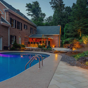
At this Yellow Breeches Residence our hardscape project went hand in hand with an addition to the back of the house, not uncommon. However, the new addition was designed in such a way that it created one opportunity to integrate an outdoor kitchen and living area into the design. With the pool already in place and the location of the house against a mountain side, after the addition was built it would cut off all access to add out living space in the future. So with careful thought and planning we set out to make sure that nothing was forgotten, from a kitchen area for congregating and preparing meals, to creating adequate patio space for entertaining, to assuring that the area was drained properly. The materials for the project were staged 6 months in advance of them being installed while the addition was being constructed and drainage work and base preparation for paving happened before the construction for the addition started.
The homeowners’ goal was to add an outdoor living space that had an updated feel, while still feeling as if it fit behind this mountainside home. The blending of the refined look of the Unilock Umbriano paver with the border of natural river stone was our way of meeting their request. Gravel-lock was applied to the gravel border so that it could act as spill over patio space when entertaining large groups.
Boulders where used to retain grade where needed and keep with the natural feel. Accent boulders were added to the slope to blend existing with the new. Natural slab step where used as the transition between the upper patio space and pool surround.
LED low voltage lighting was used to accent the plant material and structures as well as make the space usable for the evening hours. The lighting was installed up the mountainside to stretch out the landscape at night and give the landscape depth.
In the end the project exceeded the homeowners’ expectations and it is the most used room in the house we are told.
Photo Credit: Dimitri Ganas

 French Creek Designs Kitchen & Bath Design Center
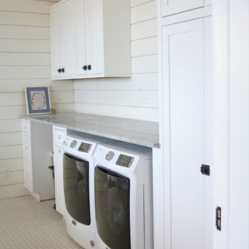
Laundry Room Cabinets bright white and beautiful. This large laundry room will be refreshing to walk into for years to come. With a large window adding additional bright light into the room. In addition, hexagon tile lines the floor adding dimension to the room. Perimeter is lined with white painted maple cabinets and Fantasy River marble countertops. A fun retro sink and hardware adds functionality to the laundry room. There is no lack of storage in this laundry room. Furthermore, lining the top of the washer and dryer with marble tops add additional workspace for folding and managing the loads of laundry. Which will be a great help on this busy ranch. White Painted Maple Cabinets and Marble Countertops complete in Client Project Laundry Room New Construction ~ Thank you for sharing! Client Remarks on the BBB “Wonderful company. Easy to work with and best prices in town.” Laundry rooms can feel dark and depressing. When designing your laundry can be just as important as your kitchen and bath. Creating productivity can begin with the overall design elements. Simply creating a space that is bright and refreshing can be the difference in enjoyment and dread. Not only for yourself but for your family. Engagement begins in a space that is fun and exciting to be in. Begin by choosing colors that brighten up the laundry. In addition, to choosing cabinetry that provides adequate storage can make working in your laundry fun and rewarding. Adding floating shelves to support those needed quick access items within reach. With many flooring options available from tile to luxury vinyl tile can create warmth through colors or wood looks. In addition, to brighten the space with bright whites and accents. Finally, purchasing electric floor warming for those bare feet can make your toes happy and content. Creating a workspace for your laundry room that is functional and beautiful can shift the mind into enjoying tasks rather than dreading them. Find your locally owned Home Improvement Store, let one of our designers assist in choosing materials and design your laundry room. Find French Creek Designs, on MeWe or Facebook, and follow us! In addition, read more about our process and read regular updates on client projects and updated materials selections and choices at FCD News a reliable source of information and current trends.
 INSPIRED KITCHEN DESIGN
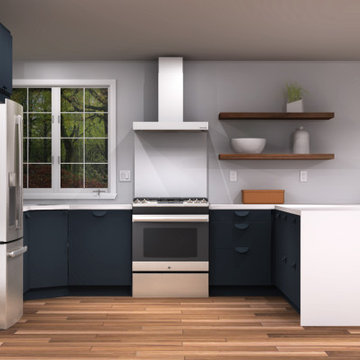
Specifically, Aly says it was critical to have adequate storage space in her small IKEA kitchen.
“We were limited for storage space due to window placements and the overall layout of our house,” she says. “So my design wishes were to get rid of our previous upper cabinetry and the cabinets over the peninsula. I also wanted a microwave that was not over the stovetop/range area.”
To address this, Aly changed out a tall cabinet next to the refrigerator that had made the original space closed off. While there is storage space above the refrigerator, this also opened up counter space between the refrigerator and corner sink area.
The base cabinetry flows onto the opposite side of the kitchen with ample storage space inside the peninsula island. The panel dishwasher on the opposite side of the range also blends seamlessly with the look of the IKEA cabinetry.
The wide peninsula provides a lot of countertop space as well for meals and includes seating for up to three people. Meanwhile, the open shelving provides a decorative touch while providing space to hold bowls and pitchers, for example.
To accommodate her microwave request, they moved it to the pantry area of the kitchen, she notes.
The look is completed by pendant lighting over the island and recessed can lighting throughout, as well as the previously mentioned natural lighting.
Aly offers advice when remodeling and installing an IKEA kitchen on your own.
“Advice I would give to future IKEA kitchen remodelers is to get a solid and well thought out design idea first,” she says. “Also as you begin to install, don’t be afraid to change some elements if you think they aren’t how you wanted.”
“That’s how we installed our project and we absolutely love our IKEA kitchen!” she concludes.
 Renovisions
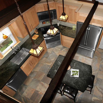
This kitchen had not been renovated since the salt box colonial house was built in the 1960’s. The new owner felt it was time for a complete refresh with some traditional details and adding in the owner’s contemporary tastes.
At initial observation, we determined the house had good bones; including high ceilings and abundant natural light from a double-hung window and three skylights overhead recently installed by our client. Mixing the homeowners desires required the skillful eyes of Cathy and Ed from Renovisions. The original kitchen had dark stained, worn cabinets, in-adequate lighting and a non-functional coat closet off the kitchen space. In order to achieve a true transitional look, Renovisions incorporated classic details with subtle, simple and cleaner line touches. For example, the backsplash mix of honed and polished 2” x 3” stone-look subway tile is outlined in brushed stainless steel strips creating an edgy feel, especially at the niche above the range. Removing the existing wall that shared the coat closet opened up the kitchen to allow adding an island for seating and entertaining guests.
We chose natural maple, shaker style flat panel cabinetry with longer stainless steel pulls instead of knobs, keeping in line with the clients desire for a sleeker design. This kitchen had to be gutted to accommodate the new layout featuring an island with pull-out trash and recycling and deeper drawers for utensils. Spatial constraints were top of mind and incorporating a convection microwave above the slide-in range made the most sense. Our client was thrilled with the ability to bake, broil and microwave from GE’s advantium oven – how convenient! A custom pull-out cabinet was built for his extensive array of spices and oils. The sink base cabinet provides plenty of area for the large rectangular stainless steel sink, single-lever multi-sprayer faucet and matching filtered water dispenser faucet. The natural, yet sleek green soapstone countertop with distinct white veining created a dynamic visual and principal focal point for the now open space.
While oak wood flooring existed in the entire first floor, as an added element of color and interest we installed multi-color slate-look porcelain tiles in the kitchen area. We also installed a fully programmable floor heating system for those chilly New England days. Overall, out client was thrilled with his Mission Transition.
 Tile Doctor Ltd
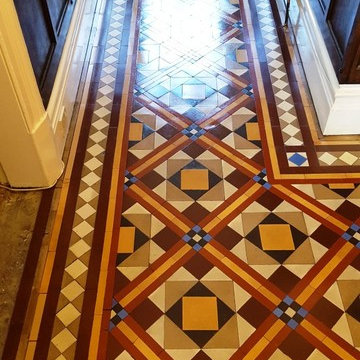
The colourful and diverse geometric patterns of a Victorian tiled floor can give a property a regal, elegant and timeless feel, making it a popular choice even in the 21st century. However, as time passes without regular care and maintenance, Victorian tiles can quickly lose their colour and appear deadened by the buildup of dirt and dust over several months (and sometimes years).
This property owner in Hebden a very small village in North Yorkshire of less than 300 people, had this common problem. Her Victorian tiled hallway had not been adequately maintained and was now more difficult to keep clean than ever. To add to the problem, most of the tiles along the edges were either broken, cracked, or filled with holes, probably I suspect from the installation of carpet grippers at some point in the past.
At this point, the property owner turned to Tile Doctor to see what could be done.
Before beginning a deep clean of the entire length of the hallway, it was first necessary to source and install replacement tiles for those that had been broken and damaged. I also relaid any that were loose.
When finished, I left the tiles to set and returned the next day to start the clean. My choice of cleaner in this situation was Tile Doctor Pro Clean, which was scrubbed into the floor with a special pad fitted to a rotary machine to break down ingrained dirt and stains. Pro Clean does this very effectively on all types of tile, including natural stone and of course Victorian tiles.
The floor was then rinsed with water and the soiled cleaning solution extracted from the floor using a vet vacuum. Stubborn areas were re-treated with more Pro Clean, and when I was satisfied with the condition of the tiles the floor was given a final but thorough rinse to remove any trace of cleaning product.
The floor was then left to dry completely overnight to ensure all excess moisture had disappeared, leaving it fresh to be sealed. I returned in the morning for a third day of work to seal the Victorian tiles with four coats of Tile Doctor Seal and Go, a topical sealer which provides a rich satin finish to really add depth to the colours in the tile while protecting it against dirt and stains.
The customer was delighted with the restoration and couldn’t quite believe the huge improvement in the appearance of the tiles, especially in regards to the enhancement in the different colours. Another satisfied customer!
Nigel Stoker
North West Yorkshire Tile Doctor
 San Luis Kitchen Co.
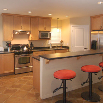
The girls in this sorority lucked out when their chapter sprang for a remodeled kitchen. A simple shaker style door in natural maple makes for a light and airy kitchen. Lots of counter space and two sinks allow for many ladies to work in the space -- either getting ready for class in the morning or prepping for the weekend's bash.
 Renovisions
The kitchen is where you spend most of your time, shouldn’t it be the most inviting room in the house? That was the logic behind this South Shore of Boston Renovision. The owners entertained frequently but struggled with lack of organized storage space and poor flow for traffic in and out of their kitchen.
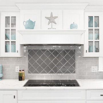
Renovisions totally reorganized the way the kitchen worked. The wall between the family room and kitchen was re-built to accommodate bar stools and added countertop space. Considerations were given to the design layout for a separate beverage/wine refrigeration station, while making sure additional prep space was adequate. A better flow in the kitchen was created, eliminating the annoyance of the typical ‘bottle-neck’.
Fine shaker cabinetry in a white painted finish with contrasting dark blue-grey island cabinets which boast large, deep drawers set the stage. A full gamut of appliances was provided including a 36” induction cooktop, convection microwave, double wall ovens, full size refrigerator and a bar refrigerator. The matching paneled dishwasher ensured an integrated look. The custom wood hood along with the unique shaped arabesque glass tile design frames a stunning focal point when entering this kitchen. Glass mullion doors flanking the hood with clear seeded glass created an upscale look and coordinated with the seeded glass shades of the island pendants.
Renovisions custom fit red oak wood flooring to match the existing floor and then re-finished with a grey stain and 3 coats of poly to add durability while also providing a beautiful new look throughout the house.
Good lighting is key especially when spending so much time in a space. LED under-cabinet lights, recessed ceiling lights and three separate pendant fixtures which all operate on dimmer switches created options for mood lighting, work lighting and everything in between. New double-hung windows with 6/1 grid configurations were added in just the right places – adding more essential natural light.
In addition to the kitchen ‘Renovision’, two corner cabinets in a white painted finish were installed in the dining room to not only accommodate the clients fine china and glassware, but also to provide a more custom built-in look to the space with the interior of the cabinets matching the wall.
Overall, our client could not have been happier with the completed project. Family, friends and guests were impressed with the design and fit and finish of every detail provided by Renovisions.
 KINGDOM WOODWORKS
Collaboration with Canonbury Homes and Frank Neely Design Associates.
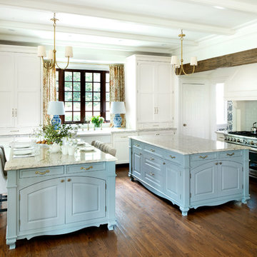
Inspiration for a timeless open concept kitchen remodel in Atlanta with beaded inset cabinets and two islands
Inspiration for a timeless open concept kitchen remodel in Atlanta with beaded inset cabinets and two islands


 Amber Freda Garden Design
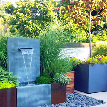
This Boerum Hill, Brooklyn rooftop terrace garden features a zinc fountain flanked by corten steel planters, custom-built ipe wood planters, bench seating, and a bed of Mexican beach stones. Many people enjoy outdoor fountains for the relaxing sound they provide, which can also help to drown out noises from A/C units or other jarring sounds of the city. We also designed these beautiful ipe (pronounced e-pay) wood planters and a comfortable built-in bench with storage under the seats. Check out the before photo at www.amberfreda.com.
 Mottram Architecture
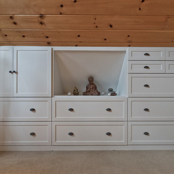
Timber frame homes offer unique challenges during a remodel. What often makes them beautiful and attractive to most homeowners, also makes them challenging for space requirements.
Context: The lovely couple that owned this home were struggling with some interesting floor plan challenges that just didn't work for their family. The loved the beautiful timbers and woodwork of their home, but the dramatically sloping ceilings on the second floor, particularly in the bathroom, just didn't work for this 1 1/2 bath home. Needing to use the skylight to approach the toilet was a less then ideal scenario. Although the bathroom footprint was more then adequate, the sloped ceiling only made half of the space useable. Check out the Before/After post on our blog to see the photos of the house pre-renovation. As much as they loved all the wood features in their home, another challenge they had was light. The wood ceiling made everything inside the house darker, even with a fantastic array of south facing windows, there were spaces in the home that felt dark and small. When they contacted us they wanted to know how could they make their brighter and more inviting, were there solutions to the 2nd floor sloped ceiling issues, and if they were going to do all of this work, how could they make their home more comfortable and efficient. A nagging water leak in the upstairs bathroom spurred them into action and here is how we solved their dilemma.
Conclusion: First, we added a little dormer to the rear of the house so we could get full headroom in nearly all of the upstairs bathroom! Then we decided to extend that dormer one more timber bay over to create a walk in closet with natural light and plenty of space. Since we were contemplating energy efficiency, we resolved a nagging issue that is present in a lot of timber frame construction, air tightness. Commonly found in timber frame construction, fiberglass insulation is installed in the rafter bays and board ceilings are installed over top. Unfortunately, board ceilings are anything but air tight, and fiberglass insulation needs to be in an airtight cavity for maximum effectiveness. So we were able to solve two issues at the same time for this homeowner. We removed the board ceiling and fiberglass insulation, we dense packed the rafter bays with cellulose insulation, and installed sheetrock in place of the boards. The boards were salvaged for re-use by the homeowner, and the space and light quality was dramatically improved. Some may think that losing the board ceiling took something away from the space, but what you'll see in the pictures is that it highly accentuates the heavy timbers and really makes them stand out in a beautiful way. Now with this added airtightness, better insulation, and brighter space, the homeowner hardly runs their wood stove, and it's so quiet in the space, an added bonus from changing the insulation. It became necessary to also add a sheetrock ceiling to the living room to hide the plumbing from the new bathroom layout above. Changing this ceiling gave the homeowner some real quality lighting that was lacking in the living room before. The brighter ceiling and new lighting layout completely transforms the living room into a space you want to hang out, even though the layout didn't change at all. When the homeowner saw the finished spaces she said "I can't believe this is my house, I want to live in this house"
Energy Efficiency: I touched a little on the efficiency above, but like all projects done with Mottram Architecture, we always want to leave you with a little extra. Timber frame construction with board ceilings and fiberglass insulation are notoriously leaky! If you want to know what we think about fiberglass insulation, check our our blog post on Why Fiberglass Insulation Sucks. By installing cellulose insulation and covering it with sheetrock we were able to greatly reduce the heat flowing out of this home. It not only improves cashflow it improves the comfort level in the space. Who wants to sit in their living room and feel a draft? Let us remind you, we are not saying cellulose insulation is an air barrier, we use the sheetrock to help with that, but it does significantly reduce the air flow over fiberglass insulation. And when we reduce the airflow, we reduce the heat flow. And when we reduce the heat flow, we reduce the need to re-heat that drafty air from outside. When it comes to energy efficiency the first and best place to start is air infiltration. We greatly reduced the air infiltration with the new insulation, but we also added a hat and warm boots. What I mean by that is, we improved the insulation in the roof, and we installed insulation in the basement. Maybe it's a silly analogy, but when you think about keeping warm, we always start with the hat and boots! With sustainability in mind, the next project will be to add a deck to the front of this house with rain catchment barrels from the metal roof. They are planning to plant a garden in the spring and the rain catchment system will help to irrigate the new garden.
Builder: East Shore Builders
Photographer: Michael Eric Berube
 Melton Design Build
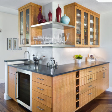
Our eclectic modern home remodel project turned a closed-off home filled with heavy wood details into a contemporary haven for hosting with creative design choices, making the space feel up to date and ready to host lively gatherings.
The dining room and bar portion of the home is incredibly stunning and make for great entertaining. The crown molding detail on the ceiling and the beautiful light fixture above the dining room table elevates this space. The walnut flooring mirrors the molding above, an excellent design choice for this space!
 Renovisions
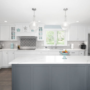
The kitchen is where you spend most of your time, shouldn’t it be the most inviting room in the house? That was the logic behind this South Shore of Boston Renovision. The owners entertained frequently but struggled with lack of organized storage space and poor flow for traffic in and out of their kitchen.
Renovisions totally reorganized the way the kitchen worked. The wall between the family room and kitchen was re-built to accommodate bar stools and added countertop space. Considerations were given to the design layout for a separate beverage/wine refrigeration station, while making sure additional prep space was adequate. A better flow in the kitchen was created, eliminating the annoyance of the typical ‘bottle-neck’.
Fine shaker cabinetry in a white painted finish with contrasting dark blue-grey island cabinets which boast large, deep drawers set the stage. A full gamut of appliances was provided including a 36” induction cooktop, convection microwave, double wall ovens, full size refrigerator and a bar refrigerator. The matching paneled dishwasher ensured an integrated look. The custom wood hood along with the unique shaped arabesque glass tile design frames a stunning focal point when entering this kitchen. Glass mullion doors flanking the hood with clear seeded glass created an upscale look and coordinated with the seeded glass shades of the island pendants.
Renovisions custom fit red oak wood flooring to match the existing floor and then re-finished with a grey stain and 3 coats of poly to add durability while also providing a beautiful new look throughout the house.
Good lighting is key especially when spending so much time in a space. LED under-cabinet lights, recessed ceiling lights and three separate pendant fixtures which all operate on dimmer switches created options for mood lighting, work lighting and everything in between. New double-hung windows with 6/1 grid configurations were added in just the right places – adding more essential natural light.
In addition to the kitchen ‘Renovision’, two corner cabinets in a white painted finish were installed in the dining room to not only accommodate the clients fine china and glassware, but also to provide a more custom built-in look to the space with the interior of the cabinets matching the wall.
Overall, our client could not have been happier with the completed project. Family, friends and guests were impressed with the design and fit and finish of every detail provided by Renovisions.
 French Creek Designs Kitchen & Bath Design Center
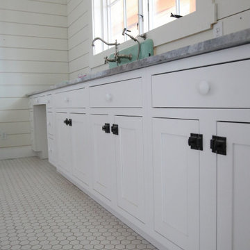
Laundry Room Cabinets bright white and beautiful. This large laundry room will be refreshing to walk into for years to come. With a large window adding additional bright light into the room. In addition, hexagon tile lines the floor adding dimension to the room. Perimeter is lined with white painted maple cabinets and Fantasy River marble countertops. A fun retro sink and hardware adds functionality to the laundry room. There is no lack of storage in this laundry room. Furthermore, lining the top of the washer and dryer with marble tops add additional workspace for folding and managing the loads of laundry. Which will be a great help on this busy ranch. White Painted Maple Cabinets and Marble Countertops complete in Client Project Laundry Room New Construction ~ Thank you for sharing! Client Remarks on the BBB “Wonderful company. Easy to work with and best prices in town.” Laundry rooms can feel dark and depressing. When designing your laundry can be just as important as your kitchen and bath. Creating productivity can begin with the overall design elements. Simply creating a space that is bright and refreshing can be the difference in enjoyment and dread. Not only for yourself but for your family. Engagement begins in a space that is fun and exciting to be in. Begin by choosing colors that brighten up the laundry. In addition, to choosing cabinetry that provides adequate storage can make working in your laundry fun and rewarding. Adding floating shelves to support those needed quick access items within reach. With many flooring options available from tile to luxury vinyl tile can create warmth through colors or wood looks. In addition, to brighten the space with bright whites and accents. Finally, purchasing electric floor warming for those bare feet can make your toes happy and content. Creating a workspace for your laundry room that is functional and beautiful can shift the mind into enjoying tasks rather than dreading them. Find your locally owned Home Improvement Store, let one of our designers assist in choosing materials and design your laundry room. Find French Creek Designs, on MeWe or Facebook, and follow us! In addition, read more about our process and read regular updates on client projects and updated materials selections and choices at FCD News a reliable source of information and current trends.
 Tile Doctor Ltd
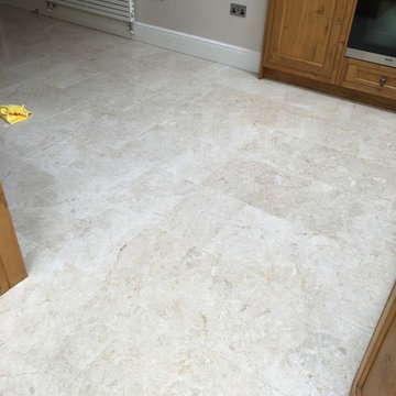
Marble tiles can be tumbled in large drums to achieve an aged and softened effect, and this can look very nice providing that the stone is adequately maintained.
In the case of this floor at a property in Twickenham South West London, the Marble tiles that had been laid over five years ago, and in that time the sealer had worn down offering the floor little protection. Dirt had now become ingrained in the pores of the stone and grout, and a deep clean and fresh seal were required to restore the stone’s original colour and lustre. The property owner asked me to complete the job and I was more than happy to oblige.
To begin the restoration, I applied both Tile Doctor Pro-Clean, which is a high alkaline cleaner, and Tile Doctor Remove and Go, which a heavy-duty stripper and remover, to the floor and scrubbed the products in using a scrubbing pad fitted to a professional rotary machine.
The chemical solvents in the Remove and Go helped to break down any old sealer that remained inside the stone, allowing the Pro Clean to then work its magic on the stubborn ingrained dirt the customer had struggled to remove previously. Some of the deeper veins and grout lines I chose to scrub by hand to ensure the fullest and most meticulous clean possible.
The resulting soiled cleaning solution was then pressure rinsed with water and the soil extracted with a wet-vacuum, leaving a completely clean floor that was now ready to be sealed using a new sealant.
I returned to the property the following day after allowing the Marble tiles to dry fully. Drying the tiles is a crucial part of the restoration process, since even a small quantity of excess moisture can cloud the sealer and prevent it from working to its fullest capabilities.
I applied two coats of our solvent-based impregnating sealer known as Tile Doctor Colour Grow. As the name of the product suggests, Colour Grow not only protects the tiles against ingrained soil, it also thoroughly lifts and enhances the natural colours in the stone.
The new seal will make it easy for our customer to maintain the floor, making daily cleaning easier. It will also protect the stone against the nasty spillages that are common in kitchens and living rooms.
The customer was thrilled with the much-improved appearance of the Marble tiles and is very reassured that they will now stay in great condition for a long time. Another satisfied client!
Jonathan Oldham
South Middlesex Tile Doctor
 Riverside Construction, LLC
Challenge
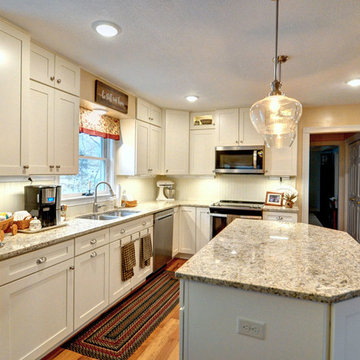
This Lafayette kitchen was dark and poorly-lit due to the unsightly soffits that hindered adequate lighting throughout the space. A bulky microwave cabinet impeded the homeowners’ ability to use the counter space below it, and the full range cooktop on the center island took up valuable prep space. Additional space was lost in an unused desk area that had no functional purpose. To make matters worse, a leaky appliance damaged their beautiful hardwood floors. Needless to say, these Lafayette homeowners were ready to remodel. With insurance check in hand, they contacted Riverside Construction to help them design and build a kitchen that would solve all of their functional challenges.
Solution
By removing the soffits, Riverside Construction was able to design the cabinets to reach all the way to the ceiling. This allowed for ample storage, and the ability for the homeowner to display her pretty dishes and other kitchen collectibles along one wall.
A non-removable pipe along the second wall and above the sink prohibited Riverside Construction from adding glass panels. However, we were still able to attach a standard cabinet door instead and preserve the seamless look that the homeowner was looking for.
The appliances were rearranged to make better use of the workspace and create better traffic flow.
Luckily, we were able to locate the same hardwood flooring that had been laid in their kitchen (not always feasible). This allowed us to repair the damaged wood and blend it seamlessly with the existing floor.
Although required by code, the homeowner didn’t like the outlets disrupting the visual appeal of the backsplash. She wanted Riverside Construction to figure out a way to hide all of the outlets. Our solution was to install power strips that mounted under the cabinets at a slight angle where the cabinet met the wall, making them less visible but still easily accessible.
Results
The homeowners were thrilled they didn’t need to pay for the cost of an entire new floor. They were also pleased with a beautiful new kitchen that met all of their needs exactly.
85