
Search results for "Alternative quick time" in Home Design Ideas

 Herald Gardell, Ltd. Design Services
Jeff McCutcheon
A large space that was made narrow by a second staircase. We took the stairs out and turned it into the principle gathering space for the family, combining the functionalities of living room, great room, family room and media room.

 High Street Design
This recently built 1,200 sq ft condo had spectacular views but was otherwise in need of character and design. My client, a single man and first time homeowner had excellent taste but wasn't sure where to begin or how to pull things together. We quickly identified a mutual love of mid century modern pieces and created a modern yet industrial inspired space that compliments and enhances his homes stunning panoramic views of downtown.
Favourite pieces include the colourful and bold silk area rug that helps ground the otherwise monochromatic space, custom stools that are as comfortable as they are visually appealing with luggage leather seats, several walnut pieces that add warmth and a concrete coffee table for a mix of modern. The final look is clean, fresh and eclectic resulting in the masculine, unique feel my client wanted.

 Green Oxen Design
Epulum Grid railing offers an alternative to the horizontal design with a precise constitution for maximum see-thru capability without sacrificing the robust strength of Epulum Railing. Using a combination of straight angles and curved edges, Epulum grid railing is crafted with intricate detail to ensure safety of users at the same time promoting a beautiful aesthetic. If you will like to see compositions of your railing area with Epulum Grid railing please email us your photos at contact@greenoxen.com.
Find the right local pro for your project

 Remodel Cincinnati
complete gut of the original large kitchen. New design, large remote exhaust. Went from "L" shaped to two islands
Inspiration for a large transitional u-shaped medium tone wood floor open concept kitchen remodel in Cincinnati with an undermount sink, raised-panel cabinets, light wood cabinets, granite countertops, beige backsplash, ceramic backsplash, paneled appliances and two islands
Inspiration for a large transitional u-shaped medium tone wood floor open concept kitchen remodel in Cincinnati with an undermount sink, raised-panel cabinets, light wood cabinets, granite countertops, beige backsplash, ceramic backsplash, paneled appliances and two islands
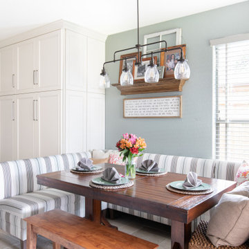
 Twelve Stones Designs, LLC
The owners of this kitchen had spent the money to upgrade the finishes in their kitchen upon building the home 12 years ago, but after living in the space for several years they realized how nonfunctional the layout really was. The (then) two preschool aged children had grown into busy, hungry teenagers with many friends who also liked to hang out at the house. So the family needed a more functional kitchen with better traffic flow, space for daily activities revolving around the kitchen at different times of day, and a kitchen that could accommodate cooking for and serving large groups. Furthermore, the dark, traditional finishes no longer reflected the homeowners’ style. They requested a brighter, more relaxed, coastal style that reflected their love of the seaside cities they like to visit.
Originally, the kitchen was U-shaped with a narrow island in the middle. The island created narrow aisles that bottle-necked at the dishwasher, refrigerator, and cooktop areas. There was a pass-through from the foyer into the kitchen, but the owners never liked that the pass-through was also located so close to the powder room. The awkward proximity was unappealing and made guests feel uncomfortable.
The kitchen’s storage was made up of lots of narrow cabinets, apothecary drawers, clipped corner units, and very few drawers. It lacked useful storage for the larger items the family used on a daily basis. And the kitchen’s only pantry was small closet that had only builder-grade, narrow shelving with no illumination to be able to see the contents inside.
Overall, the kitchen’s lighting plan was poorly executed. Only six recessed cans illuminated the entire kitchen and nook areas. The under cabinet lighting was not evenly distributed either. In fact, the builder had mis-placed the under cabinet lighting around the decorative pilasters which made for choppy, dark cubbies. Further, the builder didn’t include any lighting over the sink or the bar area, which meant whoever was doing the dishes was always in their own shadow. That, coupled with the steep overhang of the game room above made the bar area feel like a dim, cavernous space that wasn’t inviting or task oriented. The kitchen looked out into the main living space, but the raised bar and a narrow wall (which held the only large cabinet in the kitchen) created more of a barrier than a relationship to the living room or breakfast nook. In fact, one couldn’t even see the breakfast nook from the cooktop or sink areas due to its orientation. The raised bar top was too narrow to comfortably sit to either dine at or chat from due to the lack of knee space. The the homeowners confided that the kitchen felt more like a dark, dirty prison than place where the family, or their guests, wanted to gather and commune.
The clients' needs and desires were:
➢ to create a kitchen that would be a space the family loved to be in; to relate to the adjacent spaces all around, and to have better flow for entertaining large groups
➢ to remove the walls between the breakfast nook and living area and to be able to utilize the natural light from the windows in both those areas
➢ to incorporate a functional chopping block for prepping fresh food for home cooked meals, an island with a large sink and drain board, 2 pull out trash cans, and seating for at least the 2 teens to eat or do homework
➢ to design a kitchen and breakfast nook with an airy, coastal, relaxed vibe that blended with the rest of the house's coastal theme
➢ to integrate a layered lighting plan which would include ample general illumination, specific task lighting, decorative lighting, and lots of illuminated storage
➢ to design a kitchen with not only more storage for all the husband’s kitchen gadgets and collection of oils and spices, but smart storage, including a coffee/breakfast bar and a place to store and conceal the toaster oven and microwave
➢ to find a way to utilize the large open space between the kitchen, pantry area, and breakfast nook
Twelve Stones Designs achieved the owner's goals by:
➢ removing the walls between the kitchen and living room to allow the natural light to filter in from the adjacent rooms and to create a connection between the kitchen, nook, and living spaces for a sense of unity and communion
➢ removing the existing pantry and designing 3 large pantry style cabinets with LED tape lights and rollout drawers to house lots of kitchen appliances, gadgets, and tons of groceries. We also took the cabinets all the way up to the 9’ ceiling for additional storage for seasonal items and bulk storage.
➢ designing 2 islands - 1 with a gorgeous black walnut chopping block that houses a drawer for chopping and carving knives and a custom double pull out trash unit for point of use utilization - and 1 that houses the dishwasher, a large Blanco Gourmet sink with integrated drain board, woven baskets for fresh root vegetables and kitchen towels, plenty of drawer storage for kitchen items, and bar seating for up to 4 diners.
➢ closing off the space between the kitchen and the powder room to create a beautiful new private alcove for the powder room as well as adding some decorative storage. This also gave us space to include more tall storage near the new range for precision placement of the husband’s extensive oil and spice collection as well as a location for a combo-steam oven the wife wanted for baking and cooking healthy meals.
The project is enhanced functionally by:
➢ incorporated USB and standard receptacles for the kids’ laptops and phone charging in the large island
➢ designing the small island to include additional open shelving for items used on a daily basis such as a variety of bowls, plates, and colanders. This set up also works well for the husband who prefers to “plate” his dinners in restaurant-style fashion before presenting them to the table.
➢ the integration of specific storage units, such as double stacked cutlery drawers, a custom spice pull-out, a Kuerig coffee and tea pod drawer, and custom double stacked utensil drawers
➢ moving the refrigerator to the old oven location - this eliminated the bottle neck as well as created a better relationship to the eating table. It also utilizes the floor space between the pantry, nook, and kitchen
➢ creating a banquet style breakfast nook - this banquette seating not only doubles the amount of seating for large gatherings but it better utilizes the odd space between the kitchen and the previous nook area. It also helps to create a distinct pathway from the mudroom room through the pantry area, kitchen, nook, and living room.
➢ the coffee/breakfast bar area which includes the perfect location for the concealed microwave and toaster oven, convenient storage for the coffee pods and tea accoutrements. Roll-out drawers below also house the smoothie maker, hot water kettle, and a plethora of smoothie-making ingredients such as protein powders, smoothie additives, etc. Furthermore, the drawers below the Keurig house measuring utensil, cutlery, baking supplies and tupperware storage.
➢ incorporating lots of wide drawers and pullouts to accommodate large cookware.
➢ utilizing as much vertical space as possible by building storage to the ceiling which accommodates the family’s abundant amount of serving platters, baking sheets, bakeware, casserole dishes, and additional cutting boards.
The project is enhanced aesthetically by:
➢ new 5-piece Versailles pattern porcelain tile that now seamlessly joins the entire down stairs area together creating a bright, cohesiveness feeling instead of choppy separated spaces - it also adds a coastal feeling
➢ designing a cabinet to conceal the microwave and toaster oven
➢ the coastal influenced light fixtures over the nook table and island
➢ the sandy colors of the Langdon Cambria countertops. The swirling pattern and sparkling quartz pieces remind the homeowner of black-and-tan sandy beaches
➢ the striped banquet seating whose creamy white background and blue-green stripes were the inspiration for the cabinet and wall colors.
➢ All the interior doors were painted black to coordinate with the blacks and grays in the backsplash tile and countertop. This also adds a hint of tailored formality to an otherwise casual space.
➢ the use of WAC's Oculux small aperture LED units for the overhead lighting complimented with Diode LED strips for task lighting under the cabinets and inside the pantry and glass wall cabinets. All of the lighting applications are on separate dimmer switches.
Innovative uses of materials or construction methods by Realty Restoration LLC:
➢ Each 1-1/2” x 3” block of reclaimed end-grain black walnut that makes up the center island chopping block was hand milled and built in the shop. It was designed to look substantial and proportional to the surrounding elements, executed by creating the 4 inch tall top with a solid wood chamfered edge band.
➢ The metal doors on either side of the vent hood were also custom designed for this project and built in the Realty Restoration LLC shop. They are made 1x2, 11-gauge mild steel with ribbed glass. Weighing 60 lbs a piece, heavy duty cabinet hinges were added to support the weight of the door and keep them from sagging.
➢ Under-cabinet receptacles were added along the range wall in order to have a clean, uninterrupted backsplash.
Design obstacles to overcome:
➢ Because we were removing the demising walls between the kitchen and living room, we had to find a way to plumb and vent the new island. We did this by tunneling through the slab (the slab had post tension cables which prevented us from just trenching) to run a new wet vent through a nearby structural wall. We pulled the existing hot and cold lines between upper floor joists and ran them down the structural wall as well and up through a conduit in the tunnel.
➢ Since we were converting from wall overs to a gas range it allowed us to utilize the 220 feed for the wall ovens to provide a new sub panel for all the new kitchen circuits
➢ Due to framing deficiencies inherited from the original build there was a 1-1/2” differential in the floor-to-ceiling height over a 20 foot span; by utilizing the process of cutting and furring coupled with the crown moulding details on the cabinet elevations we were able to mask the problem and provide seamless transitions between the cabinet components.
Evidence of superior craftsmanship:
➢ uniquely designed, one-of-a-kind metal “X” end panels on the large island. The end panels were custom made in the Realty Restoration LLC shop and fitted to the exact dimensions of the island. The welding seams are completely indistinguishable - the posts look like they are cut from a single sheet of metal
➢ square metal posts on the small island were also custom made and designed to compliment and carry through the metal element s throughout the kitchen
➢ the beautiful, oversized end panels on the pantry cabinets which give the breakfast nook a tailored look
➢ integrating a large format 5 piece Versailles tile pattern to seamlessly flow from the existing spaces into the new kitchen space
➢ By constructing a custom cabinet that jogged around a corner we could not remodel (housing the entry way coat closet) we were able to camouflage the adjacent wall offset within the upper and lower cabinets. By designing around the existing jog in the structural walls we accomplished a few things: we were able to find the space to house, and hide, the microwave and toaster oven yet still have a clean cohesive appearance from the kitchen side. Additionally, the owners were able to keep their much needed coat closet and we didn’t have to increase the budget with unnecessary structural work.

 Kathleen Jennison
An Arts & Crafts Bungalow is one of my favorite styles of homes. We have quite a few of them in our Stockton Mid-Town area. And when C&L called us to help them remodel their 1923 American Bungalow, I was beyond thrilled.
As per usual, when we get a new inquiry, we quickly Google the project location while we are talking to you on the phone. My excitement escalated when I saw the Google Earth Image of the sweet Sage Green bungalow in Mid-Town Stockton. "Yes, we would be interested in working with you," I said trying to keep my cool.
But what made it even better was meeting C&L and touring their home, because they are the nicest young couple, eager to make their home period perfect. Unfortunately, it had been slightly molested by some bad house-flippers, and we needed to bring the bathroom back to it "roots."
We knew we had to banish the hideous brown tile and cheap vanity quickly. But C&L complained about the condensation problems and the constant fight with mold. This immediately told me that improper remodeling had occurred and we needed to remedy that right away.
The Before: Frustrations with a Botched Remodel
The bathroom needed to be brought back to period appropriate design with all the functionality of a modern bathroom. We thought of things like marble countertop, white mosaic floor tiles, white subway tile, board and batten molding, and of course a fabulous wallpaper.
This small (and only) bathroom on a tight budget required a little bit of design sleuthing to figure out how we could get the proper look and feel. Our goal was to determine where to splurge and where to economize and how to complete the remodel as quickly as possible because C&L would have to move out while construction was going on.
The Process: Hard Work to Remedy Design and Function
During our initial design study, (which included 2 hours in the owners’ home), we noticed framed images of William Morris Arts and Crafts textile patterns and knew this would be our design inspiration. We presented C&L with three options and they quickly selected the Pimpernel Design Concept.
We had originally selected the Black and Olive colors with a black vanity, mirror, and black and white floor tile. C&L liked it but weren’t quite sure about the black, We went back to the drawing board and decided the William & Co Pimpernel Wallpaper in Bayleaf and Manilla color with a softer gray painted vanity and mirror and white floor tile was more to their liking.
After the Design Concept was approved, we went to work securing the building permit, procuring all the elements, and scheduling our trusted tradesmen to perform the work.
We did uncover some shoddy work by the flippers such as live electrical wires hidden behind the wall, plumbing venting cut-off and buried in the walls (hence the constant dampness), the tub barely balancing on two fence boards across the floor joist, and no insulation on the exterior wall.
All of the previous blunders were fixed and the bathroom put back to its previous glory. We could feel the house thanking us for making it pretty again.
The After Reveal: Cohesive Design Decisions
We selected a simple white subway tile for the tub/shower. This is always classic and in keeping with the style of the house.
We selected a pre-fab vanity and mirror, but they look rich with the quartz countertop. There is much more storage in this small vanity than you would think.
The Transformation: A Period Perfect Refresh
We began the remodel just as the pandemic reared and stay-in-place orders went into effect. As C&L were already moved out and living with relatives, we got the go-ahead from city officials to get the work done (after all, how can you shelter in place without a bathroom?).
All our tradesmen were scheduled to work so that only one crew was on the job site at a time. We stayed on the original schedule with only a one week delay.
The end result is the sweetest little bathroom I've ever seen (and I can't wait to start work on C&L's kitchen next).
Thank you for joining me in this project transformation. I hope this inspired you to think about being creative with your design projects, determining what works best in keeping with the architecture of your space, and carefully assessing how you can have the best life in your home.
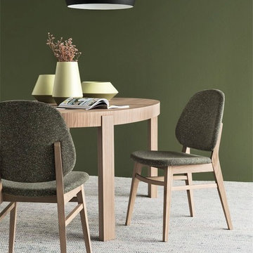
 Calligaris
CS/1491_P12_S86: Collette Chair - Smoke Frame - Tweed Forest Green Seat Finish
Features -
Protecting The Fabric From Dust, Repelling The Toughest Stains And Keeping The Fabric New And Beautiful At Touch Over Time.
Removing Stains Is Safe And Easy: Quickly Wash Off The Spill With Some Water Or Wipe The Fabric With A Damp Cloth Using Rapid And Gentle Strokes
Silver-Ion Based Treatment For Fabrics Featuring Antimicrobial, Antibacterial And Antifungal Properties. Works As A Protective Shield, Sanitizing The Treated Fabrics, Eliminating Bad Odours And Preventing Allergies. The Special Application Method Guarantees The Long Lasting Effectiveness Of The Silver Protection Treatment.
FSC Certified
Location - Indoor
Specifications -
Materials - Ashwood, 35% Polyester, 20% Wool, 15% Cotton, 15% Polyamide, 10% Silk, 5% Acrylic
Finishes - Smoke, Tweed Forest Green
Chair Leg Height - 18
CS/398-RD_P27_P27_P27: Atelier Round Ext. Table - Atelier Frame - Natural Leg Finish - Natural Top
"Features -
Semi-Automatic Extension
Location - Indoor
Specifications -
Max Width - 73.25
Materials - Wood Veneer
Finishes - Natural, Natural, Natural
"
Sponsored
Fredericksburg, OH

High Point Cabinets
Columbus' Experienced Custom Cabinet Builder | 4x Best of Houzz Winner
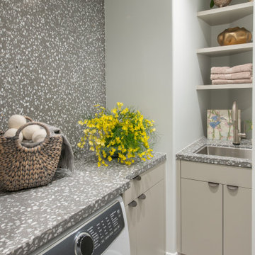
 Sarah Barnard Design LLC
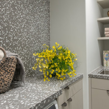
The laundry room is lined with terrazzo, with ample surface space for folding clothing. An overhead railing provides hanging space, while dual dryers speed up the laundry process for added efficiency. Yellow orchids, ranunculus, and ferns add natural beauty to the laundry space. Wool dryer balls offer a green, reusable alternative to dryer sheets and speed drying time. Artwork by Karen Sikie brings nature and wildlife into the space, providing a pleasant view while tending to laundry.
 Sarah Barnard Design LLC
The laundry room is lined with terrazzo, with ample surface space for folding clothing. An overhead railing provides hanging space, while dual dryers speed up the laundry process for added efficiency. Yellow orchids, ranunculus, and ferns add natural beauty to the laundry space. Wool dryer balls offer a green, reusable alternative to dryer sheets and speed drying time. Artwork by Karen Sikie brings nature and wildlife into the space, providing a pleasant view while tending to laundry.
 Green Oxen Design
Epulum Grid railing offers an alternative to the horizontal design with a precise constitution for maximum see-thru capability without sacrificing the robust strength of Epulum Railing. Using a combination of straight angles and curved edges, Epulum grid railing is crafted with intricate detail to ensure safety of users at the same time promoting a beautiful aesthetic. If you will like to see compositions of your railing area with Epulum Grid railing please email us your photos at contact@greenoxen.com.

 Drury Design
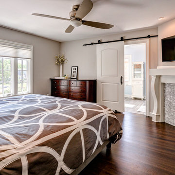
Example of a transitional master gray floor freestanding bathtub design in Chicago with shaker cabinets, black cabinets, gray walls, an undermount sink and white countertops
 Green Oxen Design
Epulum Grid railing offers an alternative to the horizontal design with a precise constitution for maximum see-thru capability without sacrificing the robust strength of Epulum Railing. Using a combination of straight angles and curved edges, Epulum grid railing is crafted with intricate detail to ensure safety of users at the same time promoting a beautiful aesthetic. If you will like to see compositions of your railing area with Epulum Grid railing please email us your photos at contact@greenoxen.com.

 Reico Kitchen & Bath
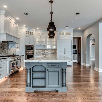
Designed by Akram Aljahmi of Reico Kitchen & Bath in King of Prussia, PA this transitional farmhouse inspired kitchen design features Green Forest Cabinetry kitchen cabinets in the Sierra door style in 2 finishes. The perimeter kitchen cabinets features a White finish and the kitchen island features a Summit Grey finish. Kitchen countertops are engineered quartz by MSI in the color Carrara Marmi. The tile back splash combines white subway tile with a Vintage Twenties tile behind the oven and ventilation hood.
Says the client, "Working with Akram was a great experience. He communicated quickly, coordinated times for me to see the products I was interested in and provided revised quotes to help meet the look and budget we wanted. Akram was patient in helping us understand and see all the options and choose what worked best for our needs. Our favorite part is the addition of the pantry cabinets. They are beautiful, clean and add so much useful storage. We love the final kitchen."
Photos courtesy of BTW Images LLC.
Sponsored
Columbus, OH

Hope Restoration & General Contracting
Columbus Design-Build, Kitchen & Bath Remodeling, Historic Renovations
 Stoneridge Decks & Outdoor Living
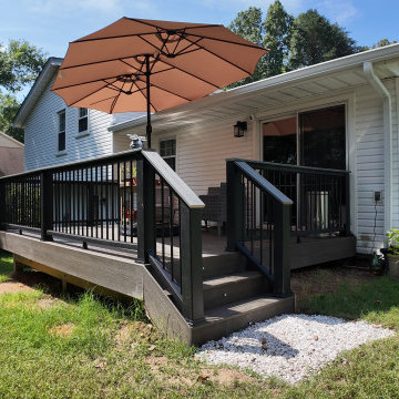
This new deck in Dumfries, Virginia was built by Stoneridge Outdoor Living where there was no previous structure. We installed Trex® composite decking for long-lasting performance and minimal maintenance. The railing system features black aluminum balusters and sleek post caps for a contemporary look. As a certified TrexPRO® Platinum Installer, we build every outdoor space to meet high durability and style standards.
 Green Solar Technologies
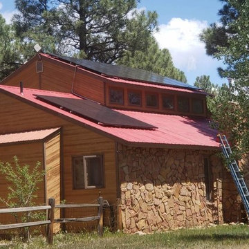
Kimberley of Pagosa Springs, CO has opted to go solar with national solar installer Green Solar Technologies. As you can see from this impressive solar panel installation, she made the right choice. GST provides complete installation services and is proud to install American-made products for its customers looking for renewable energy alternatives.
This 5,800 watt solar energy system consists of 20 SolarWorld panels with 20 power optimizers and a SolarEdge inverter enabling real-time solar production tracking. Because of the modern advancements in solar power generation, you can produce your own electricity year-round without relying on the utility company. Also when you install solar, you are increasing your property value, cutting your power generation costs, and helping contribute to a greener world. So go green and get peace of mind by making the switch to solar with Green Solar Technologies.

 Ed Sossich at Main Line Kitchen Design
Ed Sossich and Main Line Kitchen Design owner Paul McAlary have worked together at many different showrooms over 20 plus years. Ed refers to the pair as Batman and Robin although who is who is up for debate. Bringing Ed on to check and expedite all of Main Line Kitchen Design’s orders has kept mistakes and delays at our expanding company to a minimum.
Ed, (Batman or Robin), your guess, can be found checking our company’s orders and designing his customer’s kitchens in our new Upper Darby office on City Line Avenue. Ed is quick with a joke although his yellow legal pad is no joking matter for our designers. Ed makes the trains run on time at Main Line Kitchen Design.

 Mission Kitchen & Bath
When people think of remodeling their homes, they often immediately consider starting with rooms like the dining area, living room, or basement – rooms where the most amount of people spend the most amount of time. While those rooms are important, recent remodeling trends are pointing toward the popularity of re-creating a more private place – the master bath.
In fact, we are in the midst of The Year of the Master Bath. Current home improvement practices show that, not only is redoing your master bath a fun and stylish choice, but it also is a wise way to add value to your home.
For homes built in the 1990’s with master baths over 200 square feet in size, now is the ideal time to remodel and upgrade to a more efficient, stylish, and worth-while setup. Most homes built during this time period were completed with a typical master bath that included a large jetted tub, and a separate small shower. Both of these elements are quickly becoming recognizable as features of the past, and are being replaced by new and improved technologies.
For instance, many homeowners have taken it upon themselves to remove the large jetted bath, and replace it with a free standing tub. These free standing tubs allow for the room to open up in a more modern fashion, and provide endless style and aesthetic choices. Homeowners are also expanding their small showers to create a luxury environment. By pushing out walls to make more shower space, adding skylights and hinged doors, or even designing an accent tile pattern, homeowners are able to take their simple shower and turn it into a relaxing space that rivals even the best spa.
The remodeling of a master bath even allows for homeowners to get creative with storage space and style. Many emerging trends include higher vanity height, and even additional built-in towers with extra outlets so that no one is without power while curling their hair or charging a razor.
When you take the time to customize your master bath, you will add a level of value to your home that you can experience each and every day, and that will also add to your home’s worth in the long run. Join in on The Year of the Master Bath, and enjoy your improved space for decades to come!
Sponsored
Columbus, OH
Hope Restoration & General Contracting
Columbus Design-Build, Kitchen & Bath Remodeling, Historic Renovations


 Creative Design Construction, Inc.
Mid-sized elegant built-in desk medium tone wood floor study room photo in New York with blue walls and no fireplace
 Ed Sossich at Main Line Kitchen Design
Ed Sossich and Main Line Kitchen Design owner Paul McAlary have worked together at many different showrooms over 20 plus years. Ed refers to the pair as Batman and Robin although who is who is up for debate. Bringing Ed on to check and expedite all of Main Line Kitchen Design’s orders has kept mistakes and delays at our expanding company to a minimum.
Ed, (Batman or Robin), your guess, can be found checking our company’s orders and designing his customer’s kitchens in our new Upper Darby office on City Line Avenue. Ed is quick with a joke although his yellow legal pad is no joking matter for our designers. Ed makes the trains run on time at Main Line Kitchen Design.
111