
Search results for "Analyzes" in Home Design Ideas
 Ronnette Riley Architect
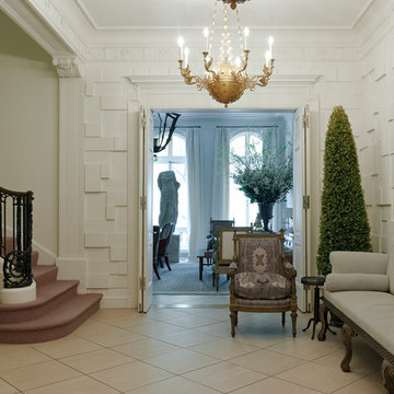
This 10,000 sf townhouse sits on one of Manhattan’s most beautiful Upper East Side streets and so the goal of the project was to return the house to its original grandeur. Previously a Kips Bay designer showcase house, the rooms were each designed in a differing style and therefore the lack of cohesion and flow made the house seem choppy. In addition, much of the interior was superficial in the sense that plumbing fixtures were not all connected, walls were “false walls” built in front of existing and much of the construction had to be rebuilt.
The scope included creating a large gourmet kitchen in the rear of the ground floor by closing off the winding corridor and creating a new door opening centered on the main entry hall with a paneled arched pocket door mimicking the original detailing of the parlor floor. The kitchen has a Calacatta Gold stone center island and dinning area flanked by counters that run the length of the east and west walls with glass front upper cabinets. A built-in buffet on the south wall anchors the space. A mud room, with access to the delivery entrance and additional storage space was added off the kitchen. A new slim profile steel and glass French door provides access to a new steel rear deck and stairs to the rear yard. On the second floor, a new tile floor was added throughout and RRA designed new stone mantle pieces fabricated from England in the living and dining rooms.
On the 3rd floor, a new wall was constructed in the 11’ wide central hallway to allow a new 135 sf master closet with custom designed built-in storage units and accessories. This concept was carried through to the 4th floor on a smaller scale and 4 new storage closets were added in the hallway. The existing bathroom on the 4th Floor was gutted and redesigned including a new 5’x5’ extra deep soaking tub and new fixtures. Silver travertine tiles were used throughout to give the room a durable, waterproof finish while also providing a warm, luxurious feel.
The 5th floor was converted into a playroom and TV room for the family’s two young children and was outfitted with chalkboard paint along the entire east wall in the play area and a bold color block wall treatment in the TV room. A new cork floor was installed for durability and resilience to lots of activity yet providing a soft and sustainable floor treatment for its intended user. A full laundry room was also created floor with new cabinetry, plumbing, and floor and wall tile. Additionally, 3 full baths and a powder room were refitted with tumbled travertine tiles on the top two floors. The exterior of the building was refurbished and new lighting and painted doors and frames were installed in accordance with Landmark designation. An additional challenge on the project was that a previously built extension on the PH level was illegally overbuilt and the property had received a violation. A 9 month process of filing drawings, completing zoning analyses and meetings with the DOB Commissioners ensued to get the extension approved allowing us to obtain a permit for the remainder of the work and complete the Certificate of Occupancy.
In spite of the complex process and scattered program, the completed townhouse has a cohesive aesthetic throughout, with upgraded amenities befitting this grand representation of elite New York living.
 Austin Patterson Disston Architects
Tria Giovan
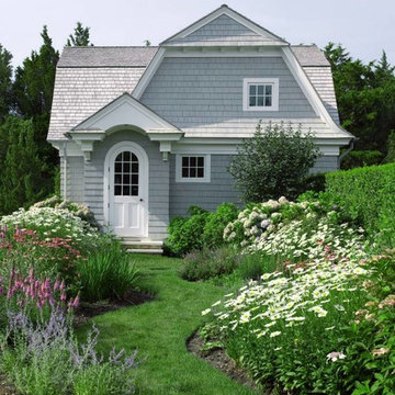
Garage - mid-sized victorian detached two-car garage idea in New York
Garage - mid-sized victorian detached two-car garage idea in New York
 Schwartz and Architecture
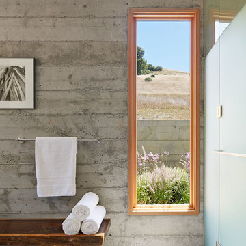
The proposal analyzes the site as a series of existing flows or “routes” across the landscape. The negotiation of both constructed and natural systems establishes the logic of the site plan and the orientation and organization of the new home. Conceptually, the project becomes a highly choreographed knot at the center of these routes, drawing strands in, engaging them with others, and propelling them back out again. The project’s intent is to capture and harness the physical and ephemeral sense of these latent natural movements as a way to promote in the architecture the wanderlust the surrounding landscape inspires. At heart, the client’s initial family agenda--a home as antidote to the city and basecamp for exploration--establishes the ethos and design objectives of the work.
Photography - Bruce Damonte
Find the right local pro for your project
 Schwartz and Architecture
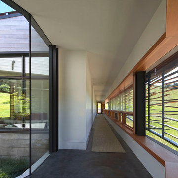
The proposal analyzes the site as a series of existing flows or “routes” across the landscape. The negotiation of both constructed and natural systems establishes the logic of the site plan and the orientation and organization of the new home. Conceptually, the project becomes a highly choreographed knot at the center of these routes, drawing strands in, engaging them with others, and propelling them back out again. The project’s intent is to capture and harness the physical and ephemeral sense of these latent natural movements as a way to promote in the architecture the wanderlust the surrounding landscape inspires. At heart, the client’s initial family agenda--a home as antidote to the city and basecamp for exploration--establishes the ethos and design objectives of the work.
Photography - Bruce Damonte
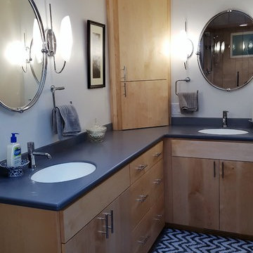
 Pamela Wilmoth, ASID Interior Design
Over the years, my jobs have involved collaborating with homeowners, business owners, architects and contractors analyzing and designing plans for new construction and remodels, renovating kitchens, designing fireplaces, cabinetry, lighting, window treatments and furnishings.
But even more important than the design, I believe the ability to communicate all the ideas and concepts of the design to the various trades people involved is critical to achieving the end results my clients and I envision.
My 35 years in the business as well as my academic background in design have given me the ability to confidently provide this service. Give me a call, I'd love to hear from you and discuss your project.
 VMI architecture
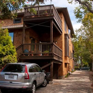
The project site is a three story apartment building with a full basement, which had recently been subject to an apartment fire. Four separate residential units were contained in the structure, including one two bedroom unit and three single bedroom units. A laundry room/basement and a pair of lofts were also housed within the building. The result of the blaze and the subsequent water damage from attempts to extinguish it left the interior of the building primarily gutted. All interior finishes, fixtures, stairways, mechanical and electrical systems were destroyed beyond repair. The exterior of the building was charred in some places, and destroyed completely in others.
The project location, the City of San Rafael, determined that due to the extent of the damage to the structure, the resulting project would be considered a “new building”. Our first task was to review the current building code and apply the current regulations to the existing structure (originally built in the early 1900’s) and bring it up to current code. We performed occupant load calculations, a code summary, square footage calculations and egress code analysis for each floor/use. This information was then compiled in order to determine how the project could legally be designed within the current code, all while minimizing modifications to the existing structure.
Once all data had been analyzed, the new floor plans were organized and laid out in a manner which retained the heritage of the original building while remaining true to current code. The site was revised to allow for code compliant parking areas while retaining the family friendly outdoor spaces inherent in the original design. The foundation was reinforced, and the building structure as a whole was strengthened to cope with modern seismic loads. Spray foam insulation, low E glazing, skylights, ceiling fans, high efficiency HVAC, etc…were all added to make the building more efficient and environmentally friendly. The use of Class “A” materials, fire separations (both vertical and horizontal) and a commercial sprinkler system were employed in order to avoid any future fires. Reconstruction of the project was recently completed in the summer of 2014.
Photos by B. James
 Byggmeister Inc
Photo by Mike Casey
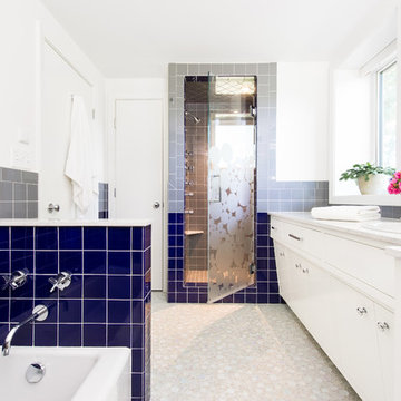
The owners of this 1960s ranch house loved their house but it wasn't configured to meet their needs. The house had only two small bedrooms for the family of four, and there was no casual living space for parents and kids to hang out separately. Neither we nor the clients wanted to increase the home's energy usage. It was a tall order: could we increase the home's size without increasing its energy footprint?
ADDING FUNCTIONALITY
We built two small additions, one at the front of the home and one off the side adjacent to the two existing bedrooms. These new spaces provided an additional bedroom on the main level as well as a new stair down to the basement. At basement level, the additions yielded a guest room, a full bathroom and a laundry area. The existing basement, which is now easily accessible from the main floor, was refinished as a casual family room.
The architect designed the new spaces to be spare and bright, replicating the mid-century aesthetic. Every detail—from the open stair, to the light maple floors, to the detailing of the bathroom vanity—echoes the vintage and character of the original home.
INTEGRATING ENERGY AND DESIGN
The key to meeting this challenge was a rigorous and integrated planning process with early-stage energy modeling accompanying design. As the architect (Anita Rogers) worked out the space plan, the energy consultant (Mike Duclos) analyzed how various scenarios could be combined with envelope and mechanical packages to not only hold the line on energy use but improve performance. We anticipate the plan we settled on will save 25% annually over pre-project energy use.
 We Build Green Inc.
We Transform your Outdoor Space into the Garden of your Dreams
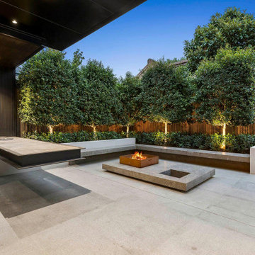
Our talented and creative team will ensure that your property reflects your tastes and preferences. We will beautify your outdoor area by providing a parking area for your kids or install a spacious patio where you can host parties for your family or friends while enjoying the beautiful weather. We will analyze your soil, study its features, the availability of light and shade, and then decide the appropriate layout and the plants most suitable for your garden. Our experienced team is skilled in soft landscaping work like planting, levelling and hard landscaping skills like paving, installation of lights, or constructing flower beds. We provide hedging and pruning for plants to ensure they are healthy and have a long life. We discard spent blooms and remove diseased branches of plants so that they grow to their maximum potential.

 Schwartz and Architecture
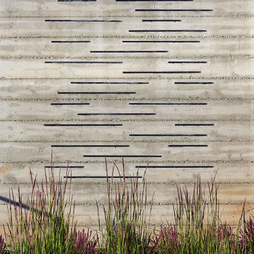
The proposal analyzes the site as a series of existing flows or “routes” across the landscape. The negotiation of both constructed and natural systems establishes the logic of the site plan and the orientation and organization of the new home. Conceptually, the project becomes a highly choreographed knot at the center of these routes, drawing strands in, engaging them with others, and propelling them back out again. The project’s intent is to capture and harness the physical and ephemeral sense of these latent natural movements as a way to promote in the architecture the wanderlust the surrounding landscape inspires. At heart, the client’s initial family agenda--a home as antidote to the city and basecamp for exploration--establishes the ethos and design objectives of the work.
Photography - Bruce Damonte
 Jay Sifford
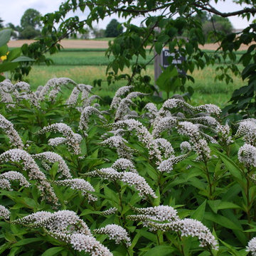
Donald Pell Farm. Designed by Donald Pell. Photo by Jay Sifford.
Photo of a farmhouse landscaping in Philadelphia.
Photo of a farmhouse landscaping in Philadelphia.

 down2earth Interior Design, LLC.
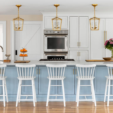
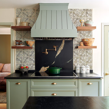
It is not uncommon for down2earth interior design to be tasked with the challenge of combining an existing kitchen and dining room into one open space that is great for communal cooking and entertaining. But what happens when that request is only the beginning? In this kitchen, our clients had big dreams for their space that went well beyond opening up the plan and included flow, organization, a timeless aesthetic, and partnering with local vendors.
Although the family wanted all the modern conveniences afforded them by a total kitchen renovation, they also wanted it to look timeless and fit in with the aesthetic of their 100 year old home. So all design decisions were made with an eye towards timelessness, from the profile of the cabinet doors, to the handmade backsplash tiles, to the choice of soapstone for countertops, which is a beautiful material that is naturally heat resistant. The soapstone was strategically positioned so that the most stunning veins would be on display across the island top and on the wall behind the cooktop. Even the green color of the cabinet, and the subtle green-greys of the trim were specifically chosen for their softness so they will not look stark or trendy in this classic home.
To address issues of flow, the clients really analyzed how they cook, entertain, and eat. We went well beyond the typical “kitchen triangle” to make sure all the hot spots of the kitchen were in the most functional locations within the space. Once we located the “big moves” we really dug down into the details. Some noteworthy ones include a whole wall of deep pantries with pull outs so all food storage is in one place, knives stored in a drawer right over the cutting boards, trash located right behind the sink, and pots, pans, cookie sheets located right by the oven, and a pullout for the Kitchenaid mixer. There are also pullouts that serve as dedicated storage next to the oven for oils, spices, and utensils, and a microwave located in the island which will facilitate aging in place if that becomes an objective in the future. A broom and cleaning supply storage closet at the top of the basement stairs coordinates with the kitchen cabinets so it will look nice if on view, or it can be hidden behind barn doors that tuck just a bit behind the oven. Storage for platters and a bar are located near the dining room so they will be on hand for entertaining.
As a couple deeply invested in their local community, it was important to the homeowners to work with as many local vendors as possible. From flooring to woodwork to tile to countertops, choosing the right materials to make this project come together was a real collaborative effort. Their close community connections also inspired these empty nesters to stay in their home and update it to their needs, rather than relocating. The space can now accommodate their growing family that might consist of children’s spouses, grandkids, and furry friends alike.
 ANX / Aaron Neubert Architects
Brian Thomas Jones
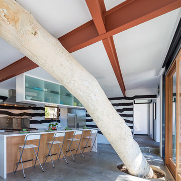
Mid-sized trendy galley concrete floor and gray floor open concept kitchen photo in Los Angeles with an undermount sink, flat-panel cabinets, white cabinets, quartzite countertops, white backsplash, stone slab backsplash, stainless steel appliances and an island
Mid-sized trendy galley concrete floor and gray floor open concept kitchen photo in Los Angeles with an undermount sink, flat-panel cabinets, white cabinets, quartzite countertops, white backsplash, stone slab backsplash, stainless steel appliances and an island
 Castle Building & Remodeling
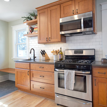
This growing family was looking for a larger, more functional space to prep their food, cook and entertain in their 1910 NE Minneapolis home.
A new floorplan was created by analyzing the way the homeowners use their home. Their large urban garden provides them with an abundance of fresh produce which can now be harvested, brought in through the back door, and then cleaned in the new Kohler prep sink closest to the back door.
An old, unusable staircase to the basement was removed to capture more square footage for a larger kitchen space and a better planned back entry area. A mudroom with bench/shoe closet was configured at the back door and the Stonepeak Quartzite tile keeps dirt from boots out of the cooking area.
Next in line of function was storage. The refrigerator and pantry areas were moved so they are now across from the prep and cooking areas. New cherry cabinetry in the Waverly door style and floating shelves were provided by Crystal Cabinets.
Finally, the kitchen was opened up to the dining room, creating an eat-in area and designated entertainment area.
A new Richlin vinyl double-hung pocket window replaced the old window on the southwest wall of the mudroom.
The overall style is in line with the style and age of the home. The wood and stain colors were chosen to highlight the rest of the original woodwork in the house. A slight rustic feel was added through a highlight glaze on the cabinets. A natural color palette with muted tones – brown, green and soft white- create a modern fresh feel while paying homage to the character of the home and the homeowners’ earthy style.

![Volume Zero, LLC [architectural design studio]](https://st.hzcdn.com/fimgs/ca0356070537acff_9871-w32-h32-b0-p0--.jpg) Volume Zero, LLC [architectural design studio]
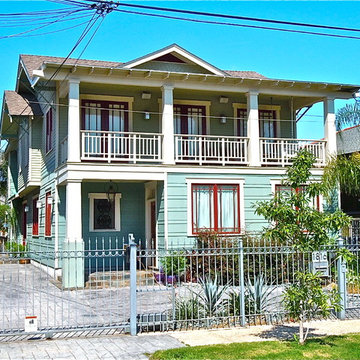
Volume Zero, LLC [architectural design studio]This project was a complete renovation of an existing Craftsman style bungalow house.
The existing house was a 2-storey Craftsman style bungalow. The first floor had low ceilings typical of the "New Orleans basement".
Upon speaking with our client and analyzing how she used the spaces, we proposed to raise the ceiling of the "basement" in order to maximize the efficiency of the layout and re-designate the first floor as the main living space.
 Schwartz and Architecture
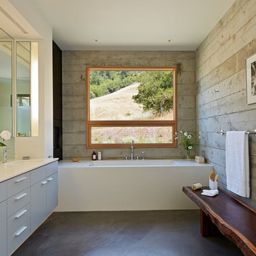
The proposal analyzes the site as a series of existing flows or “routes” across the landscape. The negotiation of both constructed and natural systems establishes the logic of the site plan and the orientation and organization of the new home. Conceptually, the project becomes a highly choreographed knot at the center of these routes, drawing strands in, engaging them with others, and propelling them back out again. The project’s intent is to capture and harness the physical and ephemeral sense of these latent natural movements as a way to promote in the architecture the wanderlust the surrounding landscape inspires. At heart, the client’s initial family agenda--a home as antidote to the city and basecamp for exploration--establishes the ethos and design objectives of the work.
Photography - Bruce Damonte
 Alexander Design Group, Inc.
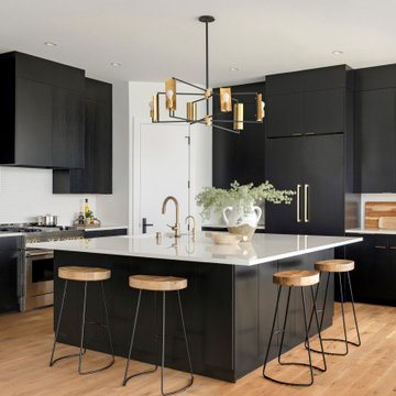
Eat-in kitchen - contemporary medium tone wood floor and brown floor eat-in kitchen idea in Minneapolis with an undermount sink, flat-panel cabinets, quartz countertops, white backsplash, an island and white countertops
 Eco Minded Solutions
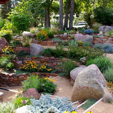
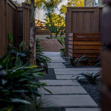
Connections are as important as other areas in a landscape design. Designers not only analyze accessibly to the home, but find ways to make these connections smooth, functional, and aesthetic.
5